
Hello everyone. Stop reading further and go fetch your helmet. Because what lies ahead is mind-blowingly awesome.
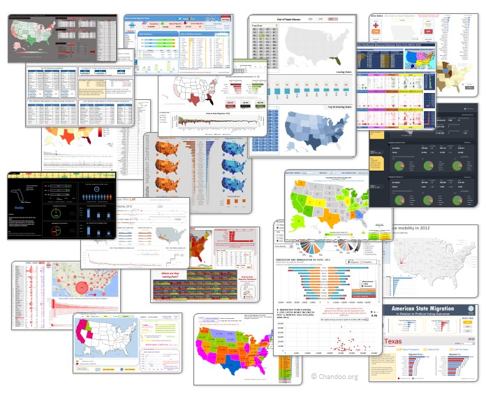
About a month and half ago, we held our annual dashboard contest. This time the theme is to visualize state to state migration in USA. You can find the contest data-set & details here.
We received 49 outstanding entries for this. Most of the entries are truly inspiring. They are loaded with powerful analysis, stunning visualizations, amazing display of Excel skill and design finesse. It took me almost 2 weeks to process the results and present them here.
![]()
But first, let me apologize
Each of our contest participants spent a lot of time crafting their files. But due to unforeseen personal work, I could not set aside time to process the entries until last week of May. I sincerely apologize for taking this much time to showcase the entries.
What about the winners?
This week our panel of judges will be reviewing these 49 entries. Next week we will share short-listed entries for public voting. Once the voting is complete, we will declare the winner. This process should be completed with-in 2 weeks.
How to read this post?
This is a fairly large post. If you are reading this in email or news-reader, it may not look properly. Click here to read it on chandoo.org.
- Each entry is shown in a box with the contestant’s name on top. Entries are shown in alphabetical order of contestant’s name.
- You can see a snapshot of the entry and more thumbnails below.
- The thumb-nails are click-able. So that you can enlarge and see the details.
- You can download the contest entry workbook, see & play with the files.
- You can read my comments at the bottom. The comments are in 2 sections – what is good, what can be improved.
- Please take my comments on “what can be improved” lightly. I do not mean to offend any of the contestants.
- At the bottom of the box, you can find links to the key techniques used. Click on them to learn more.
Thank you
Thank you very much for all the participants in this contest. I have thoroughly enjoyed exploring your work & learned a lot from them. I am sure you had fun creating these too.
So go ahead and enjoy the entries.
PS: We had to disqualify 2-3 entries due to errors in VBA code or inability to open the file.
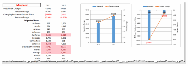
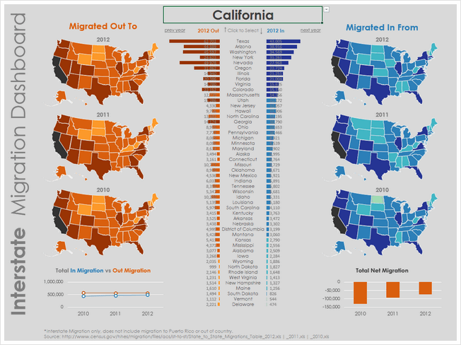
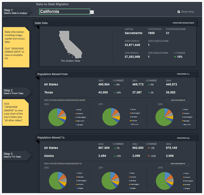
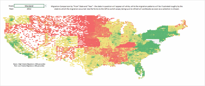
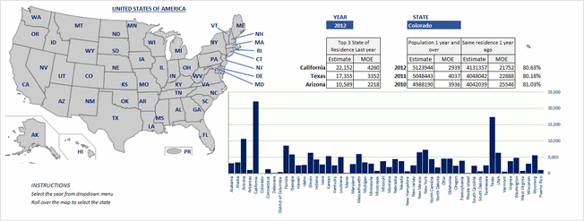
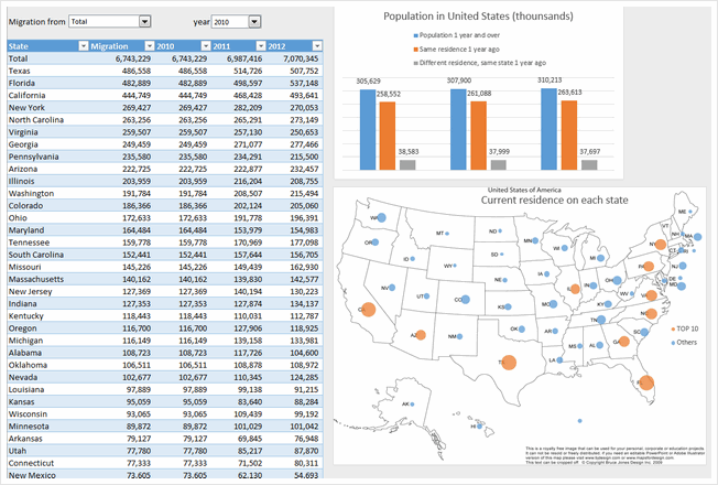
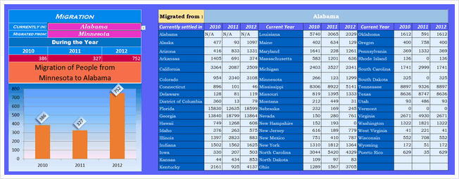
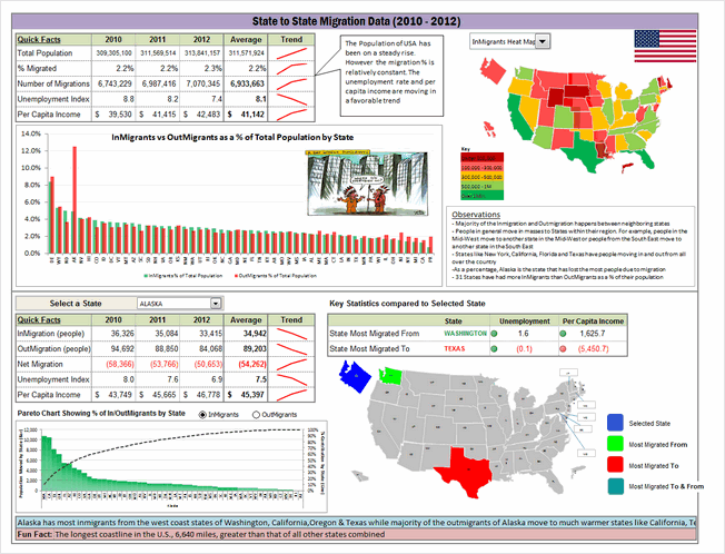
Migration Dashboard by Aditya Canay


- Good colors
- Easy to understand (built in help sheet as well)
- Interactive. Can ask questions & get answers
- Interesting facts & overall summary on top
What can be improved:
- Summary on top is static. It would be better to depend on year or state selected.
- State selection is clumsy. Could have used Active-x combo box or slicer
- Donut chart is not the best choice.
Techniques used:
Migration Dashboard by Aditya Srinivaasan


- Simple and easy on eyes
- Form controls with auto complete (Active-x combos)
- Added data on Cost of living, Crime rate & Tax rate. Helps understand what may have caused the migration.
What can be improved:
- Missing overall summary or header.
- Logarithmic scale on population breakup chart. Makes it unclear.
- Not sure which year’s data population distribution chart shows.
- Crime rate indexation assume same weightage for all crimes. Could have used a better measure.
Techniques used:
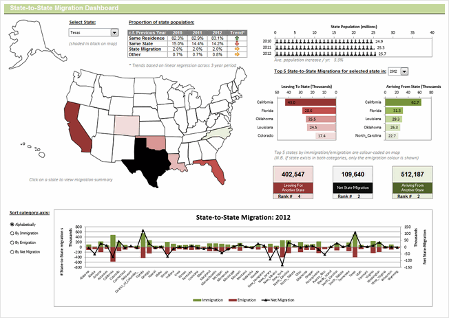
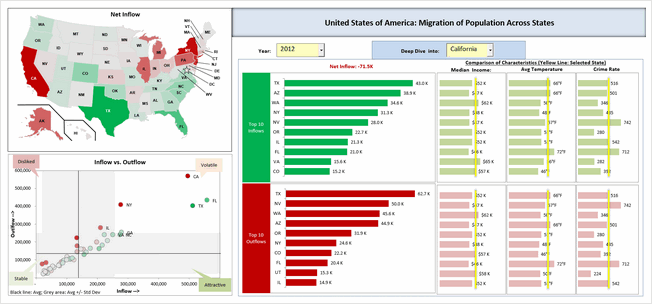
Migration Dashboard by Amit Ajmera


- Comprehensive dashboard with lots of detail
- Analysis of individual state, comparison with another state and overall trends
- Interactive. Can ask questions & get answers
- Analysis of any year or average of all 3.
- Shows a map of selected state.
What can be improved:
- Could use subtle and better colors. Also apply consistent colors.
- Alignment is off in few places.
Techniques used:
Migration Dashboard by Arnaud Duigou


- Clickable map to drill down to a state
- Overall statistics vs. Individual state focus
- Interactive. Can ask questions & get answers
- Interesting facts & overall summary on top
- Built-in help bubbles (that can be toggled)
- Analysis on factors for migration (by using additional data like per-capita income, unemployment rate and weather conditions)
What can be improved:
- Not sure how the tool tips button is supposed to work.
- Alignment is off in few places.
- Switching between state view & overall heatmaps seems clumsy. Also, the state selection combo box on top feels redundant
- Colors & fonts can be improved. Feels like too many of them are used.
Techniques used:
Migration Dashboard by Biju Chacko


- Simple charts with easy to understand colors
- Interactive charts to see migration trends per year
What can be improved:
- Could use a summary on top and few other metrics
- Bar charts have non-zero axis. Creates false impression
- Alignment can be improved. Lots of empty spaces that can be filled with useful insights.
Techniques used:
Migration Dashboard by Celso Garcia


- Clickable map to drill down to a state
- Color coded map & bar chart for easy interpretation
- Form controls to select year
What can be improved:
- Could use a header with summary statistics
- Map and bar chart represent the same data. Could have used other metrics in the bar chart to give more insights
Techniques used:
Become Awesome in Excel & VBA – Create dashboards like these…

- Learn how to create interactive dashboards & reports using Excel
- Develop your own macros & VBA code
- 50+ hours of video training
- Learn at your own pace
- Click here to know more
Migration Dashboard by Cesarino Rua


- Map with details on hover!
- Lots of details for selected state, include flag of the state, important cities etc.
What can be improved:
- Some of the tables feel like orphans. Could use titles (and overall summary or title or both)
- The bar chart on right is just repetition of data in the last of column of table before that. Could have used this space for something else.
- Feels like too much data. Need to zoom down to 80% to see everything. Consider using form controls or something else to make it easy on eyes.
Techniques used:
Migration Dashboard by Chris Newman
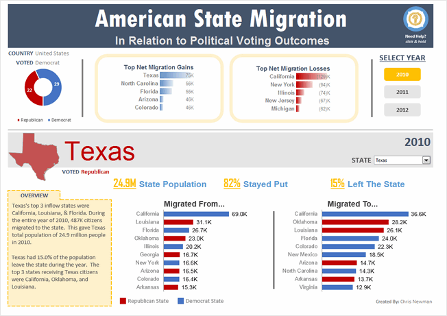


- Clear, dashboard style output with details in big fonts.
- Details of migration combined with political tastes of the state.
- Slicers for selecting year
- Good choice of colors, good alignment and layout.
- Built-in help bubbles
What can be improved:
- Poor choice of conditional formatting databar on top. Could have used regular bar chart with 0 axis.
- Giving a choice of additional measures could have added detail to state view.
Techniques used:
Migration Dashboard by Daniel Dion
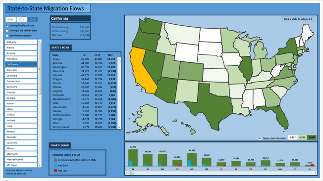


- Clickable map to drill down to a state
- Also, slicers to select a state
- Ability to select year, type of metric (leaving, entering, net gain) to view for the selected state.
What can be improved:
- Too many scrollbars. Especially both slicer & clickable map serve the same purpose. So, could have removed the slicer.
- The listing of states & column chart beneath the map are same data. Again this space could have been used for other insights.
Techniques used:
Migration Dashboard by David Hoppe
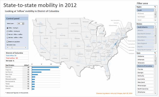


- Map with vectors indicating the movement
- Multiple statistics and ability to switch them (and years)
- Ability to analyze by absolute or relative population
- Slicers for selecting state (or region or division)
- Simple, clean layout with good colors and beautiful presentation
What can be improved:
- Could have added help or instructions
- Could have removed either region or division slicer (as they feel redundant)
Techniques used:
Migration Dashboard by Dwight Johnson


- Simple charts with easy to understand colors
- Data validation to select state
What can be improved:
- Could have moved the output to a blank sheet & cleaned it up
Techniques used:
Migration Dashboard by Fakhri Damdi

- No comments
What can be improved:
- Could have reduced the formatting and focused on insights
- Feels incomplete and rushed. Could have focused on answering some analytical questions instead of making charts from raw data
Techniques used:
Migration Dashboard by Gangadhar Yeligaty


- Simple dashboard with easy to understand layout and charts
- Interactive charts to see migration trends per year
- Scrolling area to see where people move from selected state
- Built-in help
What can be improved:
- Could have added header section with few statistics
- Could have used better formatting for the charts (labels & axis feels heavy)
Techniques used:
Migration Dashboard by Janet


- Dual map with ability to analyze by either leaving or entering state
- Ability to focus on various trends (with sortable table, year selection)
- Slicers for selecting year, state, type of sort
- Good choice of colors, good alignment and layout.
What can be improved:
- Sort order slicers are reversed (clicking on Ascending sorts the table in descending)
- Feels like too much data. Could have used 000s or millions notation for population numbers (and removed MoE numbers or have them toggled)
- Could have added help to understand what arrows meant in the last column.
Techniques used:
Migration Dashboard by Jean-MarcVoyer


- WOW
- Form controls, selectable cells to define analysis
- Good design and colors
- Excellent analysis (with ability to ask a lot of questions and get answers visually
What can be improved:
- Dark background makes it tricky to read numbers. Could have used white or dull background.
- The dashboard is very comprehensive. It could have benefited from help screen.
Techniques used:
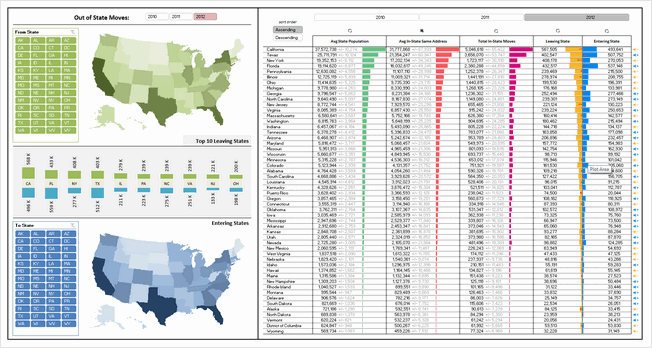
Migration Dashboard by Jeff Sawers
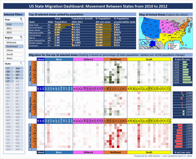


- A very interesting layout and selection mechanism (with slicers for year, region and state)
- Focus on top 10 states with-in selection and where people moved using databars & heat maps
- Good alignment, colors and design.
What can be improved:
- The heatmap section is somewhat tricky to interpret. May be aggregating data at just region level would have made it easy to read.
- A little more analysis or explanation on what may have caused migration would make this even better.
Techniques used:
Migration Dashboard by Joey Cherdarchuk


- Beautiful and simple design
- Clickable cells for selecting year and state
- Simple colors and attractive maps
What can be improved:
- The labels on bar chart are hard to read. A better color or placement would have benefited.
- If the selected year’s map is highlighted, it would make interpretation of trends faster.
- A quick summary on what may have caused such migration trends would make this dashboard even better
Techniques used:
Migration Dashboard by Jon Schwabish
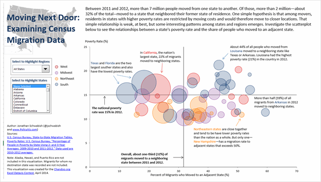


- Simple chart with interactive controls
- Uses the hypothesis that people in poor states move to neighboring states and tests it with the interactive charts & data.
- Good colors and simple design
What can be improved:
- Could have added overall statistics in header
- Could have displayed relevant facts for the selected region or state.
Techniques used:
Migration Dashboard by Jorge L
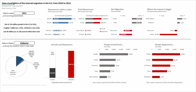


- Simple & clear layout with summary on top and state details at bottom. Good colors too
- Interactive controls to select state and year.
What can be improved:
- Selecting state is tricky with data validation. Could have used a slicer or active-x combo box
Techniques used:
Migration Dashboard by Jude Shyju


- Data & charts (map or table) in one view with ability to toggle fields & years
- Ability to drill down to a state and visualize inflow or outflow
What can be improved:
- Picture links create clumsy output. Could have used regular charts, tables and drawing shapes instead.
- Lack of alignment in few places.
- Although ability to turn off fields is welcome, it just results in a column with #N/A. Not useful as no space is gained.
Techniques used:
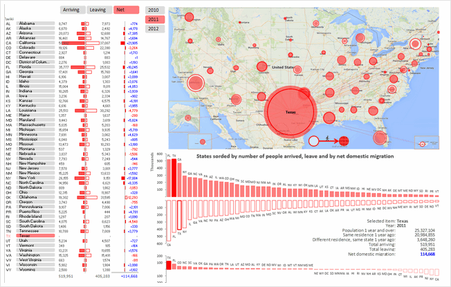
Migration Dashboard by Kevin Steiner


- Interesting visualization with very tiny cells making up US map, pivot table report filters used for selection
- Choropleth map with Excel cell grid!
- Ability to see the map & full data (as pivot report)
What can be improved:
- The cell grid map, although innovative, does not look perfect. Could have used regular map with a little bit of VBA to color it.
- Instead of presenting all the data in a table (pivot table), could have used charts. This saves space and helps create a better layout.
Techniques used:
Migration Dashboard by krishnakumar
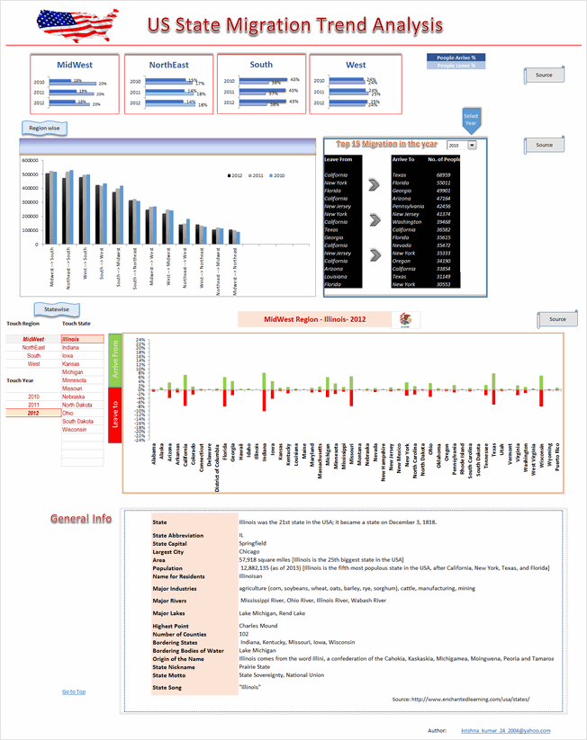


- Detailed analysis on regional migration trends (Midwest, northeast, south & west)
- Ability to drill-down to an individual state by selecting year, region and state’s name
- Interesting facts & details about state shown.
What can be improved:
- Regional migration column chart is tricky to read. Could have used a map or diagram for better effect.
- Too long. Requires 2 scrolls to see the full dashboard. Instead could have shrunk or removed a few charts to create a compact report.
Techniques used:
Migration Dashboard by krishnasamymohan

- Simple report on state migration
What can be improved:
- Too simple. Could have used some charts or conditional formatting to highlight interesting points
- Year selection does not seem to work.
- Gauge charts a poor choice for visualizing this type of data. Could have used alternatives
Techniques used:
Migration Dashboard by krishnateja


- Interesting layout and state selection mechanism (clickable map)
- Ability to analyze selected state’s migration flows
What can be improved:
- Instead of 4 charts depicting regional trends, one chart with selected region’s trends could be used. This creates space for more analysis.
- In-consistent colors and alignment
- Could have displayed a title & quick summary on top.
Techniques used:
Migration Dashboard by Kyle Tan
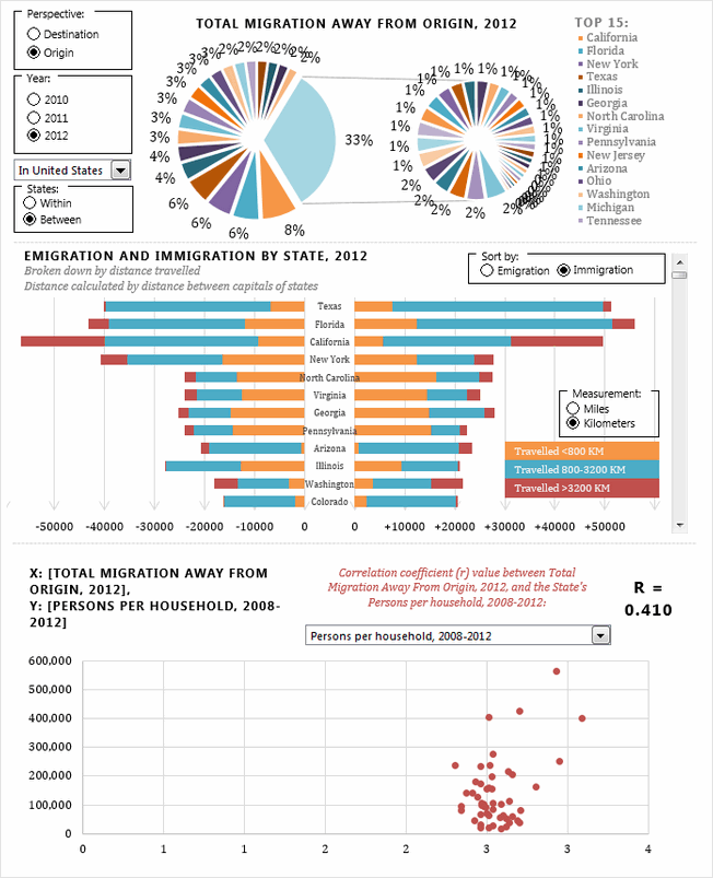


- Interesting presentation with ability to choose a variety of perspectives (destination vs. origin, year, entire USA vs. single state) and various measures for doing correlation analysis.
- Sortable, scrollable chart of state migration flows (with distance from origin!)
- I love the correlation analysis chart. But selecting right measure to analyze feels tedious. Could have pre-calculated or suggested measures based on state selection.
- Good, compact layout.
What can be improved:
- The exploded, grouped pie chart on top feels clumsy and poorly done. Should have used a simple bar chart for top 15 states alone.
- The VBA code feels buggy and sluggish. Could have checked it for errors and disabled screenupdating.
- Could have displayed a title & quick summary on top.
Techniques used:
Migration Dashboard by Mark Weber


- Superb colors, layout, chart selection and presentation
- Very easy to use with built-in help, lots of buttons to change / show / hide things you want.
- Analysis by state and state-to-state.
- 2 color themes – dark & light version.
- Subtle but powerful use of conditional formatting.
What can be improved:
- Could have added a top section with overall USA statistics.
- The analysis is limited to population numbers alone. Could have added additional metrics for richer analysis.
Techniques used:
Migration Dashboard by Matthew Waechter


- Beautiful colors and layout. Feels well balanced and easy on eyes.
- Ability to select state & year to understand migration flows. The selection choice feels slick (clickable cells with arrow indicator)
- Interesting ladder / waterfall chart to explain net gains in population.
What can be improved:
- The dot plots on top feel cryptic. Could have added help or title to explain that they are migration numbers for all 50 states.
- The analysis is limited to population numbers alone. Could have added additional metrics for richer analysis.
Techniques used:
Migration Dashboard by Michael Bellot
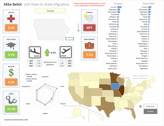


- An elegant dashboard with subtle colors, interesting shapes and clever layout
- The clickable map is a very user-friendly way to explore the information.
- Additional metrics like health, education, wealth, crime, climate etc. help explain migration reasons
What can be improved:
- Could have added data labels to the bar charts (or to the map) to make it better.
- The radar chart, although looks pretty, just repeats the data on the shapes. Could have used it for something else.
- A little more clean-up on dashboard sheet is needed. It shows some calculations and data on the right (which could be hidden)
- It is not sure for what year the map & bar chart data is displayed. An year selection mechanism can also be added.
Techniques used:
Migration Dashboard by NA Horansil
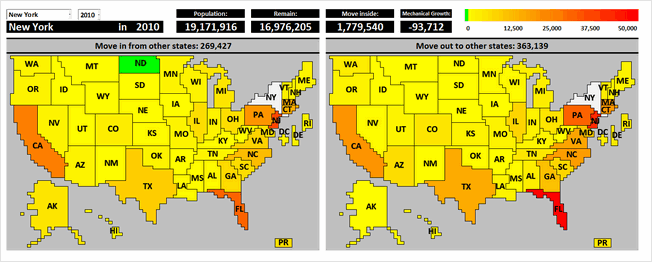


- Wow, cell grid used to create a giant map of USA. Then conditional formatting is used to highlight state’s cells based on migration numbers.
- Ability to select state & year to understand migration flows.
- Sortable migration trends chart (although in a separate sheet)
What can be improved:
- While the cell-grid map looks neat, could have used a regular map with VBA for color-coding. This provides better fidelity and forces us to focus on numbers rather than technique.
- The work books has 3 sheets with dashboards / charts. Contest rules specify one chart or dashboard. Could have integrated all to one page.
- Could have displayed a title & quick summary on top.
Techniques used:
Migration Dashboard by Nathaniel Mahoney


- One more cell grid map, this time at zip code level. Looks interesting although stretched.
- Ability to select state & year to analyze migration trends
- Uses pivot tables & additional data.
What can be improved:
- The map gets stretched and looses clarity due to cell grid approach. Could have used a regular map with VBA.
- The dashboard (?) has no title, no additional numbers and has minimal legend. Could have added a title, quick summary and few more charts.
- How the zip code level migration data is obtained is not clear. Could have added instructions & pointed to sources.
- Requires Data > Refresh once selection is made. Could have automated that with VBA.
Techniques used:
Migration Dashboard by Nhut Vo


- Simple report on state migration
- Ability to select state, year for analyzing migration flows. Ability to sort the list of states based on inflows or outflows.
What can be improved:
- The chart on the right (state-wise distribution) feels busy. Could have shown only top 10 states as sorting is already available.
- The sorting buttons are confusing. Could have used a selection mechanism (or toggle button).
Techniques used:
Migration Dashboard by Niyaz Shaffi


- Clean layout with good colors and clear titles
- Slicers for selecting to & from state, year
- Forecast of migration flows
- Choropleth map based on state migration flows
- Ability to expand a chart (and see more data points, although for a poorly executed chart)
What can be improved:
- The radar plots are a poor choice for depicting top 10 states. Should have used bar / column charts
- The migration inflow vs. area bubble chart is not easy to understand. Should have added instructions.
Techniques used:
Migration Dashboard by Permana Zainal

- Clear, simple layout with bright colors
- A map with bubbles depicting migration trends.
- Ability to analyze by state, year and migration destination
What can be improved:
- The map / bubble chart is confusing with too many colors. Not sure what the state fill colors represent. The bubble colors are also distracting and useless (as the bubble size is what matters). Could have simplified with either Choropleth map or outline map with bubbles.
- The bar charts beneath donuts do not start at zero. This creates wrong impression of the data.
- Summary of total migrants / population chart needs axis labels and ability to sort.
Techniques used:
Migration Dashboard by Prashant Sharma


- Roll-over selectable map and ability to select year for analysis
- Simple dashboard with state migration analysis
What can be improved:
- The state-wise migration flows chart needs ability to sort.
- Could have added few more charts or analysis tables. The chart & tables are just a replica of original data.
- Could have added a title & quick summary at overall USA level.
Techniques used:
Migration Dashboard by Rajesh Sangati


- Map with ability to select state, type of migration and year (from drop downs)
- Answers questions like which states get most net migrations, contribute for 90% of outflows, inflows
- Simple layout and easy to use
What can be improved:
- The map feels hand-drawn. May be a better outline map or shapes would do justice.
- Labels on charts are difficult to read. Should have used 2 letter state code with horizontal orientation.
Techniques used:
Migration Dashboard by Richard Dutton


- Clear, elegant layout with lots of detail
- Can select a state (from drop-down), year to analyze migration flows.
- Sortable state-to-state migration chart
- Clicking on any state in the map shows further statistics.
What can be improved:
- The state selection drop-down is clumsy to use. Should have used either active-x or slicer or clickable map to make it user-friendly.
- The axis labels on state-to-state migration are hard to read. May be 2 letter codes or scrollable chart would do the trick.
Techniques used:
Form ControlsMaps + VBASortable TablesConditional Formatting
Migration Dashboard by Roberto Mensa


- Wow. A very colorful, clear and well designed report
- Slicers for selecting year, type of data and state are well placed and formatted. They look very natural.
- The map / bubble chart / xy plot is a clever piece of work and explains where people are heading or coming from.
- Interesting addition of Wikipedia links for state names, so that we can learn more by clicking.
What can be improved:
- Could have added a title on the top
- An outline map instead of geo-political map would have made the bubble + XY plot pop out more.
Techniques used:
Migration Dashboard by Roger Haragushiku

- A simple data table along with bubble chart depicting migration data.
- Ability to select a state and year for analysis
What can be improved:
- The map depicts data in the data table. Could have removed one and used the space for something else.
- Could have added a title and quick summary on top.
Techniques used:
Migration Dashboard by S Ramesh


- Interesting report. Start with a help screen and can speak the numbers upon selecting a state.
- A map where you can select a state for further analysis.
What can be improved:
- The map with radio buttons feels somewhat busy. Could have used a simpler outline map with clickable text-boxes for smooth layout.
- The charts which show details are on other sheets. The contest rules specify creating one chart or dashboard on a single page.
- Although built-in help is nice, there is no way to see it again. A help button would have been useful.
Techniques used:
Migration Dashboard by Shailesh Patwardhan
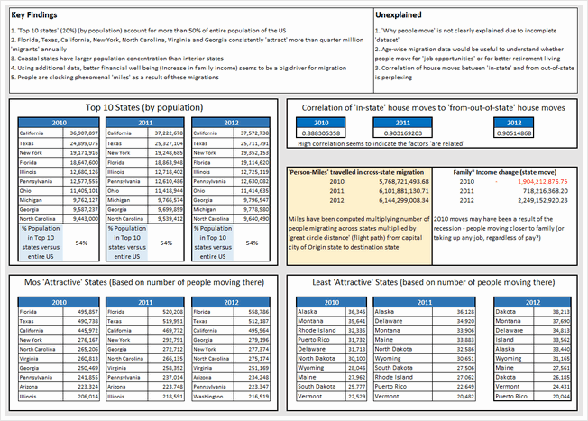

- A crisp, simple and number-only dashboard
- Tests a few hypotheses to explain the migration and explores what may have caused the movement
- Sections on key findings & unexplained are very useful
What can be improved:
- The precision of numbers seems excessive given the nature of them (and margin of error). Could have rounded numbers to nearest %, thousand or million as needed.
- A few charts could have made the insights pop out better.
- Could have added analysis by a selected state. This makes the dashboard personal and interesting.
Techniques used:
Migration Dashboard by Shamik Sharma
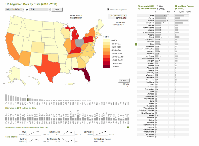


- Clear, elegant dashboard with lots of detail, interactivity and analysis
- Ability to analyze by selecting a single state, multiple states and year.
- Additional data on unemployment rate, gross state product (GSP), international migration helps understand the migration trends better.
- Very good colors, alignment, layout and feel.
- Built-in Help sheet to explain the dashboard
What can be improved:
- While the dashboard provides powerful analysis and ability to interact, a little bit of conclusions or summary text could have helped in interpreting it better.
Techniques used:
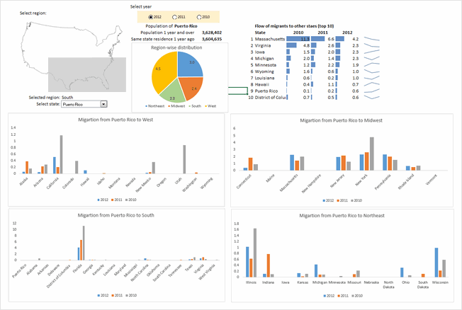
Migration Dashboard by Somalinga K


- A simple dashboard with ability to explore any given state’s migration trends and understand one state to another flows.
- Colorful and simple.
What can be improved:
- The data-validation in cell I2 was incorrectly setup (corrected it in download file)
- Instead of showing data as-is based on selection, could have added some analysis or exploration on why the migration may have happened.
- Should have used consistent fonts, alignment & colors and prevented errors thru IFERROR()
Techniques used:
Migration Dashboard by Srinivas Chilukuri


- Beautiful colors and layout. Enables quick analysis and exploration.
- Ability to select a state & year for deep-dive analysis
- Additional data median income, temperature & crime-rate helps understand migration better.
- Inflow vs. outflow scatter plot is interesting
What can be improved:
- The Choropleth map on top feels under-utilized. Could have generated map based on selected state instead of all states.
- Alignment is a bit off in few places. Also the charts on right could use grid-lines or repeated axis labels for better readability.
- The file is password protected (VBA code). This is against rules.
Techniques used:
Migration Dashboard by Stacey Baker
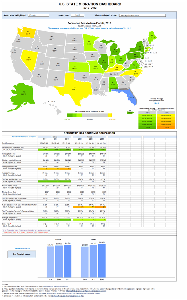


- A very insightful & detailed dashboard.
- Ability to explore migration trends based on state, year, various metrics (crime rate, per-capita income, unemployment rate, median home value, median rent, % of unmarried population etc.)
- Ability to compare up to 4 states on various metrics to understand reasons behind migration.
What can be improved:
- The dashboard is too long. Could have reduced the map size and arranged everything on one screen / page.
- Reading the dashboard is tricky due to its length. A help sheet is needed.
Techniques used:
Become Awesome in Excel & VBA – Create dashboards like these…
- Learn how to create interactive dashboards & reports using Excel
- Develop your own macros & VBA code
- 50+ hours of video training
- Learn at your own pace
- Click here to know more
Migration Dashboard by Suriya Banu
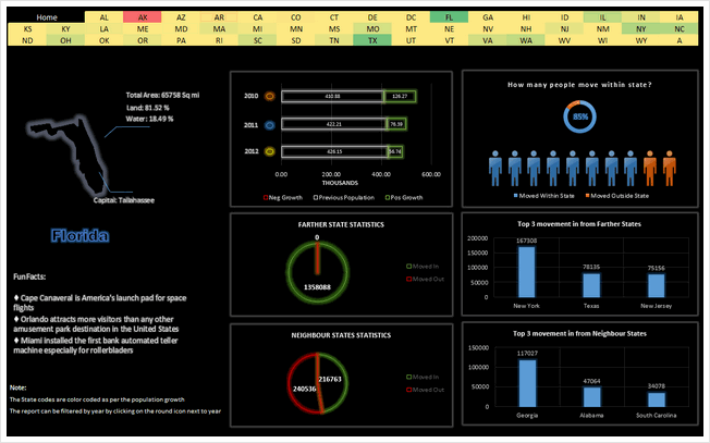


- Unique design and interesting choice of colors & layout
- Ability to select a state by clicking on cells with state 2 letter codes.
- The neighbor state statistics is insightful. It shows consistent movement of people with-in neighboring states.
- Interesting facts about the state.
What can be improved:
- The home screen is drab and has no insights. Could have used it for overall summary and quick insights on migration trends.
- The pie charts are a poor way to depict data like this. Should have used column or bar charts.
- Year selection feels tricky. Should have used a more obvious method.
Techniques used:
Migration Dashboard by Thiruselvan


- Very insightful & interesting dashboard
- Good mix of charts, observations, fun facts and analysis.
- Ability to select a state for in-depth analysis.
- Pareto analysis to understand migration of a selected state.
What can be improved:
- The pareto analysis feels forced. It would have been better to test whether a pareto behavior is exhibited by the data before going this route.
- Some place the alignment, font sizes, border thicknesses and colors are a bit off.
- Could have used an Active-X drop down for state selection.
Techniques used:
Migration Dashboard by Trevor Eyre
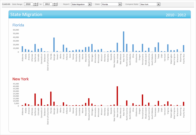


- Interesting dashboard with ability to compare 2 states for given time period on various parameters
- Simple & elegant design
What can be improved:
- The controls for date range selection feel un-necessary as we have only 3 years of data. The other controls should have been intergraded in to the dashboard to make it compact.
- The charts & analysis leaves one wanting for more.
Techniques used:
Migration Dashboard by Tyler Barr
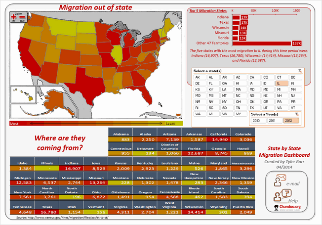


- A colorful, interesting design with built-in help
- Slicers for selecting state & year
- Ability to zoom the map view is an interesting touch.
What can be improved:
- The map, 50 state table at the bottom & top 5 migration states on top right all depict same data. Could have removed one of them and used the space for other types of analysis.
- Picture links make the “Where are they coming from” section a bit stretched. Could have used textboxes or regular cells.
- Alignment is a bit off in few places.
Techniques used:
Migration Dashboard by Vikram Krishnamurthy
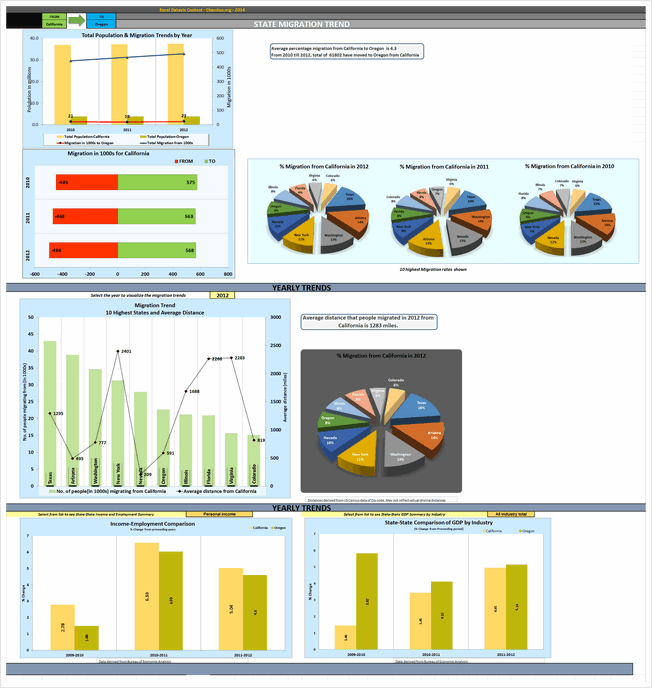


- A detailed dashboard to explore migration from one state to another
- Analysis by yearly trends, average distance from selected state. Also you can explore GDP, personal income and employment for the selected state.
What can be improved:
- Poor choice of charts & colors. The 3d pie charts, in-consistent colors and layout makes it tricky to gain insights from this. Could have used simple bar charts and subtle colors.
- Lots of white space and redundant charts make it hard to understand key points. Should have reduced the charts and made them in to a tight layout.
Techniques used:
Become Awesome in Excel & VBA – Create dashboards like these…
- Learn how to create interactive dashboards & reports using Excel
- Develop your own macros & VBA code
- 50+ hours of video training
- Learn at your own pace
- Click here to know more
Like all? Download one zip file with all dashboards
If you are planning to play with all these dashboards,
download this zip file [50 mb, ZIP file].
Make sure you close all other workbooks before opening these files as many contain VBA code.
How do you like these dashboards?
Quite a few of these dashboards are really impressive. Seeing them is just like watching a magic show or world-class ballet performance. I will share my views & our judges views next week.
Meanwhile, Tell us which entries you liked most? Go ahead and share your views.


164 Responses to “Gantt Charts – Project Management Using Excel [Part 1 of 6]”
ninja =)
Superb!
Chandoo,
One concern with this approach is that it is often very important to display the Planned and Actual schedules superimposed on each other (not available here). Also, it is not uncommon to save multiple benchmarked versions of the plan along with current re-plan, and to display multiple versions of the plan simultaneously.
This leads me to the thought that the Gantt chart you present will be very effective for a certain class of project, but not for others (ie. where Primavera or MS Project are more appropriate for their power). Can we identify those cases?
Also, it is very clear that Excel is a critically important tool for schedule analysis even when the high-power tools are used. Some of the best uses are for data export/import and graph analysis that far surpass the big boys in flexibility.
@Alex... I like your point. I have thought about it when writing this post, but I didnt mention the exact method to achieve it here. One reason is I wanted to keep the series and this tutorial simple and yet share powerful ideas.
I think excel based gantt charts are less powerful when you compare with MS project or some other project management tool. But excel has one great advantage that almost everyone in the workplace has it. This is particularly true for large and complex projects where there are several tasks and plans always change.
For eg. in MS Project, you can specify dependencies of a particular task and the gantt and schedules will be arranged automatically. I am sure we can do this in excel too, but it would be too many functions and scaling it would be an issue.
Thankyou Sir for great works done by you, I have a point .. I used the following formula to shade the weekly cell and then used conditional formating.. I found the INDEX formula bit complicated.. though i didnt make provision for % done..
=IF($M$7="Planned",(IF(AND(H$8>=$C9,H$8=$E9,H$8<=($E9+$F9-1)),"2","")))
The value 1 & 2, I have assigned with shades of my choice..
(to which email I can send you my file)..your comments please...
Regards
Rohit Chadha
[...] link Leave a Reply [...]
Chandoo,
Could you please share link to an excel file for download instead of zip file.
The Zip file hits the firewall roadblock.
@Rohit: Thanks for sharing your formula. Can you upload the file on skydrive and leave the url here... that way everyone can see your work.. 🙂
@Pankaj: You can download the .xls file from here
http://cid-b663e096d6c08c74.skydrive.live.com/self.aspx/Public/gantt-chart-project-management-template.xls
nice...
[...] Preparing & tracking a project plan using Gantt Charts Team To Do Lists - Project Tracking Tools Part 3: Preparing a project time line [upcoming] Part 4: Time sheets and Resource management [upcoming] Part 5: Tracking issues and risks [upcoming] Part 6: Project Status Reporting - Dashboard [upcoming] [...]
I'm sure it wouldn't be difficult to finagle the conditional formatting to outline the target, and fill in the actual (or vice versa), or some other form of formatting that will superimpose the two.
The alternative, of course, is creating a graph that does the same, and shows actual versus projected...
@Sal: I agree. Excel 2003 has a limitation on the number of 3 conditional formats applied on a range of cells. Also the formats stop if true. Excel 2007 none of these limitations. We can use that to show planned and actual both on the grid along with % completion.
[...] have started 2 new series of posts - Project Management using Excel and slightly controversial Chart [...]
Ive been playing (learning) with this and took cognisance of the need to show planned and actual on the same graph.
I used the following formula in the cell
=IF(AND(J$8>=$E9,J$8<=($E9+$F9-1),$E9=$C9,J$8<=($C9+$D9))
This got the same effect without the need for a 3rd conditional format.
however id like to use that 3rd conditional format to colour the text "?" based of the %complete column. Could Index be used ?
ill try upload the file later but im at work now. Thanks
hmm timed out and didnt upload properly ill update later when i get time
@Jon: Cool, thanks for sharing your formula. However the formula is not working. I think it missed the other two parameters and only specifies the parameters for AND(). If possible, please upload your file somewhere or email it to me at chandoo.d @ gmail.com so that I will be able to upgrade the version in the post.
thanks for getting back. i tried to update again last night but it didnt work( and i didnt want to look like i was spamming 🙂 )
http://cid-8d9d5762da62b814.skydrive.live.com/self.aspx/.Public/Copy%20of%20gantt-chart-project-management-template.xls
I looked at the comments from the other users and also noticed that the %complete line shows 100% even if its only 90% in column G.
Please note i have only changed Rows 9 and 10.
After having a play i came up with the following formulas.
in the cell formula i have (note addition of the -1)
=IF(AND(H$8>=$E9,H$8<=($E9+$F9-1),$E9=$C9,H$8<=($C9+$D9))
-and-
=H$8=$AL$6
This frees up the 3rd conditional format. I was hoping to reflect the % complete by changing the colour of the "?" based on the %'s and colours in columns AO and AP and was hoping Index could do this.
your advice would be greatly appreciated 🙂
(really doesnt like the way im typing this so ill try without the paragraphs. It should read -)
Please note i have only changed Rows 9 and 10.
After having a play i came up with the following formulas.
in the cell formula i have (note addition of the -1)
=IF(AND(H$8>=$E9,H$8<=($E9+$F9-1),$E9=$C9,H$8<=($C9+$D9))
-and-
=H$8=$AL$6
grr
in the conditional format formulas i have
=AND(H$8>=$C9,H$8<=($C9+$D9))
@Jon... Thanks for such an elegant solution. I am trying to update the template and provide another download. I will do it this weekend.
[...] Preparing & tracking a project plan using Gantt Charts Team To Do Lists - Project Tracking Tools Project Status Reporting - Create a Timeline to display milestones Part 4: Time sheets and Resource management [upcoming] Part 5: Tracking issues and risks [upcoming] Part 6: Project Status Reporting - Dashboard [upcoming] [...]
I'm feeling very inadequate after reading through these posts (and the tips above). I am a project manager that is trying to get an 'old fashioned' (defunked) program under control by making everything uniform. I thought I was doing well with my chart, until it came to learning actual/planned, conditional formatting, and the formulas needed. I've been able to figure out a lot of what I'm doing on my own, but I've hit a wall with this last part. Can you please explain what the two different colors on the chart represent (light blue, dark blue) and the difference between the proposed and actual bars? I've probably taken on more than I should have with a gantt chart, but I'm too far along to give up now. Besides, it'll drive me crazy until I figure it out. THANK YOU in advance for any help you can lend.
@Kelly: Welcome to PHD and thanks for your comments.
The spreadsheet uses slightly intricate formulas to show planned or actual gantt chart. The dark blue bars are that. The light blue ones are the portion of work that is finished. This is based on the "% complete" values you enter. I am not sure if my answer is helping you. Let me know if you want more help.
Hi Chandoo
Fantastic stuff! How can I change the colors of the cells? I want to change the light blue one.
@Espri... Welcome to PHD and thanks.
You can change the light blue color (actually it is white, due to the blue background it looks like light blue) by selecting the entire grid and changing the font color. 🙂
[...] Gantt charts are very good to understand a project progress and status. But they are heavy on planning side. They give little insight in to what is happening. A burn down chart on the other hand is good for understanding the project progress and how deliverables are coming along. According to Wikipedia, A burn down chart is graphical representation of work left to do versus time. The outstanding work (or backlog) is often on the vertical axis, with time along the horizontal. That is, it is a run chart of outstanding work. It is useful for predicting when all of the work will be completed. [...]
Hi, everyone, I just found the very interesting web that open my eye on excel. Can I learn how to create the box with world 'plan' and 'actual' inside. Also I notice there is a legend sheet, what is that? Thanl You.
Hi,
I'm an Excel noob so apologies in advance if the following statements seem foolish. I'm wondering if the following could become part of the tutorial.
I'm currently planning a home extension & will be the de facto project manager. Is it possible to include budgets as a % of total build cost, contractor's quotes against actual payments to them, etc.
Won't go into too much detail yet in case this sort of enquiry is inappropriate to the thread.
Thanks,
Clive
This is really great stuff - easy tool to use. One quick question - How do i change the grid to display 52 weeks or say 35 to 52 weeks. I am no excel guru so any help is welcome.
@Ta: welcome to PHD. you can learn about adding validation drop down list to a cell by reading this article: http://chandoo.org/wp/2008/08/07/excel-add-drop-down-list/
@Clive: Very good idea. I havent really dedicated a whole post to cost aspect. Since cost is directly proportional to effort I left it out. I will be discussing about effort estimation as part of the 4th installment of this series (will be posting it this week). Meanwhile, you can edit the downloadable workbook on this post and add budget details as well. You might want to take a look at the burn-down charts post here: http://chandoo.org/wp/2009/07/21/burn-down-charts/ and may be use it to indicate budget burn down too.
@Sundeep: Welcome to PHD. You can easily add more columns.If you are familiar with how excel formulas (and conditional formatting) work then it should be fairly easy. Otherwise spend a few minutes reading articles on conditional formatting (here: http://chandoo.org/wp/tag/conditional-formatting/ ) and formulas (here: http://chandoo.org/wp/tag/formulas/ ) and then try it. Good luck.
Hi,
Thanks for the site.
Is there a way to add milestones to the chart with no duration (similar to MS Project) like start, or meeting, or other no duration events?
Great post! I am trying the project management on excel.
Thanks for the tips.
[...] Preparing & tracking a project plan using Gantt Charts Team To Do Lists – Project Tracking Tools Project Status Reporting – Create a Timeline to display milestones Part 4: Time sheets and Resource management Part 5: Tracking issues and risks [upcoming] Part 6: Project Status Reporting – Dashboard [upcoming] Bonus Post: Using Burn Down Charts to Understand Project Progress [...]
Great stuff. This info post helps me lot.... thanks so much for sharing
Not to put a damper into this series of post but using excel as a project management tool (other than unique one/few time use needs) is really a poor idea. Excel is a poor mans database and should only be used with cost reporting for regularly used reports. Even then I do not think it is a great idea. Don't get me wrong I use it all the time for project management. Not because I want to use excel to create the reports let alone collect the data. It is because my company is to cheap and ignorant (of the processes) to buy the software to do project management functions more effectively in less time. Excel is used in way to many cases instead of a properly designed database by us Finance/Accounting professionals.
I needed a quick & inexpensive way to build a decent-looking Gantt chart and this fit the bill perfectly. Thanks for posting it.
@Brian: I disagree with you on "using excel as a project management tool ... is really a poor idea." part. While excel cannot fulfill a large scale project's management needs, it works very well for day to day project management stuff be it maintaining issue logs, change logs, listing and tracking activities, reporting, analyzing. It is simple to learn and easy to work with. I have used MS project and a handful of agile software project management tools, but I find excel quite simple and intuitive compared to these complicated tools.
However, excel has a ton of limitations too. To start with, there is no straight forward way to do even the simplest project management activities using excel. You have to make templates, created models and charts before starting to use it for a real project. That is where this series comes in to picture.
My experience is very small and limited. From what I have seen, excel seems like a decent fit when the other choice is learning a complex tool or paying money through nose. But, I am sure you have different experiences and thus different opinion. 🙂
@Sree, Study and Steve.. thank you 🙂
Chandoo - I love your posts - I drift back and forward periodically, as a source of expertise and skill. I rate myself as a reasonably serious user of Excel (VBA programming - not just recording....), and whilst I understand it has limitations, it is often my fallback tool for exactly those reasons you state. In addition, it is much more pliable than other products, insofar as its ability to present and manipulate data. I also accept that it is not purpose built for gantt charting, dependency mapping and WBS development - but let me tell you, it sure can represent the outputs much more effectively! (and more attractively!). Andin my line of business (consulting) I aasure you - not all companies understand, invest, or even want to use the more complex tools.
So - thank you for your posts - and I hope all those that stumble on your site, like I did years ago, find it as informative, educational, and value adding as I did (and continue to do so)!
@Chandoo: I partly agree with your statement that is why I said "(other than unique one/few time use needs)" in my message. I should of added as I did in another post "except for small and simple projects."
The problem with excel is scalability and multiple users of the same info. Excel is great for making personal logs and list that very few people will use (and have limited amounts of records and fields). I will also say excel is fine for creating very simple schedules. This I agree with, which my post probably did not convey.
However, when a lot of people start using the same sheet, then you run into a whole host of problems. Excel is only there to help one do your job better. My point is you need to look at the alternatives which includes total life cycle cost , creation time, and who will use the information. Spending a little time looking at better ways to do things (which includes taking into consideration everyone’s fully burdened hourly rate) instead of defaulting to excel can save you a lot of money in the long run. There is no point in recreating the wheel if there is software that cost a firm what they pay for 2 or 3 hours of your time.
This is an excellent series - and perfect for this situations where (even though you have access to some fancy and more complicated software) - once this is set up - it can be used as a template for those smaller projects (like the ones I always seem to get)...
Thank you for the time you put into this presentation!
Certainly we can all agree that there can be changes made to suite each of our needs - but that's the neat thing about it...add/remove away - alter as you like...make it your own...
Having said that - Chandoo - I sent you and email to inquire about Pivot Table usage with regards to some portion of this...
Thanks again for the awesome presentation!
Sincerely,
Jae
Totally agree!
[...] Preparing & tracking a project plan using Gantt Charts Team To Do Lists – Project Tracking Tools Project Status Reporting – Create a Timeline to display milestones Time sheets and Resource management Part 5: Issue Trackers & Risk Management Part 6: Project Status Reporting – Dashboard [upcoming] Bonus Post: Using Burn Down Charts to Understand Project Progress [...]
[...] Preparing & tracking a project plan using Gantt Charts Team To Do Lists – Project Tracking Tools Project Status Reporting – Create a Timeline to display milestones Time sheets and Resource management Issue Trackers & Risk Management Part 6: Project Status Reporting – Dashboard Bonus Post: Using Burn Down Charts to Understand Project Progress [...]
..Follow-up to question regarding the colours and the legend sheet
Could you explain exactly how the legen sheet is used and what (and where) the link is between the two sheets
And about the colours, I managed to change the colors related to the 'actual' element of the grid by selecting the entire grid and changing the font color, but how do I change the color linked to the 'planned' part of the grid - thanks for a great series...!
Hi,
Really liking this, however the %'s seem to have very little impact aside from 0 and 100. is their a way to make them reflect the %?
Hope that makes sense. Basically if i put 25% or 75% in the amount of area covered is exactly the same.
Thanks
Ben
@CS: legend sheet is used to define the symbols used in filling the gantt chart completion bars and labels for Planned and actual words. The color is same for both planned and actual. You can edit these colors from conditional formatting dialog. If you are not familiar with conditional formatting, read up this article: http://chandoo.org/wp/2009/03/13/excel-conditional-formatting-basics/
@Ben: I am using a variety of charts called as in-cell charts. That is why may be you are seeing bars in jumps. You can replace the in-cell charts with traditional bar charts so that you can get more fine grained bars...
Also, try with more duration than 2 days (say 30 days) and you should see bars of varying lengths.
How easy would it be to also incorporate a 'Budget' section showing a vertical bar chart presenting the target budget and actual costs incurred in implementing the project? It would be a nice addition to this or the dashboard template.
@Joe.. this is very easy to do. Infact you get a gantt chart template (template #1) in the project management bundle that has a vertical bar chart showing activity completions. You can easily configure this to show budget vs. actual spend per activity. See more here: http://chandoo.org/wp/project-management-templates/
[...] http://chandoo.org/wp/2009/06/16/gantt-charts-project-management/ [...]
[...] have stared the Project Management using Excel series in this month with Project Management Gantt Charts. The 6+1 posts soon became legendary and helped me launch the project management templates. In [...]
[...] Part1: Preparing & tracking a project plan using Gantt Charts Part2: Team To Do Lists – Project Tracking Tools Part3: Project Status Reporting – Create a Timeline to display milestones Part4: Time sheets and Resource management Part5: Issue Trackers & Risk Management Part6: Project Status Reporting – Project Management Dashboard Part7: Using Burn Down Charts to Understand Project Progress [...]
I realize this may be very basic but I cannot seem to figure out how to highlight the week column. Some assistance please.
Nicole as far as i can remember its in Format - Conditional Formatting
[...] Excel Gantt Charts part of our project management series, we have discussed about how using Conditional Formatting and [...]
Dear Chandoo,
Today I started this Project Management Series but realized that even after reading Chandoo's blog I can't independently prepare Gantt chart as I say this because Chandoo is our hero and champion of novices and non-professionals like me and his blogs are not meant only for MVPs. So my request is please explain the above steps like, how we arrive at % done, how you created the graphs, how you created the combo boxes & lists etc., in laymen terms that is, the hallmark of Chanoo's blogs, as you explained in an excellent way the conditional formatting and formulas so that even a layman like myself can prepare a gantt chart after reading your blog and say " long live Chandoo".
Thanks and kind regards
Fakhar
I don't understand the difference between actual and % Complete.
In any plans I have, I have a Plan and a % complete. If the Plan changes, as long as you've followed a process to justify that change, I don't see the need to keep the original plan and then have a 'new plan', which I assume is what the Actual is being used for here.
@Jamie... Very good point. I have used Actual vs. Planned view as some times in projects even though plans change, managers (and sponsors) stick to original view and want to ask for justifications for schedule slippages. I have seen this happen in several of the projects where I worked. If you follow agile methodologies or similar ideas in project management, this should not be a problem, otherwise you may want to have actual and planned view of gantt to find differences.
hi chandoo,
this series of yours is very cool. i saw the template which is quite flawless.
however, when i tried to make my own, i couldn't. i am simply very poor at using excel.
please help me out. it is quite urgent for me..
thanks a ton.. 🙂
[...] useful as it lets us change the starting month very easily. We can use such a set up in, for eg. Gantt Charts to change the project start dates with ease. Today we are going to learn how to set up automatic [...]
hi chandoo,
i like ur work but i want to know the tracking system how to done in ASP.NET...
if u knw about ASP.NET den plz tell me on my e--mail and u have any example of this den also send me....
and i request all my friend who read this comment if u know den u also tell me...
Thank You...
[...] to and use in both my educational and career endeavors. Viola! A learning goldmine from the pointy haired dilbert. If you’re a fellow learner, I’d love to hear from you and what you think about the [...]
hi chandoo, just a line to say thanks a lot dude! that's very helpful.
[...] gantt chart based project plan assumes that there is only one possible end date for each [...]
Love the chart, one thing; I'd like to change the "planned" and "actual" start days from weeks to days. So for example "Activity 1" has a planned start date of "1" and actual of "1"
I would like to change to: "Activity 1" has a planned start date of "7/9/10" and actual of "7/9/10".
How can this be done without breaking the formulas??
Thanks,
Chris
@Chris... Thanks for the comments 🙂 You can easily change everything from numbers to dates. Make sure you have changed the numbers in top row to dates of successive weeks as well. It might take sometime to figure out how this works, but you should be able to do it easily without writing drastically new formulas.
[...] Most read post ever: It has to be the Gantt Charts – Project Management using Excel post. Written on June 16th, last year, the post attracted 150k page views so far, with 63 comments. [...]
Awesome........................
beep beep 😉
Dear all;
see i too want to change the start date format to 1/10/'10, I had followed what "Chandoo" is suggesting, but not successful...
pls I thin the "Dur" is the problem..
Pls help...
tks
Anil
This is an excellent chart and am very impressed witht eh feaures, on question, I am a maintenance planner and use MSProject i see this as a bit of a step forward to me if it could schedule in hrs. We have a lot of daily shutdowns that i would like to schedule in a minimun on 30Minute units. Do you think it would be poss to do ??..
Regards
James
Fantastic chart! Thank you! But when I try to include this into another Excel book, the chart doesn't work propertly. Chandoo, is there any way to integrate this in a different Excel book?
thanks again!
[...] Gantt Charts in Excel – Free Template & Tutorial 3.07% [...]
Thank your for your great chart.
Is it possible to introduce your chart in our blog at: http://xprojectmanagement.com/ ?
This would be helpful for our readers.
Best regards,
Hong
[...] Gantt Chart – Excel Tutorial & Free Template [...]
@Hong: you can link to this page with an excerpt and a small image of the chart. I hope that is ok.
Thank you! It's a pleasure to visit this Web site.
Hi,
Excel is an excellent tool for creating and managing projects when used correctly. Thanks...
Great series Chandoo...I've bought the set and looking for some help to understand an issue I have run into...
In Project Management Dashboard 2 (created 10/13/2009):
Can you explain the Ongoing Activities 5 calculation you are using?
If you put in the number of weeks in the Plan Gantt chart as being 4 you only list 4 activities when I see 6 are highlighted in the Plan Gantt Chart with 1 being 100% completed. My expectations are that 5 activities should be ongoing. (Activities 2-6 with Activity 1 not being shown)
I've tried changing the Index calculation with no luck and tried understanding whether the Named lists are off, but to no avail...
Cheers
Cliff
@Cliff... Thanks for your comments. I have answered your question via email.
Hi, may I know how do I apply the circular reference to have the highlighting of current week or day? Thanks! and your spreadsheet have been of great use to me. Thanks again!
Hi chandoo! thanks for this. What does your legends indicate? How do I show actual vs. planned timeline?THanks!
Hi, Great job! I always knew that I knew only 1% of the power of excel. Do you have a version of the worksheet which displays in days rather than in weeks? Will we be able to display weekends & holidays too?
Not much use for me. For me It is important to have dates showing, but I could not get that to work. I could not view the planned and actual at the same time, and I needed something that allowed me to compare how things were doing at a glance, and this does not allow it.
I think if you go by weeks, then it will be OK, but for those of us that need to work to set dates and don't have the time to compare the week number to a calendar, then sorry, I don't see this being much use, sorry
Never mind, got the date thing to work.
Is it possible to view the planned and the actual at the same time?
I loved the approach but have hit a wall. ..
I am helping a friend implementing a gantt chart I have just downloaded your templates but she needs a cell per week, and in each cell the numbers of days worked in that week. The project is for a few years!. So the bars would go from one bar to 5 bars.
I want to align them all so that it looks like a continuous bar with the bars in the first cell aligned to the right if there are less than 5, and the one at the end of the line aligned to the left if less than 5. This cannot be done by conditional formatting as the alignment is not part of the conditional formatting tools ( I am using 2003 for that project, but checked 2007, the alignment is also not a conditional formatting option). I then thought of adding spaces for the days that are not worked, either to the left or to the right using if in the formula. The spaces do not have the same width as the font I tried. I'm sure there is an easy way but cannot see it!
Thanks!
It is looking great what you are achieving with Excel but this one is limited at a certain point regarding project management. You can not handle working calendar and all king of scheduling mechanisms if you have these needs. Here is a comparison between spreadsheets and dedicated project management tools:
http://www.rationalplan.com/projectmanagementblog/upgrade-from-spreadsheets-to-project-management-software/
Hi Chandoo,
Thanks for all these great stuff. I made my own chart with planned and actual dates and colored it with conditional formatting. Now I am thinking how to highlight a date which crosses over two months example planned start date is from 28 April to 4 May. It does not work if I repeat dates after 31st for the next month. Please help.
I use EasyProjectPlan
http://www.EasyProjectPlan.com
EasyProjectPlan is an Excel Gantt Chart that syncs with Outlook and Microsoft Project
[...] that I am coming across more and more amongst designers. The options vary from the low-tech free MS-Excel solutions to the high-tech and expensive professional packages like primavera (Which I wouldn’t recommend [...]
[...] Chandoo understands that there are dozens of excellent office management programs out there, and thousands of offices where you’re not allowed to use them. The “approved software” list is the bane of the efficient employee, but so is whining about that, so this guy has gotten on with an excellent mission. Making Excel work for everyone who has to work with it. Chandoo Gantt [...]
thx for sharing this template., very usefull for developing my software., thx... 😀 i already download it..
can anybody teach me how i can prepare a progress measurement table
Hi, just going back to Jon solution I'm struggling to get a third CF that will show the border/lines associated with the current week No on the 'Planned' part of the Gantt. Does that make any sense... like: |colour|
Thanks, fantastic blog
Hi, I have quite some experience of project management, and would make the following comments. For a large complex project you use Excel at your peril because you should first establish dependancies after you have identified the tasks, then assign resources and evaluate durations in real world calendars, however you can share your MS-Project with Excel users using Paste Link to distribute the calculating engine of MSP. On one project I managed, we took 9 months out of a 3 year project by evaluating the critical path, and doing some re-structuring. Also, I always plan using what % needs completing. Whilst reporting what has been done (actual) is easy you can do nothing about it, it is what still needs to be done that can be managed (nothing to do with Excel or MSP 🙂 )HOWEVER for relatively simple projects, without complex dependancies everyone seems to use Gantt charts, and Excel is excellent at that, so if you can plan using a Gantt, you can use Excel just keep questioning what is really happening and don't mistake the precision of Excel for the accuracy of the real world. Excellent that the capabilities of Excel are being shared, so keep it up.
[...] … Download [...]
I apologize for the novice quesiton. How do I change the Project Status from Amber to Yellow? I changed the drop down from Red,Amber,Green to Red,Yellow,Green via Data Validation on the Excel's Data Tab, but I am not sure how to change the Project Status color on the Project Status Dashboard tab in the spreadsheet. Thanks!
When I download this gnatt chart it has only 32 columns for scheduling (i.e project length can at max be 32 days / 32 weeks ) . How can I increase that frame . I tried a lot but failed . please help .
[...] excel 2007 *.xlsx fileDynamic Gantt Chart.xlsxRecommended links:How to create a dynamic chart Gantt Charts – Project Management Using Excel [Part 1 of 6] (Chandoo.org) Gantt charts in excel (PDF by John Walkenbach)Related blog postsExcel charts: Use [...]
Gantt charts are an excellent project management tool and the best thing about integrating them into Excel is that you don't have to learn or install any new software!
Hi Chandoo,
Can you explain to me the meaning of the 3 Gantt Chart Symbols?
Thank you so much, you just saved my life 😀 great chart!
Hello Chandoo. Thank you for your Gantt Chart Project Template. I also like http://www.excel-easy.com/excel-examples/gantt-chart.html
what is the formula to indicate the percentage completions on the chart?
this is a very good stuff.
I have try this, and do some modifications, but I have a problems:
1. how to change the colors of graphic?
2. where is the formula to move a red line according to "Current week"?
please, give me answers...
Thanks a lot bro...
Chandoo,
Excellent stuff mate! You are the Superman of Excel. Keep up the good work. Brilliant!
Sincerely,
Ashwin
Excellent chart, many thanks.
Anyone managed to alter it so that when there is a value in the Actual Start column but the Actual Duration value is blank then this is still shown with blue between the actual start value and this weeks value? At the moment nothing is indicated.
Hi Chandoo,
I can never thank you enough on the gantt chart help and examples !
Yaamuna Aldragen
[...] Free Excel Gantt Chart Template and Tutorial – Project Management … Link to this post!Related posts: [...]
Great work - I've created something similar - albeit a bit less sophisticated... http://www.mlynn.org/2012/05/excel-project-planning-spreadsheet/
Just stopping by to let you all know that I've updated my similar project... freely available example project planning template with color coded progress indicators.
http://www.mlynn.org/2012/05/excel-project-planning-spreadsheet-version-2
Hi Chandoo,
Thanks a lot for this great tutorial. I am trying to create my own version using these principles, and I was wondering how you made that red moving vertical line marker? When you change the week number, the line moves accordingly.
Would love to know how you made that.
Thanks,
Patrick
am trying to do this sample,,,hoping i will succeed or my task would excelence,,,thank you.
Greetings,
I am project template with dashboard. My projects are not long projects but more like projects performed during maintenance window ( 6 hours) Can the templates be configured to use time base formulas as opposed to days?
I am not an Excel expert but I have read great things about this site and the templates provided here. Any information you can provide will be greatly appreciated.
Here is an example of a maintenance project:
11:00 message sent to users to log off system
11:15 users disabled from system
11:20 maintenance window begins
11:30 service packs installation starts
12:30 Status check to see if we are on schedule
01:30 Service packs installed
01:35 IT notified to run scan
02:30 Status check to see if we are on schedule
03:30 scans complete
03:35 Copy to clients start
04:00 status on copy to client 1
04:00 status on copy to client 2
04:30 copy to client 1 complete
04:30 client 1 updates local pc's
04:45 copy to client 2 complete
04:45 Client 2 updates local pc's
05:30 all system updated
05:45 all systems enabled
06:00 maintenance window completed
I hope this helps to paint a clear understanding ..
Thanks for all you assistance and look forward to your response
Thanks man...helped me a lot....
Hey there,
I love your template. It has really helped me. The only thing I cant figure out is how to delete the red boarder around the number 3 and downwards. Could you please help me with this?
Thanks
Hi Nick, Welcome to chandoo.org and thanks for your comments.
To remove the red color line, select the entire chart cells, go to conditional formatting and remove the rule corresponding to red line.
I've got a project here at work that I would like to put in to a gantt chart. Currently they are just using Word to list out the "schedule" of tasks with their corresponding due dates. But there is nothing in this schedule that refers to which of these tasks are dependent upon the completion of other tasks. Start dates and duration times are irrelevant to us. So is there a way for me to easily add task dependency to this gantt chart?
Hi miffany
The simplest way to illustrate the dependancy is to add a column in which you list the task number of any dependancies, eg 4,5,8
If you want more information, there as of course 4 types of dependancy, Finish-Start, Start-Start, Finish-Finish and Start-Finish, all of which can have lag or lead times added.
An Excel wizard could make the graphic like visible, but that is the most basic way that would solve your issue now.
tpmbrian
First off, this Gantt Chart is amazing! Thank you for putting it together.
With that said, I am looking to recurring meetings to chart. For example there is a meeting on the 5th of every month that I would like to put on the chart. Does anyone know a way to do with without hard coding it into the chart?
[...] http://chandoo.org/wp/2009/06/16/gantt-charts-project-management/ [...]
Really cannot wait to download this wonderful and functional chart to be used in my production timeline.TQ
[...] Preparing & tracking a project plan using Gantt Charts Team To Do Lists – Project Tracking Tools Project Status Reporting – Create a Timeline to display milestones Time sheets and Resource management Issue Trackers & Risk Management Project Status Reporting – Create a Timeline to display milestones More on using Excel for Project Management [...]
You are a champ!!! I really like trcaking tool of your's and that % signage.. You are simply outstanding..
Hi Chandoo, Thank you for offering the free tool! Unfortunately, when I download it, I cannot open it: I get a warning that the document's damaged and cannot be opened. Can you maybe email it to me? Thanks again!
Fixed it! Turned out to be a technical problem with the network @work.
Looking forward to working with your sheet, thanks again!
Any idea how to exclude weekends from this great tool?
I am not sure how to incorporate NetWorkDays into the formula.
Thanks
Hi Trying to add a priority column by inserting a column at C and selecting 1 for hi 2 for medium etc
in the conditional formatting box to change from blue to Green Amber etc I've added a new rule and tried
=AND(C8=1,IF($O$5=INDEX(ganttTypes,1),AND(I$7>=$D8,I$7<$D8+$E8,I$7=$AM$5),AND(I$7>=$F8,I$7<$F8+$G8,I$7=$AM$5)))
and
=IF(C8=1,IF($O$5=INDEX(ganttTypes,1),AND(I$7>=$D8,I$7<$D8+$E8,I$7=$AM$5),AND(I$7>=$F8,I$7<$F8+$G8,I$7=$AM$5)),"")
Neither work and I can't see why can anyone help?
Thanks for sharing your thoughts. I truly appreciate your efforts and I will be
waiting for your further write ups thanks once again.
Link exchange is nothing else but it is just placing the
other person's web site link on your page at suitable place and other person will also do same in favor of you.
Is there a possiblity to add scrollbar to this - if I want to display the data for say 3 months
I am honestly very glad that I came to this site. I learned a lot of great things about gantt charts project management and excel. Thank you very much for sharing this information.
The gantt chart is excellent. I was able to create it with all the formatting and got the same results! Thanks for posting it.
Hi Chandoo,
I need to chart, say, 30 tasks that are performed each month between business day (BD) 1 and BD8; and that are spread over a few departments (say, dept 1 to 5). Some tasks involve intra-department or inter-department dependencies. Other tasks are carried out without much dependencies.
I need to arrange the 30 tasks into a timeline (BD1 to BD8), and am hoping to do it without spending too much time with technical set ups and maintenance -- preferably in Excel. There are no specific dates (like June 10, 11 etc.) since the tasks are carried out each month during the BD range mentioned above.
Can you suggest some solutions that will meet my need?
Thank you
Srikanth
hi, I need some more experimental example using user form in excel 2003 by VBA..like want to make a program where i can browse other file in a work book an past them ryt there in the active workbook...hope u can help me out! Regards....
THANK YOU SIR FOR THIS REPORT
Excellent work.
Great thanks!!!
I love it when folks come together and share views.
Great blog, stick with it!
I am managing a garment factory and my boss is very demanding!!
I want the help of Chandoo/Excel to solve some of my day to day/chronic/repeaed work place problems so that I do not have to go back and forth on these issues every day
Pls suggest me a suitable solution and if there are charges I don’t mind remitting the money to your account once we have an agreement on the cost.
My issue is that of Tracking WIP-we have 24 steps wherein the WIP moves through until the final packaging and despatch;i have formats in place to track the daily progress-STYLE WISE and PROCESS WISE-which as of now work ok but I feel the need for improvement.
The problem is that though I am able to monitor the progress on a day to day basis,I am unable to manage the history of a particular style code
For instance for an average style code would have the order qty of 2000pcs;process would register variance due to the fact that recording of data is manual and at the time of despatch I am unable to locate the complete qty of say 2000pcs in this case in terms of despatch qty and rejection;I have to create a third category by the name of LOST GOODS as I am unable to locate these goods at the time of despatch due to heavy flow of WIP;only after few weeks/or after the seasonal cycle gets to be on the leaner side
Pls suggest something which is excel based to solve this problem
@Raghav
Your problem is your using Excel for you database. Seriously Excel is brillant for custom jobs, working out complex models before you program them into a database, and data analysis that is never quite the same twice. However, a MRP/MPS system that has WO and is set-up to track information like you are requesting is a must have. I am sure there are some fairly cheap manufactoring suites designed for the Garmet industry (under 100k if not less than 80k U.S. Dollars to purchase plus some addtional cost for implimentation and training.) If you stick to it out of the box I don't and you are in Asia the training implimenation should be a lot cheaper than the purchase value. Excel is a poor man's database and you will get what you pay for. Pay some money for a real system, you will save on labor and vastly imporve quality of information (by a few decades) if you use the system correctly.
@Raghav
Your problem is your using Excel for your database. Seriously Excel is brillant for custom jobs, working out complex models before you program them into a database, and data analysis that is never quite the same twice. However, a MRP/MPS system that has WO modual for Garmet industry, and is set-up to track information like you are requesting is a must have. I am sure there are some fairly cheap manufactoring suites designed for the Garmet industry (under 100k if not less than 80k U.S. Dollars to purchase plus some addtional cost for implimentation and training.) If you stick to the system out of the box and you are in Asia, the training and implimenation portion should be a lot cheaper than the purchase value. Excel is a poor man's database and you will get what you pay for. Pay some money for a real system, you will save on labor and vastly imporve quality of information (by a few decades) if you use the system correctly.
[…] Gantt charts are a very popular way to visually depict project plans. Today, let us learn how to use Excel to make quick & easy Project Plan Gantt Chart. […]
[…] Gantt charts are a very popular way to visually depict project plans. Today, let us learn how to use Excel to make quick & easy Project Plan Gantt Chart. […]
Looks great
Is there a way to add a resource column and to create a sheet that is grouped by the resources to show bars for each resource?
Hi Chadoon, Excel master.
I came again in the website.
I downloaded the gantt chart you made and trying to simulate(?) it. currently I lost somewhere how I can make this progress bar (red rectangular).
could you give a some comment where I can start?
because I am thinking this progress bar automatically follow the current computer time then I can see the daily progress and check work load.
Thanks.
but
Chandoo,
There is a heading like this - Steps for preparing an Gantt Chart. There is a small error. May I correct it? It should be 'Steps for preparing a Gantt Chart'.
Regards,
Nagarajan
Every weekend i used to visit this website,
as i wish for enjoyment, since this this site conations really pleasant
funny information too.
An impressive share! I have just forwarded this onto a coworker who has
been doing a little homework on this. And he actually ordered me breakfast because I discovered it for him...
lol. So allow me to reword this.... Thank YOU for the meal!!
But yeah, thanks for spending time to discuss this matter here on your internet site.
Can the row (row 7 in your example) above the chart that is in weeks be changed to months? My projects go from fiscal year to fiscal year and are tracked by months instead of weeks. I tried changing the numbers through formatting to months, but chart goes away.
thanks in advance.
Dear Chandoo,
I like various format availble on your website. Need one help.I monitor the project on week number basis, Like for 2014 we call week no 1401 to 1452. First two digit repersent year 2014 and last two digit number of week. same way for 1501 to 1552 for year 2015.
Appriciate if you can provide gantt chart template that way. because inputting week data give problem. after 1452 next week is 1501 and activity shown at this transision peroids will not refelected correctly.
Need your help.
Regards
Lokesh
[…] [3] Many Gantt Chart Tutorials are available on line. For example, see: http://chandoo.org/wp/2009/06/16/gantt-charts-project-management/ […]
[…] may have pulled some Some of the original work from this from a post at […]
I have purchased your project templates and i am trying to work out how to change in the gantt chart the dates across the top with the =valStart formula.
Good article. I'm facing many of these issues as well..
Good explanation. I use lot of org charts for managing HR of my projects and the tool I use or the org chart software I use is creately.
Quick question, might be me being stupid and missing something...
Our team are given projects individually in which we have 50+ projects with 8/9 we are currently working on...
What method could i use to get the % completed? any ideas??
In need of this being delivered by COB 4th Sept so qucik response would be nice
HK
@HK... you can calculate % complete as = Total hours worked so far / Total hours needed for projects that began
This way, you can ignore any projects that are yet to begin. If you don't have hours, you can use money / days etc.
Chandoo
Hi
Thanks for the template of the gantt chart, it is very nice and useful. I want to modify it because I can not show to my boss with the links. could you explain me how unprotect the sheets to cancel the links
thanks
Kind Regards
Caminos
Hi,
How do i add in multiple months?
Regards,
Francesca
[…] Free Excel Gantt Chart Template and … – Gantt Chart is a great way to prepare and manage a project plan. It shows project activities and what is their start and end dates. In this tutorial, learn how […]
Hi,
I would like to ask if someone can explain how to create the "red rectangle" every time we select the current week.
Thanks!
[…] Gantt Charts – Project Management Using Excel [Part 1 of 6] […]
Hello - I'm using your gantt chart template as I'm not quite skilled enough to create my own. My project has about 43 weeks and 61 activities. If/when I add columns and rows to make the template bigger, is there an easy way to copy in the needed formulas? On more simple spreadsheets I've created, copy/paste of formula automatically updates the rows/columns for where it's pasted, but I'm not certain if that works here too. Any advice is appreciated! Love your templates BTW.
Hi Nicole,
Like you I find it hard to manage a gantt in excel. I tried to find an easier way to create gantts, but did not find it.
I'm trying to build something but want to understand what people need before building. Are you up for a 20 min chat?
No selling, just trying to learn.
Thank you!
Hello Chandoo, I am new to using your templates and have down loaded a Gantt chart. I would like to know how to widen the columns so that the dates that I have entered are visible. I have tried to expand the column by clicking at the top, however this does not work and wonder is the document secured and how do I unlock it? Look forward to hearing back from you. Thank you Maria Rowland