Excel Charts, Graphs and Templates
Tutorials, Examples and explanations on Excel charting. You can learn how to create almost any chart type in this section. Also learn how to create effective charts, make them interactive and add automation thru VBA
Visualize Excel salaries around world with these 66 Dashboards |
|

|
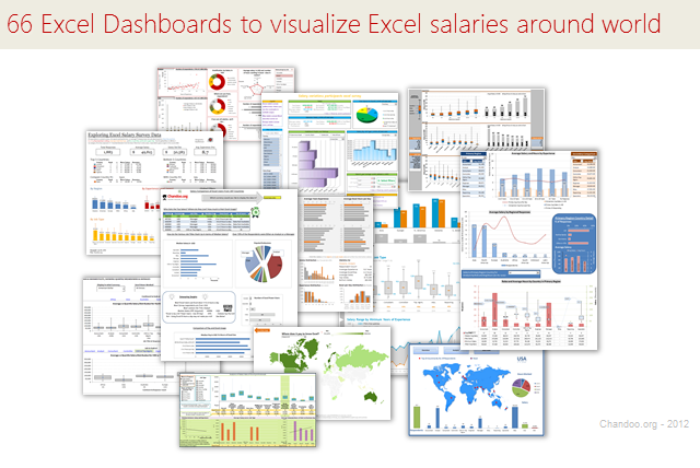
Ladies & gentleman, put on your helmets. This is going to be mind-blowingly awesome. See how many different ways are there to analyze Excel salary data. Look at these 66 fantastic, beautifully crafted dashboards and learn how to one up your dashboard awesomeness quotient. |
Analyzing 20,000 Comments |
|

|
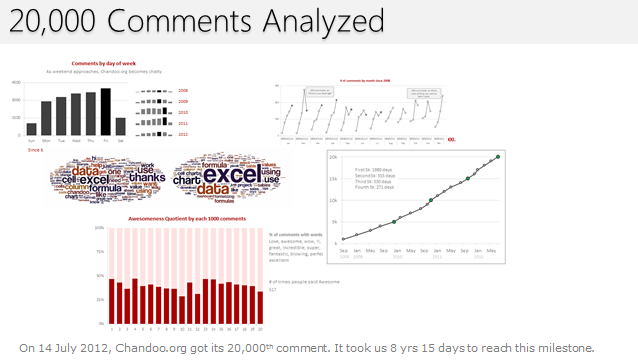
On 14th July, evening 4:51 PM (GMT), Chandoo.org received its 20,000th comment. 20,000! It took us 8 years & 15 days since the very first comment to get here. And it took just 1 year 7 months & 23 days to add the last 10,000 comments (we had our 10,000th comment on 21st November, 2010). Out of curiosity, I wanted to understand more about these 20,000 comments. So I downloaded our comment database, dumped it in Excel and start analyzing. |
Creating a Masterchef Style Clock in Excel [for fun] |
|
![Creating a Masterchef Style Clock in Excel [for fun]](https://img.chandoo.org/c/mc/master-chef-clock-demo.gif)
|
Jo (wife) likes to watch Masterchef Australia, a cooking reality show every night. Even though I do not find contestant’s culinary combats comforting, occasionally I just sit and watch. You see, I like food. The basic premise of the program is who cooks best in given time. To tell people how much time is left, they use a clock that indicates how much time is left (much like a stop clock, with a small twist). One day, while watching such intense battle, my mind went It be cool to make such a clock using hmm… Excel? While I cannot share my snapper (or pretty much any other food item) with you, I can share my Masterchef style Excel clock with you. So behold, |
How to make a Spoke Chart |
|

|
Have you ever wanted to make your own Custom Chart type ? This post will explain how you can make a custom Excel Spoke Chart and introduce you to techniques that can be used to make other custom chart types. |
Thermo-meter chart with Marker for Last Year Value |
|

|
During a recent training program, one of the students asked, Thermo-meter chart is very good to show how actual value compares with target (or budget). But how can we add another point for say Last Year value to the chart with out cluttering it. Something like above. Sounds interesting? Read on |
Interactive Sales Chart using MS Excel [video] |
|
![Interactive Sales Chart using MS Excel [video]](https://img.chandoo.org/vp/interactive-sales-chart-quick-demo.gif)
|
Finally, I got some time to sit down and do what I love most – write a blog post to make you awesome in Excel. After a whirlwind trip to Sydney, I am back in India to spend few days with my kids & wife before rushing to Australia to run 2nd leg of my training programs (in Perth, Melbourne & Brisbane). I did 2 sessions in Sydney – one for KPMG and other for public and both went very well. We got lots of positive feedback and people really loved it. I am saving the details for another post, but today lets talk about Interactive Sales Chart using Excel. Take a look at the Interactive Sales Chart First, take a look at interactive sales chart. Today, you will learn how to build this using Excel. |
Adding Macros & Final Touches to Customer Service Dashboard [Part 4 of 4] |
|
![Adding Macros & Final Touches to Customer Service Dashboard [Part 4 of 4]](https://img.chandoo.org/dashboards/macros-vba-in-customer-service-dashboard.png)
|
Welcome back. In final part of Making a Customer Service Dashboard using Excel let us learn how to add macros & VBA code that makes our dashboard interactive. As you can see, there are 2 important macros in this dashboard. |
Creating Customer Service Dashboard in Excel [Part 3 of 4] |
|
![Creating Customer Service Dashboard in Excel [Part 3 of 4]](https://img.chandoo.org/dashboards/constructing-charts-customer-service-dashboard.png)
|
Welcome back. In third installment of our Customer Service Dashboard series, we will learn how to construct the charts in our dashboard. We will understand the sparklines, traffic lights & dynamic chart setup. To help you learn better, I have recorded a short video too. Go ahead and enjoy. |
Speeding up & Optimizing Excel – Tips for Charting & Formatting [Speedy Spreadsheet Week] |
|
![Speeding up & Optimizing Excel – Tips for Charting & Formatting [Speedy Spreadsheet Week]](https://img.chandoo.org/optimize/speeding-up-optimizing-excel-charts-formatting.png)
|
Is Excel acting slow & taking ages? As part of our Speedy Spreadsheet Week, today lets talk about optimizing & speeding up Excel by formatting & charting better. Use these tips & ideas to super-charge your sluggish workbook. No matter how much data you got, how many formulas you wrote, the end users seldom see them on your workbook. They see the finalized dashboard, they play with the model, they look at the report. And if you make poor choices, your end users will thing your workbook is slow. So let me present you 7 charting & formatting tips to optimize & speed up Excel. Read on…, |
Data and Calculations for our Customer Service Dashboard [Part 2 of 4] |
|
![Data and Calculations for our Customer Service Dashboard [Part 2 of 4]](https://img.chandoo.org/dashboards/variables-in-our-customer-service-dashboard.png)
|
Welcome back. In part 2 of Making a Customer Service Dashboard using Excel let us learn how the data & calculations for the dashboard are setup. Designing Customer Service Dashboard In this installment, we will examine all the variables, named ranges & various formulas that drive our dashboard. Also, you can download the full dashboard workbook and play with it to examine these formulas and learn better. |
Yet Another Sales Funnel Chart in Excel |
|

|
A while ago, our reader Shay emailed me a Sales Funnel chart template.
I took the liberty of making little changes to Shay‘s funnel chart template to make it even better. Here is how the funnel looks like. |
Designing a Customer Service Dashboard in Excel [Part 1 of 4] |
|
![Designing a Customer Service Dashboard in Excel [Part 1 of 4]](https://img.chandoo.org/dashboards/customer-service-dashboard-excel.png)
|
Sawadee Krup folks. Today, we begin a new series on Chandoo.org – Making a Customer Service Dashboard using Excel. This 4 part tutorial teaches you, Designing Customer Service Dashboard Customer service is one area where a lot of data is collected regularly. Understanding all this and making business decisions is quite complex task. This is where dashboards shine. Read on to learn how to design customer service dashboards. |
Learn Any Area of Excel using these 80 Links |
|

|
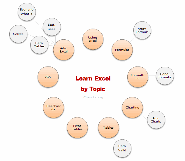
Last week I asked, What is one area of Excel you want to learn more? More than 250 of you responded to this question. Many of you shared your areas of interest thru comments, quite a few of you also emailed me personally. So what next?You told us what you want to learn, the next step is logical. We share some of the best tutorials & examples with you so that you can learn. In this post, we have presented more than 75 links, to help you learn your area of focus. I have divided this in to 16 areas. In each area, we have identified (upto) 5 best links for you to learn more. I have also recommended 1 or 2 training programs that make you awesome in that area. Plus, if we found any excellent external resources, we have highlighted them as well. So go ahead and learn Excel. |
Maintenance Work Complete |
|

|
Maintenance on the 18 month old, Data Tables, Monte-Carlo Simulations and Fractals in Excel – A Comprehensive Guide has been completed. |
Add Data to Charts with Copy Paste [Quick Tip] |
|
![Add Data to Charts with Copy Paste [Quick Tip]](https://img.chandoo.org/q/add-data-to-charts-with-copy-paste.png)
|
So how did your weekend go? I did a bit of gardening, painted our car shed, played badminton (I am learning), attended 60th birthday of a close friend’s dad. Pretty hectic, but fun as usual. To start this week, let me share a simple but fun way to add data to charts. Lets say you have a chart that depicts Annual sales for last few years. And you want to add the data of Profits (or Expenses) to this chart. Here is a dead-simple way to do it.
|
Making Small Multiples in Excel [Charting Technique] |
|
![Making Small Multiples in Excel [Charting Technique]](https://img.chandoo.org/c/final-small-multiples-chart.png)
|
Today, lets learn how to create small-multiples (or panel charts) to visualize trend of 2 product lines over years in various regions. The inspiration for this chart and article came from my friend, Paresh‘s recent article on his blog. See how you can create a combination of area & line chart to create the small-multiple chart and clone it. You can also download the workbook and play with it to understand this technique better. |
Incell Sales Funnel Charts |
|

|
Sales Funnel or Sales Process refers to a systematic approach to selling a product or service. [more on sales process] Whether you run a small business or part of a large corporation, chances are, you heard about Sale Funnel. Understanding & analyzing your sales performance from a Funnel point of view is a great way […] |
Analyzing Performance of Stocks using Excel [Example] |
|
![Analyzing Performance of Stocks using Excel [Example]](https://chandoo.org/wp/wp-content/uploads/2011/09/stock-analysis-in-excel.png)
|
Last week, we learned how to visualize Suicides vs. Murders data using Interactive charts in Excel. William, one of our readers, took this technique and applied it to Stocks. He emailed me because he has some formula issues with the stock data. Once I solved the problem, I asked him, “Can I share this with […] |
Participate in Microsoft BI DataMashUp Contest & You could win $3000 Prize |
|

|
Hello Data Junkies & Chart Lovers, I have a fun announcement for you. If you like to analyze data and present results in charts, then you can win up to $3000 in prizes by participating in Microsoft’s BI DataMashUp Contest. The contest is on from September 8th and runs until 28th. How to Participate in […] |
Suicides & Murders by US States – An Interactive Excel Chart |
|

|
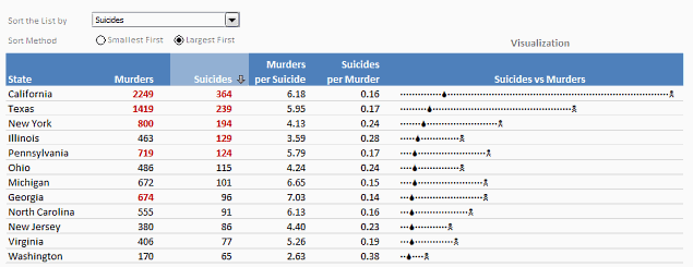
Over at PTS Blog, my dear friend & charting guru, Jon Peltier has an interesting post on using dot plots to visualize Murders & Suicides data by US States. Not that murders & suicides fascinate me, but I wanted to play with this data myself and see how we can visualize it. So I emailed Jon and asked him to share the raw data. Being a lovely chap Jon is, he immediately sent me the data. So here we are, playing with gory data on a Friday. Suicides & Murders by US States – An Interactive Excel Chart You can see a demo of the chart I came up with above. Read on to learn how this chart is constructed. |


