Excel Charts, Graphs and Templates
Tutorials, Examples and explanations on Excel charting. You can learn how to create almost any chart type in this section. Also learn how to create effective charts, make them interactive and add automation thru VBA
50% off on ExcelUser’s Dashaboard Kit [2 days only] |
|
![50% off on ExcelUser’s Dashaboard Kit [2 days only]](https://chandoo.org/wp/wp-content/uploads/2009/12/exceluser-dashboards-th.png)
|
Charley at Excel User is running a sale on the excel dashboard kits. It is too good to be true. You get the plug and play dashboard kits for half the regular price. Go here to avail this offer and read on, if you are not sure what the dashboard kit is. For a long time now, I have been an advocate of Excel User’s dashboards. Charley is a pioneer when it comes to excel based dashboard reporting. He has popularized several techniques like using sumproduct formula, using camera tool etc. I have been such a fan boy of his work that I even interviewed him once on this blog. |
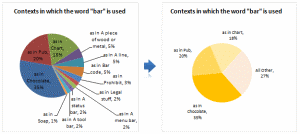
Group Smaller Slices in Pie Charts to Improve Readability |
|
|
Jon Peltier can stand on his roof and shout in to a megaphone “Use Bar Charts, Not Pies”, but the fact remains that most of us use pie charts sometime or other. In fact I will go ahead and say that pie charts are actually the most widely used charts in business contexts. Today I want to teach you a simple pie chart hack that can improve readability of the chart while retaining most of the critical information intact. |
Format Charts Faster in Excel 2007 [quick tips] |
|
![Format Charts Faster in Excel 2007 [quick tips]](https://chandoo.org/img/c/quick-chart-formatting.png)
|
Most of us use chart formatting options to change the way grid-lines, data series, labels, axis, titles, plot areas look. Chart formatting is one of the areas where people spend most time. Today I want to teach you a quick productivity hack to speed up chart formatting. In excel 2007 and above, when you click […] |
What is the most embarrassing charting mistake you made? [weekend poll] |
|
![What is the most embarrassing charting mistake you made? [weekend poll]](https://chandoo.org/wp/wp-content/uploads/2008/10/making-sports-dashboards-in-excel-sml.png)
|
This week’s poll is very simple. What is the the most embarrassing charting mistake your made? For me it has to be that one time when I made a sports dashboard using excel. I have adjusted the axis scale of a bar chart so that my favorite cricket player (Sachin Tendulkar, who else?)’s records are emphasized. In a matter of minutes I have received several comments from all over world pointing out the mistake. Even though, the intention was to highlight the achievements of master blaster, the axis adjustment was obviously a mistake. |
Zoho sponsors our Visualization Challenge #2 |
|
|
|
Aravind (@arvindnatarajan on twitter) who works at Zoho emailed me earlier today and asked if Zoho Reports – Online Reporting and Business Intelligence Service, can sponsor our visualization challenge #2. |
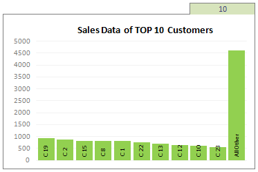
Top X chart – Show Top X values of a chart Interactively |
|
|
Two charting principles we hear all the time are,
Today we will learn a dynamic charting technique that will mix these two ideas in a useful way. I call this a Top X chart. |
Chart this Sales Data and get an iPod Touch [Visualization Challenge #2] |
|
![Chart this Sales Data and get an iPod Touch [Visualization Challenge #2]](https://chandoo.org/img/cb/ipod-touch-8gb.png)
|
Here is a challenge many people face. How to make a chart visualizing sales data with several dimensions like product, brand, region, sales person name, year (or month or quarter) and one or two values like sales, # of units sold, profits, # of new customers. In visualization challenge #2, all you have to do is a make a chart or dashboard to visualize this sales data effectively. |
Lets Pimp a Gauge Chart [Chart Porn Friday] |
|
![Lets Pimp a Gauge Chart [Chart Porn Friday]](https://chandoo.org/wp/wp-content/uploads/2009/11/fancy-excel-gauge-chart-th.png)
|
Egil, one of our alert readers from Norway sent this to me in e-mail, which I swear, I am not making up – A Fancy Gauge Chart. See the e-mail and chart yourself. I’m having a lot of fun with your gauge template 🙂 To make it more industrial-like, I’ve added: 1. Brushed metal background […] |
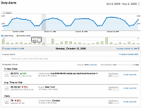
Dashboard Best Practice – Google Analytics Intelligence Report |
|
|
Yesterday while checking my website analytics reports on Google analytics site, I have noticed a new beta feature called “Intelligence”. Out of curiosity I clicked on it. It took me to a an intelligence alert dashboard. Ok, lets just back up for a minute and understand what “intelligence dashboard” is before moving on. In the […] |
Switch Rows and Columns in Charts [Quick Charting Tip] |
|
![Switch Rows and Columns in Charts [Quick Charting Tip]](https://chandoo.org/img/c/switch-rows-columns-in-charts.png)
|
Let us say you have built a nice chart showing your sales and profits for the top 5 products (learn how to highlight top 5 products in a list), with products on X axis. Suddenly your boss wants to switch the rows to columns (or transpose the chart) so that she can see metric level grouping instead of product level grouping. No need to freak out and rush to Espresso machine, You can do it very easily with Excel Charting features. In today’s quick tip you will learn how to swap chart rows and columns in excel. |
Making Interaction Plots using Excel |
|

|
Yesterday I read about interaction plots on junk charts where he points out the merits of an interaction plot. Interaction plots show interaction effects between 2 factors. For eg. you can show how your product sales have changed between year 1 and year 2 using an interaction plot like the one shown aside. |
Project Dashboard + Tweetboard = pure awesomeness!!! |
|
|
Check out an implementation of project dashboard along with tweetboard by our reader Fernando. He says, it “turned out to be a great success”. I am so happy for him. Btw, the post includes a link to download the workbook so that you can see the dashboard and tweetboard in action. |
Making a chart with dynamic range of values |
|

|
We all know that to make a chart we must specify a range of values as input. But what if our range is dynamic and keeps on growing or shrinking. You cant edit the chart input data ranges every time you add a row. Wouldn’t it be cool if the ranges were dynamic and charts get updated automatically when you add (or remove) rows? Well, you can do it very easily using excel formulas and named ranges. It costs just $1 per each change. 😉 Ofcourse not, there are 2 ways to do this. One is to use Excel Tables and another is to use OFFSET formula. |
Baby Feeding Chart using Excel |
|

|
While feeding the babies last night, I had this idea. Why not make an excel sheet where you can keep track of the baby’s feeding and sleeping activities on day to day basis. It would probably help you understand your baby’s needs better and may be give you some insights. |
Visualization Lessons from Eiffel Tower [Chartbusters in Paris] |
|
![Visualization Lessons from Eiffel Tower [Chartbusters in Paris]](https://chandoo.org/img/cb/eiffel-tower-visualization-lessons.png)
|
Ever since I was a child, I was fascinated by Paris (and Eiffel Tower). Recently, I had opportunity to visit Paris, albeit for just a few hours (I had a 12 hour lay-over in Paris between flights). I went to see the Eiffel Tower and it looked just as beautiful and majestic as it did in my imaginations. During my visit to Eiffel tower, I took the stairs to 2nd floor and along the way they have a handful of visualizations explaining the tower. I found them quite interesting and well made. Here, I have listed down 4 simple, yet very effective visualization lessons for all of us. |
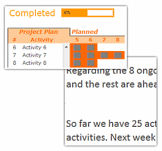
Project Management Dashboard / Project Status Report using Excel [Part 6 of 6] |
|
![Project Management Dashboard / Project Status Report using Excel [Part 6 of 6]](https://chandoo.org/img/pm/project-status-dashboard-th.png)
|
Project management dashboards, project status reports help stakeholders, project sponsors and team-members can understand project status very quickly. In the last installment of project management using excel, learn how to make project management dashboard using excel in this tutorial. Also download the excel project status dashboard template. |
Make a Bubble Chart in Excel [15 second tutorial] |
|
![Make a Bubble Chart in Excel [15 second tutorial]](https://chandoo.org/img/l/bubble-chart-excel-tutorial.png)
|
A Bubble chart displays circles (or bubbles) at given X and Y co-ordinates. Bubble chart is a very good way to show 3 dimensional data (for eg. Region-wise product sales) without confusing users. In this tutorial, we will learn how to create a bubble chart using excel. |
Recipe for a Donut Bar Chart |
|
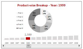
|
We all know that bar charts can be used to display values spread across various categories or times and pie charts / donut charts can be used to display percentage breakup of various quantities in a sum total. How about mashing up both to create a Donut Bar chart? In this tutorial, you can learn how to make a donut bar chart and linking it to a form control to display Product-wise sales breakups spread across several years. |
Twins, Clones and Duplicates – 6 Excel Shortcuts from an Excited Dad |
|

|
I could barely sleep last night. Even though I came home, my heart was in that hospital room only. I got up at 5:30, and came to see my wife and kids by 7:30. Now that they all are sleeping, I can quickly whip an excel post, to help you make twins, clones and duplicates. |
7 ideas Excel can pick-up from iWork Numbers |
|

|
We have a macbook at home. Like all latest macbooks, this one too came with a trail version of iWork. Even though I have used iWork before, this time I wanted to compare iWork numbers with Excel. In this post, I want to highlight 7 really cool features for iWork and how Microsoft excel can benefit from implementing the same. |

