This post is part of our chartbusters series.
Ever since I was a child, I was fascinated by Paris (and Eiffel Tower). So much so that I even took french lessons during my post graduation in the hopes of one day traveling to the romantic land.
Recently, I had opportunity to visit Paris, albeit for just a few hours (I had a 12 hour lay-over in Paris between flights). I went to see the Eiffel Tower and it looked just as beautiful and majestic as it did in my imaginations.
But this is not a travel blog, it is a charting and excel community. So I have something for you as well.
During my visit to Eiffel tower, I took the stairs to 2nd floor and along the way they have a handful of visualizations explaining the tower. I found them quite interesting and well made. Here, I have listed down 4 simple, yet very effective visualization lessons for all of us.
Lesson 1: Compare with known things in your charts
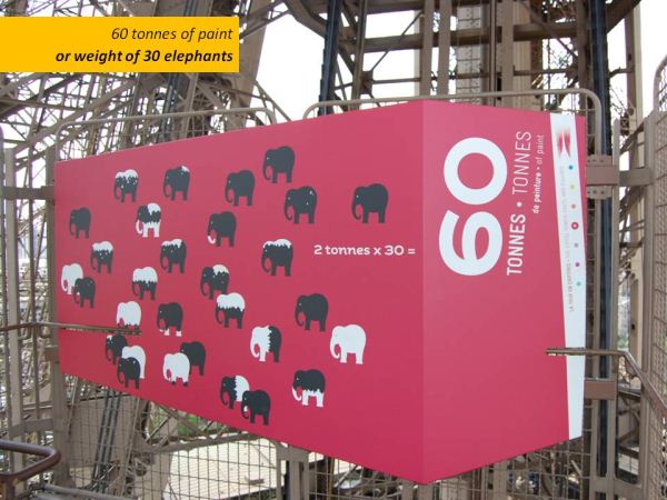
Eiffel tower is a huge tourist attraction with distinguished history. But you have to tell about it to scores of visitors everyday in easy to understand manner. Comparison is a very effective technique. It raises the curiosity and connects well with audience.
For eg. see how they have explained the fact that “Eiffel tower used 60 tonnes of paint”.

Lesson 2: Get creative, don’t always fallback on bar / pie charts
We all know that bar charts are very effective. But too many bars would make the charts look bland. Experimentation could lead to some creative solutions to bar (or pie) fatigue. [Related: 5 ways to dress up your charts]
For eg. see how they have compared the height of Eiffel tower with other familiar landmarks (it is still a bar chart, but creatively implemented)

Lesson 3: Sometimes just numbers will do
While charts add a lot of value (and provide insight), sometimes you want to limit yourself to just numbers.
For eg. they have shown the number 336 in large font along with an illustration of flood-lights to tell us that 336 floodlights light up the tower in the night.

Lesson 4: Focus on the the tower, not on charts
This, probably is the most important lesson of all. We are all here to build our own Eiffel tower and show it off to others. So it is important to focus on the tower, the charts are secondary.

I have made a small presentation with various visualizations showcased on the Eiffel Tower, each one teaches a valuable lesson on charting and story-telling. Take a look at it below:
if you are not able to view it in feed reader / e-mail, click here
Other charting lessons:


66 Responses to “Budget vs. Actual Charts – 14 Charting Ideas You can Use”
[...] Update: Check out the results at Budget vs. Actual Charts [...]
Hi there:
I'm interested in understanding exactly how contestants #'s 1, 8 got their surplus or shortfall to show up at the top of the bar (is this overlapped or stacked somehow) and change colour? I hope this makes sense. I've tried to find samples and I can see contestant 8 (cuboo) may have used something called graphomate but I can't use this.
I need to create a bar chart that shows budget, and actual variance whether it be a surplus or a shortfall and I would like make it look like option 1 or 8 above but haven't a clear idea how to do it...any help would be greatly appreciated!
Regards..Linwe
[...] heute können alle Beiträge auf “Pointy Haired Dilbert” gesichtet und bis zum 12.04. bewertet werden. Falls mein Vorschlag - Nr. 8 - gefällt, freue ich [...]
Danken Sie Excel friend!
#6 is the best here. Simple, no extraneous visual effects.
I was all set to vote for #9...until I noticed its lack of y-axis labels. So I have to go with #6 also.
I think #6,#9 is enough .
#9 is my favorite
Nice data/ink ratio 😉
I agree with Jon - #6 for me.
8 & 14
I go for # 9 (simple) and #14 (complete)
I go for cuboo #8
cheers
#6 for overview at a glance / top management
#8 for deeper analysis / those who need more detailed information
#14 although I think you only need the bottom panel and I then would stack the Center charts vertically to make Center comparisons easier.
#10 gets my vote.
If there is a second place, then #14
denise
Hi, if I was not wrong, Samples 3,4 and 5 were created using Tableau software and not Excel. For more information on Tableau you might want to visit http://www.tableausoftware.com/. It was initially designed by Prof. Pat Hanrahan and his PhD students. I am not their salesperson but I thought someone might want to know more about this particular technology.
Hi Tin Seong Kam:
Thanks - I have looked at Tableau before. I have also found the means to reproduce something similar to chart 8 without using graphomate, and also chart 7. I proposed chart 9 as well but the overlap is confusing to some.
I am really not too concerned about showing actual budget figures but the variance in $ and % is important for my particular use. That is why I gravitate to the charts that seem to easily tell us that we have a surplus or a shortfall.
Thanks!
Linwe
11, 6, 9 (presque pareil)
7 pour la clarté
cuboo #8 ist my favorite
best regards...
8
8 is fantastic
I prefer N#8 - N# 1,7 & 8 use the settings of Rolf Hichert...
6 : The GURU (read "Jon Peltier ") has spoken,
SOO easy on eyes!
Hi Chandoo,
I liked Cuboo's submission. So #8 gets my vote.
Regards,
Sumit
Number 8 by far. Even though it's not part of the data display, the comments feature sells me. Variance explanations are as important as the actual variances.
I visually prefer #8, but #3 is really easier to understand, even if it lacks a lot of information (inverting budget/actual), legend, etc...
[...] All in all there are several great entries suggesting a good variety to present budget vs. actual performance. Go check them out. [...]
[...] reshape, zoo by learnr A reader of a Pointy Haired Dilbert blog enquired about best ways to visualise budget vs. actual performance. In response PHD challenged his blog readers to contribute their visualisations made using Excel or [...]
anyone willing to post their xls for these? Some really excellent exmaples.
To avoid the summary execution of the person presenting these to an executive team these charts must handle overspending as well as underspending, be comprehensible in 5 seconds and show the key fact clearly. The key fact isn't budget or actual - it's the magnitude of the gap!
Therefore:
#14 for nailing the key fact and being able to handle overspending. The winner therefore.
#6 for nailing speed-reading and being able to handle overspending, but somewhat obscuring the key fact. Second place.
#8 for nailing information depth and aesthetics. Third place.
I really wanted #8 to win, but that's the technician's view not the end-user's.
[...] Todas as contribuições podem ser vistas no seguinte endereço: Budget vs. Actual Charts – 14 Options You can Use Posted on April 5th, 2009 http://chandoo.org/wp/2009/04/05/budget-vs-actual-charts/ [...]
Social comments and analytics for this post...
This post was mentioned on Twitter by NancyJHess: I like to explore fav tweets of those I follow. Here is one from DutchDriver http://twurl.nl/17eiap Creative visual charts: Budget vs Actual...
number 8
clean, full of info, qualitative as well as quantitative
Hi,
I Like 4 chart in above as per the following ratings:-
no 1# -> 14***
no 2# -> 7***
no 3 # -> 8**
no 4# -> 1.3**
I will be greateful if someone can send me the process of making all above 4 charts.
Virender
[...] Budget vs. Actual Values in Charts – 14 more options [...]
[...] Budget vs. Actual – 14 charting options [...]
Does anyone know what type of chart #6 is (chart name?)? Also, how do I create this is Excel 2007?
@Shazbot
I'd call it a Column and Bar chart, but don't get hungup on names
To make it try this:
Setup the chart as a Clustered Column Chart
Change the Series so there is 100% overlap, ie: One column is in front of the other
Change the Budget series to a line chart
Set the line color to none
Set the marker style to a Flat Line
Change the marker width to make it the same width as the bar
Change colors and other chart properties to suit
Does anyone have an idea on how to create chart #1?
Thanks
Caroline, please see the german page: http://www.hichert.com/de/software/exceldiagramme/55
there you can find the original example for nr1.
best regards,
stefan
Caroline
This is a Clustered Stacked Column Chart
Which has the column under the Shortfall/Excess colored the same as the Budget
Have a look here
http://chandoo.org/forums/topic/question-about-budget-v-actual
&
http://peltiertech.com/WordPress/clustered-stacked-column-charts/
Hi,
Is it possible to get the source files like the other visualisation challenge (on sales).
Thanks,
Vijay
Dear Chandoo,
I discovered your site by pure chance and I am really thrilled about it and I am learning a lot.
Is it possible to post the source file for this visualisation challenge?
Thanks,
Vijay
[...] Budget vs. Actual Charts in Excel [...]
Dear Chandoo,
How do I create Chart #10 (comparing Budget vs Actual Performaces) by cost center by quarter without the cumulative performance. Do you have an actual example that I could use?
Thanks,
Greg
HI
Does anyone can help me to a to create chart #7? I'm beginer in excel , I started to work two weeks ago and my boss ask me to follow the budget/actual until the end of the year.
SO I really need your help.
Thanks in advance
p.s Sorry for my english ( i'm french)
@OKI, Greg
I have made a mockup of #7 and #10
It is available at:
http://chandoo.org/wp/wp-content/uploads/2009/04/Bud-Act-visualizaion-challenge-7+10..xlsx
#10 is a straight, Pivot Chart/Table but the data has been rearranged to get it into the pivot table
#7 is 2 charts, being a simple Bar Chart and a Scatter Chart with 100% Error Bars
I have used Named Formulas for the two charts.
HELLO Hui
Thanks you very much for your hepl , i really appreciate
Have I nice week
Hi,
I was wondering how can you replicated chart 1.3? The bars looked like there overlapped on two different axis?
Tony
I think 1 & 3 are good.
Hi Chandoo,
Please can you provide a link of the excel sheet for 1. Chart "3 colors and everything is clear"
I would like to drill into the spreadsheet and learn the secrets as how the chart was made.
Many thanks,
Sawan
@Sawan
It is probably 12 seperate charts, I will assume snapped to the underlying cells to ensure they are the same size
The left 3 Charts have a vertical Axis
The bottom 4 Charts have a horizontal Axis
The remainder have no axis
The remaining text maynot be part of the charts but is probably cell content
Saludos,
Como puedo descargar estos maravillosos ejemplos para estudiarlos y analizarlos deseo aprender a realizar este tipo de graficas en Excel.
Gracias,
Dear Chandoo and Hui,
Please would you help me (step by step if possible) to create Chart #8?
Many thanks in advance!
Dear Chandoo,
I think chart #8 is really great. Would really appreciate if you can show basic step to create it.
Thanks 🙂
Hi all,
Is there any step by step tutorial to recreate the the chart #1 please?
Would really appreciate if someone could show me how it done.
Regards
Sawan
Can someone tell me how do you create chart number 2? Thanks!
Am I the only one that can not display any of the images? Would love to take a look at these. This is the ONLY page on the whole website I have had this issue with. 🙁
Dear All,
how can i create chart # 7? is there any link where i can subscribe to your website by paying a certain amount. i want to learn some good excel techniques.
please let me know.
Cant see the images 🙁
Where can I find the link to download some of the above charts?? these are extremely usefull chart and would like to utilize the same.
Waiting for the reply.
Thanks..
I am interested for # 1,6,7,8,9,10,11 its very exciting for me .
Hi,
Just wanted to check, is there any possibility that pivot table or drop down work in power point?
Regards
Satyapal
@Satyapal... you can only use static images or slide animations in Power Point. Not features like pivot tables or drop downs. However, you can embed the entire workbook (or sheet) in a presentation. When clicked this will just open Excel so your users can play with the data.
Is there any instalment kind of facility available for joining the online course of Rs.12000/-.
Regards
Ramesh N
Hi,
I badly want to replicate #10. Can someone help me.. I've checked google to help but I can't figure out how to add the total 🙁
Regards,
Tim