Excel Charts, Graphs and Templates
Tutorials, Examples and explanations on Excel charting. You can learn how to create almost any chart type in this section. Also learn how to create effective charts, make them interactive and add automation thru VBA
Introducing Flag Project – A fun way to Learn Excel Charting |
|

|
I have a new community project for all the members of PHD. It is a simple yet intuitive challenge. Make your own country’s flag using Excel Charts. To start the project, I have made the Indian flag using a bar and pie chart. Go ahead and see the rest of this post to findout how this chart is made and then participate in the “flag project” by making your own country’s flag. All the best. |
Annual Goals Tracker Sheet [awesome ways to use excel] |
|
|
|
Marko, who is a long time PHD reader and an excel ninja sent this via email, I work at an insurance company in Slovenia. At the beginning of each year we have a conversation with our superiors to review our work in the past year and to set new goals (main activities) that we’re gonna […] |
Sachin Tendulkar ODI Stats – an Excel Info-graphic Poster |
|

|
Sachin Tendulkar is undoubtedly the best cricketers to play One Day International Cricket. He is a source of inspiration and joy for me and many others. So, naturally I was jumping with joy when I heard that he scored the highest ever runs in a single match on 24th of Feb. He scored 200 runs […] |
Use Paste Special to Speed up Chart Formatting [Quick Tip] |
|
![Use Paste Special to Speed up Chart Formatting [Quick Tip]](https://chandoo.org/img/q/use-paste-special-in-charts.png)
|
Excel Paste Special is one of my favorite features. So I was naturally thrilled when I discovered that you can use paste special to paste formatting from one chart to another. When we have multiple charts, ensuring consistent color schemes, fonts etc. is very important. Often we individually format the charts because they have different […] |
What is the most useless feature in Excel? [poll] |
|
![What is the most useless feature in Excel? [poll]](https://chandoo.org/img/l/surface-charts-excel-whats-the-point.png)
|
What do you think is the most useless feature in MS Excel? I know there are a ton of cool, extremely useful features in excel. But it also comes with a few really un-necessary features. For me, the most useless feature seems to be a 3D surface chart. I have tried to figure why this […] |
Group Project Activities to Make Readable Gantt Charts |
|
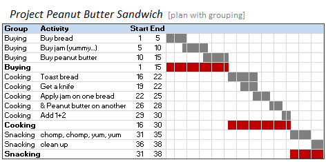
|
In Excel Gantt Charts part of our project management series, we have discussed about how using Conditional Formatting and Formulas we can make a gantt chart like this: But when you have large project plans, gantt charts like above can get pretty intense and hard to read. So a better approach is to group various […] |
Best Month Ever (and a charting tip inside) |
|
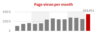
|
Let us take a minute and bask in some glory, for, our little community at PHD had the most fantastic month ever. That is right, January 2010 is so far the best month since I started blogging. We have broken all sorts of previous records on content, conversations, connections, traffic and revenue. In January, we […] |
Flu Trends Chart in Excel [Yes, we can edition] |
|
![Flu Trends Chart in Excel [Yes, we can edition]](https://chandoo.org/img/p/flu-trends-chart-final-th.png)
|
Last week I have reviewed Google’s flu trends chart and told you that is it is very well made. Out of curiosity I made a similar chart in Excel. In this post, I am going to share the experience and results with you. Interested? Read on… |
Use “Playbill” font to make your incell charts realistic [quick-tips] |
|
![Use “Playbill” font to make your incell charts realistic [quick-tips]](https://img.chandoo.org/c/use-playbill-font-incell-charts.png)
|
Most of you already know that using the REPT formula along with pipe (“|”) symbol, we can make simple in-cell charts in excel. For eg. =REPT(“|”,10) looks like a bar chart of width 10. Despite the simplicity, most people don’t use in-cell charts because these charts don’t look anything like their counterparts. But you can […] |
Best Sales Dashboards, as Voted by You [Visualization Challenge #2 – Winners] |
|
![Best Sales Dashboards, as Voted by You [Visualization Challenge #2 – Winners]](https://img.chandoo.org/v/s/sales-data-dashboard-alex-kerin-1-excel.png)
|
Finally, our second visualization challenge comes to an end. We got a winner. Background about Zoho Reports Visualization Challenge: (skip this section if you know what I am going to say) Back in November, 2009, I have asked the readers to come up with best possible ways to visualize a set of fictitious sales data. […] |
Product Recommendation – Excel Dashboard Training Kit |
|

|
If you want to make better charts and create lasting impressions, chances are you have heard about Jorge Camoes. He writes at excelcharts.com (previously charts.jorgecamoes.com). I have been reading Jorge’s blog for over 2 years now and have linked to his excellent articles on PHD several times. Jorge also has an Excel Dashboard Training Kit, which teaches us how to make a dynamic and comprehensive excel dashboard. The dashboard training kit is a culmination most of his lessons implemented in a practical way using Excel. In this article, I review the product and tell you why you should get a copy of it. |
A Brief History of Microsoft Excel – Timeline Visualization |
|
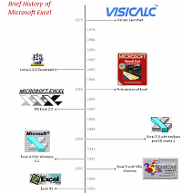
|
Timeline charts are great for providing quick snapshots of historical events. And hardly a day goes by without some one making a cool visualization of a time line of this or that. Time lines are easy to read, present information in a logical manner and mostly fun. So yesterday, I set out to mimic the iconic gadgets of all time in excel, just for fun. Then it strike me, why not make a visual time line of Microsoft Excel ? So I did that instead. |
Collapse, Expand Excel Charts using this hidden trick |
|
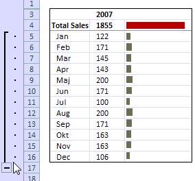
|
Do you know that you collapse or expand excel charts? Don’t believe me? Me neither. When I first realized that we can collapse / expand charts without writing any macros or lengthy formulas, I couldn’t wait to share it with all of you. This is such a simple yet powerful trick. See it for yourself. The trick lies in using group / un-group data feature and carefully aligning charts with the cell grid. The whole process takes just about 2 minutes and produces wow factor worth a week. Go check it, now. Also, a downloadable template is included in the post. |
What is PowerPivot? (and does it really wear underwear on top of pants !?!) |
|

|
Along with Excel 2010, Microsoft released a free add-in called PowerPivot. According to MS, PowerPivot gives users the power to create compelling self-service BI solutions, facilitates sharing and collaboration on user-generated BI solutions in a Microsoft SharePoint Server 2010 environment, and enables IT organizations to increase operational efficiencies through Microsoft SQL Server 2008 R2-based management […] |
A New Year Resolutions Template that Kicks Ass |
|
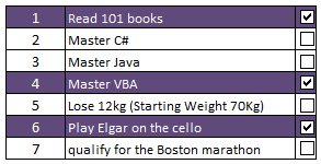
|
Jennie, a sweet and ambitious lady set out to do 101 things in the next 1001 days. She took the inspiration from Day Zero Project. Not stopping there, she prepared a cute little excel sheet to keep track of all these new year resolutions and sent it to me. I think this is a swell excel template if you want to keep track of your goals or new year resolutions or just manage a list. |
Sales Dashboards – Visualizing Sales Data – 32 Dashboard Examples & Implementations |
|

|
Sales reports and dashboards are very common in any company. There are several ways in which you can visualize sales data to understand the trends and sales performance. So in November, I have asked you to visualize sales data using sample data. The visualization challenge #2, sponsored by Zoho Reports generated a huge buzz around the community and fetched 32 incredible entries. The response was so overwhelming that it took me almost 24 hours to write this post. Thanks everyone for participating and making this a huge learning experience for everyone. Personally I have learned several useful dashboard and charting tricks. I will be sharing some of these lessons with all of you in the coming weeks. |
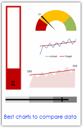
Best Charts to Compare Actual Values with Targets – What is your take? |
|
|
Comparing values is one of the main reasons we make charts. Yesterday we have a post on using thermometer charts to quickly compare actual values with targets. Today we follow up the post with 10 charting ideas you can use to compare actual values with targets. Check out how bullet charts, thermometer charts, traffic lights, gauges, column charts, area charts can help you compare targets with actual performances. A review of best charting options when you need to compare. Read the rest of the post to see the options and participate in poll. |
Make a Quick Thermometer Chart to Compare Targets and Actuals |
|

|
Comparing values is one of the reasons why we make charts. So today I am going to teach you a handy little trick to make a thermometer like chart to compare targets with actuals. This type of chart is very useful when you have a bunch of sales targets and you want to measure how the performance has been. |
How to hide “0” in chart axis [quick tip] |
|
![How to hide “0” in chart axis [quick tip]](https://chandoo.org/wp/wp-content/uploads/2009/12/hide-zero-chart-axis.png)
|
Have you ever wondered how you can hide that 0 (zero) at axis bottom? Like shown beside. You can use custom cell formatting codes (or custom number formatting codes) to do just that. Just go to axis formatting and from the number tab set the axis number format to something like |
Use Shapes and Images to make Prettier Charts [Dashboard Tricks] |
|
![Use Shapes and Images to make Prettier Charts [Dashboard Tricks]](https://chandoo.org/img/c/use-shapes-to-make-better-dashboard-charts.png)
|
One of the annoyances of charts is that they all look like boxes (except for pie charts, they just look wrong). Boxes might be ok when you are making 1 or 2 charts. But a whole dashboard of boxes can look little rigid. So how can we make the charts peppy without loosing any effect? Like these charts below: Very simple, we use drawing shapes in MS Excel to draw whatever we want and overlay the chart on top. |

