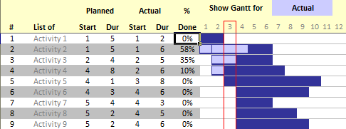
In Excel Gantt Charts part of our project management series, we have discussed about how using Conditional Formatting and Formulas we can make a gantt chart like this:

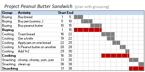
But when you have large project plans, gantt charts like above can get pretty intense and hard to read. So a better approach is to group various tasks in project plan – like this:

In this article, we will learn how you can make such a grouping in a regular gantt chart.
For this tutorial, we will choose a familiar project – Project Peanut Butter Jelly Sandwich. (If you dont know what a PBJ is, you should find-out, prepare and eat one before reading any further. I am serious…)
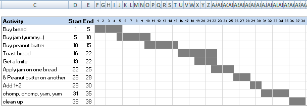
Step 1: Make the regular project plan gantt chart in the following format
We will not talk about making a regular gantt chart. Here is an excellent tutorial on making excel gantt charts (and one more).
Once you are done, the chart should look like this:

Step 2: Add a new column and define groups of activities
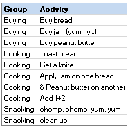
This is very simple. Just add a new column (preferably to the left of activities) and define groups of project activities there. Like this,

Step 3: Select the entire gantt chart and add “subtotals”
To do this, just go to Data Ribbon (or menu) and select “Subtotals”.

Once you are inside the subtotals dialog, select “Start” and “End” columns to add subtotals.
In order to get the correct grouping in the gantt chart, we need minimum of start and maximum of end in each group. But this is not possible with subtotals dialog. So we just select “minimum” as the subtotal type.

Once you press OK, Excel will insert new rows and add SUBTOTAL formulas automatically.
Step 4: Change the SUBTOTAL formulas
Since both Start and End subtotals are pointing to minimum, we need to change the formulas for End so that they show Maximum. Just do that by editing the subtotal formulas manually and changing total type to “4” (MAX) for column End.
While we are at it, you can also change the labels from “Min of <group>” to “<group>”.
Step 5: Modify the conditional formatting so that groups are shown in a different color
In the conditional formatting add another condition (like when activity is blank) so that we can show those rows in a different color. [here are some tutorials on conditional formatting]
Now our Project Plan for Peanut butter sandwich is ready with groups.

Download the Gantt chart template with grouped activities
Download a copy of this example – Excel 2007 | Excel 2003 [mirror]
Get a copy of my project management template set – It has 7 gantt chart templates and 17 other project management templates.
Do you group tasks in your project plans ?
Grouping activities can be very useful to monitor project progress. In large projects usually there will be hundreds of activities. It can be a nightmare to know which ones are delayed, which ones need attention. By grouping you can present overall picture while allowing drill-down to items that need attention.
Do you group tasks in your plans? What is your experience like?
More resources on Project Management using Excel:
I suggest reading my 7 part series on project management using excel. Starting with Excel Gantt Charts to Project Dashboards.
Also, read the excel conditional formatting tips article and primer on excel subtotal formula.


14 Responses to “Group Project Activities to Make Readable Gantt Charts”
Great Post Chandoo,
going a little further, over the years working with Excel, I've realised the importance of adding an extra column sometimes, such as this, and also when making remarks by using colors, both for the font and/or the cell.
In the past, the only way you can group by color is coding them in VBA, so most of the times it was more useful to simply add an extra column with a comment, or a flag to group by, and then do the grouping/sorting, whatever you need. As you have shown, this case is a great example of the added value of the added column.
Regards,
Martin.
Excellent article, Chandoo 🙂
I always use extra columns and rows left and above of my content cells (5 to 10 top and left usually) in the development phase. My idea is that I always can reduce or delete them later on, but they come in very handy when you want add some information or kinds of guides. In general I enter ongoing numbers in columns and using them with the OFFSET-function.
By the way, I didn't know that your image from the Gannt-Chart post of June 16th, 2009 is featured in Wikipedia. I found an article on Henry Gannt in the Wikipedia (http://en.wikipedia.org/wiki/Henry_Gantt) and especially the part on his proposals on how to do the daily work was very interesting for me (very structured approach, which comes close to our daily use of spreadsheets but in the time before 1920!)
Hi,
Very new to the advanced charting features you guys are all working with, but I hope this isn't a completely basic question.
I was modifying the "Gannt chart template 1 advanced 1" (from your fantastic Project Mgt Pack) to include the groupings using subtotals per the post above (regrettably doing this at work on old excel version though). I've been able to include the subtotals and groupings etc but it has thrown out the graphic that represents the percentage done. Where this used to line up with the relevant rows, it now appears the row height of each graphic has increased thus throwing out the row alignments to a greater and greater extent as I go down the page. They are out by about a row by the time I get from row 6 to row 14.
I don't yet fully understand the drivers behind this graph so it there's a post that I should read, feel free to gently point me in that direction.
@Martin - very good points
@Phil... yes, I have added the image to gantt charts article on wiki. When I read it, I felt may be we can enhance it a bit, so I made my image public domain and uploaded and linked to it there.
@Duncan - Welcome and thanks for getting a copy of the templates 🙂
Coming to your question, the template (#1) needs some extra work if you want to add more than 40 rows. Since when you grouped items, new rows will be inserted, we need to change the % complete chart (it is actually a bar chart carefully placed and aligned along with the gantt). You can change the input data source to add these extra rows (right click on chart, go to source data).
I will be adding few more gantt templates to the pack during march (they will include a grouping template and some other ideas). You will get a free upgrade then. In the mean time you can use the chart source data adjustment.
Hi ! this is a brilliant site and the timing of finding this is great. Now, I've purchased the excell pm pack yesterday and I absolutely love the tools - especially the project plan with the dashboard.
Only disapointment, the gantt charts did not come with the grouping feature. I'll try to adjust the one I'm using with the tutorial provided to the site; hopefully it wont throw off every dashboard display 🙂
great job and I'm looking forward to learning through this site - I never realized how much I underused excel.
thanks again, this is brilliant info ... everyone you look !!
@Diane... Thanks for getting a copy of the tools and telling me how you feel about them... 🙂
I have already scheduled groupable gantts in the next release of PM Templates. And everyone who bought the templates since invention of slice bread is going to get a free upgrade (why? because that is how awesome PHD is... )
when is the next PM template release scheduled for ?
curious ... 🙂
Since I run a small shop and most importantly 2 needy kids and a wife, I would not like to commit on release dates. It puts un-necessary pressure. I will let you know once a handful of templates are ready...
Excellent PM template pack. Highly recommended. I would second, or third, the request for grouping within gantt charts. Adding this bit of functionality would provide an outsized return for all of us adoring users... Many thanks for considering.
Like so many, I also bought the fantastic PM Pack late last year but without the grouping template .. in fact, my interest is to apply "phasing" to my plan and your idea of "grouping" would perfectly complement that. I am not sure if you had released it or was it me who did not receive the update ? ...
I am using the Dashboard for the first time. I notice the Gnatt chart does not have dates just days for duration of an activity, can this be changed?
Also can the gantt chart be used for very large projects. I have a project that will last a t minimum 3 yrs! Can this accomodate a large project. I seemed to have difficulty adding rows.
Hi,
great site - love all the info and tools you're providing us. It is great that somebody really puts effort in creating visually pleasing excels - so basically there's no need to use powerpoint anymore as everything can be done in Excel 😉
One question though - I'm replicating your guide on gantt grouping, but in my case the activities don't happen all at once. Let's say I have a scheduled reporting deadline every three months: for this I create four different rows so that all deadlines are shown. However these can't be grouped your way as in between the three months no real activity is happening.
Is it possible to combine the info in these four rows to one row (that would include four cells that are conditionally formatted)?
Actually figured it out by myself. For those interested I used the formula:
=AND($C9="";W9>=1) , where C9 is the first activity (not group name, just individual activity), W9 is the first week's and activity's first slot (so it's not the column week name as in your case, it's the cell in the "calendar's" top left corner). This formula applies to the whole "calendar" (i.e. the area that should be conditionally formatted).
Hopefully somebody understood my description 🙂
[…] Activates to make Readable Gantt Charts. [Online] United Kingdom: Chandoo. Available from: http://chandoo.org/wp/2010/02/11/group-project-activities-in-gantt-charts/ [Date Accessed: […]