All articles with 'screencasts' Tag
Group Project Activities to Make Readable Gantt Charts

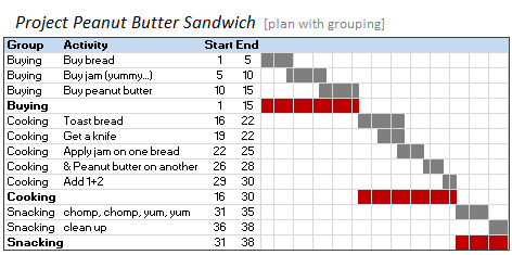
In Excel Gantt Charts part of our project management series, we have discussed about how using Conditional Formatting and Formulas we can make a gantt chart like this: But when you have large project plans, gantt charts like above can get pretty intense and hard to read. So a better approach is to group various […]
Continue »Preparing Profit / Loss Pivot Reports [Part 2 of 6]
![Preparing Profit / Loss Pivot Reports [Part 2 of 6]](https://chandoo.org/img/ea/profit-loss-reports-2.png)
This is part 2 of 6 on Profit & Loss Reporting using Excel, written by Yogesh Data sheet structure for Preparing P&L using Pivot Tables Preparing Pivot Table P&L using Data sheet Adding Calculated Fields to Pivot Table P&L Exploring Pivot Table P&L Reports Quarterly and Half yearly Profit Loss Reports in Excel Budget V/s […]
Continue »What is Excel SUBTOTAL formula and 5 reasons why you should use it

Today we will learn Excel SUBTOTAL formula and 5 beautiful reasons why you should give it a try.
SUBTOTAL formula is used to find out subtotal of a given range of cells. You give SUBTOTAL two things – (1) a range of data (2) type of subtotal. In return, SUBTOTAL will give you the subtotal for that data. Unlike SUM, AVERAGE, COUNT etc. which do one thing and only one thing, SUBTOTAL is versatile. You can use it to sum up, average, count a bunch of cells.
Continue »Pivot Table Tricks to Make You a Star

We, data junkies, love pivot tables. We think pivot tables are solution for everything (except for may be global warming and that broken espresso machine down stairs).
Today, we are going to learn 5 awesome pivot table tricks that will make you a star.
Continue »Flu Trends Chart in Excel [Yes, we can edition]
![Flu Trends Chart in Excel [Yes, we can edition]](https://chandoo.org/img/p/flu-trends-chart-final-th.png)
Last week I have reviewed Google’s flu trends chart and told you that is it is very well made. Out of curiosity I made a similar chart in Excel. In this post, I am going to share the experience and results with you. Interested? Read on…
Continue »
Today we will build a mortgage payment calculator (and amortization schedule) using excel. But we will not build a boring excel sheet, we will build a mortgage calculator that is easy to play with.
A mortgage payment is a monthly installment that you pay towards a loan. Any mortgage loan will typically have, (1) loan amount, (2) duration of the loan in years, (3) interest rate per year
Given these 3 parameters, we can easily determine the monthly installment amount (this will be the same amount for all months during loan tenure)
We are going to use Excel’s form controls (more on this below) to build a mortgage payment calculator like this.
Continue »Extract usernames from E-mail IDs [using LEFT and FIND formulas in Excel]
![Extract usernames from E-mail IDs [using LEFT and FIND formulas in Excel]](https://chandoo.org/img/f/username-from-email-id-excel-formula.png)
Today we will learn to use Excel’s LEFT and FIND formulas. But what fun it is to learn a new formula on a Tuesday? So, we will actually learn to use these formulas to solve the problem: “extract the username from an email ID” How is an email ID structured? Any email ID contains 2 […]
Continue »Collapse, Expand Excel Charts using this hidden trick

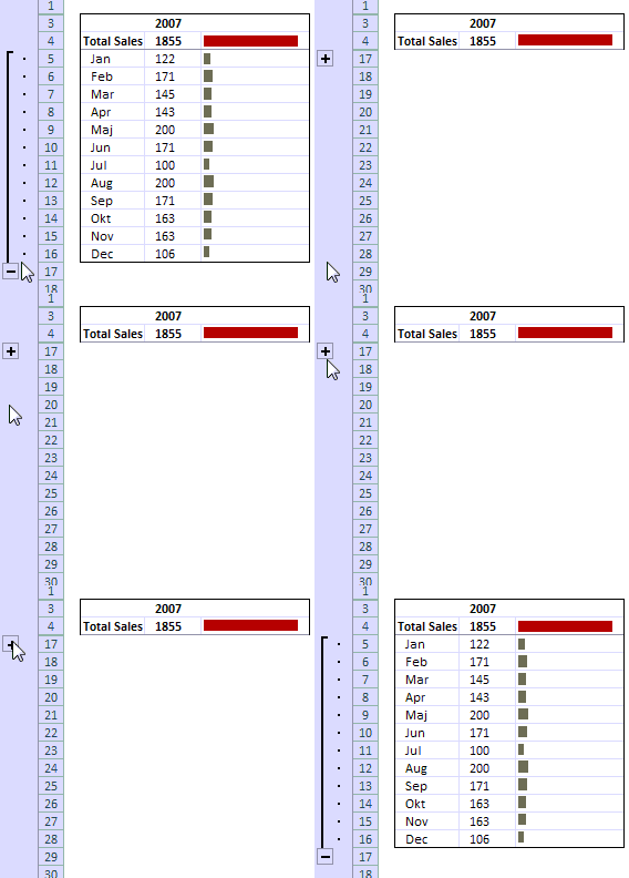
Do you know that you collapse or expand excel charts? Don’t believe me? Me neither. When I first realized that we can collapse / expand charts without writing any macros or lengthy formulas, I couldn’t wait to share it with all of you. This is such a simple yet powerful trick. See it for yourself.
The trick lies in using group / un-group data feature and carefully aligning charts with the cell grid. The whole process takes just about 2 minutes and produces wow factor worth a week. Go check it, now. Also, a downloadable template is included in the post.
Continue »A New Year Resolutions Template that Kicks Ass

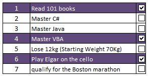
Jennie, a sweet and ambitious lady set out to do 101 things in the next 1001 days. She took the inspiration from Day Zero Project. Not stopping there, she prepared a cute little excel sheet to keep track of all these new year resolutions and sent it to me.
I think this is a swell excel template if you want to keep track of your goals or new year resolutions or just manage a list.
Continue »Grouping Dates in Pivot Tables

Do you know you can group dates in pivot tables to show the report by week, month or quarter? I have learned this trick while doing analysis on a pivot table today. In this online lesson on pivot tables, I will teach you how to group dates in pivot tables to analyze the data by month, week, quarter or hour of day.
Continue »Top X chart – Show Top X values of a chart Interactively

Two charting principles we hear all the time are,
- Sort your data in a meaningful order before plotting it.
- Show only relevant information, not everything – because un-necessary information clutters the chart.
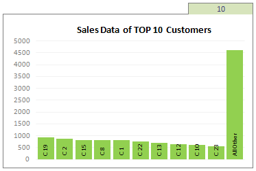
Today we will learn a dynamic charting technique that will mix these two ideas in a useful way. I call this a Top X chart.
Continue »Switch Rows and Columns in Charts [Quick Charting Tip]
![Switch Rows and Columns in Charts [Quick Charting Tip]](https://chandoo.org/img/c/switch-rows-columns-in-charts.png)
Let us say you have built a nice chart showing your sales and profits for the top 5 products (learn how to highlight top 5 products in a list), with products on X axis. Suddenly your boss wants to switch the rows to columns (or transpose the chart) so that she can see metric level grouping instead of product level grouping. No need to freak out and rush to Espresso machine, You can do it very easily with Excel Charting features.
In today’s quick tip you will learn how to swap chart rows and columns in excel.
Continue »Solve Sudoku Puzzles using Excel [because it is weekend]
![Solve Sudoku Puzzles using Excel [because it is weekend]](https://chandoo.org/img/i/sudoku-solver-using-excel.png)
Sanjay, my colleague is an avid programmer and excel enthusiast. In his spare time he wrote a small VBA macro to solve Sudoku. Sudoku is a very famous number based puzzle with a 9×9 grid of cells. Each of the 9 rows, columns and 3×3 blocks should be filled in such a way that they have all the numbers from 1 to 9. Sudoku is a very effective way to keep your brain cells ticking. I am a huge sudoku fan and I solve sudoku whenever I have few minutes to kill. So naturally I jumped with joy when I saw Sanjay’s excel macro for solving sudoku. He is kind enough to let me share this with all of you.
Continue »How to get Excel 2003 Toolbars in Excel 2007 [productivity hack]
![How to get Excel 2003 Toolbars in Excel 2007 [productivity hack]](https://chandoo.org/img/p/customize-quick-access-toolbar-th.png)
In our recent poll, I have asked you to tell me which buttons you have on the quick access toolbar?
Finnur, one of our readers has configured the Excel 2007 quick access toolbar to make it look like Excel 2003 toolbar.
I think this is a very cool way to max up your productivity, it takes 5 minutes to make your quick access bar look like Excel 2003 toolbar and you could save countless hours of “searching-for-that-command-in-ribbon” time.
Continue »Making a chart with dynamic range of values

We all know that to make a chart we must specify a range of values as input.
But what if our range is dynamic and keeps on growing or shrinking. You cant edit the chart input data ranges every time you add a row. Wouldn’t it be cool if the ranges were dynamic and charts get updated automatically when you add (or remove) rows?
Well, you can do it very easily using excel formulas and named ranges. It costs just $1 per each change. 😉
Ofcourse not, there are 2 ways to do this. One is to use Excel Tables and another is to use OFFSET formula.
Continue »

