All articles with 'MATCH()' Tag
![Finding the closest school [formula vs. pivot table approach]](https://chandoo.org/wp/wp-content/uploads/2016/11/school-data.png)
First a quick personal update: There has been a magnitude 7.8 earth quake in NZ on 14th November 2016 early morning. It is centered in Kaikoura, which is about 250 km away from Wellington. We did feel several shakes and after shocks. It has been an interesting and often scary experience. But my family is safe. I feel very sad for the all the damage and the loss for families in NZ. If you suffered from this quake, My prayers and thoughts are with you.
Yesterday, a friend asked me an interesting question. He has school distance data, like above. He wants to know which is the closest school for each school.
There are a few ways to answer this question. Let’s examine two approaches – formulas & pivot tables and see the merits of both.
Continue »Visualizing target vs. actual progress – Biker on a hill chart

Over the years, we have discussed a whole heap of techniques to visualize budget vs. actual charts. Today let’s take a ride on this slope again and learn another fun, silly & awesome way to depict target vs. actual progress.
Introducing biker on a hill chart
Tada!!!
Biker on a hill!?! Don’t worry, I didn’t fall down on a descent and lose my brain. I am talking about an Excel chart to visualize target vs. actual progress on a time line with biker on a hill analogy. See the above chart, you will know.
Looks interesting? Read on to learn how to create this in Excel.
Continue »
Learn how to convert a Roman Numeral to a Number using this nifty formula. No VBA required.
Continue »![Analyzing 300,000 calls for help [case study]](https://chandoo.org/wp/wp-content/uploads/2016/08/raw-data-first-onscene.png)
Over the weekend, I got an email from Mr. E, one of my students. Mr. E works at a police department in California and as part of his work, he was looking at calls received by police. Whenever police get a call for help, multiple teams can respond to the call and go to the location. All of these dispatches are recorded. So a single call can have several such dispatches. And Mr. E wanted to findout which team responded the first. The problem?
Finding the first responded team is tricky.
Today let’s take up this problem as a case study and understand various methods to solve it. We are going to learn about writing better lookups, pivot tables, power pivot and optimization. Put on your helmets, cause this is going to be mind blowingly awesome.
Continue »
Lets look at how to apportion sales according to multiple criteria
Continue »CP051: VLOOKUP FAQs – Most frequently asked questions about VLOOKUP – Answered

Podcast: Play in new window | Download
Subscribe: Apple Podcasts | Spotify | RSS
In the 51st session of Chandoo.org podcast, let’s discuss most frequently asked questions about VLOOKUP.
What is in this session?
In this podcast,
- What is VLOOKUP?
- What happens when VLOOKUP can’t find the value?
- Should my list be sorted?
- Is VLOOKUP slower than INDEX + MATCH?
- What if my list has multiple matches?
- How to fetch 2nd / 3rd matching item?
- How to fetch all matching items?
- How to fetch items matching multiple conditions?
- How to speed up VLOOKUP?
- Why doesn’t my VLOOKUP work?
- What to do in case of errors?
- Resources for you

Here is an interesting twist on the good old VLOOKUP. How to find the pricing applicable for given quantity of a product?
Something like above.
Looks interesting? Then read on…
Continue »
Learn how to find which worksheet a max or min value occurs on using this neat formula
Continue »
We all know that VLOOKUP (and its cousins MATCH, HLOOKUP and LOOKUP) are great for finding information you want. But they are helpless when you want to do a case-sensitive lookup.
So how do we write case sensitive VLOOKUP formulas?
Simple. We can use EXACT formula.
Continue »![Who is the most consistent seller? [BYOD]](https://chandoo.org/wp/wp-content/uploads/2015/02/who-is-the-most-consistent-seller-data.png)
Who is the most consistent of all?
Imagine you are a category manager at a large e-commerce company. Your site offers various products, but you don’t really make these products. You list products made by other vendors on your site. Every day, these vendors would send you invoices for the amount of product they have sold. Above is a snapshot of such invoices.
Looking at this list, you have a few questions.
- Who is the best seller?
- Who is the most active seller?
- Who is the most consistent seller?
- Which seller has fewest invoices?
Let’s go ahead and answer these using Excel. Shall we?
Continue »
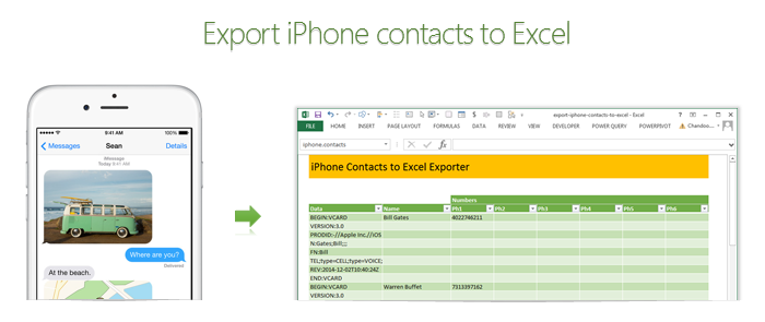
Recently my iPhone 4 crashed. It is 3.5 years old. And just like any other 3 year old, it started acting weird & crazy one night. The next morning it went silent. It won’t go beyond the Apple logo whenever I start it. Since I couldn’t wait for the phone to start, I took out the SIM card (the phone is unlocked, if you are wondering) and placed it in my old Nokia phone. But alas, none of my contacts are on the SIM. They are in “cloud”.
After a day of answering phone calls from everyone including my mom as “Chandoo here”, I’ve decided to get my contacts back. So I logged in to iCloud to download a backup. And the backup was a .VCF file.
Since I wanted to have all my contact numbers in a spreadsheet, I did what any Excel nerd would do. I built a template that can convert VCF data to Excel worksheet.
Continue »The ultimate VLOOKUP trick – Multi-condition Lookup

This is a guest post by Sohail Anwar.
Let’s not bore you with an intro. You are about to learn a VLOOKUP trick that Lucifer himself would not want you to know. It’s so absurdly powerful that it was developed in a lab and had to be tested on Rocky’s arch nemesis Ivan Drago.
Presenting the Multiple criteria VLOOKUP!
…boring…pass, we’ve seen it.
Oh, have you? Not like this you haven’t. This will change the way you work with Excel.
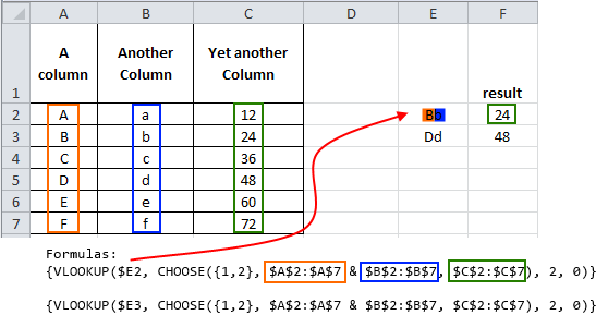
Let me start with an easy example. Here’s some data and we would love to know what Bb and Dd is.
Continue »A better chart to visualize “Best places to live” – Top 100 cities comparison Excel chart
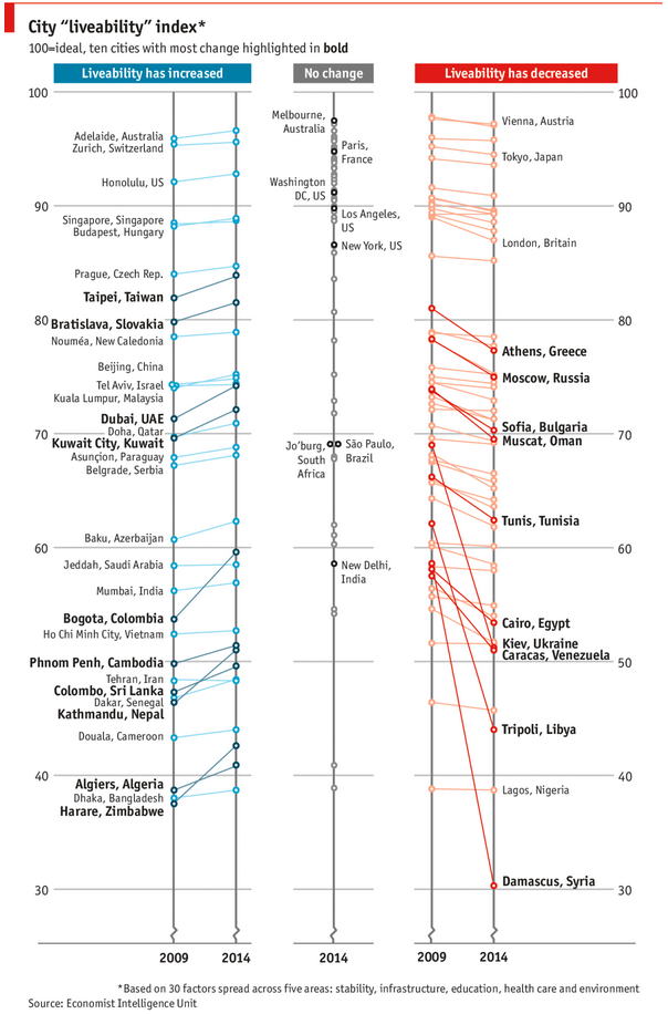
Recently, I saw this chart on Economist website.
It is trying to depict how various cities rank on livability index and how they compare to previous ranking (2014 vs 2009).

As you can see, this chart is not the best way to visualize “Best places to live”.
Few reasons why,
- The segregated views (blue, gray & red) make it hard to look for a specific city or region
- The zig-zag lines look good, but incredibly hard to understand % changes (or absolute changes)
- Labels are all over the place, thus making data interpretation hard.
- Some points have no labels (or ambiguous labels) leading to further confusion.
After examining the chart long & hard, I got thinking.
Its no fun criticizing someones work. Creating a better chart from this data, now thats awesome.
Continue »ABC Inventory Analysis using Excel
ABC analysis is a popular technique to understand and categorize inventories. Imagine you are handling inventory at a plant that manufactures high-end super expensive cars. Each car requires several parts (4,693 to be exact) to assemble. Some of these parts are very costly (say few thousand dollars per part), while others are cheap (50 cents per part). So how do you make sure that your inventory tracking efforts are optimized so that you waste less time on 50 cent parts & spend more time on costly ones?
This is where ABC analysis helps.
We group the parts in to 3 classes.
- Class A: High cost items. Very tight control & tracking.
- Class B: Medium cost items. Tight control & moderate tracking.
- Class C: Low cost items. No or little control & tracking.
Given a list of items (part numbers, unit costs & number of units needed for assembly), how do we automatically figure which class each item belongs to?
And how do we generate above ABC analysis chart from it?
Continue »This is a guest post by Krishna, a football lover & one of our readers.
The wait for lifting the most valued priced in football for Germans was finally over. For a football fan, world cup is best time that is scheduled every four years and that if your favorite team lifting the trophy is like your crush is going on a date with you. 🙂
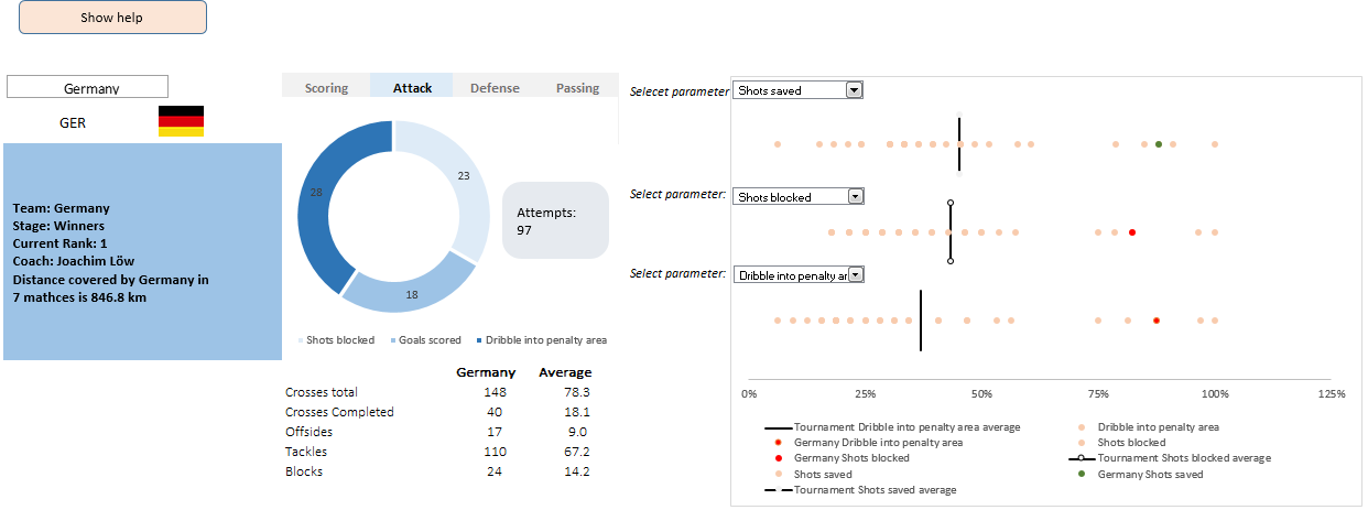
A sneak-peek at the final dashboard
Here is the final dashboard (it has more functionality than depicted). Click on it to enlarge.
Continue »


