All articles with 'in-cell charting' Tag
Show Top 10 Values in Dashboards using Pivot Tables

A good dashboard must show important information at a glance and provide option to drill down for details.
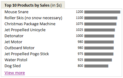
Showing Top 10 (or bottom 10) lists in a dashboard is a good way to achieve this (see aside). Today we will learn an interesting technique to do this in Excel.
Continue »Excel Animation without Macros!
Today we will learn an interesting animation technique that ONLY uses, … wait for it …, Excel Formulas. That is right, we will use simple formulas to animate values in Excel.
Intrigued? Confused? Interested?
First see a short demo of excel animation achieved using this technique.
Now read the rest of this post to learn more about this technique and download sample workbook.
Continue »An Excel Dashboard to Visualize 10,007 Comments [Dashboard Tutorial]
![An Excel Dashboard to Visualize 10,007 Comments [Dashboard Tutorial]](https://chandoo.org/img/vp/10007-comments-dashboard-thumb.png)
First some good news, On 21st November, 2010, our little blog received its 10,000th comment!
Thank you so much for making this happen.
Those of you reading chandoo.org for a while know my penchant for comments. I have learned a lot of excel tips & ideas just by reading the comments you posted on this blog. I think comments are one of the best parts of this blog. So, naturally, I wanted to celebrate this milestone, with something big & awesome.
My intention was to download all the 10,000+ comments and play with the data to come up with something outstanding, like a dashboard. It took me 2 days to conceptualize and create this beauty.
Continue »New Features in Excel 2010 Conditional Formatting
Conditional formatting is one of favorite features in Excel. CF has helped me save the day at work more than a dozen occasions. I almost became project manager just because I knew how to make a gantt chart in excel using conditional formatting. I have written extensively about it.
So, I was naturally curious to explore what is new in Excel 2010’s Conditional Formatting. In this post, I will share some of the coolest improvements in CF.
Continue »Survey Results in Dot Plot Panel Chart [followup on Incell Panel Chart]
![Survey Results in Dot Plot Panel Chart [followup on Incell Panel Chart]](https://chandoo.org/img/vp/incell-dot-plot-panel.gif)
In a follow up to last week’s how to visualize survey data in excel, we will explore how you can create an incell dot plot panel chart. Please follow the links in the article to get more commentary and insights from established persona in the visualization world (including Stephen Few, Naomi, Jon etc.)
Continue »![How to Visualize Survey Results using Incell Panel Charts [case study]](https://chandoo.org/img/cb/survey-results-panel-chart-example.png)
A panel chart (often called as trellis display or small-multiples) shows data for multiple variables in an easy to digest format. It lets users compare in any way and draw conclusions with ease.
Today, I want to discuss how the principles of panel chart can be applied to visualize a complex set of survey results. For this we will use the recent survey conducted by Gartner on how various customers use BI (Business Intelligence) tools.
Continue »Use “Playbill” font to make your incell charts realistic [quick-tips]
![Use “Playbill” font to make your incell charts realistic [quick-tips]](https://img.chandoo.org/c/use-playbill-font-incell-charts.png)
Most of you already know that using the REPT formula along with pipe (“|”) symbol, we can make simple in-cell charts in excel. For eg. =REPT(“|”,10) looks like a bar chart of width 10. Despite the simplicity, most people don’t use in-cell charts because these charts don’t look anything like their counterparts. But you can […]
Continue »Sales Dashboards – Visualizing Sales Data – 32 Dashboard Examples & Implementations

Sales reports and dashboards are very common in any company. There are several ways in which you can visualize sales data to understand the trends and sales performance. So in November, I have asked you to visualize sales data using sample data. The visualization challenge #2, sponsored by Zoho Reports generated a huge buzz around the community and fetched 32 incredible entries. The response was so overwhelming that it took me almost 24 hours to write this post. Thanks everyone for participating and making this a huge learning experience for everyone. Personally I have learned several useful dashboard and charting tricks. I will be sharing some of these lessons with all of you in the coming weeks.
Continue »50 Best Cities for Finding a Job [Incell Dashboard using Excel]
![50 Best Cities for Finding a Job [Incell Dashboard using Excel]](https://chandoo.org/wp/wp-content/uploads/2009/08/incell-comparison-charts.png)
We all know that incell charts are a very cool way to explore and visualize data. Personally I like them so much that I have written several tutorials on it here. Today we will see how a Job dashboard on “50 best cities for finding a job” originally prepared by Indeed job search engine can be recreated in Excel using In-cell charts. The final outcome is something like this.
Continue »Member of month, Excel links and Cooked HDD

Starting this month I will announce one member of our little community as member of month. It is to honor the contribution they made.
Jeff Weir is our member of month for July, 2009. He not only commented more than 40 times in the last month, but he even wrote a marvelous guest post on the chart busters series. I have learned several valuable excel and charting tips from him in the past few weeks. I am sure some of have too. Thank you Jeff.
Also in the post we have some excel links worth checking.
Continue »Incell Dot Plots in Microsoft Excel

Dot plots are a very popular and effective charts. According to wikipedia “Dot plots are one of the simplest plots available, and are suitable for small to moderate sized data sets. They are useful for highlighting clusters and gaps, as well as outliers.”
Today we will learn about creating in-cell dot plots using excel. We will see how we can create a dot plot using 3 data series of some fictitious data.
Continue »How to present changes in Market Share using Charts?

Most of us are comfortable with numbers, but we are confused when it comes to convert the numbers to charts. We struggle finding the right size, color and type of charts for our numbers. The challenge is two fold, we want to make the charts look good (we mean, really… really good) but at the […]
Continue »Sports Statistics Dashboard in Excel – Few More Alternatives

First of all, thanks everyone for making the should you always start barcharts at zero? discussion lively. Almost everyone felt that we should start bar charts at zero. After spending sometime with my initial test cricket statistics dashboard, I have created few alternatives. You can see them below. But somehow I feel that I haven’t […]
Continue »
With each passing day the amount of information contained in a single spreadsheet, slide, document is growing. Thanks to demanding bosses, clients and colleagues, we are now supposed to provide all the relevant information in as much less space as possible. This is where micro charting or light weight data exploration has become a rage. […]
Continue »Excel Bullet Graphs

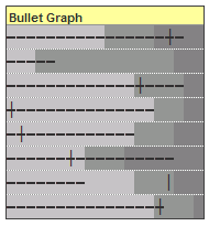
Bullet graphs provide an effective way to dashboard target vs. actual performance data, the bread and butter of corporate analytics. Howmuchever effective they are, the sad truth is there is no one easy way to do them in excel. I have prepared a short tutorial that can make you a dashboard ninja without writing extensive […]
Continue »

