All articles with 'Learn Excel' Tag
{ 31 Comments }
Excel Check Boxes, Even Simpler Way
Published on Sep 15, 2009 in Excel Howtos, Learn Excel

In how to get tickmarks in excel, Jon commented,
“[…] Better yet, use real checkboxes, so the user can change them with the mouse.”
That got me thinking,
In excel, you can add a checkbox to spreadsheet using developer tools. But what if you need a whole bunch of checkboxes, one in each cell?
Continue »{ 15 Comments }
How to get tick marks in Excel? [custom cell formatting]
Published on Sep 15, 2009 in Excel Howtos, Learn Excel
![How to get tick marks in Excel? [custom cell formatting]](https://chandoo.org/img/i/showing-tick-marks-using-excel.png)
Here is tricky scenario, faced by Basil, our forum member, “I want to have Excel display a wing ding check mark when a user types “y” in a cell. I have been trying to do a substitute formula but putting the symbol in an unused portion of the spreadsheet and calling it to the selected cell but I can’t get it to work. Any thoughts?”
We can use either cell formatting or conditional formatting to achieve this.
Continue »{ 28 Comments }
Pimp your comment boxes [because it is Friday]
Published on Sep 11, 2009 in VBA Macros
![Pimp your comment boxes [because it is Friday]](https://chandoo.org/img/l/better-comment-box.png)
Excel comment boxes are a very useful feature, but the comment box look hasn’t changed since slice bread. So Tom, one of our readers, took it upon himself to revamp the comment box. He wrote a simple macro to botox, smoothen and color the comment box. It is a fun and simple macro, something that can make a boring spreadsheet friday a little more exciting.
Continue »{ 31 Comments }
Issue Trackers & Risk Management using Excel [Project Management using Excel – Part 5 of 6]
Tracking issues and risks is where most of the project management time goes. Once the project planning and organizing activities are in good shape, most of the project management activities are around risk management and issue tracking. In this installment of project management using excel, we will learn how to create a simple issue tracker template using excel and how to analyze issues using excel.
Continue »{ 3 Comments }
Pin Frequently Used Documents to File Menu to Save Time
Published on Sep 4, 2009 in Learn Excel
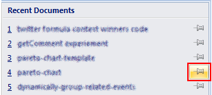
Here is a quick productivity tip if you work with same set of excel (or word or powerpoint) documents everyday. Just pin the documents to recent documents list in the Office Menu in MS Office 2007. See this: More excel 2007 productivity tips & double click tricks.
Continue »{ 93 Comments }
Get cell comments using Excel Formula
Published on Sep 3, 2009 in Learn Excel, VBA Macros
Excel has a very useful feature called “cell comments” using which you can add comment to a cell. This is a very good way to gather remarks and review comments when a workbook is shared with colleagues and others. But what if you have typed a ton of cell comments and now want a way to extract them and do something with that data?
Continue »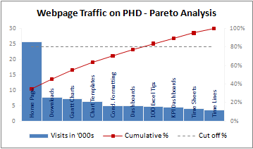
A Pareto chart or pareto graph displays the importance of various factors in decreasing order in columns along with cumulative importance in a line. Pareto charts are often used in quality control to display most common reasons for failure, customer complaints or product defects. The pareto chart is a great way to do the pareto analysis. Today, we will learn how to use excel to make a pareto chart.
Continue »Recently our blog has reached the 5000 RSS subscriber milestone and to celebrate the occasion I have announced a giveaway. All you had to do was to complete the sentence “if excel is a superhero …”. 70+ people have participated in it.
Read more to find the list of randomly chosen winners.
Continue »{ 10 Comments }
Using Combo Charts to Group Related Time Events [Charting Goodness]
Published on Aug 26, 2009 in Charts and Graphs
![Using Combo Charts to Group Related Time Events [Charting Goodness]](https://chandoo.org/wp/wp-content/uploads/2009/08/excel-combo-chart-th.png)
In his latest book, Now You See It, on pages 165 and 166 of the book, Stephen Few discusses how grouping related time intervals can facilitate analysis of data. As an illustration he explains that when viewing data of daily website visits, it helps in separating weekdays and weekends to differentiate expected traffic during these periods. The use of this technique would make it easier for the analyst to identify any anomalous movement in ether the weekend or the week day.
Fortunately excel combo charts can help you do that. In this guest post, Paresh explains to us how to do this.
Continue »{ 21 Comments }
Make a Pivot Table in Excel [15 Second Tutorial]
Published on Aug 25, 2009 in Excel Howtos
![Make a Pivot Table in Excel [15 Second Tutorial]](https://chandoo.org/img/l/make-a-pivot-table-in-excel-tutorial.png)
Last week we have posted a simple to understand excel pivot table tutorial here. Today I am going to supplement the tutorial with a 15 second video tutorial on Making excel pivot tables.
Continue »It is no exaggeration that knowing excel formulas can give you a career boost. From someone starting at the long list of numbers, you can suddenly become a data god who can lookup, manipulate and analyze any spreadsheet.
So when our little excel blog hit the 5000 RSS Subscriber milestone, I celebrated the occasion by asking you to share an excel formula through twitter or comments with rest of us. And boy, what an excellent list of formula tips you have shared with us all.
Here is the complete list of entries for the twitter formula contest.
{ 9 Comments }
50 Best Cities for Finding a Job [Incell Dashboard using Excel]
Published on Aug 20, 2009 in Charts and Graphs, Learn Excel
![50 Best Cities for Finding a Job [Incell Dashboard using Excel]](https://chandoo.org/wp/wp-content/uploads/2009/08/incell-comparison-charts.png)
We all know that incell charts are a very cool way to explore and visualize data. Personally I like them so much that I have written several tutorials on it here. Today we will see how a Job dashboard on “50 best cities for finding a job” originally prepared by Indeed job search engine can be recreated in Excel using In-cell charts. The final outcome is something like this.
Continue »{ 26 Comments }
Use ROWS() and COLUMNS() formulas to generate numbers in a sequence [quick tip]
Published on Aug 17, 2009 in Learn Excel
Here is a quick excel formula tip to start your week. Use ROWS() and COLUMNS() formulas next time you need sequential numbers. What does ROWS() excel formula do? ROWS excel formula takes a range as an argument and tells you how many rows are there in that range. For. eg. ROWS(A1:A10) gives 10. How can you […]
Continue »{ 1 Comment }
Only 2 more days to get prizes worth $425, Hurry
Published on Aug 14, 2009 in blogging
The PHD 5k Giveaway which includes exciting prizes like Excel dashboard bundle, Power Utility Pack Licenses, Amazon gift card and Excel 2007 Formulas book is going to end by tomorrow midnight (that is 15th August people). To participate, all you got to do is, either send a tweet with your favorite formula tip or complete […]
Continue »![Hide Grid Lines [Quick Tip]](https://chandoo.org/wp/wp-content/uploads/2009/08/hide-gridlines-excel-workbook.png)
I like to hide grid lines on my spreadsheets and charts whenever possible. I think removing gridlines makes the charts and worksheets more presentable. In case you are wondering how to remove (or hide) gridlines from your worksheet or chart, follow these simple instructions.
Continue »
