All articles with 'downloads' Tag
{ 28 Comments }
How to find sum of top 3 values based on filtered criteria [video]
Published on May 17, 2013 in Excel Howtos
![How to find sum of top 3 values based on filtered criteria [video]](https://img.chandoo.org/f/sum-of-top-3-values-meeting-filtered-criteria-excel.png)
Lets say you are looking at some data as shown above and wondering what is the sum of budgets for top 3 projects in East region with Low priority. How would you do that with formulas?
Continue »{ 23 Comments }
How to transpose a values in a row to column using formulas… [Quick tip]
Published on May 14, 2013 in Excel Howtos
![How to transpose a values in a row to column using formulas… [Quick tip]](https://img.chandoo.org/q/transpose-columns-to-rows-using-formulas.png)
This is interesting, I am in Columbus to meet one of my college friends. I remember him as a very meticulous person from college days. So it is no surprise when he showed me his massively impressive finance tracker last night. He has been tracking expenses, income, credit card payments and gas (petrol) consumption since 2008. Very impressive indeed.
Then out of blue he said, he has a problem with his spreadsheet. In this own words,
When entering data for credit cards, I use one column per card. But in my report view, I want to show credit card details in rows. How do I do this?
Something like above…. Today, lets learn how to do this using Excel formulas.
Continue »Hello there,
My travel to US was fantastic and fun. Many thanks to Jocelyn & Rob Collie, who found a nice apartment for us and made sure we are settled down in almost no time. Weather has been excellent so far too with lots of sunshine and blue skies. We went to a nearby park the other day and kids really loved walking on trials and exploring.
Gentle reminder
Today is last day to sign-up for my USA Masterclass
Today is last day to join my USA Advanced Excel & Dashboards masterclass with early bird discount. If you live near Chicago, Washington DC or Columbus and love Chandoo.org style of teaching, then you will benefit alot from my masterclass. We have very few spots left in Chicago & Columbus. So go ahead and book yours today and save $200.
Click here to know more and join us.
Continue »{ 35 Comments }
How to create a column chart with background image in Excel ?
Published on May 6, 2013 in Charts and Graphs, Excel Howtos
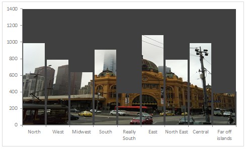
Tony sends this chart and asks if it can be done in Excel.
It sounded like a good challenge for a lazy Sunday morning. So here we go. (Posting it on Monday).
Now I could not get an oil rig photo or that data. So I made up few numbers and used a photo of Flinders street station I took when I was in Melbourne last year.
Continue »{ 109 Comments }
How to create an Interactive Chart in Excel? [Tutorial]
Published on Apr 23, 2013 in Charts and Graphs, Excel Howtos
![How to create an Interactive Chart in Excel? [Tutorial]](https://cache2.chandoo.org/images/c/interactive-chart-in-excel-demo.gif)
Imagine you have a worksheet with lots of charts. And you want to make it look awesome & clean.
Solution?
Simple, create an interactive chart so that your users can pick one of many charts and see them.
Today let us understand how to create an interactive chart using Excel.
Continue »{ 6 Comments }
Chart for wall hygrometric physic (or how to create a chart with custom x axis intervals?)
Published on Apr 18, 2013 in Charts and Graphs
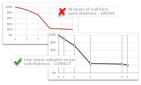
Livio, one of our readers from Italy sent me this interesting problem in email.
Continue »I would like to prepare an xy linear graphic as representation of the variation of temperature trough a wall between two different bulk temperature i.e. outside and inside a house. This graphic should show the temperature gradient trough the wall thickness. The wall is normally made by different construction materials (different layers, as bricks, insulation, …..) and so the temperature change but not as a straight line with only one slope, instead as few lines with different slopes (see below figure) Calculations are not difficult, and also prepare the graphic also not difficult.
But, I am looking a beautiful solution for x-axis. X-axis should be divided not with constant interval, instead with different length between each sub-division exactly as the different thickness of the wall. This is a correct graphic, because you can show the correct slope of each straight line though each layer of the wall.
![How to create interactive calendar to highlight events & appointments [Tutorial]](https://img.chandoo.org/vba/interactive-event-calendar-in-excel.png)
One of the popular uses of Excel is to maintain a list of events, appointments or other calendar related stuff. While Excel shines easily when you want to log this data, it has no quick way to visualize this information. But we can use little creativity, conditional formatting, few formulas & 3 lines of VBA code to create a slick, interactive calendar in Excel. Today, lets understand how to do this.
Continue »{ 41 Comments }
There is an Easter egg in this chart!
Published on Mar 27, 2013 in Charts and Graphs
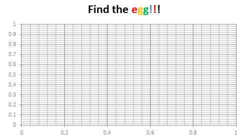
Do not worry, you are not time traveling or seeing things. Its just that, this year I have decided to publish our Easter Egg a few days early.
And oh, I have 3 reasons for it:
- 2 of my favorite festivals – Easter & Holi (a festival of colors, celebrated in India) are this week. Holi is today (Wednesday) & Easter on Sunday.
- My kids are super excited about Holi as this is the first time they will be playing it. So we have family time from today until Wednesday and I do not feel like writing a blog entry on Friday 🙂
- I like to have 3 reasons for everything.
Hence the Easter Egg is advanced a few days. But it is just as fun (or may be better) as previous Easter eggs.
Continue »{ 20 Comments }
Finding Nearby Zipcodes using Excel Formulas
Published on Mar 18, 2013 in Excel Howtos
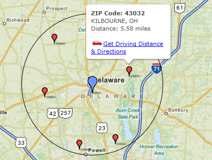
Recently, I had a peculiar problem. I have a list of zip codes and I wanted to find out nearest zip codes for each of them.
Now, If I wanted to find out near by zip codes for one area, I could go and search in Google. But, how to do it for dozens of them?
Today, lets understand how you can use Excel (that’s right) to do this automatically. We will be using Excel 2013 for this.
Continue »{ 15 Comments }
Finding Conversion ratio using Pivot Table Calculated Items
Published on Mar 6, 2013 in Pivot Tables & Charts, Power Pivot
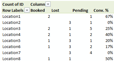
Today, lets understand how to use Calculated items feature in Pivot tables. We will use a practical problem many of us face to learn this feature – ie calculating conversion ratio from a list of sales calls.
Continue »{ 18 Comments }
Use Advances vs. Declines chart to understand change in values
Published on Feb 21, 2013 in Charts and Graphs
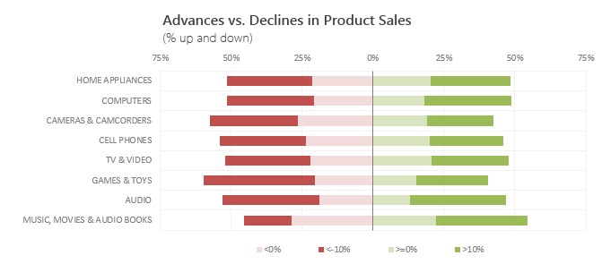
Lets say you are responsible for sales of 100s of products (which belong to handful of categories). You are looking at sales of each product in last month & this month. And you want to understand whether sales are improving or declining by category. How would you do it?
Turns out, this is not a difficult problem. In fact, this question is asked every day & answered using Advances vs. Declines chart.
You may have seen this chart in financial newspapers or websites. Shown above, Advances vs. Declines chart tells us how many items have advanced & how many have declined.
Read on to learn how to create this chart using Excel.
Continue »{ 4 Comments }
Last day for enrollments – Join our Power Pivot course & become awesome analyst
Published on Feb 15, 2013 in Power Pivot, products
 Hi folks,
I have a quick announcement & an awesome Power Pivot technique to share with you. First the announcement.
Only few hours left to join our Power Pivot course…
As you may know, I have opened enrollments for our inaugural batch of Power Pivot course few days ago. The aim of this course is to make you awesome in Excel, Advanced Excel, Dashboards & Power Pivot.
We will be closing the doors of this program at midnight, today (11:59 PM, Pacific time, Friday, 15th of February).
If you want to join us, click here and enroll now.
How many people have joined the class?
At the time of writing this, we have 195 students enrolled in Power Pivot class. We are eager to share Power Pivot knowledge & techniques to as many more of you as possible. So go ahead and join us because you want to be awesome in Excel & Power Pivot.
Continue »{ 19 Comments }
Shading above or below a line in Excel charts [tutorial]
Published on Feb 13, 2013 in Charts and Graphs
![Shading above or below a line in Excel charts [tutorial]](https://img.chandoo.org/c/shaded-line-charts-tell-a-better-story.png)
When comparing 2 sets of data, one question we always ask is,
- How is first set of numbers different from second set?
A classic example of this is, lets say you are comparing productivity figures of your company with industry averages. Merely seeing both your series as lines (or columns etc.) is not going to tell you the full story. But if we can shade our productivity line in red or green when it is under or above industry average… now that would be awesome! Something like above.
Continue »{ 4 Comments }
Distinct Count & Blanks – Power Pivot Real Life Example
Published on Feb 11, 2013 in Power Pivot
When it comes to analyzing business data, managers are always asking, “so how many distinct x each y is doing?”
And that sends us, data analysts & reporting professionals running from pillar to post figuring out the best way to do it.
- We can use variations of SUMPRODUCT, COUNTIFS etc, but the methods are not flexible..
- We can use VBA, but it would become slow as you add more data.
- We can use Pivot tables, but it only gives half of what we want ie each y part, but not distinct count of x.
- We might as well shave our head with a shovel before manually counting values.
And that brings us to 2 distinctly simple solutions:
- Using Power Pivot & Excel 2010
- Using regular pivot tables in Excel 2013
Today, lets talk about these 2 approaches & see why they are so better than anything else for distinct count situations.
Continue »{ 49 Comments }
Transpose a table of data using Excel Formulas
Published on Feb 1, 2013 in Excel Howtos
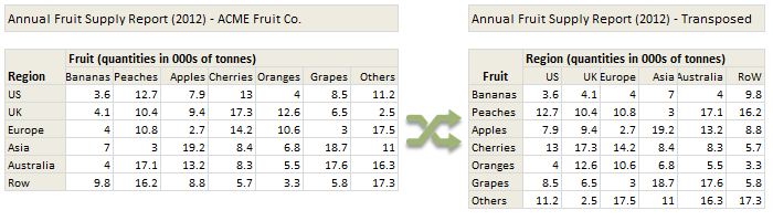
Today lets tackle a familiar data clean-up problem using Excel – Transposing data.
That is, we want to take all rows in our data & make them columns. Something like this:
Learn these 4 techniques to transpose data:
1. Using Paste Special > Transpose
2. Using INDEX formula & Helper cells
3. Using INDEX, ROWS & COLUMNS formulas
4. Using TRANSPOSE Formula

