All articles with 'downloads' Tag
{ 13 Comments }
Revenue vs. Commission growth – Getting the message across [BYOD]
Published on Feb 17, 2015 in Analytics, Charts and Graphs
Situation: Our commissions are growing way faster than revenues
Let’s say you are looking revenues & sales commissions of your company for last few years. The data looks like this:

And you want to highlight the fact that commissions are growing faster than revenues.
So you plot YoY growth rates for revenues & commissions.
Problem: The chart of YoY growth rates is not convincing
Take a look at the chart. It doesn’t convey the message that we want. At best it says “revenue growth is less than commission growth”

How to convey the message “Commission growth is a problem for us”?
Continue »![How to consolidate data that is different shapes [BYOD]](https://chandoo.org/wp/wp-content/uploads/2015/02/consolidating-data-in-different-shapes-excel-problem.png)
Last week, I asked my email newsletter readers to submit “one data analysis problem you are struggling with”. We called it BYOD – Bring your own data. More than 100 people have emailed various interesting (and often very difficult) problems. This week (between 16th of February to 20th of February), let’s take a look at some of these problems and solve them.
Consolidating data in different shapes
We can use either VBA or Excel’s consolidation features to combine data that has same shape (ie same number & type of columns). Here is one way to do it.
But what if we need to consolidate data that is in different shapes?
Something like above.
In such cases, we can use 3 powerful tools.
- Multiple Consolidation Ranges – Pivot Tables
- VBA
- Power Query
So let’s examine how to use these approaches to consolidate data in different shapes.
Continue »
Imagine you are the in-charge of finance department at Hogwarts. So one fine day, while you are practicing the spells, Dumbledore walks in to your office and says, “Our electricity bills are way too high. As the muggles don’t accept wizard money, we have to find a way to reduce our power consumption.”
So you summoned the previous 12 month utility bills to examine energy consumption patterns, and pretty soon you realized that most of the electricity consumption is due to the light bulbs. You suddenly have a brilliant idea. Why not replace the light bulbs with a variety that consumes low power? A light bulb moment indeed.
Your next step is to figure out what varieties of light bulbs are out there. Fortunately this is easier than catching a snitch in a game of quidditch. A quick search revealed that there are 3 types of light bulbs:
- Regular incandescent bulbs (the kind Hogwarts currently uses)
- Compact Fluorescent Light bulbs (CFL)
- Light Emitting Diode bulbs (LED)
Now your job is to do a cost benefit analysis of these options and pick one.
Continue »{ 40 Comments }
How to check for hard-coded values in Excel formulas?
Published on Jan 14, 2015 in VBA Macros
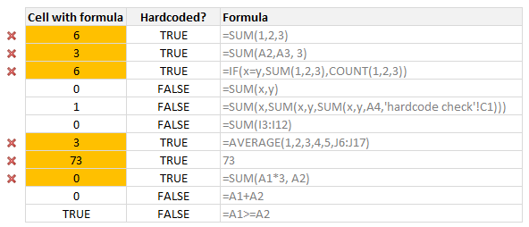
Here is a common problem. Imagine you are looking a complex spreadsheet, aptly titled “Corporate Strategy 2020.xlsx” which as 17 tabs, umpteen formulas and unclean structure. Whoever designed it was in insane hurry. The workbook has formulas like this, =SUM(Budget!A2:A30, 3600)+7925 .
It was as if Homer Simpson created it while Peter Griffin oversaw the project.
So how do you go about detecting all cells containing formulas with hard-coded values?
Continue »{ 19 Comments }
Free 2015 Calendar, daily planner templates [download]
Published on Jan 2, 2015 in Learn Excel
Here is a New year gift to all our readers – free 2015 Excel Calendar & daily planner Template.

This calender has,
- One page full calendar with notes, in 4 different color schemes
- Daily event planner & tracker
- 1 Mini calendar
- Monthly calendar (prints to 12 pages)
- Works for any year, just change year in Full tab.
{ 23 Comments }
Merry Christmas & Happy New Year 2015 [Holiday Gift Inside]
Published on Dec 23, 2014 in Chandoo.org Podcast Sessions, personal
Podcast: Play in new window | Download
Subscribe: Apple Podcasts | Spotify | RSS
A big, warm & pleasant hello to you.
I wish you a merry Christmas & Happy New Year 2015. May your holidays be filled with joy, togetherness, celebrations and fulfillment. May your new year be filled with hope, energy and awesomeness.
I want to tell you how thankful I am for all your support in this year. Every time you visit our website, read an article, leave a comment, enroll in a course, purchase a product, read one of my books, listen to a podcast episode, watch a video or tell your friends about Chandoo.org, I feel nothing but gratitude, thankfulness and amazement. 2014 is the most successful year since starting Chandoo.org, all thanks to you. Heartfelt thanks to you, from my family, staff and volunteers.

About this year’s holiday card
We took this picture recently when we went to Udaipur (a city in northern India). For a change, no one closed their eyes when the camera clicked.
A holiday gift for you…
Read on to download your special holiday gift.
Continue »{ 40 Comments }
Compare 2 sets of data by letter or word & highlight mismatches [vba]
Published on Dec 15, 2014 in VBA Macros
![Compare 2 sets of data by letter or word & highlight mismatches [vba]](https://img.chandoo.org/vba/compare-2-texts-by-letter-word-demo.gif)
We analysts like to compare. If you ever want to keep an analyst busy, just give her 2-3 options. She won’t return to your desk until the cows come home. My wife uses this trick all the time. Picture this:
[In late 2013]
Me: I want to buy a new phone
She: Do you want Nexus 5 or Galaxy S5 or iPhone 5s?
Its late 2014 and I am not done comparing.
So today, let’s talk about an interesting comparison scenario.
Comparing by letter or word
See above demo to understand the concept. Read more to learn how to do this.
Continue »{ 60 Comments }
Excel to the Next Level by Mastering Multiple Occurrences
Published on Dec 9, 2014 in Learn Excel
This is a guest post by Sohail Anwar.
August 29, 1994. A day that changed my life forever. Football World Cup? Russia and China de-targeting nuclear weapons against each other? Anniversary of the Woodstock festival?
No, much bigger: Two Undertakers show up at WWE Summerslam for an epic battle. Needless to say: MIND() = BLOWN().
And thus begun one boy’s journey into understanding the phenomenon of Multiple Occurrences.
My journey continued, when just a few years later my grandfather handed me down a precious family heirloom: A few columns of meaningless data that I could take away and analyze in Excel. You may laugh but in the 90’s, every boy only wanted two things 1) Lists of pointless data and …
Continue »{ 15 Comments }
Creating In-cell charts with markers for average (or target) values
Published on Dec 3, 2014 in Charts and Graphs
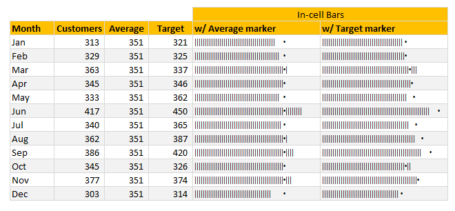
Today, lets talk about an interesting extension to the idea of in-cell charts. Adding average or target markers to the chart.
Adding a marker (like average or target or last year value) can enhance your charts greatly and provide more context. Lets understand how to add marker symbols to in-cell charts.
Continue »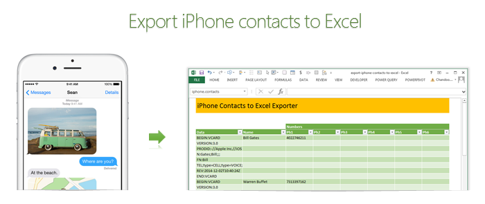
Recently my iPhone 4 crashed. It is 3.5 years old. And just like any other 3 year old, it started acting weird & crazy one night. The next morning it went silent. It won’t go beyond the Apple logo whenever I start it. Since I couldn’t wait for the phone to start, I took out the SIM card (the phone is unlocked, if you are wondering) and placed it in my old Nokia phone. But alas, none of my contacts are on the SIM. They are in “cloud”.
After a day of answering phone calls from everyone including my mom as “Chandoo here”, I’ve decided to get my contacts back. So I logged in to iCloud to download a backup. And the backup was a .VCF file.
Since I wanted to have all my contact numbers in a spreadsheet, I did what any Excel nerd would do. I built a template that can convert VCF data to Excel worksheet.
Continue »{ 15 Comments }
Download today – Introducing Excel Dashboard Templates from Chandoo.org
Published on Nov 13, 2014 in Charts and Graphs, Cool Infographics & Data Visualizations
Friends and readers of Chandoo.org, my newest download, Excel Dashboard Templates are available for your consideration. Click here if you are ready to get them. Read on to know more.
What are Excel Dashboard Templates?
As the name suggests, these are ready to use Excel templates for creating awesome, informative, easy to understand & quick dashboards with your data. You just enter your data, set up few calculation options, decide how your dashboard should look & bingo, a beautiful & insightful dashboard will be created for you. These dashboards are optimized to look great, convey key information & prompt correct action.
Who should buy these templates?
Analysts, managers, reporting professionals, business owners & executives. These templates are designed to help anyone preparing Excel based dashboards, scorecards or KPI reports.
Benefits for you
- Design awesome dashboards in minutes, not months: Don’t waste hours trying to figure out formulas, chart settings and layouts. Instead focus on what your users want, how your business works and use those insights to tell the ‘Excel Dashboard Template’ what you want. Save time and look awesome.
- Accommodate change elegantly: People change. Businesses change. What your boss wanted last month is no longer what she wants today. So when someone asks you, “hmm, can you show me YTD data instead of last 13 months”, or “Can I see top 10 KPIs instead of all”, you just smile and tap a few clicks and bingo, the new dashboard will be ready. These templates are designed to handle change (data, requirements, design preferences and insights).
- Beautiful & Informative: These templates are designed with a delicate balance of beauty & insight. Everything is seamlessly designed, perfectly aligned and precisely calculated so that you & your boss can focus on the insights & decisions. Time tested and well honored visualization principles & guidelines are observed thru-out the reports.
- Built for starters, built for pros: Whether you are just starting with Excel or a seasoned pro, you can find the templates right up your alley. For advanced users, we have many customizations to whet your appetite. Want to build a custom calculation or include another type of sorting, you can do it by tinkering with ‘calculations’ sheet.
{ 9 Comments }
Looking up when data won’t play nice – few more alternatives
Published on Nov 12, 2014 in Learn Excel, VBA Macros

Recently, we discussed about the case of unwieldy data and how we lookup what we want using formulas like SUMIFS. Today, let us learn few more ways to solve the same problem.
Suitable structure spawns simple solutions
Poorly structured is the 2nd biggest problem of analysts. The first one is not enough coffee. That is why there is a dictum in the data analytics world.
Structure is everything
So, we can easily solve our lookup problem, if our data were to magically re-arranged in 2 column fashion – Data & Value.
Continue »{ 41 Comments }
Looking up when the data won’t co-operate (case study)
Published on Nov 4, 2014 in Excel Challenges, Excel Howtos
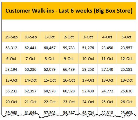
Occasionally we deal with data that is so uncooperative that we might as well give up and go back to calculators & ledger books.
Recently I found myself in such a situation and learned something new.
Introducing … data that won’t play nice
Drum roll please. Here is a data-set that I got from somewhere.
The problem – build a lookup formula
And the problem. Oh, simple. Write a lookup formula to find how many customer walk-ins we have on any given day.
But how?
Continue »{ 173 Comments }
The ultimate VLOOKUP trick – Multi-condition Lookup
Published on Oct 28, 2014 in Learn Excel
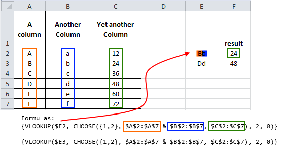
This is a guest post by Sohail Anwar.
Let’s not bore you with an intro. You are about to learn a VLOOKUP trick that Lucifer himself would not want you to know. It’s so absurdly powerful that it was developed in a lab and had to be tested on Rocky’s arch nemesis Ivan Drago.
Presenting the Multiple criteria VLOOKUP!
…boring…pass, we’ve seen it.
Oh, have you? Not like this you haven’t. This will change the way you work with Excel.
Let me start with an easy example. Here’s some data and we would love to know what Bb and Dd is.
Continue »{ 13 Comments }
A better chart to visualize “Best places to live” – Top 100 cities comparison Excel chart
Published on Oct 8, 2014 in Charts and Graphs, Cool Infographics & Data Visualizations
Recently, I saw this chart on Economist website.
It is trying to depict how various cities rank on livability index and how they compare to previous ranking (2014 vs 2009).
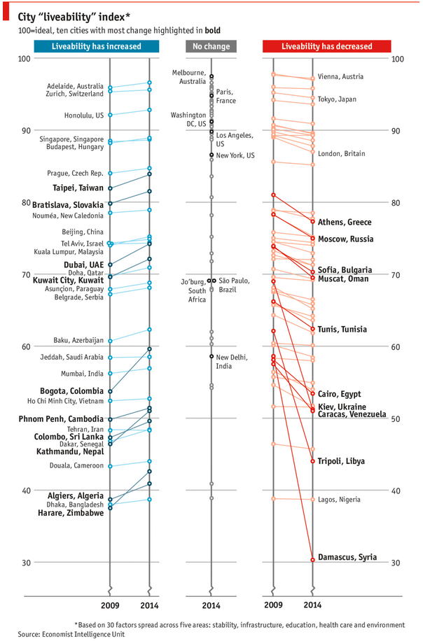
As you can see, this chart is not the best way to visualize “Best places to live”.
Few reasons why,
- The segregated views (blue, gray & red) make it hard to look for a specific city or region
- The zig-zag lines look good, but incredibly hard to understand % changes (or absolute changes)
- Labels are all over the place, thus making data interpretation hard.
- Some points have no labels (or ambiguous labels) leading to further confusion.
After examining the chart long & hard, I got thinking.
Its no fun criticizing someones work. Creating a better chart from this data, now thats awesome.
Continue »
