All articles with 'downloads' Tag

We all know that VLOOKUP (and its cousins MATCH, HLOOKUP and LOOKUP) are great for finding information you want. But they are helpless when you want to do a case-sensitive lookup.
So how do we write case sensitive VLOOKUP formulas?
Simple. We can use EXACT formula.
Continue »{ 9 Comments }
How to create cascading drop downs in Excel – video
Published on Aug 31, 2015 in Excel Howtos, Learn Excel

Cascading drop downs enhance usability of your dashboards & interactive workbooks. A cascading drop-down is a 2 or more level selection mechanism. When you have 100s of selection choices, instead of creating one massive drop down or combo-box, you can set up multiple levels of drop downs, so that users can narrow down their selection. For example, users can select Country, State and then City using cascading drop downs.
There are many ways to setup cascading drop downs. You can use formulas coupled with either data validation or form controls. You can also use Slicers. In this video we will review these techniques.
Continue »{ 0 Comments }
Make a quick funnel chart in Excel to track sales performance [video]
Published on Aug 29, 2015 in Charts and Graphs, Learn Excel
![Make a quick funnel chart in Excel to track sales performance [video]](https://chandoo.org/wp/wp-content/uploads/2015/08/funnel-chart-excel.png)
Funnel charts are useful to visualize sales & marketing performance. In this brief video, let’s understand how to make a quick funnel chart in Excel.
Read on to learn how to make funnel charts & to download a template for your funnel analysis needs.
Continue »![Monthly Planner Template [downloads]](https://chandoo.org/wp/wp-content/uploads/2015/08/monthly-planner-demo.gif)
Here is an awesome planner template to help you manage activities over a month. It is useful for charity drives, activity planning, school schedules, marketing initiatives, project planning etc.
Read on to download a copy of the template & learn how to use it.
Continue »{ 12 Comments }
How to use GETPIVOTDATA with Excel Pivot Tables
Published on Aug 26, 2015 in Pivot Tables & Charts

Pivot tables are very powerful analysis tools. They can summarize vast amounts of data with just few clicks. But they are lousy when it comes to output. Imagine the horror of putting a pivot table right inside your beautiful dashboard. One refresh could ruin the layout and create half-an-hour extra work for you.
How to combine the power of pivot tables with elegance of your dashboards?
The answer is: GETPIVOTDATA()
Continue »{ 4 Comments }
Summarize only filtered values using SUBTOTAL & AGGREGATE formulas
Published on Aug 25, 2015 in Learn Excel

We all know the good old SUM() formula. It can sum up values in a range. But what if you want to sum up only filtered values in a range? SUM() doesn’t care if a value is filtered or not. It just sums up the numbers. But there are other formulas that can pay attention […]
Continue »
Yesterday, you learned about Print Areas – a time & paper saving feature of Excel. While print areas are great, you can only set up one print area per sheet. What if you want to print either report or data based on user selection?
In such cases, you can set up dynamic print areas.
That is right. See above demo to understand how it looks. Read on to learn how to set up dynamic print areas.
Continue »{ 6 Comments }
How to import web data to Excel using Power Query
Published on Aug 21, 2015 in Power Query

Power Query offers many ways to get data to Excel. One of them is to Web Data import feature. Let’s understand how this works by importing world stock exchange closing data from Google Finance website.
[Related: Introduction to Power Query]
Continue »{ 1 Comment }
Dashboard best practice: Highlight user selection [video]
Published on Aug 20, 2015 in Charts and Graphs, Learn Excel
Here is a best practice to improve your dashboard usability. If you have an interactive dashboard, highlight user selections thru conditional formatting.
Check out below quick video to understand what this means.
Continue »{ 16 Comments }
Use mail merge to create custom letters, invoices, labels and more
Published on Aug 17, 2015 in Excel Howtos

The idea of mail merge is simple & powerful. Imagine you handle recruitment at a large company. You just hired 300 analysts for the big data division. The next job – generate employment offer letters for each of them. Of course, you don’t want to type these letters one at a time. You have the details of all the 300 offers (name, email, address, offer code, role, benefit package details and date of joining etc.) in a spreadsheet. You also have a template of the offer letter.
Enter mail merge. This powerful feature of MS Word combines (Excel) data with Word document contents to generate all the 300 letters in just few minutes.
Continue »{ 4 Comments }
A simple trick to make your dashboards user friendly [video]
Published on Aug 16, 2015 in Cool Infographics & Data Visualizations, Learn Excel
Whenever you have a dashboard that is quite long or spans across multiple worksheet tabs, it can be hard to use. Here is a simple trick to make your dashboards user friendly. If your dashboard has form controls, create duplicate sets of them and place them in locations where users are looking. For example, If your […]
Continue »{ 11 Comments }
In-cell 5 star chart – tutorial & template
Published on Aug 15, 2015 in Charts and Graphs, Excel Howtos
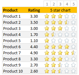
Whenever we talk about product ratings & customer satisfaction, 5 star ratings come to our mind. Today, let’s learn how to create a simple & elegant 5 star in-cell chart in Excel. Something like above.
Read on to learn how to create the above chart.
Continue »
VLOOKUP is one of the most useful Excel functions. So much so that I even wrote a book about it. But it has one serious limitation.
It looks up the first occurrence and returns corresponding data.
What if you want to find the last value?
Say, for example, you are looking at a task assignment list and want to know what is the last task assigned to employee Emp13?
We want to extract the task “Make amazing workbook”. Of course our good old VLOOKUP stops once it finds Emp13 and returns the answer as “Create intuitive workbook”.
Continue »{ 15 Comments }
Use shapes to enhance your Excel charts [tip]
Published on Aug 8, 2015 in Charts and Graphs
![Use shapes to enhance your Excel charts [tip]](https://chandoo.org/wp/wp-content/uploads/2015/08/use-shapes-to-enhance-your-charts.png)
Here is a simple way to enhance your Excel charts – use shapes & pictures in your charts.
We will learn how to create something like above.
Looks interesting? Read on…
Continue »{ 35 Comments }
Calculate sum of top 10 values [formulas + homework]
Published on Aug 4, 2015 in Formula Challenges, Learn Excel
![Calculate sum of top 10 values [formulas + homework]](https://chandoo.org/wp/wp-content/uploads/2015/08/sum-of-top-10-values-excel.png)
Analyzing top n (or bottom m) items is an important part of any data analysis exercise. In this article, we are going to learn Excel formulas to help you with that.
Let’s say you are the lead analyst at a large retail chain in Ohio, USA. You are looking at the latest sales data for all the 300 stores. You want to calculate the total sales of top 10 stores. Read on to learn the techniques.
Continue »
