All articles with 'dashboards' Tag
{ 18 Comments }
Thank you Sachin [a small tribute]
Published on Nov 15, 2013 in Charts and Graphs, Cool Infographics & Data Visualizations
Lets talk about people who inspire us. People who show us that anything is possible. People who prove that commitment, hard work and perseverance are true ingredients of a genius.
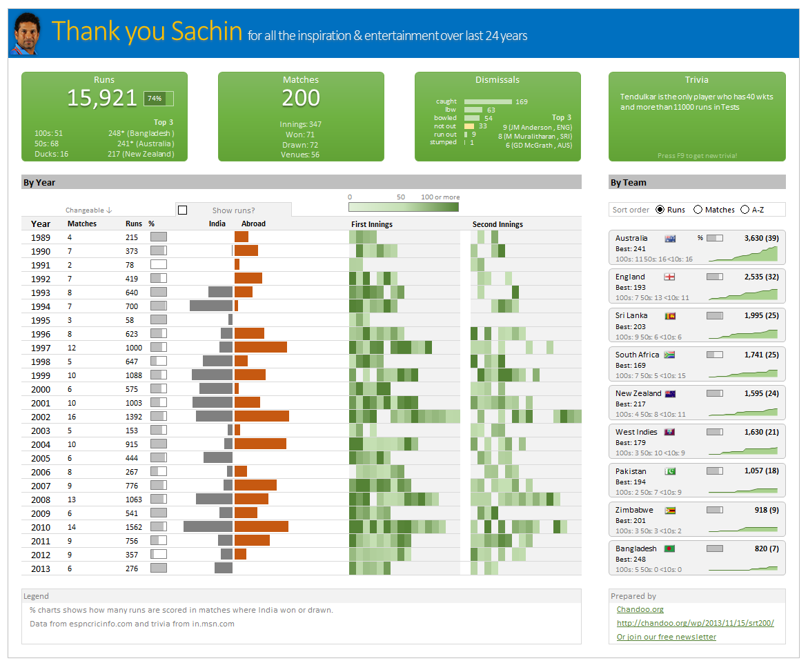
I am talking about Sachin Tendulkar. Those of you who never heard his name, he is the most prolific cricketer in the world. He is the leading scorer in both tests (15,921 runs) and one day matches (18,426 runs). Read more about him here.
Tendulkar has been an inspiration for me (and millions of others around the world) since I was a kid. The amount of dedication & excellence he has shown constantly motivates me. It is a pity that the great man is retiring from test cricket. He is playing his last test match (200th, most by any person) as I am writing this.
So as a small tribute, I have decided do something for him. Of course, I have never been a cricketer in my life. Once in college I was reluctantly asked to be a stand-by player in a game with seniors. I did not get a chance to pad up though. That is the closest I have been to a cricketer. So I did what I do best. Create an Excel workbook celebrating Sachin’s test career.
Thank you Sachin – his test career in a dashboard
Here is a dashboard I made visualizing his test cricket statistics. It is dynamic, fun & awesome (just like Sachin).
(click on the image to enlarge)
{ 8 Comments }
Closing gaps in this Gender Equality Gap chart…
Published on Nov 5, 2013 in Charts and Graphs
Today lets close some gaps.
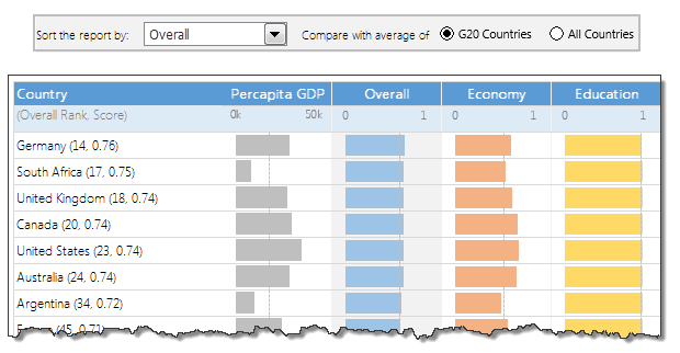
Recently I saw this interesting chart on Economist Daily Charts page. This chart is based on World Economic Forum’s survey on how women compare to men in terms of various development parameters. First take a look at the chart prepared by Economist team.
So what are the gaps in this chart?
This chart fails to communicate because,
- All country charts look same, thus making it difficult to spot any deviations.
- We cannot quickly compare one country with another on any particular indicator.
- It does not provide a better context (for eg. how did these countries perform last year?)
But criticizing someone’s work is not awesome. Fixing it and making an even better chart, that has awesome written all over it. So that is what we are going to do. You can see the improved chart above. Click on it to learn how you can create it.
Continue »{ 7 Comments }
Last day for enrollments – Join our Power Pivot class & become awesome analyst
Published on Aug 16, 2013 in Power Pivot
 Hi folks,
I have a quick announcement & a creative dashboard to share with you. First the announcement.
Only few hours left to join our Power Pivot course…
As you may know, I have opened enrollments for our 2nd batch of Power Pivot course few days ago. The aim of this course is to make you awesome in Excel, Advanced Excel, Dashboards, Power Pivot & Advanced Power Pivot.
We will be closing the doors of this program at midnight, today (11:59 PM, Pacific time, Friday, 16th of August).
If you want to join us, click here and enroll now.
Continue »
As the launch date for our 2nd batch of Power Pivot class nears, my plate looks fuller than ever. Fine tuning the course details, preparing our online classroom for new batch of students and coordinating with Rob for video recording etc.
But I wanted to take a few mins today and share with you some really useful Excel tricks, ideas and examples from web. I found these really useful and inspiring. I am sure you will learn from these links as much as I learned.
Continue »{ 2 Comments }
Details about upcoming Power Pivot course (and a bonus tip on dashboards)
Published on Jul 24, 2013 in Power Pivot

Hello friends..,
I have 2 things for you:
- Details about our upcoming Power Pivot courses
- A short video about designing better dashboards.
{ 53 Comments }
Never use simple numbers in your dashboards (bonus tip: how to fix default conditional formatting)
Published on Jul 11, 2013 in Charts and Graphs
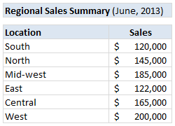
Pop quiz: What is wrong with above report?
At first glance, it looks alright. But if you observe closely, you realize that it is not telling the entire story. Just looking at regional sales numbers, you have not much clue what is going on with them.
So how to improve it?
Continue »{ 13 Comments }
10 Rookie mistakes to avoid when making dashboards [video]
Published on Apr 25, 2013 in Charts and Graphs
Are you making these 10 rookie mistakes when creating dashboards?
Watch below to video to understand what these mistakes and how to avoid them.
10 Rookie mistakes to avoid when making dashboards [23 mins]

{ 11 Comments }
Join my Excel Dashboard Masterclass in USA [May-June 2013]
Published on Mar 25, 2013 in Excel Workshops
![]()
Hello folks,
I have a super exciting news to share with you all. I will be conducting a series of Masterclasses on Advanced Dashboards & Excel in USA this Summer (May – June 2012). So if you live in (or nearby) Chicago, New York, Washington DC or Columbus OH, and want to one up your dashboard skills, you know what to do next.
I am conducting these masterclasses in partnership with PowerPivotPro.
Click here to know more and book your slot.
Continue »{ 132 Comments }
Designing a dashboard to track Employee vacations [case study]
Published on Jan 24, 2013 in Charts and Graphs, Learn Excel
![Designing a dashboard to track Employee vacations [case study]](https://chandoo.org/wp/wp-content/uploads/2013/01/employee-vacation-dashboard-full-view.png)
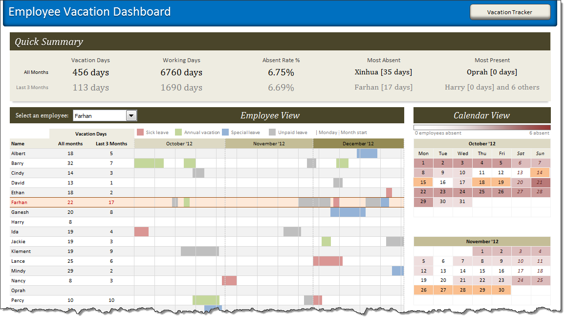
HR managers & department heads always ask, “So what is the vacation pattern of our employees? What is our average absent rate?”
Today lets tackle that question and learn how to create a dashboard to monitor employee vacations.
What do HR Managers need? (end user needs)
There are 2 aspects tracking vacations.
1. Data entry for vacations taken by employees
2. Status dashboard to summarize vacation data
![Project Portfolio Dashboard in Excel [Part 2 of 2]](https://img.chandoo.org/pm/project-portfolio-dashboard-small.png)
In this 2 part tutorial, we will learn how to design a project portfolio dashboard. Part 1 discussed user needs & design. Part 2 will show you Excel implementation.
Project Portfolio Dashboard Pack is now available.
Click here to get your copy.
Click here to get your copy.
Final Implementation – Project Portfolio Dashboard
First lets take a look at the finalized dashboard implementation. Continue reading to learn more & download this dashboard.
Continue »{ 27 Comments }
Designing a Project Portfolio Dashboard [Part 1 of 2]
Published on Oct 25, 2012 in Project Management
![Designing a Project Portfolio Dashboard [Part 1 of 2]](https://img.chandoo.org/pm/project-portfolio-dashboard-mockup.png)
In this 2 part tutorial, we will learn how to design a project portfolio dashboard. Part 1 will focus on user needs & design. Part 2 on Excel implementation.
Background
As you may know, we sell a set of Excel Project Management templates. These templates help plan, track, manage & report a project right from Excel.
While these templates good, they have one limitation. They work for one project at a time. Many customers have asked me if I come up with a project portfolio dashboard that can tell what is going on in a set of projects in one view.
And that is where we begin.
Continue »{ 28 Comments }
Excel Salary Survey Dashboard Contest Winners
Published on Aug 27, 2012 in Cool Infographics & Data Visualizations, Excel Challenges
Finally the wait is over. Eager to know who won our Excel Salary Survey Dashboard contest? Read on.
Continue »{ 30 Comments }
Excel Salary Survey Dashboards – Choose the winner [poll]
Published on Aug 3, 2012 in Cool Infographics & Data Visualizations
![Excel Salary Survey Dashboards – Choose the winner [poll]](https://img.chandoo.org/contests/ssc/excel-salary-dashboards-pick-the-winner-poll.png)
Recently, we published 66 dashboards visualizing Excel salaries around the world. Each of the contestants have put in great effort and hand-crafted these beauties. Now its time we picked a winner.
How does the voting work?
The voting has 2 components
- Readers (that is you) pick a winner and runner-up using online voting.
- Judges (2 of them) will also pick winners. Judges vote carries 20% weight.
![Making your dashboards interactive [Dashboard Essentials]](https://img.chandoo.org/vp/grammy-bump-chart-replication-in-excel-demo.gif)
Everyone likes to be in control. Even my 2 year old daughter jumps with joy when she lays her hands on TV remote. She pushes the buttons and assumes it is working. It is another story that we rarely watch TV at home.
By adding an element of control, we can make our dashboard reports fun. Interactive elements like form controls, slicers etc. invite users to play with your dashboard, get involved and understand data by asking questions. That is why I recommend making dashboards interactive.
Today lets understand how you can make dashboards interactive.
Continue »{ 22 Comments }
How to make Box plots in Excel [Dashboard Essentials]
Published on Jul 31, 2012 in Charts and Graphs
![How to make Box plots in Excel [Dashboard Essentials]](https://img.chandoo.org/dashboards/bp/box-plot-in-excel-how-to.png)
Whenever we deal with large amounts of data, one of the goals for analysis is, How is this data distributed?
This is where a Box plot can help. According to Wikipedia, a box plot is a convenient way of graphically depicting groups of numerical data through their five-number summaries: the smallest observation (sample minimum), lower quartile (Q1), median (Q2), upper quartile (Q3), and largest observation (sample maximum)
Today, let us learn how to create a box plot using MS Excel. You can also download the example workbook to play with static & interactive versions of box plots.
Continue »
