All articles with 'Microsoft Excel Conditional Formatting' Tag
![Show Decimal Points if needed [Quick Tip]](https://img.chandoo.org/q/general-formatting-in-excel.png)
Sometimes you want to turnoff decimal points if the value after point is 0. Mireya, Chandoo.org member had one such situation. She writes:
I am a complete beginner in excel, how can I keep the zeros when I am working with decimals and remove them when are not required.
This is where we can use General formatting. Read on to learn how General formatting works and what to do in extreme cases.
Continue »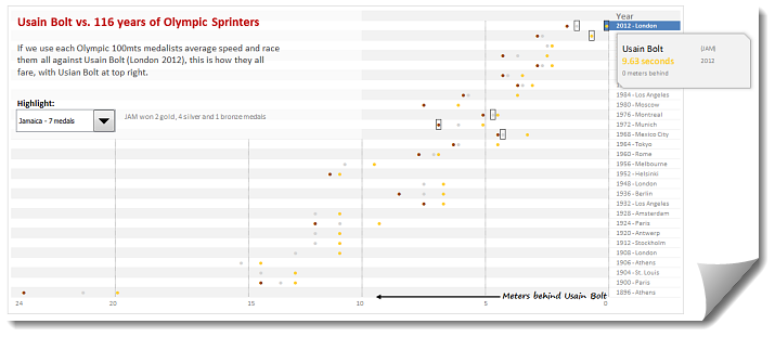
During London 2012 Olympics, Usain Bolt reached the 100mts finish line faster than anyone in just 9.63 seconds. Most of us would be still reading this paragraph before Mr. Bolt finished the race.
To put this in perspective, NY Times created a highly entertaining interactive visualization. Go ahead and check it out. I am sure you will love it.
So I wanted to create something similar in Excel. And here is what I came up with.
Continue »
Today Formula Forensics looks at a formula that Highlights Only the Duplicate Entries in a range.
Continue »![Making your dashboards interactive [Dashboard Essentials]](https://img.chandoo.org/vp/grammy-bump-chart-replication-in-excel-demo.gif)
Everyone likes to be in control. Even my 2 year old daughter jumps with joy when she lays her hands on TV remote. She pushes the buttons and assumes it is working. It is another story that we rarely watch TV at home.
By adding an element of control, we can make our dashboard reports fun. Interactive elements like form controls, slicers etc. invite users to play with your dashboard, get involved and understand data by asking questions. That is why I recommend making dashboards interactive.
Today lets understand how you can make dashboards interactive.
Continue »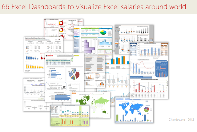
Ladies & gentleman, put on your helmets. This is going to be mind-blowingly awesome.
See how many different ways are there to analyze Excel salary data. Look at these 66 fantastic, beautifully crafted dashboards and learn how to one up your dashboard awesomeness quotient.
Continue »{ 88 Comments }
Analyzing 20,000 Comments
Published on Jul 19, 2012 in Charts and Graphs, Cool Infographics & Data Visualizations
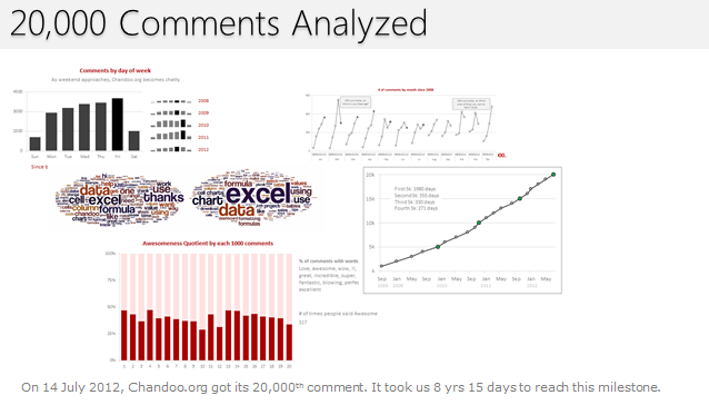
On 14th July, evening 4:51 PM (GMT), Chandoo.org received its 20,000th comment. 20,000!
The lucky commenter was Ishav Arora, who chimed, “Like super computers…Excel is a super calculator!!!!” in our recent poll.
It took us 8 years & 15 days since the very first comment to get here. And it took just 1 year 7 months & 23 days to add the last 10,000 comments (we had our 10,000th comment on 21st November, 2010).
Out of curiosity, I wanted to understand more about these 20,000 comments. So I downloaded our comment database, dumped it in Excel and start analyzing.
Continue »{ 70 Comments }
Highlight Row & Column of Selected Cell using VBA
Published on Jul 11, 2012 in Excel Howtos, VBA Macros
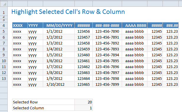
When looking at a big table of analysis (or data), it would make our life simpler if the selected cell’s column and row are highlighted, so that we can instantly compare and get a sense of things. Like above.
Who doesn’t like a little highlighting. So lets learn how to do highlighting today.
Continue »{ 21 Comments }
Visualizing Roger Federer’s 7th Wimbledon Win in Excel
Published on Jul 9, 2012 in Cool Infographics & Data Visualizations
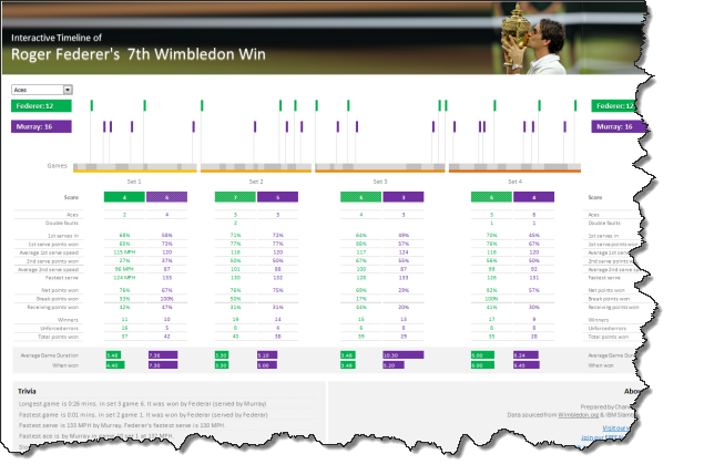
Did I tell you I love tennis? Some of my personal heroes & motivators are tennis players. And as you can guess, I admire Roger Federer. Watching him play inspires me to achieve more. So last night when he lifted Wimbledon trophy for 7th time, I wanted to celebrate the victory too, in my style. So I made an interactive timeline chart in Excel depicting his victory.
Continue »{ 15 Comments }
Highlight Employees by Performance Rating – Conditional Formatting Challenge
Published on May 18, 2012 in Excel Challenges, Learn Excel
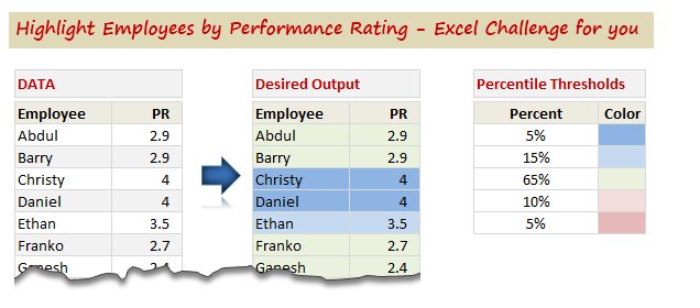
So who is up for an Excel challenge?
Shelly, who is an HR Manager sent this distress call last week,
“I have a group of employees- lets say 100 employees. Each employee has a performance rating attached to them. I want to divide the group by 5%, 15%, 65%, 10%, 5% based on their performance rating.”
And that is our challenge today. Read on & help Shelly.
Continue »![Interactive Sales Chart using MS Excel [video]](https://img.chandoo.org/vp/interactive-sales-chart-quick-demo.gif)
Finally, I got some time to sit down and do what I love most – write a blog post to make you awesome in Excel. After a whirlwind trip to Sydney, I am back in India to spend few days with my kids & wife before rushing to Australia to run 2nd leg of my training programs (in Perth, Melbourne & Brisbane). I did 2 sessions in Sydney – one for KPMG and other for public and both went very well. We got lots of positive feedback and people really loved it. I am saving the details for another post, but today lets talk about Interactive Sales Chart using Excel.
Take a look at the Interactive Sales Chart
First, take a look at interactive sales chart. Today, you will learn how to build this using Excel.
Continue »
Pivot tables are a great way of summarising and consolidating data to produce summary reports.
One of the main limitations of Pivot tables is that they don’t natively return Text values.
This post looks at a method to work around this without the use of VBA.
Continue »{ 4 Comments }
Creating Customer Service Dashboard in Excel [Part 3 of 4]
Published on Apr 18, 2012 in Charts and Graphs, Learn Excel
![Creating Customer Service Dashboard in Excel [Part 3 of 4]](https://img.chandoo.org/dashboards/constructing-charts-customer-service-dashboard.png)
Welcome back. In third installment of our Customer Service Dashboard series, we will learn how to construct the charts in our dashboard. We will understand the sparklines, traffic lights & dynamic chart setup. To help you learn better, I have recorded a short video too. Go ahead and enjoy.
Continue »{ 12 Comments }
Speeding up & Optimizing Excel – Tips for Charting & Formatting [Speedy Spreadsheet Week]
Published on Mar 21, 2012 in Charts and Graphs, Excel Howtos
![Speeding up & Optimizing Excel – Tips for Charting & Formatting [Speedy Spreadsheet Week]](https://img.chandoo.org/optimize/speeding-up-optimizing-excel-charts-formatting.png)
Is Excel acting slow & taking ages? As part of our Speedy Spreadsheet Week, today lets talk about optimizing & speeding up Excel by formatting & charting better. Use these tips & ideas to super-charge your sluggish workbook.
No matter how much data you got, how many formulas you wrote, the end users seldom see them on your workbook. They see the finalized dashboard, they play with the model, they look at the report. And if you make poor choices, your end users will thing your workbook is slow.
So let me present you 7 charting & formatting tips to optimize & speed up Excel. Read on…,
Continue »{ 10 Comments }
Comparing 2 Lists with a Twist
Published on Feb 6, 2012 in Excel Howtos, Learn Excel
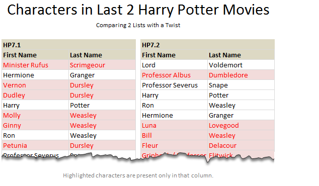
We love to compare. The instinct to compare leaves no one. Even my two year old twins compare their toys with each other (and fight).
It would make Excel hugely popular if Microsoft builds a handy data comparison tool right in to it. Alas, they have customizable ribbon, 3d effects & equation editor…
Since comparison is one of the main uses of Excel, we have written extensively about it here.
But there is always one more interesting comparison problem. Today, I want to share one such problem, based on a comment left by N-Man.
Continue »
Zebra Stripes and Checker Boards
This week in Formula Forensics I’m taking a break from Array Formulas to have a look at some Zebra Stripes and Checker Boards.
No, I haven’t gone crazy, although some may argue that point.
More specifically were going to take a look at, Zebra Stripes and Checker-Board Conditional Formatting.
Continue »
