All articles with 'column charts' Tag
Make info-graphics with shape fill technique [Charting Tip]
![Make info-graphics with shape fill technique [Charting Tip]](https://chandoo.org/wp/wp-content/uploads/2019/07/make-info-graphics-in-excel.png)
This is a quick, fun and elegant way to make impressive charts. You can easily create info-graphic style charts in Excel using shape fill technique. Something like this:
Continue »5 simple rules for making awesome column charts

For every column chart that is done right, there are a dozen that get messed up. That is why lets talk about 5 simple rules for making awesome column charts.
Tip: Same rules apply for bar charts too.
Continue »Make funky and creative hand-drawn chart in Excel – Quick tutorial

Charts are great way to tell story about what is going on in your business. But they also feel a bit too impersonal and meh. How about adding your personality to them? I don’t mean making them tall, dark and pretty. I mean using hand-drawing style to make them pop out. Something like above example of hand-drawn chart.
The best thing is, You don’t need to actually draw these charts by hand. We can use a powerful charting trick to get these charts automatically generated (and linked) to your data. Interested? Read on to learn how to create hand-drawn charts in Excel.
Continue »
Ever wanted to make a cool, snazzy interactive chart in Excel? Something like this:
In this tutorial, learn all about making your very first interactive chart. We use both formulas and pivot tables to build two versions of an awesome interactive chart in Excel.
Continue »How to add a line to column chart? [Charting trick]
![How to add a line to column chart? [Charting trick]](https://chandoo.org/wp/wp-content/uploads/2016/11/column-chart-with-line.png)
Let’s say you work in super hero factory as floor manager. You are looking at the recent time sheet data submitted by your underlings and want to know who works more. So you did what any self respecting floor manager does. You made yourself a large cup of hot chocolate, whipped open Excel and created a column chart.
But now, you want to add a line to it at 6:00 PM (or some other arbitrary point) so you can clearly see which superheros are over working.
So how do you go about it?
Continue »Cropped chart: when some values are too big to fit

We know that column charts are excellent for presenting information. But what if some of the columns are too tall and hijacking the rest. In a previous article, we discussed few of the approaches. Today let’s learn how to build a cropped chart (broken y-axis chart) using Excel, something like above.
Looks interesting? Read on.
Continue »CP032: Rules for making legendary column charts

Podcast: Play in new window | Download
Subscribe: Apple Podcasts | Spotify | RSS
In the 32nd session of Chandoo.org podcast, let’s make legendary column charts.
What is in this session?
Column charts are everywhere. As analysts, we are expected to create flawless, strikingly beautiful & insightful column charts all the time. Do you know the simple rules that can help you create legendary column charts?
That is our topic for this podcast session.
In this podcast, you will learn
- Few personal announcements
- Rule 0: Start at zero
- Rule 1: Sort the chart
- Rule 2: Slap a title on it
- Rule 3: Axis + grid-lines vs. Lables
- Rule 4: Moderate formatting
- Conclusions
Revenue vs. Commission growth – Getting the message across [BYOD]
Situation: Our commissions are growing way faster than revenues
Let’s say you are looking revenues & sales commissions of your company for last few years. The data looks like this:

And you want to highlight the fact that commissions are growing faster than revenues.
So you plot YoY growth rates for revenues & commissions.
Problem: The chart of YoY growth rates is not convincing
Take a look at the chart. It doesn’t convey the message that we want. At best it says “revenue growth is less than commission growth”

How to convey the message “Commission growth is a problem for us”?
Continue »Bar chart with lower & upper bounds [tutorial]
![Bar chart with lower & upper bounds [tutorial]](https://img.chandoo.org/c/bar-chart-with-lower-and-upper-bounds.png)
Bar & Column charts are very useful for comparison. Here is a little trick that can enhance them even more.
Lets say you are looking at sales of various products in a column chart. And you want to know how sales of a given product compare with a lower bound (last year sales) and an upper bound (competition benchmark). By adding these boundary markers, your chart instantly becomes even more meaningful.
Lets learn how to create a column chart with lower & upper bounds in this tutorial.
Continue »How to create a column chart with background image in Excel ?

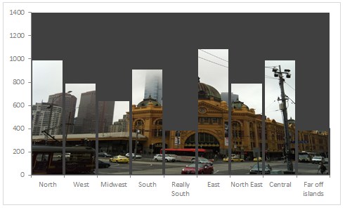
Tony sends this chart and asks if it can be done in Excel.
It sounded like a good challenge for a lazy Sunday morning. So here we go. (Posting it on Monday).
Now I could not get an oil rig photo or that data. So I made up few numbers and used a photo of Flinders street station I took when I was in Melbourne last year.
Continue »Shading above or below a line in Excel charts [tutorial]
![Shading above or below a line in Excel charts [tutorial]](https://img.chandoo.org/c/shaded-line-charts-tell-a-better-story.png)
When comparing 2 sets of data, one question we always ask is,
- How is first set of numbers different from second set?
A classic example of this is, lets say you are comparing productivity figures of your company with industry averages. Merely seeing both your series as lines (or columns etc.) is not going to tell you the full story. But if we can shade our productivity line in red or green when it is under or above industry average… now that would be awesome! Something like above.
Continue »![Interactive Sales Chart using MS Excel [video]](https://img.chandoo.org/vp/interactive-sales-chart-quick-demo.gif)
Finally, I got some time to sit down and do what I love most – write a blog post to make you awesome in Excel. After a whirlwind trip to Sydney, I am back in India to spend few days with my kids & wife before rushing to Australia to run 2nd leg of my training programs (in Perth, Melbourne & Brisbane). I did 2 sessions in Sydney – one for KPMG and other for public and both went very well. We got lots of positive feedback and people really loved it. I am saving the details for another post, but today lets talk about Interactive Sales Chart using Excel.
Take a look at the Interactive Sales Chart
First, take a look at interactive sales chart. Today, you will learn how to build this using Excel.
Continue »
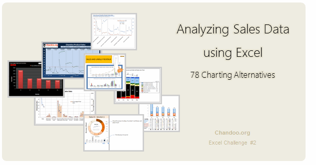
Recently, I ran a contest asking you to analyze a bunch of sales data and present your results in charts. We received a total of 78 charts from 45 people. The contest entries had a mind-boggling variety of excel charts, techniques and ideas. It took me a while to go thru all the files and compile the results. Thanks for your patience. In this post, you can find all the charts along with my comments & links to download files.
Continue »Win Loss Chart from a Series of Win, Loss Data

Last week, we learned how to create win-loss charts in Excel. In the comments, Dan said,
“Incidentally, the fastest way to do this would be using SFE, just reflect your data with 1 for a win, – 1 for a loss. There’s even an option to automatically invert negative numbers.”
Of course, we can use the beautiful Sparklines for Excel addin to do this and several other charts. But if you just have a series of Wins and Losses, like below, you can use a column chart to create win loss charts too.
Today, we will learn how to create a win loss chart from a set of win, loss data in Excel.
Continue »
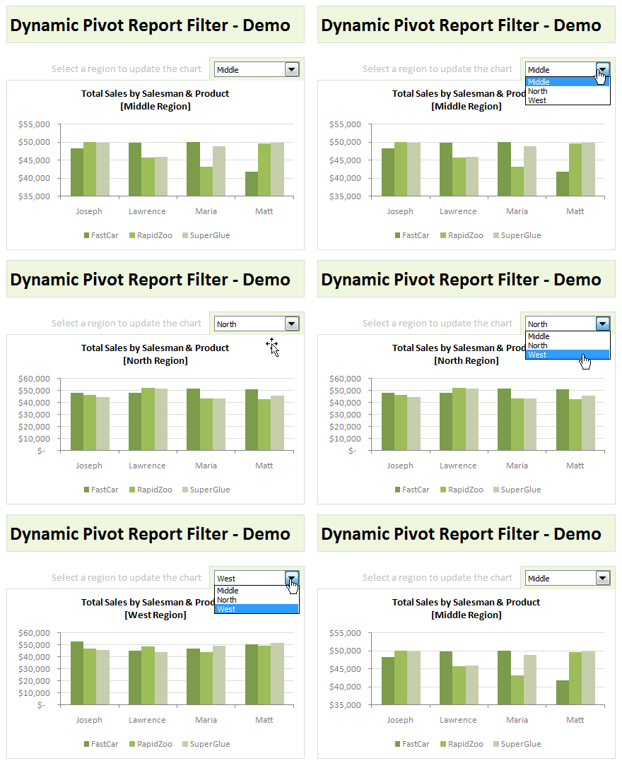
Last week, we have learned what Pivot Table Report Filters are & how to use them.
Today, I am going to show, how you can use simple macro code to change the report filter value dynamically.
We will learn how to create the chart shown here.
Continue »

