All articles with 'column charts' Tag
{ 11 Comments }
Excel Teens are out to get you & Other findings from our Survey
Published on Feb 25, 2011 in Charts and Graphs
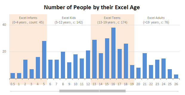
Our of curiosity and fun I asked you “how long have you been using Excel?”. I was overwhelmed by the response we got to this simple question. More than 437 people responded with their comments, stories and enthusiastic responses. Thank you so much.
It would taken me more time to make the charts and understand the data. But thanks to Hui, who volunteered to tabulate all the survey data in a simple CSV.
Shown above is a chart I came up with based on the data. Read the rest of the post to understand the survey results and view more charts. Also, you can download the excel workbooks and original data set to play.
Continue »{ 8 Comments }
Introducing PHD Sparkline Maker – Dead Simple way to Create Excel Sparklines
Published on Mar 22, 2010 in Charts and Graphs

Sparkline or Microchart is a tiny little chart that you can place on dashboards, reports or presentations to provide rich visualization without loosing much space. In excel 2010, MS introduced a beautiful feature for creating sparklines from data in spreadsheets. For earlier versions of Excel (that is 2007 and before) there is no native support […]
Continue »{ 18 Comments }
Best Charts to Compare Actual Values with Targets – What is your take?
Published on Dec 18, 2009 in Charts and Graphs, Featured
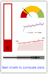
Comparing values is one of the main reasons we make charts. Yesterday we have a post on using thermometer charts to quickly compare actual values with targets. Today we follow up the post with 10 charting ideas you can use to compare actual values with targets. Check out how bullet charts, thermometer charts, traffic lights, gauges, column charts, area charts can help you compare targets with actual performances. A review of best charting options when you need to compare.
Read the rest of the post to see the options and participate in poll.
Continue »{ 39 Comments }
Make a Quick Thermometer Chart to Compare Targets and Actuals
Published on Dec 17, 2009 in Charts and Graphs

Comparing values is one of the reasons why we make charts. So today I am going to teach you a handy little trick to make a thermometer like chart to compare targets with actuals. This type of chart is very useful when you have a bunch of sales targets and you want to measure how the performance has been.
Continue »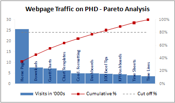
A Pareto chart or pareto graph displays the importance of various factors in decreasing order in columns along with cumulative importance in a line. Pareto charts are often used in quality control to display most common reasons for failure, customer complaints or product defects. The pareto chart is a great way to do the pareto analysis. Today, we will learn how to use excel to make a pareto chart.
Continue »{ 26 Comments }
Dynamically Grouping Related Events [Excel Combo Charts with Pizzazz]
Published on Aug 27, 2009 in Charts and Graphs
![Dynamically Grouping Related Events [Excel Combo Charts with Pizzazz]](http://chandoo.org/img/n/dynamic-event-grouping-charts-th.gif)
Yesterday we have posted how to use excel combo charts to group related time events. Today we will learn how to change the event grouping dynamically using form controls.
This effect can be easily achieved with a cup of coffee, one combo box form control and the good old IF formula. Read more to learn how to do this.
Continue »{ 10 Comments }
Using Combo Charts to Group Related Time Events [Charting Goodness]
Published on Aug 26, 2009 in Charts and Graphs
![Using Combo Charts to Group Related Time Events [Charting Goodness]](https://chandoo.org/wp/wp-content/uploads/2009/08/excel-combo-chart-th.png)
In his latest book, Now You See It, on pages 165 and 166 of the book, Stephen Few discusses how grouping related time intervals can facilitate analysis of data. As an illustration he explains that when viewing data of daily website visits, it helps in separating weekdays and weekends to differentiate expected traffic during these periods. The use of this technique would make it easier for the analyst to identify any anomalous movement in ether the weekend or the week day.
Fortunately excel combo charts can help you do that. In this guest post, Paresh explains to us how to do this.
Continue »{ 106 Comments }
Waterfall Charts using Excel
Published on Aug 10, 2009 in Charts and Graphs, Featured

Learn how to create waterfall charts in Excel in this tutorial. Our guest author, Aaron, explains how to create cool looking waterfall charts with connectors. Waterfall charts are great, especially for visually showing the contribution of parts to a whole.
Continue »
