
Japanese Candlestick Chart or Candlestick Chart as they are popularly known are one of the most commonly used stock charts.
According to Wikipedia, a Japanese Candle Stick Chart is,
Candlesticks are usually composed of the body (black or white), an upper and a lower shadow (wick). The wick illustrates the highest and lowest traded prices of a stock during the time interval represented. The body illustrates the opening and closing trades. If the stock closed higher than it opened, the body is white, with the opening price at the bottom of the body and the closing price at the top. If the stock closed lower than it opened, the body is black, with the opening price at the top and the closing price at the bottom. A candlestick need not have either a body or a wick.
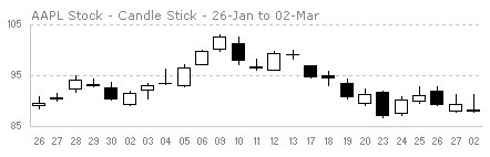
Today we will learn how to make a candlestick chart in Microsoft Excel in 4 simple steps. For our purpose, we will plot candlestick chart for Apple stock prices between Jan 26 and May 02.
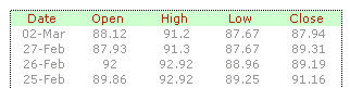
1. First get the stock price data
You can get stock price details – open, high, low, close prices for the stock chart from anywhere. I have used google finance (here)
The data should be in this format for us to make the chart:
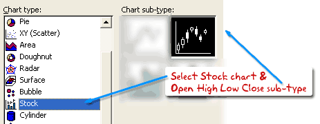
2. Insert stock chart
Select your data and launch insert chart dialog and select “stock chart” as type and “Open High Low Close Chart” as sub-type.
This will insert a chart like the one shown below.
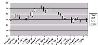
However there is a problem with this chart: excel leaves blanks when stock market is on leave (for eg. weekends) so,
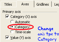
3. We change the axis type from time-scale to category
Right click the chart and select chart options and in the “axes” tab change the category axis type from “automatic” to “category”. This ensures that excel treats dates as categories instead of times and thus removes the blanks.
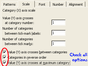
But when we do this, excel reverse the dates, thus your new chart would read from 02 march to 26 jan instead of the otherway around. To fix this, select the category axis, and check the categories in reverse order and value axis crosses at maximum category options. This sets the date order correctly.
4. We are almost done, now format the chart
Adjust axis scaling options, grid lines etc and you have a Japanese candlestick stock chart ready.
Download the Japanese Candlestick Chart Template
Go ahead and download the Japanese Candlestick Chart Tutorial workbook and use the template to make stock charts.
More Stock Charts using Excel
Sign up for e-mail updates or RSS Feeds to learn how to make more stock charts using excel as they are posted.


20 Responses to “Japanese Candlestick Chart – Excel Tutorial”
I actually prefer the weekend gaps. They provide me with a better sense of time than a lot of data just piled up. But that's just me.
Suggestion: Use a lighter gray solid line for your horizontal gridlines. Dotted lines attract more attention than solid lines.
I've written a few articles about stock charts in Excel:
Stock Charts and Other Line Chart Tricks
Horizontal Stock Chart
Stock Chart with Added Series
Candlestick Alternative: Individually Colored Up-Down Bars
Stock Charts in Excel 2007
The weekend gaps act for me like an invisible panel of sorts allowing to visualize each weeks data individually, and then collectively.
@Jon: very good suggestion about the gird lines. the dullest gray in 2003 is still strong... so I end up using dotted lines.. but I you are right, using very dull colors is still better.
On weekend gaps, I found them somewhat distracting and creating discontinued picture in the stock price movement. Instead of the gap, I prefer background shading for alternative weeks (somewhat lengthy to implement in excel)
@Somnath... see above...
Hello Chandoo,
Our company has a WinXP/Office 2003 custom software image that gets installed onto every PC. So, the candlestick does not show up even when I choose the options you ask us to in the tutorial. I downloaded your sample, chose to save your candlestick format as a template and tried using it. Still, the candlestick does not show up.
What am I missing?
Any help is appreciated.
P.S: Hope you had a good vacation during Easter.
Regards,
Suresh.
@Suresh: Welcome to PHD and thanks for commenting.
Since you guys have a customized version of office, it might be possible that they have removed certain features at the time of installation. I am not sure how I can help you. Did you check with your IT admin to understand what features are included and what add-ins (if needed) are available for you? Sometimes you can install and addin to get certain types of charts.
Hello Chandoo,
Hope you had a nice quiet weekend recovering from the Easter trip. Here's part 2 of the story. I ran this problem past my wife and she pointed me to a really simple fact. I was simply using too much data! Yes, as simple as that. So, we chose a small subset, and guess what? Your candlestick showed up beautifully on the chart page. X-(
P.S: I am still bemused from the simplicity of the point escaping me. I hope this will help others, IF at all they face such a problem.
Thanks for the reply.
Suresh.
Thanks very much - that solved my problem. I did not know that in the special case of a stock chart a data array must be highlighted BEFORE inserting the chart onto the worksheet.
Is it possible to overlay [eg] a moving average on the chart?
I have not been able to do it.
[...] reading the Japanese Candlestick Charts in Excel post, Gene asks me in an email, I’m trying to graph candlestick charts in Excel for 10 minute [...]
I have imported eSignal CSV data into Excel, of the form:
Bar,Date,Time,Open,High,Low,Close
1,02/02/99,00:00,2130.93,2133.40,2065.74,2078.69
2,02/03/99,00:00,2078.69,2120.10,2064.34,2119.94
3,...
Ideally, I would like to use a Scatter (XY) chart with date and time merged together and displayed as "category" data on the x axis, with a single choice of y value -- say "Close" -- without munging the original data. I could then apply linear best-fit analysis as desired. However, Excel won't let me use "category" data on the x axis for Scatter.
My next choice would be to use a Stock chart. Is there a way to concatenate (merge) date and time for the x axis (as category data) and settle for the "candlestick" icon for this chart?
Respected,
I want the chart template for making candlestick starts for SPOT and FUTURE considering its OPEN-HIGH-LOW-CLOSE-VOLUME(Volume has to be put in the beginning in Excel 2010 and thats okay.
and other one to compare(charting side-by-side in same graph) this with Index.
Zohar
zoharsb@gmail.com
@Zohar
refer: http://chandoo.org/forums/topic/comparing-spot-and-future-in-a-candlestickbar-chart
Hi,
Actually I want to prepare a chart for gold/silver with following requirements:
intraday
5 & 10 min MA (moving average)
slow stochastic indicator
candlestick
Most important, I want to have a live chart moving as per the current market.
Kindly suggest/help/provide me a tool to prepare such live chart.
Regards,
ashish
[...] a split second. So candlestick charts are one of the most useful visual aids for any forex trader. Among the many types of technical analysis available to forex traders, the single most useful and po...reason they are often known as Japanese candlestick charts, and many of the patterns that they form [...]
Guys - How to draw horizontal lines to show Pivot, Support and Resistance lines
[...] Japanese Candlestick Chart – Excel Tutorial – ChandooMar 4, 2009 … Today we will learn how to make a candlestick chart in Microsoft Excel in 4 simple steps. For our purpose, we will plot candlestick chart for … [...]
I want to highlight the base candle or the boring candle in chart by changing the colour of the candle in excel can anyone help me in doing this?
Thanks in advance
@Maheshwari
How do you want to change the color?
Which specific Candle or is it all candles ?
How do you highlight the chart area in Japanese Candle stick charts?
For this, I had been using MarketXLS and it's great.
It has instructions which can help you.
They also have live support and forum to help you anytime.
how do we plot candle stick patterns from excel like hammer, doji, shooting star, bullish engulfing etc...