All articles with 'charts' Tag
Quickly change charts from one to another with this trick

We all change minds. Heck, I just did it with the leading line. I thought something else, but went with what you just read. So why must Excel charts be set in stone? Let’s say you made some charts and want to quickly second guess your selection. How to change Excel chart easily? Sure, you […]
Continue »CP029: Impress your boss with Excel charts – 6 step road map for you

Podcast: Play in new window | Download
Subscribe: Apple Podcasts | Spotify | RSS
In the 29th session of Chandoo.org podcast, let’s impress the boss with Excel charts.
What is in this session?
Many Excel charts live a short life. They spawn in an ambitious analyst’s spreadsheet. They go to boss with literally flying colors. The boss frowns, they disappear in to recycle bin.
Don’t curse your Excel charts with short life span.
Here is a 6 step road map to help you create awesome Excel charts, everytime.
That is our topic for this podcast session.
In this podcast, you will learn
- Quick announcements about 50 ways & Einstein
- 6 step road map for charting success
- ONE: Dig your data
- TWO: Validate insights
- THREE: Pick charts that go well
- FOUR: Add title & message
- FIVE: Remove clutter
- SIX: Prompt action
- A real life example with road map in action
- Resources for creating awesome charts
Quick and easy Gantt chart using Excel [templates]
![Quick and easy Gantt chart using Excel [templates]](https://img.chandoo.org/pm/quick-gantt-chart-template-excel.png)
Gantt charts are a very popular way to visually depict project plans. Today, let us learn how to use Excel to make quick & easy Project Plan Gantt Chart.
This is what we will be creating.
Continue »
Last week, we had a lovely poll on what are your favorite features of Excel? More than 120 people responded to it with various answers. So I did what any data analyst worth his salt would do,
I analyzed the data and here are the top 10 features in Excel according to you.
Read on to learn more.
Continue »Monitoring Monthly Service Levels using Excel Charts [Example]
![Monitoring Monthly Service Levels using Excel Charts [Example]](https://img.chandoo.org/c/service-levels-7-years-excel-chart.png)
Recently, I wrote a tutorial on tax burden in USA chart.
Jared, One of our readers liked this chart very much. Jared works as a workforce scheduler and has data similar to our chart. So he applied the same technique to analyze monthly service levels for last 7 years & sent me the file so that I can share it with all of you.
First take a look at the demo of Jared’s chart. And read on to know how this works.
Continue »Analyzing 20,000 Comments

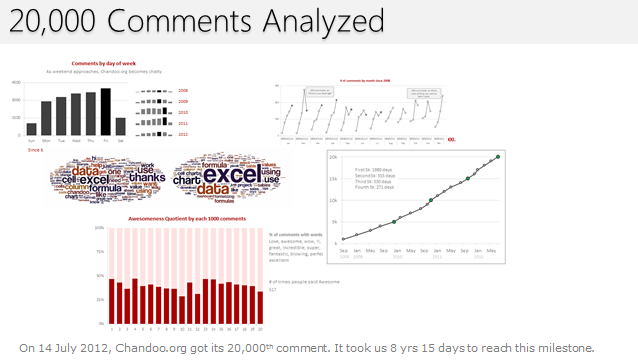
On 14th July, evening 4:51 PM (GMT), Chandoo.org received its 20,000th comment. 20,000!
The lucky commenter was Ishav Arora, who chimed, “Like super computers…Excel is a super calculator!!!!” in our recent poll.
It took us 8 years & 15 days since the very first comment to get here. And it took just 1 year 7 months & 23 days to add the last 10,000 comments (we had our 10,000th comment on 21st November, 2010).
Out of curiosity, I wanted to understand more about these 20,000 comments. So I downloaded our comment database, dumped it in Excel and start analyzing.
Continue »![Interactive Sales Chart using MS Excel [video]](https://img.chandoo.org/vp/interactive-sales-chart-quick-demo.gif)
Finally, I got some time to sit down and do what I love most – write a blog post to make you awesome in Excel. After a whirlwind trip to Sydney, I am back in India to spend few days with my kids & wife before rushing to Australia to run 2nd leg of my training programs (in Perth, Melbourne & Brisbane). I did 2 sessions in Sydney – one for KPMG and other for public and both went very well. We got lots of positive feedback and people really loved it. I am saving the details for another post, but today lets talk about Interactive Sales Chart using Excel.
Take a look at the Interactive Sales Chart
First, take a look at interactive sales chart. Today, you will learn how to build this using Excel.
Continue »Our VBA Class Registrations Close in Few Hours, Join Now & Learn Excel VBA

Hi everyone, I have a quick announcement for you.
Registrations for our VBA class will be closing in a few hours
As you may know, we have re-opened the doors for our VBA Class on September 5th. This program is aimed at beginners & intermediate level users. The aim of our VBA class is to make you awesome in Excel & VBA.
We will be closing registrations for this program in few more hours (exactly at 11:59 PM, Pacific time, on 16th September, 2011)
Click here to join our VBA Class now.
Continue »
Last week I introduced the technique of using custom Number Formats for Chart Axis labels.
Today I present a few more alternative layouts including Chart Series Data Label Formats.
Continue »VBA Classes Registration Closing in a Few Hours – Join Now!

I have a quick announcement for you.
Registrations for our VBA Class will be closing in a few hours
As you may know, we have opened registrations for our first batch of Online VBA classes on May 9th. This program is aimed at beginners & intermediate level VBA users. The aim of this course is to make you awesome in VBA. We will be closing registrations for this program in few more hours (exactly at 11:59 PM, Pacific time, on 20th May 2011)
Click here to join our VBA Class now.
Continue »
How to make a 5 Star Chart (Similar to Amazon)
Last week Chandoo presented Give more details by showing average and distribution
At the top of the post was a small screen capture from Amazon.com showing a 5 Star chart showing that Twilight had a 3.5 Star Rating (way over-rated if you ask me).
I received an email shortly afterwards from Rajiv, “How can I make one of those charts ? ” with the Stars Circled
It’s actually very simple and this post will show you how.
Continue »
In the final post of the Are You Trendy? series we will look at the use of Excel Charts and associated Trendlines for trend analysis and I will give you a free tool (Normally valued at $200, I wish) which will allow interactive assessment of a Charts Trendline Y value for any X value.
Continue »An Excel Dashboard to Visualize 10,007 Comments [Dashboard Tutorial]
![An Excel Dashboard to Visualize 10,007 Comments [Dashboard Tutorial]](https://chandoo.org/img/vp/10007-comments-dashboard-thumb.png)
First some good news, On 21st November, 2010, our little blog received its 10,000th comment!
Thank you so much for making this happen.
Those of you reading chandoo.org for a while know my penchant for comments. I have learned a lot of excel tips & ideas just by reading the comments you posted on this blog. I think comments are one of the best parts of this blog. So, naturally, I wanted to celebrate this milestone, with something big & awesome.
My intention was to download all the 10,000+ comments and play with the data to come up with something outstanding, like a dashboard. It took me 2 days to conceptualize and create this beauty.
Continue »Financial Modeling School Closing in a Few Hours – Join Now!

I have a quick announcement for you.
As you may know, I am running an Online Financial Modeling Training Program called as Financial Modeling School in collaboration with Pristine Education. We have opened registrations for first batch of this program on October 18th. Thank you very much for supporting this program wildly. In a few hours, I will be closing the registrations for Financial Modeling School.
Click here to sign up for Financial Modeling School
Continue »August 2010 – Best Month Ever (and 2 charting tips inside)

Time to stop everything we do and celebrate, for, our little community at chandoo.org had the most fantastic, awesome month ever.
That is right. August 2010 has been the best month since I started chandoo.org. We have broken a majority of previous records in terms of conversations, connections, content and revenues.
In August, we had 17 posts, with 604 comments. We had 178,000 visitors reading 453,000 pages. Our RSS subscriber base grew to 11,917 (it was 5738 an year ago). August has been the best month in-terms of revenues too. We sold highest number of project management templates & excel formula e-books since launch. We had a stellar launch for wedding planner with 22 customers.
Read rest of this post to find statistics about chandoo.org and get 2 charting tips.
Continue »

