All articles with 'charting' Tag
Our VBA Class Registrations Close in Few Hours, Join Now & Learn Excel VBA

Hi everyone, I have a quick announcement for you.
Registrations for our VBA class will be closing in a few hours
As you may know, we have re-opened the doors for our VBA Class on September 5th. This program is aimed at beginners & intermediate level users. The aim of our VBA class is to make you awesome in Excel & VBA.
We will be closing registrations for this program in few more hours (exactly at 11:59 PM, Pacific time, on 16th September, 2011)
Click here to join our VBA Class now.
Continue »Suicides & Murders by US States – An Interactive Excel Chart
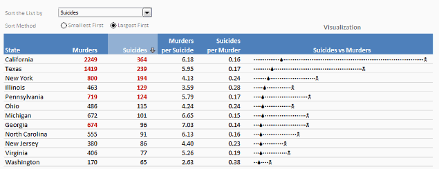
Over at PTS Blog, my dear friend & charting guru, Jon Peltier has an interesting post on using dot plots to visualize Murders & Suicides data by US States.
Not that murders & suicides fascinate me, but I wanted to play with this data myself and see how we can visualize it. So I emailed Jon and asked him to share the raw data. Being a lovely chap Jon is, he immediately sent me the data. So here we are, playing with gory data on a Friday.
Suicides & Murders by US States – An Interactive Excel Chart
You can see a demo of the chart I came up with above. Read on to learn how this chart is constructed.
Continue »
You’ve been there before. It’s almost 5:00, and you are going crazy trying to finish the presentation due for a monthly performance meeting the next morning. The model is refreshed, and now it just takes a LOT of copying, pasting, and positioning to get the PowerPoint ready. Finally, the slides are finished…, until you read a new message from your boss requesting a minor change. But of course her change means you have to start all over with the copy and pastes…
There is always a better way! In the Oil and Gas industry, I constantly have monthly reports to assess the performance of our operating assets. Excel VBA makes it a cinch to automate the entire process. So when a simple change is requested, the presentation is automatically generated with the click of a button. No more wasting time!
Continue »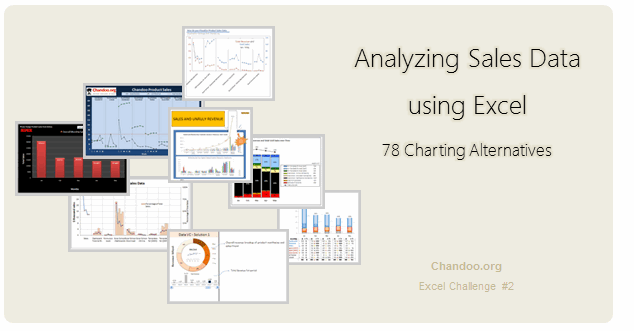
Recently, I ran a contest asking you to analyze a bunch of sales data and present your results in charts. We received a total of 78 charts from 45 people. The contest entries had a mind-boggling variety of excel charts, techniques and ideas. It took me a while to go thru all the files and compile the results. Thanks for your patience. In this post, you can find all the charts along with my comments & links to download files.
Continue »Excel Links – Updates on Singapore Workshop Edition
It has been a while since we had an Excel Links post. So here we are.
First, I want to update you about our Singapore Workshop.
As you know, we have opened the registrations for this workshop last week. If you are in Singapore and want to attend an Excel & Financial Modeling Workshop, Please consider joining us on July 8- 10. For details & enrollment, visit Singapore Bootcamp page.
Apart from the Singapore workshop, I was busy last week conducting live training at CapGemini, in their Hyderabad office on Excel & Dashboards. It was a very good experience. I learned a lot about practical challenges people face when doing sales reports etc. using Excel.
Continue »Win Loss Chart from a Series of Win, Loss Data

Last week, we learned how to create win-loss charts in Excel. In the comments, Dan said,
“Incidentally, the fastest way to do this would be using SFE, just reflect your data with 1 for a win, – 1 for a loss. There’s even an option to automatically invert negative numbers.”
Of course, we can use the beautiful Sparklines for Excel addin to do this and several other charts. But if you just have a series of Wins and Losses, like below, you can use a column chart to create win loss charts too.
Today, we will learn how to create a win loss chart from a set of win, loss data in Excel.
Continue »How to create a Win-Loss Chart in Excel? [Tutorial & Template]
![How to create a Win-Loss Chart in Excel? [Tutorial & Template]](https://img.chandoo.org/c/win-loss-chart-excel-template.png)
Win Loss Charts are an interesting way to show a range of outcomes. Lets say, you have data like this:
win, win, win, loss, loss, win, win, loss, loss, win
The Win Loss chart would look like this:

Today, we will learn, how to create Win Loss Charts in Excel.
We will learn how to create Win Loss charts using Conditional Formatting and using In-cell Charts.
Continue »How Would You Visualize Product Sales Data? [Excel Challenges #2]
![How Would You Visualize Product Sales Data? [Excel Challenges #2]](https://chandoo.org/img/ec/2/ec2-visualize-product-sales-data.jpg)
We have a new Excel Challenge folks!
I know our friends in US are away celebrating Memorial Day weekend. But that should not leave rest of us from fun. So, we have a new Excel Challenge. This time, you need to make a chart, to visualize product sales data.
And what more, one lucky person could get an Amazon Kindle Reading Device (Wi-fi version) by making the chart.
Continue »VBA Classes Registration Closing in a Few Hours – Join Now!
I have a quick announcement for you.
Registrations for our VBA Class will be closing in a few hours
As you may know, we have opened registrations for our first batch of Online VBA classes on May 9th. This program is aimed at beginners & intermediate level VBA users. The aim of this course is to make you awesome in VBA. We will be closing registrations for this program in few more hours (exactly at 11:59 PM, Pacific time, on 20th May 2011)
Click here to join our VBA Class now.
Continue »Place Key Information in Golden Triangle on your Reports, Dashboards etc. [Quick Tips]
![Place Key Information in Golden Triangle on your Reports, Dashboards etc. [Quick Tips]](https://img.chandoo.org/dashboards/golden-traingle-excel-workbooks.jpg)
Today, we will take a detour to world-wide web and learn how we can improve our dashboards, reports, presentations or workbooks by using one of the ideas, called as Golden Triangle.
Continue »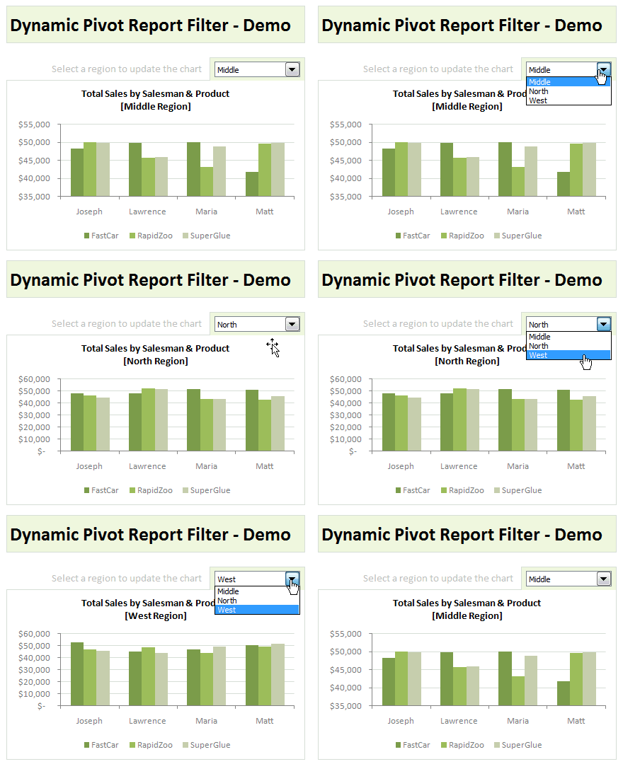
Last week, we have learned what Pivot Table Report Filters are & how to use them.
Today, I am going to show, how you can use simple macro code to change the report filter value dynamically.
We will learn how to create the chart shown here.
Continue »Comparing Sales of One Product with Another [Excel Techniques]
![Comparing Sales of One Product with Another [Excel Techniques]](https://img.chandoo.org/c/comparing-sales-of-one-product-with-another-demo.png)
This is a guest article by Theodor on how to Compare Sales of One Product with Another
Ok, now here’s one for you.
Suppose you’d like to come up with a sales report on different products, comparing their evolution on the same period of different years (say Jan ’09 vs. Jan Jan ’10). At the same time, you’d like to keep an eye on their yearly trend (entire 2009 vs. entire 2010).
Read on to learn how you can use Excel Charts to do this very easily.
Continue »![Show Details On-demand in Excel [Tutorial + Training Program]](https://img.chandoo.org/c/on-demand-analysis-and-details-in-excel-demo.gif)
Yesterday, we have seen a beautiful example of how showing details (like distribution) on-demand can increase the effectiveness of your reports. Today, we will learn how to do the same in Excel.
Continue »Give more details by showing average and distribution [Charting Tips]
![Give more details by showing average and distribution [Charting Tips]](https://chandoo.org/img/c/show-distribution-along-with-average-to-give-more-details-charting-tips.jpg)
When we have lots of data, we try to summarize it by calculating the average. As they say, averages are mean, they do not give away much.
I want to share with you an interesting example from Amazon.com on how they give more details by combining average with distribution.
As you might know, Amazon shows the rating of each of the products they sell. Customers & users rate the products from 1 to 5 stars. When you visit the product page you will see the average rating. But there is a small down-arrow next to it. When you click on it, Amazon shows you the break-up of that rating so you have a better idea of how the ratings are split.
Continue »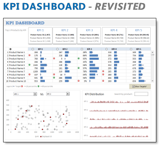
In 2008, I received an email from Robert Mundigl, which was the start of a life-long friendship. Robert asked me if he can teach us how to make KPI dashboards using Excel. I gladly said yes because I am always looking for new ways to use Excel.
The original KPI dashboards using Excel article was so popular. They still help around 12,000 people around the globe every month. Many of our regular readers and members have once started their journey on Chandoo.org from these articles.
In this article, we will revisit the dashboard and give it a fresh new spin using Excel 2007.
Continue »

