All articles with 'bar charts' Tag
![How to Visualize Survey Results using Incell Panel Charts [case study]](https://chandoo.org/img/cb/survey-results-panel-chart-example.png)
A panel chart (often called as trellis display or small-multiples) shows data for multiple variables in an easy to digest format. It lets users compare in any way and draw conclusions with ease.
Today, I want to discuss how the principles of panel chart can be applied to visualize a complex set of survey results. For this we will use the recent survey conducted by Gartner on how various customers use BI (Business Intelligence) tools.
Continue »
I have a new community project for all the members of PHD. It is a simple yet intuitive challenge. Make your own country’s flag using Excel Charts. To start the project, I have made the Indian flag using a bar and pie chart. Go ahead and see the rest of this post to findout how this chart is made and then participate in the “flag project” by making your own country’s flag. All the best.
Continue »Annual Goals Tracker Sheet [awesome ways to use excel]
Marko, who is a long time PHD reader and an excel ninja sent this via email, I work at an insurance company in Slovenia. At the beginning of each year we have a conversation with our superiors to review our work in the past year and to set new goals (main activities) that we’re gonna […]
Continue »Sachin Tendulkar ODI Stats – an Excel Info-graphic Poster

Sachin Tendulkar is undoubtedly the best cricketers to play One Day International Cricket. He is a source of inspiration and joy for me and many others. So, naturally I was jumping with joy when I heard that he scored the highest ever runs in a single match on 24th of Feb. He scored 200 runs […]
Continue »Best Month Ever (and a charting tip inside)
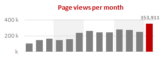
Let us take a minute and bask in some glory, for, our little community at PHD had the most fantastic month ever. That is right, January 2010 is so far the best month since I started blogging. We have broken all sorts of previous records on content, conversations, connections, traffic and revenue. In January, we […]
Continue »Use “Playbill” font to make your incell charts realistic [quick-tips]
![Use “Playbill” font to make your incell charts realistic [quick-tips]](https://img.chandoo.org/c/use-playbill-font-incell-charts.png)
Most of you already know that using the REPT formula along with pipe (“|”) symbol, we can make simple in-cell charts in excel. For eg. =REPT(“|”,10) looks like a bar chart of width 10. Despite the simplicity, most people don’t use in-cell charts because these charts don’t look anything like their counterparts. But you can […]
Continue »A Brief History of Microsoft Excel – Timeline Visualization
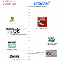
Timeline charts are great for providing quick snapshots of historical events. And hardly a day goes by without some one making a cool visualization of a time line of this or that. Time lines are easy to read, present information in a logical manner and mostly fun.
So yesterday, I set out to mimic the iconic gadgets of all time in excel, just for fun. Then it strike me, why not make a visual time line of Microsoft Excel ? So I did that instead.
Continue »Collapse, Expand Excel Charts using this hidden trick
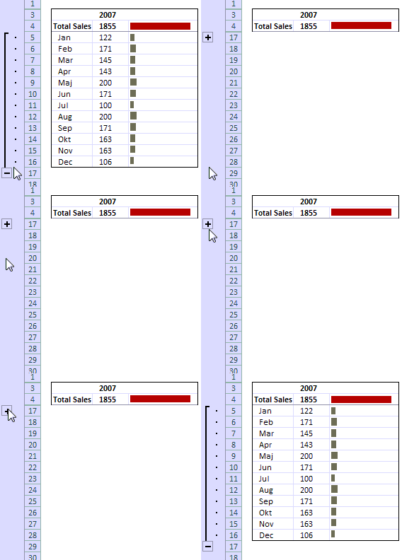
Do you know that you collapse or expand excel charts? Don’t believe me? Me neither. When I first realized that we can collapse / expand charts without writing any macros or lengthy formulas, I couldn’t wait to share it with all of you. This is such a simple yet powerful trick. See it for yourself.
The trick lies in using group / un-group data feature and carefully aligning charts with the cell grid. The whole process takes just about 2 minutes and produces wow factor worth a week. Go check it, now. Also, a downloadable template is included in the post.
Continue »Sales Dashboards – Visualizing Sales Data – 32 Dashboard Examples & Implementations

Sales reports and dashboards are very common in any company. There are several ways in which you can visualize sales data to understand the trends and sales performance. So in November, I have asked you to visualize sales data using sample data. The visualization challenge #2, sponsored by Zoho Reports generated a huge buzz around the community and fetched 32 incredible entries. The response was so overwhelming that it took me almost 24 hours to write this post. Thanks everyone for participating and making this a huge learning experience for everyone. Personally I have learned several useful dashboard and charting tricks. I will be sharing some of these lessons with all of you in the coming weeks.
Continue »Make a Quick Thermometer Chart to Compare Targets and Actuals
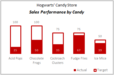
Comparing values is one of the reasons why we make charts. So today I am going to teach you a handy little trick to make a thermometer like chart to compare targets with actuals. This type of chart is very useful when you have a bunch of sales targets and you want to measure how the performance has been.
Continue »Top X chart – Show Top X values of a chart Interactively
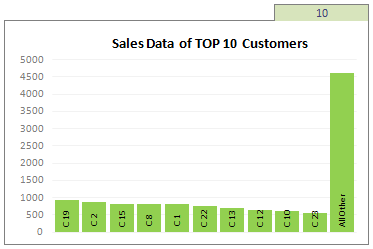
Two charting principles we hear all the time are,
- Sort your data in a meaningful order before plotting it.
- Show only relevant information, not everything – because un-necessary information clutters the chart.
Today we will learn a dynamic charting technique that will mix these two ideas in a useful way. I call this a Top X chart.
Continue »Dashboard Best Practice – Google Analytics Intelligence Report
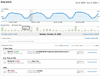
Yesterday while checking my website analytics reports on Google analytics site, I have noticed a new beta feature called “Intelligence”. Out of curiosity I clicked on it. It took me to a an intelligence alert dashboard. Ok, lets just back up for a minute and understand what “intelligence dashboard” is before moving on. In the […]
Continue »Switch Rows and Columns in Charts [Quick Charting Tip]
![Switch Rows and Columns in Charts [Quick Charting Tip]](https://chandoo.org/img/c/switch-rows-columns-in-charts.png)
Let us say you have built a nice chart showing your sales and profits for the top 5 products (learn how to highlight top 5 products in a list), with products on X axis. Suddenly your boss wants to switch the rows to columns (or transpose the chart) so that she can see metric level grouping instead of product level grouping. No need to freak out and rush to Espresso machine, You can do it very easily with Excel Charting features.
In today’s quick tip you will learn how to swap chart rows and columns in excel.
Continue »![Project Management Dashboard / Project Status Report using Excel [Part 6 of 6]](https://chandoo.org/img/pm/project-status-dashboard-th.png)
Project management dashboards, project status reports help stakeholders, project sponsors and team-members can understand project status very quickly. In the last installment of project management using excel, learn how to make project management dashboard using excel in this tutorial. Also download the excel project status dashboard template.
Continue »Recipe for a Donut Bar Chart
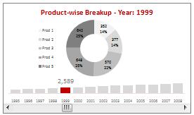
We all know that bar charts can be used to display values spread across various categories or times and pie charts / donut charts can be used to display percentage breakup of various quantities in a sum total. How about mashing up both to create a Donut Bar chart?
In this tutorial, you can learn how to make a donut bar chart and linking it to a form control to display Product-wise sales breakups spread across several years.
Continue »

