All articles with 'axis formatting' Tag
Excel Links – Delay in State migration visualization results edition
Hello friends,
First a quick update about state migration visualization contest.
We got more than 50 wonderful entries for this contest. I have compiled 50% of the entries. Due to personal reasons (its annual vacation time at our household), I had to delay the rest and resume it after first week of June. So the results will be announced in 2nd week of June. Thanks for understanding and your patience. Watch this space for mind-boggling dashboards in 3 more weeks.
Click “Read more” to get a sneak-peek at 3 random entries & 4 useful Excel links.
Continue »Making Small Multiples in Excel [Charting Technique]
![Making Small Multiples in Excel [Charting Technique]](https://img.chandoo.org/c/final-small-multiples-chart.png)
Today, lets learn how to create small-multiples (or panel charts) to visualize trend of 2 product lines over years in various regions. The inspiration for this chart and article came from my friend, Paresh‘s recent article on his blog.
See how you can create a combination of area & line chart to create the small-multiple chart and clone it. You can also download the workbook and play with it to understand this technique better.
Continue »![Show Details On-demand in Excel [Tutorial + Training Program]](https://img.chandoo.org/c/on-demand-analysis-and-details-in-excel-demo.gif)
Yesterday, we have seen a beautiful example of how showing details (like distribution) on-demand can increase the effectiveness of your reports. Today, we will learn how to do the same in Excel.
Continue »Show Months & Years in Charts without Cluttering

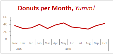
We make charts with date axis all the time. So, today we will learn how to set up axis settings in Excel so that Months & Years are shown neatly structured without cluttering your chart. See the example next to understand.
Continue »Thanks half a million… (and 2 excel tips)

I have a happy news to share with you!!! For the first time since starting this website, we got 500,000 + page views in the month of September 2010. Half-a-million! Thank you so much. To put this in context, in Sept 2009, we got 245,000 views. Traffic grew by more than 100% in last 12 […]
Continue »August 2010 – Best Month Ever (and 2 charting tips inside)

Time to stop everything we do and celebrate, for, our little community at chandoo.org had the most fantastic, awesome month ever.
That is right. August 2010 has been the best month since I started chandoo.org. We have broken a majority of previous records in terms of conversations, connections, content and revenues.
In August, we had 17 posts, with 604 comments. We had 178,000 visitors reading 453,000 pages. Our RSS subscriber base grew to 11,917 (it was 5738 an year ago). August has been the best month in-terms of revenues too. We sold highest number of project management templates & excel formula e-books since launch. We had a stellar launch for wedding planner with 22 customers.
Read rest of this post to find statistics about chandoo.org and get 2 charting tips.
Continue »How do you make charts when you have lots of small values but few extremely large values? [Debate]
![How do you make charts when you have lots of small values but few extremely large values? [Debate]](https://img.chandoo.org/c/charts-with-small-large-values-th.png)
Here is an interesting charting problem we come across once in a while. We have a lot of small numbers and a few very large numbers. How do we effectively plot all of them in a chart?
Now, how do you go about making a chart?
Continue »Introduction to Panel Charts using Excel – Tutorial & Template

In this article we will learn what a Panel Chart is and how you can construct a panel chart in Excel.
What is a Panel Chart?
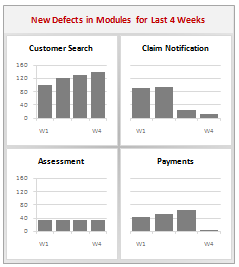
A panel chart is a set of similar charts neatly aligned in panels to help us understand some data which has multiple variables in it. Panel charts are also called by names “trellis displays” or “small multiples”. They are an effective way to display multi-variable data.
Here is an example panel chart showing the total defects per module over the last 4 weeks.
Continue »How to hide “0” in chart axis [quick tip]
![How to hide “0” in chart axis [quick tip]](https://chandoo.org/wp/wp-content/uploads/2009/12/hide-zero-chart-axis.png)
Have you ever wondered how you can hide that 0 (zero) at axis bottom? Like shown beside. You can use custom cell formatting codes (or custom number formatting codes) to do just that. Just go to axis formatting and from the number tab set the axis number format to something like #,##0;-#,##0;; Read the rest of the post to learn more.
What is the most embarrassing charting mistake you made? [weekend poll]
![What is the most embarrassing charting mistake you made? [weekend poll]](https://chandoo.org/wp/wp-content/uploads/2008/10/making-sports-dashboards-in-excel-sml.png)
This week’s poll is very simple. What is the the most embarrassing charting mistake your made?
For me it has to be that one time when I made a sports dashboard using excel. I have adjusted the axis scale of a bar chart so that my favorite cricket player (Sachin Tendulkar, who else?)’s records are emphasized. In a matter of minutes I have received several comments from all over world pointing out the mistake. Even though, the intention was to highlight the achievements of master blaster, the axis adjustment was obviously a mistake.
Continue »Switch Rows and Columns in Charts [Quick Charting Tip]
![Switch Rows and Columns in Charts [Quick Charting Tip]](https://chandoo.org/img/c/switch-rows-columns-in-charts.png)
Let us say you have built a nice chart showing your sales and profits for the top 5 products (learn how to highlight top 5 products in a list), with products on X axis. Suddenly your boss wants to switch the rows to columns (or transpose the chart) so that she can see metric level grouping instead of product level grouping. No need to freak out and rush to Espresso machine, You can do it very easily with Excel Charting features.
In today’s quick tip you will learn how to swap chart rows and columns in excel.
Continue »Make a Bubble Chart in Excel [15 second tutorial]
![Make a Bubble Chart in Excel [15 second tutorial]](https://chandoo.org/img/l/bubble-chart-excel-tutorial.png)
A Bubble chart displays circles (or bubbles) at given X and Y co-ordinates. Bubble chart is a very good way to show 3 dimensional data (for eg. Region-wise product sales) without confusing users. In this tutorial, we will learn how to create a bubble chart using excel.
Continue »
A Pareto chart or pareto graph displays the importance of various factors in decreasing order in columns along with cumulative importance in a line. Pareto charts are often used in quality control to display most common reasons for failure, customer complaints or product defects. The pareto chart is a great way to do the pareto analysis. Today, we will learn how to use excel to make a pareto chart.
Continue »Using Combo Charts to Group Related Time Events [Charting Goodness]
![Using Combo Charts to Group Related Time Events [Charting Goodness]](https://chandoo.org/wp/wp-content/uploads/2009/08/excel-combo-chart-th.png)
In his latest book, Now You See It, on pages 165 and 166 of the book, Stephen Few discusses how grouping related time intervals can facilitate analysis of data. As an illustration he explains that when viewing data of daily website visits, it helps in separating weekdays and weekends to differentiate expected traffic during these periods. The use of this technique would make it easier for the analyst to identify any anomalous movement in ether the weekend or the week day.
Fortunately excel combo charts can help you do that. In this guest post, Paresh explains to us how to do this.
Continue »![Fix this chart [excel homework #1]](https://chandoo.org/img/cb/axis-mixup-chart-fix.gif)
This column chart shows daily, weekly or monthly data depending on the user’s choice. In daily the columns are displayed properly, but in weekly & monthly mode the columns are a fraction of the width they should be – why, and how can this be avoided? Bonus points if you can describe how to use an INDIRECT formula on the x-axis labels which is another problem. Go fix it.
Continue »

