
This is the third installment of project management using excel series.
Preparing & tracking a project plan using Gantt Charts
Team To Do Lists – Project Tracking Tools
Part 3: Project Status Reporting – Create a Timeline to display milestones
Time sheets and Resource management
Issue Trackers & Risk Management
Project Status Reporting – Dashboard
Bonus Post: Using Burn Down Charts to Understand Project Progress
Why Create Project Timeline Chart?
There are 2 key elements in all the successful projects I have been part of.
- They had exceptional individuals who are also exceptional team players
- The communication and collaboration is really good.
While there is little that project management software can do when it comes to first point, the second point can be addressed by using right tools and visualizations. In this installment and the part 5 and 6 of this series, we will learn some excel based visualizations / charts that can help you to communicate about the project status and progress to your team and stake holders.
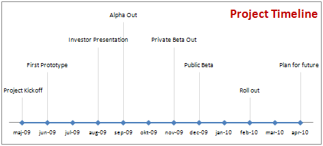
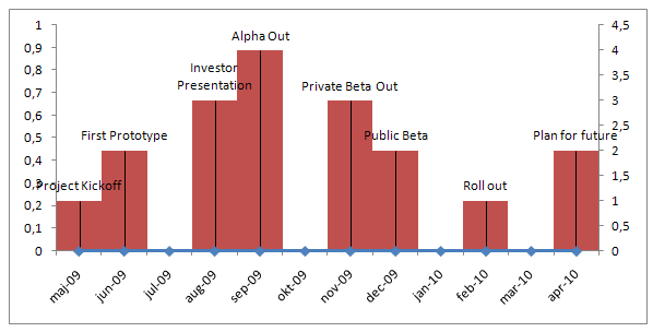
Project milestones can be shown in a simple time line chart in excel. While the chart doesn’t look complicated, it can provide good amount of information on project progress in a simple and understandable chart.
We will learn to create a project milestone chart like this:
Steps to create a project milestone chart in excel
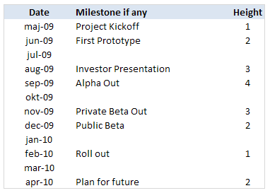
- In order to create a project milestone chart, we need to have the milestone data. The simplest format for milestone data is Date and the milestone. But since our chart requires the milestone to be displayed at a certain height on the chart, we will add the third column – height.
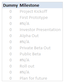
PS: the height column can be easily calculated using formulas. I leave it to your imagination. - Once you have the data in the above format, we will add 2 more helper columns – named DUMMY and Milestone. The Dummy column is used to create the timeline (where Y axis value is zero). The milestone column is a more cleaned up version of milestones (see how it is showing #NA where the milestone is blank.)
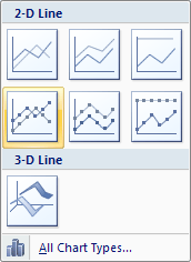
- Now, select the date and dummy columns and insert a line chart.
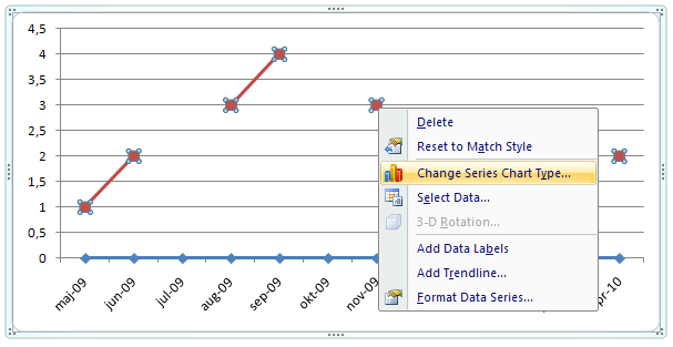
- To this chart, we will add one more data series – Height column.
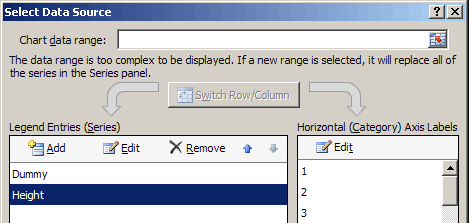
- Now select the height data series and change the chart type to a bar chart. Also set the height series to be plotted on secondary axis. Learn more about combining 2 chart types and adding secondary axis in excel.
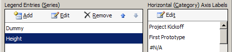
- We will also set the horizontal / axis labels for the height series as the “milestones”. We need to do this so that when we set the data labels for the height series, we will see the milestone instead of month.
- At this point our chart should look like this:
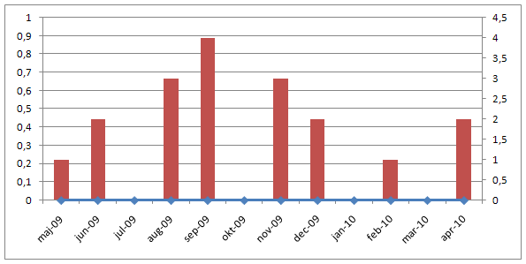
- Now, we will add data labels to the height series. Set the label type as “category”
- We will also add error bars to the height series (the bar chart). We will configure the error bar in such a way that they are shown 100% on the negative side only.
- After doing this, the chart should look like this:
- Finally we will do some formatting like,
- Removing fill color / line from height series by setting them to None / transparent.
- Changing the error bar color to a dull shade of gray.
- Adding chart title and aligning it.
- Removing vertical axes and gridlines.
- Formatting horizontal axis – changing label orientation, removing tick marks.
After all this is done, our project milestone time line chart should look like this:
- That is all, we now have a cool looking project milestone chart ready. Now go and achieve a milestone.
Download the Project Milestones Time Line chart template:
I am sure you are overwhelmed reading the above tutorial. You are probably thinking if it is easier to work towards the project milestones than creating this chart. Well, don’t worry. You can download the time line chart template and play with it to suit your needs.
Download 24 Project Management Templates for Excel
What next?
Project timelines are a great way to tell the story of project to strangers and new people joining your project. They are a good addition to project status meetings and reports.
In the next installment of this series, we will learn how to use Excel to manage timesheets and resources.
If you are new, please read the first 2 parts of this series: Project planning using gantt charts, Tracking day to day project progress with team todo lists.
Your thoughts and suggestions?
What are your ideas on communicating project progress to stakeholders and new comers? What do you think about this tutorial? Please share through comments.


28 Responses to “Pimp your comment boxes [because it is Friday]”
This borders on Excel soft-cell...er, soft-core...porn. My favorite kind.
Wow, that is pimp-TASTIC! I have a question, as a VBA n00b: additional comment boxes stay plain unless I "run" the macro. Is there a way to change all comments, going-forward?
hi Chandoo, well, I like the macro approach. For those who don't like it, there is another way: just add the "draw" toolbar to the shapes toolbar (via Custom etc), click on "edit comment", click on the auto-shape and then choose "draw" drop-down, --> modify auto-shape --> then you even can have a heart or a banner (I like the horizontal banner in in purple :-)) . in excel 2007, you have to add this custom menu that you choose via Excel Options --> Custom --> it is called "change/ modify auto-shape"!!!
best,
@Chandoo. Great Post 🙂
@Tim : the way the macro is coded, it must be run very time.
@Community: If someone has an idea to perform it when opening an existing excel, it should be nice.
@Community: if someone has some code to revamp the commentboxes on all sheets, please share it. 🙂
@Microsoft Excel-progammers: some pimpoptions for the commentboxes should be great.
Cheerio
Tom
For the auto run, please add the codes in workbook:
Private Sub Workbook_SheetActivate(ByVal Sh As Object)
Call Comments_Tom
End Sub
Wow, that was a lot of fun... Thanks Tom!
@Jeff... Now, 5000 people know about your favorite porn... 😛
@Tim ... you can write an event to handle the new comments. I wouldnt recommend it as it is really painful. another option is to use the macro suggested by Yukikomi. It will update comments everytime you activate the sheet.
@laguerriere: very cool 🙂
@Chandoo ... Thanks! This is good stuff. I combined your tip with a tip from Mark O'Brien, then assigned it to a button on Excel 2010's Quick Access Toolbar, to format comments AS I add them. I also like how Mark's code saves me the trouble of backspacing my name out of new comments:
Sub AppendToExistingComment()
'Source: Mark O'Brien at http://www.mrexcel.com/forum/showthread.php?t=57296
Dim oRange As Range
Dim oComment As Comment
Dim sText As String
'Use object variable to hold range.
Set oRange = ActiveCell
'Use object variable for comment
Set oComment = oRange.Comment
'text to be added to the comment box
sText = InputBox("Type text to be added:", "APPEND TO COMMENT TEXT")
If Len(sText) = 0 Then End
'If Active Cell has a comment then append new text to the end of the comment text
If Not oComment Is Nothing Then
sText = oComment.Text & vbNewLine & sText
oRange.Comment.Delete
End If
'Add a comment with the contents of sText
oRange.AddComment sText
DoEvents
Comments_Tom
End Sub
Thank you very much for the code, it seems to be working for the most part; I am having a problem however. Once the routine makes the corrections to the comment, the comment becomes invisible. By invisible, I mean that when I highlight my mouse over it, nothing appears. However, when I right click the cell and click 'edit comment' then the comment becomes visible and I enter edit mode. Upon clicking out of the comment, it simply vanishes again. I've tried to fix this problem by adding a .shape.visible = msoTrue but then every comment is always visible. o_O please advise...
Thank you,
Nick
@Nick- That is because the font color of the comment is white and when you select the color of selection is also white hence you can not see anything. Try to change the color code in the routine to something else. would work
Thanks for that! The code works perfectly!
[...] look at Format Excel Comment Boxes using VBA Macros | Chandoo.org - Learn Microsoft Excel Online [...]
@ Chandoo - code works great and the comments look super cool. But I have ran into a small issue. In the comments, I am inserting pictures. When I run the macro, for all comments which already have pictures; pictures are deleted. Pls help me retain the pics in comments.
[…] posted some code one of his readers submitted, it "pimps" your comment boxes from those boring black-text-on-yellow rectangles to something more professional and eye-pleasing. […]
love in it
Hi Tom,
This looks really excellent. I am however relatively new to macros / VBA codes so having copy pasted your code in the Developer mode of an Excel file, what are the next steps to use them? Can you please help? Just to recap, I opened a blank Excel workbook, clicked on Developer, copy pasted the comments code and saved the file to the desktop.
Now how do I go about using it to add comments to an existing file? My apologies for asking a question which may be basic to you great geniuses, but I am not there yet and aspire to get there.
Many thanks for helping me with next steps that I need to take so that I can now use the code.
Best Wishes
Deepak Dave, CMA, MBA, PMP
Senior Management Consultant
Dear Dave,
The best thing to do is to copy the macro in the personal.xls(x) file. The personal excel file will always be launched when you open excel so you can use it with every excelworkbook.
Read all about it on the page of Microsoft.
https://support.office.com/en-us/article/Copy-your-macros-to-a-Personal-Macro-Workbook-aa439b90-f836-4381-97f0-6e4c3f5ee566
Once you have the macro in the personal, you can 'call' the macro by the keyboardcombination 'alt+f8' and klik on the macroname.
Hope this clarifies the 'how to'. Good luck with your first steps in the wonderfull world of macro's.
Tom
Hi Tom,
Many thanks. I will try that out. Learning is fun and learning this stuff is even more amazing.
Best Wishes
Deepak Dave
There is a line 'Dim LArea As Long' which does not appear to be used. Have I missed something?
Dear Gary,
Correct the 'Dim LArea As Long' is indeed not relevant and can be deleted.
Tom
Excellent hack!
For some reason when I opened my file after using LibreOffice Calc, all comment boxes had changed to some arrow shape.
So this macro helped me from manually changing more than 5000 comments in a worksheet, or having to install some Excel extension.
I used it with the following attributes to get back old style comments:
It helped me from manually changing more than 5000 comments in a worksheet, or having to install some Excel extension.
.Shape.AutoShapeType = msoShapeRectangle
.Shape.TextFrame.Characters.Font.Name = "Calibri"
.Shape.TextFrame.Characters.Font.Size = 10
.Shape.TextFrame.AutoMargins = True
.Shape.TextFrame.AutoSize = True
Thanks a lot!
This was helpful, thank you
I think this is among the most significant
information for me. And i am glad reading your article.
But wanna remark on some general things, The site style is great,
the articles is really great : D. Good job, cheers
Is there code to add to this that will format a particular part of the comment (i.e. make the last sentence in the comment bold and in italics)?
This is fantastic!
How would I add auto-sizing to it?
I tried adding this:
.Shape.AutoSize = True but it gives me an error and as a novice at VBA I can't figure it out.
.Shape.TextFrame.AutoSize = True
Hello I am so glad I found your web site, I really found you by accident,
while I was browsing on Bing for something else, Nonetheless I am here now and would
just like to say thanks a lot for a remarkable post and a all round entertaining blog (I also love the theme/design), I don’t have time to
read it all at the moment but I have book-marked
it and also added in your RSS feeds, so when I have time I will be back to read a lot more,
Please do keep up the fantastic work.
This is GREAT!
How should the code be changed in order to tun once for all worksheets in a workbook?