
We all know that to make a chart we must specify a range of values as input.
But what if our range is dynamic and keeps on growing or shrinking. You cant edit the chart input data ranges every time you add a row. Wouldn’t it be cool if the ranges were dynamic and charts get updated automatically when you add (or remove) rows?
Well, you can do it very easily using excel formulas and named ranges. It costs just $1 per each change. 😉
Ofcourse not, there are 2 ways to do this. One is to use Excel Tables and another is to use OFFSET formula.
Continue »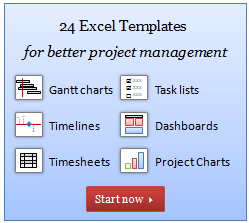
I have a super exciting news for all our members. During the last several weeks, I have been working on making 24 strikingly remarkable and easy to use excel templates for better project management. Finally the bundle is ready. You can get a copy of the bundle starting today.
Continue »
While feeding the babies last night, I had this idea. Why not make an excel sheet where you can keep track of the baby’s feeding and sleeping activities on day to day basis. It would probably help you understand your baby’s needs better and may be give you some insights.
Continue »![Visualization Lessons from Eiffel Tower [Chartbusters in Paris]](https://chandoo.org/img/cb/eiffel-tower-visualization-lessons.png)
Ever since I was a child, I was fascinated by Paris (and Eiffel Tower). Recently, I had opportunity to visit Paris, albeit for just a few hours (I had a 12 hour lay-over in Paris between flights). I went to see the Eiffel Tower and it looked just as beautiful and majestic as it did in my imaginations.
During my visit to Eiffel tower, I took the stairs to 2nd floor and along the way they have a handful of visualizations explaining the tower. I found them quite interesting and well made. Here, I have listed down 4 simple, yet very effective visualization lessons for all of us.
Continue »![Another Reason why Tables are so awesome [quick tip]](https://chandoo.org/img/l/excel-table-scroll-feature.png)
Ever since I have learned the tables feature in Excel 2007, I have fallen in love with that. They are so awesome and so user friendly.
Here is a simple, yet very effective feature of Excel Tables that will show table header row even when you scroll down. The header row is shown in the place of column headings (the place where you see A,B,C,D etc.).
Continue »![Project Management Dashboard / Project Status Report using Excel [Part 6 of 6]](https://chandoo.org/img/pm/project-status-dashboard-th.png)
Project management dashboards, project status reports help stakeholders, project sponsors and team-members can understand project status very quickly. In the last installment of project management using excel, learn how to make project management dashboard using excel in this tutorial. Also download the excel project status dashboard template.
Continue »![Make a Bubble Chart in Excel [15 second tutorial]](https://chandoo.org/img/l/bubble-chart-excel-tutorial.png)
A Bubble chart displays circles (or bubbles) at given X and Y co-ordinates. Bubble chart is a very good way to show 3 dimensional data (for eg. Region-wise product sales) without confusing users. In this tutorial, we will learn how to create a bubble chart using excel.
Continue »
