
It is very easy to customize Excel ribbon and save time. You can make a new ribbon or modify an existing one with new group of commands. This can be a huge productivity boost for people using MS Office applications.
How to create your own ribbon in Excel 2019 / 365 / 2016 / 2013 / 2010:
Customizing ribbon is as simple as customizing your coffee at Starbucks.
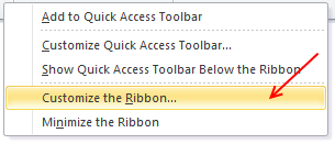
- Right click on ribbon area and select “customize ribbon” option.
- Now, add a new tab (or group or both) – see below for illustration.
- Add a few commands (or buttons) to your new ribbon
- Click ok and you have a sparkling new ribbon ready.
10 things you should know about ribbon customization
This is how the customize Excel ribbon screen looks.
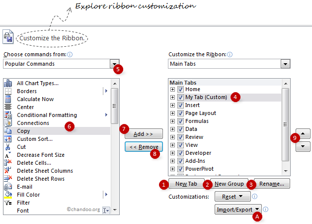
I have highlighted 10 items on the screen. Read thru below 10 points to master ribbon customization.
- Use New Tab button to create a new ribbon tab.
- Use New Group button to add a new group of commands to an existing or new ribbon.
- Rename button helps you to change the name of an existing custom group or tab.
- Once you add a group / tab, you have to select it to add items to that group / tab.
- You can choose the type of commands you want to add to your ribbon tab / group. You can also add any macros as well (sweet!).
- Now select the command you want to add to your group
- Click on “Add” button to add the command to your ribbon tab / group.
- You can use “Remove” button to remove any commands from custom tabs / groups.
- Use the up / down arrow buttons to move your ribbon tab / group up or down. (For eg. you can move your custom tab to first, ie before home tab).
- You can export your ribbon customizations and re-use them in other computers (both ribbon and QAT settings will be exported).
Ribbon and QAT Customization – Few Tips:
Use “Hide Command Labels” option to shrink your ribbon groups
See the below illustration to understand what I mean.

Customize tool ribbon tabs to save a ton of time:
By default, when you go to “customize ribbon” screen, you only see main tabs. But you can also customize tool specific tabs. For eg. I use only a handful of chart formatting options and all of these are spread across 3 different tabs – design, layout and format. So I combined all the options I use regularly to come up with a simple ribbon tab like this:

As you can guess, the above ribbon tab appears only when I am formatting a chart.
Add groups of commands to QAT:
You can now add a group of commands (for eg. all alignment options) to Quick Access Toolbar to improve your productivity.

Minimize ribbon with a click:
Press the ^ icon you see next to help icon to instantly collapse / expand ribbon. You can also use CTRL+F1 keyboard shortcut to do the same.
Export Ribbon Settings
In 2010 and later you can Export your Ribbon & QAT to a file that can be imported to another computer, or after reinstalling Office
In the Options dialog > Customize Ribbon (or Quick Access Toolbar) options > Import / Export button at bottom of both dialogs.
Ribbon Customization Gotchas!
While ribbon customization is a great move ahead for Excel in particular and Office apps in general, there are a few gotchas. Beware of the following to avoid un-necessary troubles.
- When you add a group or tab, excel doesnt ask you for a name. Make sure you click on “rename” button to change the name to something you remember.
- You cannot add commands to an existing excel defined group. You can however add groups to existing ribbons.
- Even if you try to make a group with exactly same commands, the group may look different.
- The ribbon and QAT customizations you do are local to your installation of excel only. You have to export the customizations and import them before they work on other comps.
What is your opinion about ribbon customization?
I am very happy to see the possibilities of ribbon customizations. It can improve productivity and simplify a lot of things.
What about you? How are you planning to customize your ribbon? What tips and ideas you have to share with us? Please tell me using comments.


37 Responses to “Customize Excel ribbon – How-to guide, FAQs and Help”
Well thats a great feature! Actually one could use such customization to recreate Excel2003 type toolbars as a new tab on a ribbon. Is it possible to use new tab as default tab?
Hi,
Can you please elaborate on the last point in the gotchas?
1) How easy is it, say, for me to create a new Ribbon and send it to you?
2) Can I create a new Ribbon and make it a part of standard installation for my entire team?
Subhash
Hi Chandoo,
A very helpful post (as always).
Why don't you add the download links for the Ribbon Settings that you customised. Create some new tabs in the ribbon, which may also include URL and RSS links to your blog as well as help link to your excel forum. It will help your readers to think on what lines they can start customising the ribbon and make it more productive (e.g. One tab for daily tasks, one for Project A etc.). Moreover they can then tweak your custom tabs as per their requirement. The idea is-instructions on "how to customise ribbon" will be on various blogs. So if you provide your version of custom ribbons, which I am sure will be very well-planned containing the maverick composition of commands, that will yet again further elevate the standard of this blog.
If you like the idea, then I'm waiting to see:
(a) what new tabs you come up with and what will be the assortment of commands in them,
(b) my prize of Office 2010 – home & student edition 🙂 (one can always buy but the joy that one gets on winning something is priceless).
Excellent article - I will save it for when my company one day upgrades to 2010 (only just getting 2007 - I sometimes use my own laptop to work in 2007 and email it to myself...!)
If only this was possible in 2007 though! How could MS leave out this feature? Maybe it can be done in VBA, anyone?
The cynic in me says they left it out deliberately...
PS I like Subhash's idea - then we could share our recommended items here!
Ehhhhhh........
Imo, menu customization is good for only one thing: getting buttons for stuff that does not have one already. Other than that, I"m a defaults kind of guy. Like camera mode.
Although, good for MS for adding some customization.
there is a bug that wasn't fixed in regards to the ribbon.
here's an example:
select home tab
customize the ribbon
remove styles
click ok
click the developer tab
now customize the ribbon again.
on developer tab and remove xml
click ok
go to the home tab, styles is back
customize ribbon again
remove styles
click ok
click developer tab
xml is back
the way to keep both changes is after making the 2nd change, go back to the previous tab, expand it and then exit. once you do this, both changes will be retained.
Thanks for this post. I'm very happy with the fact that we will be able to customize the ribbon as I'm used to customize my toolbars and menus to improve my productivity. We're still using 2003 at work and my interface is very customized. I just hope that we will move to 2010 and not 2007. Unlike Dan, I'm not the default kind of person.
This is a nice addition that they finally added to the ribbon. But it's really only good for individual computers.
In 2003, I only modify my toolbars manually if there's a command I need right now, but will not need later. Otherwise, I decide to make the change permanent, and I build it into my personal macro add-in that loads when Excel boots up. If I had to share part of the changes with colleagues, or if I needed to distribute them with a workbook or add-in, I would copy the relevant parts of the code and the associated rows of the table that the code reads from, and distribute that. It's reliable, and you never have to worry about the xlb file getting corrupted.
In 2007 I had to learn the XML to modify the ribbon, and any changes I wanted to implement had to be done through XML. This code can be shared as easily as the VBA for modifications in 2003, and I think I'll keep using XML except for one-time customizations.
This may move our office one step closer to the "upgrade". So far, 2003 is still meeting our needs.
The Ribbon/QAT Customization in Excel 2010 is extremely limited
a) You cannot choose the size of the buttons
b) You cannot create your own split buttons/menu buttons/toggle buttons etc
c) The Button Images are extremely limited
d) You cannot control the Behaviour of the groups (Autoscale = true/false)
e) You cannot customise the File Tab
f) There is no decent editor provided for the "Excel Customizations.exportedUI" - you have to use the notepad
g) It is nowhere close the the Ribbon customizer developed Andy pope.
h) It is better than having nothing as in 2007
Jon, tell us of these personal macros.
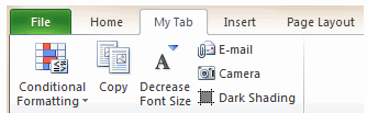
A good post, lots of useful screenshots. I've been meaning to get round to doing a post about how to customise the Ribbons for a while, with a few power tips about choosing the order of buttons, which impacts the order they get "collapsed" when the screen width is reduced - for example in your custom tab email camera and dark shading are on the right, so they get turned into smal buttons first, then lose their labels, then the other large buttons go small.
The most frustrating thing about the sharing / backing up / moving is that it is an "all or nothing" process. So if I do some great customisations (say a new funky data and Pivot tab, and you do some (your custom chart tab), you can send me yours but I lose mine in the process (as far as I can tell from my limited testing, again I want to do this more thoroughly and write it up).
At least it's easy to chop stuff around in the export files and paste things together to create SuperRibbons (TM) - it's just XML after all (@Jon this export/import file is not far different from the previous arcane Ribbon XML, but much more accessible for non-power users to customise their interface without having to go near the XML itself)
Two minor things:
You say "You can now add a group of commands...to Quick Access Toolbar". You could already do this in Office 2007.
@Chandoo and @dan l - while the camera function is also one of my favourite "not in the toolbar" features which I remember from older versions, they have now exposed equivalent, almost identical functionality in the GUI without the extra button.
To compare:
Select an area. Click camera. Click target location. A dynamic picture is created at that point.
Alternative (2007):
Select an area. Copy. Select new location Paste>As picture>Paste picture link (which you can add to the QAT but it has no useful icon).
Almost identical result with a slightly different order of operation. Also note that the new function has a default of no filll, whereas the camera has a default background fill of white (you can change this in both cases as a normal property of the object fill colour under formatting).
In 2010 the same function is now one of the many Paste options represented by icons in a gallery - it's the bottom right one with a clipboard and chain links. Annoyingly you can't add this button on it's own to the QAT, only the whole gallery. Maybe we're back to using the camera function after all!
@garyk - I can't reproduce your problem (and have not seen this in the TP, Beta or RTM). When I click OK my Ribbon changes are saved and the dialogue closes. Those changes are fixed, and subsequent customisations are independent. Have you missed out any steps of your description? Are you exporting and importing these (which is all-or-nothing as I mentioned)?
@adamV
you need to follow specific steps. this has been a bug in every beta and rtm, confirmed by microsoft, that wouldn't be fixed. if i can get an email address, i can send you a psr of the entire process.
@garyk
I think I worked out what I misunderstood about your steps.
You select the Home Ribbon, then right click it and choose customise *from that Ribbon tab*. Likewise when you do the Developer one.
I was doing it by selecting the tab, but going to File > options > customise to change it, or from the drop down at the end of the QAT. Either of these ways it seems to work as expected without reverting the previous changes.
Your way does seem to revert other built-in Ribbons to a default state, which is a pretty poor bug to have made it through to RTM.
We've only recently got 2010 and I'm having the same issue with the ribbon. No matter which way I enter the 'customise ribbon' option it will only retain the most recent change; previous changes default. Upgrading from 2000 has meant major changes - I don't like very much about the new version anyway - but not even being able to adjust the ribbons and have them stay the way I've put them is even more frustrating.
@adamv:
yes, i thought they should have fixed it. when i first saw it, i thought i was going crazy. i said to myself, "i thought i just got rid of that tab! maybe i didn't."
but like i mentioned, if before you exit the 2nd customization, you expand the tab you customized the first time, they both will be retained.
Hoooray! This is what I need. I have run out of space on my custom Ribbon Bar in Excel 2007. Now the only problem is getting Excel 2010..
Very useful tutorial. Thank You. Tutorials on VBA, Macros and excel services will be appreciated. Thank You.
One of the worst realizations was that I had after "upgrading" to 2007 was that I would no longer be able to customize the toolbars for distribution to my employees. I've been looking forward to 2010, although I feel like I'm just beginning to understand 2007.
Jon Peltier, so what's your solution for the short-term needs for a one-time tool in 2007?
I only recently switched over to 2007 after a laptop change, and I have to say that I lost significant productivity until I bought an add-in that replicates the 2003 menus. Unfortunately it's not customizable itself (AFAIK), so I end up using menus a lot more than I used to--but I know where those things are at least. I tried 2007 as-is for over a month before buying the add-in just to give it a shot, but I must be too old for that drastic a change. I was spending time every day looking on google for where the command that I wanted was now hidden and getting very frustrated with the whole experience. I think the prediction was that it would take an hour to get up to speed but I've not had that experience. I don't really have time to learn xml just to get back where I was before...I just want to get work done. Hoping that this and other 2010 enhancements will obviate the need for an add-in.
For those that find themselves lost in the ribbon UI and not able to find functionality they're used to from the Office 2003 menu/toolbar interface, Microsoft Labs has a (little known) handy add-in called Search Commands:
http://www.officelabs.com/projects/searchcommands/Pages/default.aspx
Well worth the install. Enter the keyword(s) you're interesting in (for example, "Headers") and it will show you where headers are handled in the ribbon.
Thanks for all the tips. I've been sticking with Excel 2003 specifically because I hate the ribbons. I can sit down and customize 2003 exactly the way I like it in about five minutes - 2007 slows me down immensely. Glad 2010 offers some options as (when I save up the $$$ to buy) I'll have to upgrade if more of my clients do.
I sure wish they'd just get rid of those ribbons, though. None of my clients thinks they add anything but annoyance, even after using them for over a year. We all used to be able to fly in Excel - now not so much. We've just started experimenting with Open Office. Toolbars!!!
Can somebody just provide a link the classic TAB exportedUI files for MS Office 2003 for us to use in office 2007/2010?. searching online, everybody just wnats to make a buck online with silly Classic Tab installers which do nothing more than inport exportedUI files for you.
Don't give me a ribbon how to guide, just give me free exportedUI files. I should not have to pay anyone for this, it is free XML, MS should have included this to begin with.
does anyone have experience with customising toolbars not saving when people use them on terminal servers?
Hi,
In Excel Help, under "What's new in Excel 2010", there is a heading "improved ribbon". There is a picture below which shows "Main tabs" --> Quick Format (Custom). However I am not able to find this quick format tab under Main tabs in my Excel 2010. Could you please tell me how I can activate this tab? Thanks
How do I get rid of the macro Icon when creating a custum ribon. I would like to create menu buttons that are associated with macros, but I do not want to see the macro icon that is shows by default. I just want a simple menu label.
The possibilities are endless with this cool feature! I can see productivity increasing by creating my own ribbon to use.
I skipped Excel 2007 so I'm going from 2003 to 2010. In 2003 it was possible to have a floating toolbar that could be moved next to the area/column/row that was being worked on. It that available in 2010? I can't find a way to do it.
Thanks in advance
Joe -
In their infinite wisdom, the Microsoft Office User Interface team removed the infinitely useful floating toolbars and tear away palettes from Office 2007 (and thus 2010). Millimeters of mouse travel and a handful of button clicks have transformed into meters of movement and dozens of clicks.
Excuse me, I am froam Indonesia. I have problem to make costume ribbon that contain icons with hyperlink to related sheets in workbook
Totally newbie in Office 2010 ... sorry
In Excel 2003 I've created/used local menu funtionality, whiched changed alle depending on the individual templates creted for end users.
The VBA menu function was stored each spreadsheet, and loaded and unloaded when this was in use. Typically, the menu included vba-macro functionality only to be used in one teplate and not others.
I can't see how this is done in Office 2010 ... am I totally blind ???
Great post, you should include a definition of a ribbon thought first, it is like an tab of useful excel tools you can group together? It would help people searching for what is an" excel ribbon"?
I have been using custom ribbons in all my Office 2010 products (Excel, Outlook, Word) for over a year and found some good tips.
1. Move your custom ribbon to the top of the list to make it your default.
2. Limit your groups to no more than five (5) items to keep the larger icons.
3. Never use "Hide Command labels" unless you like the little icons.
4. Make your first group "File" or something like that and add these commands:
(a) New
(b) Open
(c) Open Recent File
(d) Save
(e) Save As
Now you never need to go to the original File ribbon.
Hope these tips help.
Wonderful and useful article
I wish I could attach the customisation I did....
I had customized my toolbar, but how can I export this customized toolbar so I can share it with others?
You mention to export and then import it... But how do you do that?
Thanks in advance.
Hey chandoo:
You updated the article date to 2019, how about updating the article to reflect Office 2019 / 365, or at least confirming that nothing significant has changed
Import / Export ribbon (ie add this to the body of the article)
In 2010 and later you can Export your Ribbon & QAT to a file that can be imported to another computer, or after reinstalling Office
In the Options dialog > Customize Ribbon (or Quick Access Toolbar) options > Import / Export button at bottom of both dialogs.
Another "gotcha" you didn't mention
As well as not being able to customize existing groups in a tab, we cannot recreate existing groups to look like the originals. Using the Ribbon UI, if you recreate an existing group by adding all of the commands, the layout will not be the same. So we CAN'T fake adding new buttons to an existing tab by recreating it.
Thanks for the suggestions Ron. I have updated the post to reflect some of these comments 🙂