
Finally the winner for our first visualization contest is decided. It is… Cuboo.
The entry by MB (#6) came a close second.
All the participants will receive a copy of my excel formulas e-book while Cuboo gets a copy of The Visual Display of Quantitative Information by Edward Tufte.
All in all there are several great entries suggesting a good variety to present budget vs. actual performance. Go check them out.
A Month ago I got a request from a reader asking me what is the best way to visualize budget vs. actual performance? I didn’t have any ready made answer for him. So I posted a visualization challenge, inviting contributions from my readers.
I got several responses and I am still not sure which one of them is best. So I have asked you to vote for the best visualization among all. And you selected Cuboo as the winner. Congratulations!
Many thanks to all my readers and contributors for making this a memorable and learning experience. I have learned several fun and interesting charting tricks looking the contest entries. I hope you had similar experience.
Have a Charting Problem and need some help?
Write to PHD by posting a comment or e-mail me at chandoo.d @ gmail.com. I a bit sloppy on emails these days, but I always star your mails and revisit them during weekends and send a response. So…


11 Responses
Any chance that someone has an Excel version of the winner?
Also…looking back at the contest, I notice that all of the data is *under* budget. It would have been nice to see what folks would have done with entries that are over budget.
@Michael: The charts that Cuboo made are inspired from here: http://www.hichert.com/227644/126291.html if you go to that site, there are several very good examples of excel charts that you can download and play with. The site is in German, so I could understand little. But I believe the formulas and charts should work anywhere nevertheless.
I agree that the data was kind of skewed. I guess we would have seen few different alternatives if the data had a mix of both below and above budget values.
All the participants will receive a copy of my excel formulas e-book. Pls send me the ebook.
Sorry for answering so late … I was on holiday!
Thank you for choosing my solution … good to see that simplicity rules.
You find the .xls-file for Excel 2003 at the end of this post:
http://cuboo.wordpress.com/2009/04/05/excel-visualisierungs-oomph-oder-how-to-visualize-planist-abweichungen/
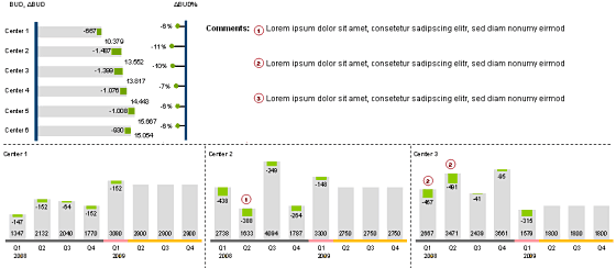
The cumulative view of all centers I took from the Hichert+Partner website: http://www.hichert.com/Excel-Beispiele/511.xls
As chandoo mentioned you find more examples of their incredible
visualizations with Excel here:
http://www.hichert.com/227644/126291.html
@Michael: If actual values are over budget, the bars in my solution will turn red, of course.
@ cuboo: hi, very good solution.
I can open the link for the excel file in your blog, could you please share it again
Hi Cuboo,
This is some great work. I have a slight “glitch” when I open this file in Excel 2007. On the “Cum. View” tab, the series “neg”, which are the small green blocks at the end of each budget bar, they are not lining up with their corresponding grey bars. They are aligned horizontally, but are ALL vertically below the grey bar, should be aligned to the middle of the bar (looking at the snapshot).
What’s interesting is that when I immediately open the file, EVERYTHING IS ALIGNED, then it does something for about .5 seconds and then the green bars drop down.
http://www.flickr.com/photos/seanmcnair/4892342268/
http://www.flickr.com/photos/seanmcnair/4892342242/
Any thoughts how I might correct?
could you please share us that excel file?
Hi,
Where can I get a copy of this spreadsheet?
Paul