Last week, Our of curiosity and fun I asked you “how long have you been using Excel?“.
I was overwhelmed by the response we got to this simple question. More than 437 people responded with their comments, stories and enthusiastic responses. Thank you so much.
It would taken me more time to make the charts and understand the data. But thanks to Hui, who volunteered to tabulate all the survey data in a simple CSV. He also made an interesting dynamic dashboard from this data-set so that you can search and visualize matches. More on this below.
First the data:
We had 437 responses to the poll. While this is no way a good representation of all the 300 million Excel users out there, I would say this is a pretty good sample of Chandoo.org readers.
The key statistics are,
- Median Excel age is 14 years
- Average is 13.2 years
- Minimum is 6 months
- Maximum is 26 years (Rod Reed, Haseen I Alam and Jack Nefus)
Message #1: Excel Teens & Tweens are a majority
When I ran the survey, I thought, a majority of people would be in the Excel age group of 3-10 years. But I was surprised to say the least when I saw the data. More than 45% of the respondents have been using Excel for 11 years or more.
Chart – Excel Age distribution

What this means – possible explanations
- Biased data set (!?!): Since people who started using Excel just a few years ago tend to be not so serious about it, they may not have responded to the survey or neglected it. On the other hand, people who have been using Excel for more than a 10 years tend to be more passionate about it and thus they are active on sites like chandoo.org. So they are prone to responding to surveys or indulging in discussions.
- Excel user base shrinking: With the launch of drag-and-drop analysis tools like Tableau and cheap alternatives like Google docs, Open Office and Zoho, may be Excel user base is shrinking. This could be the reason behind such heavy concentration of 10-19 year user base.
Message #2: Excel 95 and 97 are very popular versions
I wanted to understand how the year on which users started using Excel correlated with Excel releases. So I flipped the chart and plotted Number of people by Year. Then I overlaid Excel releases as noted in Excel history time-line chart. Here is what I got,
Chart – Year people started using Excel by Number of people

What this means – possible explanation
- The big spikes in data coincide with releases of Excel 95 and 97. In fact, you could notice that a large chunk of users (~30%) have started using Excel between 1995 and 1998. We can attribute this to features like VBA (introduced in 1993), Windows 95 launch and spreading of concepts like MIS, Business Intelligence, enterprise databases and business analysis.
Note: this could just be a coincidence.
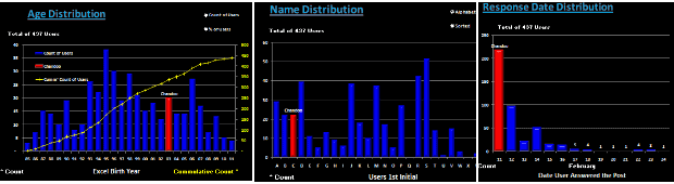
Additional Charts prepared by Hui:
Hui, our guest author and resident Excel Ninja, prepared an impressive dynamic dashboard from this data set. Using this dashboard, you can search for a name or year or age and highlight matches and do some fun analysis (like the distribution of names by first letter of first name) etc.
Few sample charts from Hui’s workbook:

Download Excel workbooks with this analysis:
- Click here to download my workbook with both the charts above and associated formulas etc.
- Click here to download Hui’s dynamic dashboard workbook
- Click here to download just the data (CSV format) so that you can do your own analysis.
Open Challenge to you – Visualize the Excel Age survey Data
Go ahead and download the data here. Make a chart or set of them so that we all can understand the data better.
Excel Techniques used in my charts:
- Generating Frequency distributions for a histogram using FREQUENCY Formula
- Box plot with quartiles overlaid on a regular column chart (more on box plots)
- Text boxes with fill color to create visual segments by age
- Labels on a dummy series (on secondary axis) to show the Excel versions, much like project milestone time-line chart
If you like this post, you will love,
- Visualization of last visible cell in Excel survey
- Visualizing survey results in a panel chart – Excel example
- Want to create similar charts and work with data like a ninja? Join my Excel School online training program


39 Responses to “Make a Quick Thermometer Chart to Compare Targets and Actuals”
You'll probably have some readers insist on bullet charts, which in my experience are no easier to read.
Note on the case where actuals may exceed targets, the target has to be the second series in the chart, not the first, so it appears in front of the actual.
@Jon.. good point. And yes, readers are already saying bullets are the way to go. Atleast @dmgerbino said it on twitter: http://twitter.com/dmgerbino/status/6761754333
But I feel the same as you did. Bullets need orientation to get started and not that easy to construct (here is a tutorial btw... http://chandoo.org/wp/2008/07/21/dashboard-bullet-graphs-excel/ )
When you just have to compare 2 sets of values, a chart like above is good and easy enough.
And yes, thank you for saying that data series order should be correct to show the target on top.
I think bullet charts are a good alternative. I'm not a huge fan of the formatting that you used above where the outline is so thick.
Another option would be to combine a line graph (plan/goal amounts) with the columns (actual) and select the option to remove the line. This leaves just the value (marker), which can be increased in size to leave only a line about the size of the bar. It's an easy and cleaner way to show actual to plan/goal. Does that make sense?
Tony -
I would use columns (or area) for goal, and lines and markers for actual.
What about if you go over the target? The chart doesn't work so well then.
The technique described today is a near bullet chart. As I stated early this morning on Twitter (link: http://bit.ly/4K3yPM ) , I am a fan of Stephen Few's Bullet Graph.
Hubert Urruttia and I started with Charlie Kyd's method, but as Jon Peltier and Chandoo said, they are not easy to contruct. We moved onto prototyping with Fabrice Rimlinger's SPARKLINES FOR EXCEL and now use XLCube's (BonaVista) Micro Chart tool. Both of these tools allow you to create bullet charts just as easy as any Excel chart type.
As far as reading and interpreting them, this chart type has been the easiest for us to present.
There are many chart types. Today's "Make a Quick Thermometer Chart to Compare Targets and Actuals" is fine for a start, but your ultimate goal should be to create Bullet Graphs. AS Stephen Few states in his overview, "The bullet graph was developed to replace the meters and gauges that are often used on dashboards. Its linear and no-frills design provides a rich display of data in a small space, which is essential on a dashboard. Like most meters and gauges, bullet graphs feature a single quantitative measure (for example, year-to-date revenue) along with complementary measures to enrich the meaning of the featured measure. Specifically, bullet graphs support the comparison of the featured measure to one or more related measures (for example, a target or the same measure at some point in the past, such as a year ago) and relate the featured measure to defined quantitative ranges that declare its qualitative state (for example, good, satisfactory, and poor). Its linear design not only gives it a small footprint, but also supports more efficient reading than radial meters."
@dmgerbino
Since @dmgerbino had to bring my name up I guess I should throw in my two cents.
@dmgerbino and I have both implemented Bullet Charts with great success. What is most interesting about this fact is that we have had a harder time implementing Sparklines than Bullet Charts. The reason for this revolves around the simple fact of familiarity. I will explain. People look at a Sparkline and they think it is a really small Line Chart and it is not. People are familiar with Line Charts since they have been around since 1786 when they were created by William Playfair. Bullet Charts on the other hand are different so they almost demand an explanation. Because of this there was a lot of face time that was needed to explain these charts but once people got them they understood the concept. This is similar to when I introduced Cycle Plots http://bit.ly/87ydVG (Thank you @nbrgraphs!) or Horizon Charts http://bit.ly/6PVavj.
Now about the Thermometer Charts… The first thing I want to address is Tony Rose’s statement. I totally agree that the outline on the chart is too think. It might come of as being a whole new series or a new variable. What I have done in instances like this is I have created a Bar Graph and Scatter Plot mixture. Then I have turned off the Data Series on the Scatter Plot and turned on the Horrizontal Error Bars on the Scatter Plot. The new horizontal line stands for the Plan and the Bar is the actual. The reason why I find this more useful is because this technique works if you have exceeded plan. Actually, I do not understand how Chandoo’s method would display the data if Plan is surpassed.
This reminds me of another blog post that @dmgerbino, @Jon_Peltier, and myself commented on over a year ago. http://bit.ly/PNdO Actually, I talk about similar things in regards to familiarity to charting techniques.
- @hubert_urruttia
[...] we have a post on using thermometer charts to quickly compare actual values with targets. Today we follow up the post with 10 charting ideas you can use to compare actual values with [...]
Hi Chandoo
How do I increase the width of the bar chart and also make the long axis labels come in the same line?
Thank you,
Rajiv
@Rajiv
Select the outer part of the chart "Chart Area" and note the cursor will change to arrows
drag the edges to what ever size you want
You can hold the Alt key as you drag and the chart will snap to the cell boundaries
Now click on the chart area inside the chart "Plot Area" and note that a box with small circles appears around it
drag the circles on the edge of that box to suit
You can hold the Alt key as you drag and the chart will snap to the cell boundaries
@ Hui
Thank you for your comments. But my question was not for the "Plot Area" instead I wanted to know about how should I increase the width of the individual bar charts because with my data all the individual bars are coming to be thin and I want to make them appear broader.
Thank You
@Rajiv
Right click on the Series you want to change and select Format Data Series
Under Series Options goto Gap Width and decrease it to suit
[...] Make a Quick Thermo-meter Chart using Excel [...]
Thank you for the great chart and explanation!
How do I show two amounts (Signed Revenue and Pipeline) as stacked within the Target amount?
@CL... you can use stacked column charts and follow the same technique to get this. See attached file for an example - http://img.chandoo.org/playground/thermo-meter-with-additional-details.xlsx
Chandoo - thanks for the quick response! What if I want the data label for the pipeline to be the actual pipeline value, not the signed rev + pipeline value? i.e. 15 instead of 55
Thanks!
How would i do this in excel 2003?
[...] Thermo-meter charts are very good to show how actual value compares with target (or budget). But how can we add another point for say Last Year value to the chart with out cluttering it. [...]
Hi Guys,
As Matt said,
"What if you if you go over the target?"
Is there a way to make it change color? or at least to show what the target was?
I am planning to use this with a "Forecasted vs Real" production chart but I do not know how to show overproduction.
Any clue?
Thanks
How do I do this if I have 2 bars I want side-by-side? ie 2012 Mean with 2012 benchmark overlapping and then 2013 mean with 2013 benchmark overlapping? I want the 2012 and 2012 mean bars sie by side to compare multiple categories.
Sorry, I meant to say the 2012 and 2013 mean bars side by side
I have a problem in that my PM wants a chart that shows a stacked column (Labor and Expense) and then have the overall buget shown as a thermo.
Everytime I try to do this, I either end up with all three being stacked or all of them being seperated.
Help?
Or if someone knows how to only outline the top and sides of a chart series....then I would have this solved. (Make a stacked column with labor, expenses, and remaining budget, then clear the fill and outline only the top and sides.) I just can't figure out how to do that/ not sure if excel will let me only outline part of a chart series.
[...] Thermometer chart to show budget vs. actual performance [...]
Your home is valueble for me. Thanks!...
I've created the thermometer chart as the Chandoo tutorial described. How do I move my columns closer together? I don't want wider columns; I want to move my narrow columns closer together. Thank you!
Dear Elite members,
could you please let me informed whether we could incorporate color formating in this thermometer approach i.e. if my actual performance is <Min then meter color sud go Red, in between min & target it sud change to Amber & target and above sud change to Green. pls advise. thanks,
I think the only way to do that would be with VBA programming.
@Abhinav
Yes, Simply use a stacked column chart, colored appropriately
Or
You may also want to read about Bullet Charts
@ Hui,
Could you pls demonstrate this with the help of an example.
let's have the below sample data
Actual=12
Min=10
Target=15
Max=20
if Actual>=Min then bar color sud be Red
in between Min & Target= Amber
between target(inclusive) & Max = Green
greater than or equal to Max= Blue
Thanks in advance
Abhi
Great blog post with awesome sample data. I've implemented two of the top "power tips" by changing the colour of the actual values, AND setting Actual to be 40% transparent. Looking good.
[…] easy with these charts. Use them sparingly. As a rule a thermo-meter chart would be better (easy to make, takes less space, scalable) for situations like […]
[…] easy with these charts. Use them sparingly. As a rule a thermo-meter chart would be better (easy to make, takes less space, scalable) for situations like […]
I recently purchased the template bundle and love the ease of use - thank you!
I would like to ask if it is possible to add an important 'block' to the dashboard to illustrate an important status for my executive team; 'billing status'? (ie budget / amount billed) something like that?
Thank you!
@Cheif449.. Thanks for your purchase and kind words.
You can add this easily to the dashboard. Follow below steps.
1. Unprotect the dashboard worksheet.
2. Add a text box (Insert > Drawing Shapes) to the dashboard
3. Put any text inside it as per your need.
4. Format it as needed.
5. Protect the dashboard again.
How do you do this in Excel 2010 - I am not seeing that option in Format data series.
how would we check target and actual sale for multiple years
Select any of the bar, right click and format data series