All articles with 'hui' Tag

Learn some of the Microsoft Excel MVP’s favorite Excel Tips, Tricks, Cheats & Hacks in this post
Excel Tips, Tricks, Cheats & Hacks – Microsoft MVP Edition
{ 19 Comments }
Shading above or below a line in Excel charts [tutorial]
Published on Feb 13, 2013 in Charts and Graphs
![Shading above or below a line in Excel charts [tutorial]](https://img.chandoo.org/c/shaded-line-charts-tell-a-better-story.png)
When comparing 2 sets of data, one question we always ask is,
- How is first set of numbers different from second set?
A classic example of this is, lets say you are comparing productivity figures of your company with industry averages. Merely seeing both your series as lines (or columns etc.) is not going to tell you the full story. But if we can shade our productivity line in red or green when it is under or above industry average… now that would be awesome! Something like above.
Continue »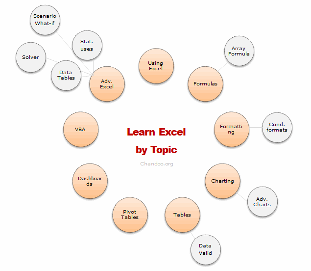
Last week I asked, What is one area of Excel you want to learn more?
More than 250 of you responded to this question. Many of you shared your areas of interest thru comments, quite a few of you also emailed me personally.
So what next?
You told us what you want to learn, the next step is logical. We share some of the best tutorials & examples with you so that you can learn. In this post, we have presented more than 75 links, to help you learn your area of focus.
I have divided this in to 16 areas. In each area, we have identified (upto) 5 best links for you to learn more. I have also recommended 1 or 2 training programs that make you awesome in that area. Plus, if we found any excellent external resources, we have highlighted them as well.
So go ahead and learn Excel.
Continue »{ 10 Comments }
Scenario Analysis for the Project Valuation [Financial Modeling]
Published on Jul 26, 2011 in Financial Modeling
![Scenario Analysis for the Project Valuation [Financial Modeling]](https://chandoo.org/wp/wp-content/uploads/2011/07/clip_image004_thumb.jpg)
Few months ago, we learned how to create a project valuation model in Excel as part of our series on Financial Modeling in Excel.
My Project Evaluation Model had a limitation!! In one of the personal comments that I received, the reader pointed out an important problem!
Continue »{ 11 Comments }
Excel Teens are out to get you & Other findings from our Survey
Published on Feb 25, 2011 in Charts and Graphs
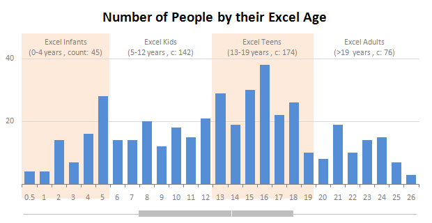
Our of curiosity and fun I asked you “how long have you been using Excel?”. I was overwhelmed by the response we got to this simple question. More than 437 people responded with their comments, stories and enthusiastic responses. Thank you so much.
It would taken me more time to make the charts and understand the data. But thanks to Hui, who volunteered to tabulate all the survey data in a simple CSV.
Shown above is a chart I came up with based on the data. Read the rest of the post to understand the survey results and view more charts. Also, you can download the excel workbooks and original data set to play.
Continue »{ 87 Comments }
Printing Excel Reports via a Word Document
Published on Feb 17, 2011 in Excel Howtos, Posts by Hui

Transferring data regularly between Excel and Word for the production of Word based forms or reports cab be tedious if it involves much more than a few numbers.
This post looks at a technique for automating this process.

WordArt is a quick and easy to use tool to allow Excel users to add pizzazz to the presentation of your worksheets.
This is a quick tutorial in the use of WordArt.

Introducing a method of allowing data points to be interactively highlighted in Excel Scatter / X-Y Charts and Line Charts.
You will see a lot of these style charts in various places where you want to highlight various aspects of the chart to your audience. It is a great technique for complex scientific and engineering charts where you may have hundreds or thousands of points.
{ 96 Comments }
How to show Indian Currency Format in Excel?
Published on Jul 26, 2010 in Excel Howtos

This is a guest post by our excel ninja – Hui. Today we will learn how to format numbers and amounts in Indian currency format. Indian numbers are grouped differently than standard English numbers. English Grouping 123,456,789.01 Indian Grouping 12,34,56,789.01 Quick and easy fix to show numbers in Indian format: A custom number format of: […]
Continue »{ 206 Comments }
Data Tables & Monte Carlo Simulations in Excel – A Comprehensive Guide
Published on May 6, 2010 in All Time Hits, Analytics, Charts and Graphs, Excel Howtos, Featured, Huis, Learn Excel, Posts by Hui, simulation

If anybody asks me what is the best function in excel I am drawn between Sumproduct and Data Tables, Both make handling large amounts of data a breeze, the only thing missing is the Spandex Pants and Red Cape!
How often have you thought of or been asked “I’d like to know what our profit would be for a number of values of an input variable” or “Can I have a graph of Profit vs Cost”
This post is going to detail the use of the Data Table function within Excel, which can help you answer that question and then so so much more.
Continue »{ 13 Comments }
Data Validation using an Unsorted column with Duplicate Entries as a Source List
Published on Feb 2, 2010 in Learn Excel
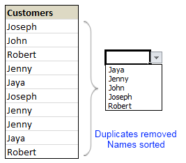
Here is a typical scenario: We want to allow only one of the pre-defined customer names in our spreadsheet. We have listed down all the customers in column B and want excel to check against this list and validate the data. But there are 3 problems. (1) Our list is not sorted alphabetically (2) It contains duplicates and (3) The list comes from external source, so we can not remove duplicates and sort the list every time.
Now how can we set up a simple data validation list that would not repeat customer names and shows them in sorted order like this.
Read the rest of this guest post by Hui to learn how to use data validation in creative new ways.
Continue »