All articles with 'frequency()' Tag
CP030: Detecting fraud in data using Excel – 5 techniques for you
Podcast: Play in new window | Download
Subscribe: Apple Podcasts | Spotify | RSS
In the 30th session of Chandoo.org podcast, let’s learn how to uncover fraud in data.

What is in this session?
In the wake of hedge fund scams, accounting frauds and globalization, We, analysts are constantly second guessing every source of data. So how do you answer a simple question like, “am I being lied to?” while looking at a set of numbers your supplier has sent you.
That is our topic for this podcast session.
In this podcast, you will learn
- Quick announcements about 50 ways & 200k BRM
- Introduction to fraud detection
- 5 techniques for detecting fraud
- Benford’s law
- Auto correlation
- Discontinuity at zero
- Analysis of distribution
- Learning systems & decision trees
- Implementing these techniques in Excel
- A word of caution
Give more details by showing average and distribution [Charting Tips]
![Give more details by showing average and distribution [Charting Tips]](https://chandoo.org/img/c/show-distribution-along-with-average-to-give-more-details-charting-tips.jpg)
When we have lots of data, we try to summarize it by calculating the average. As they say, averages are mean, they do not give away much.
I want to share with you an interesting example from Amazon.com on how they give more details by combining average with distribution.
As you might know, Amazon shows the rating of each of the products they sell. Customers & users rate the products from 1 to 5 stars. When you visit the product page you will see the average rating. But there is a small down-arrow next to it. When you click on it, Amazon shows you the break-up of that rating so you have a better idea of how the ratings are split.
Continue »Excel Teens are out to get you & Other findings from our Survey

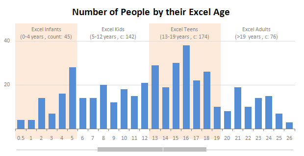
Our of curiosity and fun I asked you “how long have you been using Excel?”. I was overwhelmed by the response we got to this simple question. More than 437 people responded with their comments, stories and enthusiastic responses. Thank you so much.
It would taken me more time to make the charts and understand the data. But thanks to Hui, who volunteered to tabulate all the survey data in a simple CSV.
Shown above is a chart I came up with based on the data. Read the rest of the post to understand the survey results and view more charts. Also, you can download the excel workbooks and original data set to play.
Continue »It is no exaggeration that knowing excel formulas can give you a career boost. From someone starting at the long list of numbers, you can suddenly become a data god who can lookup, manipulate and analyze any spreadsheet.
So when our little excel blog hit the 5000 RSS Subscriber milestone, I celebrated the occasion by asking you to share an excel formula through twitter or comments with rest of us. And boy, what an excellent list of formula tips you have shared with us all.
Here is the complete list of entries for the twitter formula contest.
Statistical Distributions in Excel [spreadcheats]
![Statistical Distributions in Excel [spreadcheats]](https://chandoo.org/img/n/frequency-excel-formula.png)
Excel has very powerful formulas and add-ins for performing almost any kind of statistical analysis. Today we will learn how you can make a statistical distribution of test scores using excel. There is a downloadable workbook too, for you to take a look at the formulas and play with them.
Continue »

