Archive for January, 2009
{ 4 Comments }
[Weekend Poll] How do you Sex up your Charts?
Published on Jan 30, 2009 in Charts and Graphs, Learn Excel
![[Weekend Poll] How do you Sex up your Charts?](https://chandoo.org/img/a/your-fav-chart-format.png)
This weekend, let us talk … umm… charts. I want to know if you absolutely make sure your charts look good every time you sent them out to someone. I do this most of the time.
How do you sex up your charts?
Continue »{ 32 Comments }
Colors in Chart Labels [Quick Tip]
Published on Jan 29, 2009 in Charts and Graphs, Learn Excel
![Colors in Chart Labels [Quick Tip]](https://chandoo.org/img/a/chart-label-formatting-trick.png)
A simple label formatting hack can improve the effectiveness of YoY change charts by adding color to differentiate positive vs. negative growth (or mediocre vs. sky rocketing growth rates). See this example:
Continue »Hurray, PHD blog crossed 2000 RSS Subscriber base. This is a very significant milestone for me.
To celebrate this occasion we have a mega post: 100 Excel & Charting Tips, Tricks and Resources for you.
Continue »{ 2 Comments }
Excel Links of the Week – Minor Changes to PHD edition
Published on Jan 26, 2009 in blogging, excel links
There are some minor changes to PHD sidebar layout and feed address. Also, in this week’s featured links learn how to Understand Stock Charts in Excel, Choose the Right Chart Using this Flow Chart, Quickly Create Named Ranges using F4 Key, Print Multiple Areas by Creating a Consolidation Sheet and Get a List of Filenames in a Directory to Excel using Browser
Continue »{ 10 Comments }
Do you know how to KISS, Wall Street Journal Does!
Published on Jan 23, 2009 in Charts and Graphs, Cool Infographics & Data Visualizations

Do you know the “KISS” principle of chart design ?
Continue »{ 78 Comments }
How to Hide Worksheet Tabs in Excel Workbook
Published on Jan 22, 2009 in Excel Howtos, Learn Excel
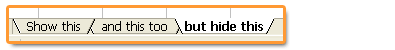
Excel trick to prevent users from un-hiding “hidden sheets” in an excel file.
Continue »{ 32 Comments }
[Reader Poll] Stacked, Seperated or Mirrored ?
Published on Jan 21, 2009 in Charts and Graphs, Learn Excel
![[Reader Poll] Stacked, Seperated or Mirrored ?](https://chandoo.org/img/a/bar-charts-ways-to-stack.gif)
Stacked bar charts are a popular way to depict 2 more series of related data, like sales of 2 products.But there are several ways to stack the bars in a bar chart. Here is a list of 6 ways to stack them
Continue »{ 14 Comments }
Visualizing Search Terms on Travel Sites – Excel Dashboard
Published on Jan 19, 2009 in Charts and Graphs, Learn Excel
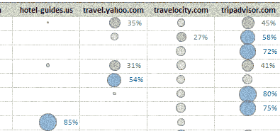
Microsoft excel bubble chart based Visualization to understand how various travel sites compete search terms
Continue »Over the weekend I tried to move this site (chandoo.org) from one hosting provider to another. Whenever I do this, I dont feel so good and yesterday was no exception.
The move failed resulting in HTTP errors for most of you.
Continue »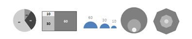
9 charting tricks you can use to make your pie charts likable
Continue »{ 40 Comments }
What are the formulas you wish Excel had ?
Published on Jan 13, 2009 in Featured, Learn Excel
Here is a list of formulas I wish MS Excel had. Alas, we need to build some work-arounds to solve them though.
Continue »Everyweek PHD shares some of the Excel links to help you learn better and become productive at using Excel. This weeks edition will help you with printing, creating named ranges, finding excel version.
Continue »{ 3 Comments }
Featured Visualizations – Jan 09
Published on Jan 10, 2009 in Cool Infographics & Data Visualizations

Check out user journeys and other cool visualizations in this weeks edition.
Continue »{ 25 Comments }
Sales Funnel Charts in Excel – Tutorial
Published on Jan 9, 2009 in Charts and Graphs, Learn Excel
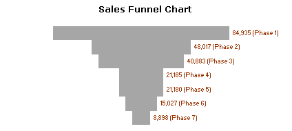
Sales funnel is a very common business chart. Here is a simple bar chart based trick you can use to generate a good funnel chart to be included in that project report.
Continue »{ 175 Comments }
Automatically insert timestamps in excel sheet using formulas
Published on Jan 8, 2009 in Learn Excel

Often when you use excel to track a particular item (like expenses, exercise schedules, investments) you usually enter the current date (and time). This is nothing but timestamping. Once the item is time stamped, it is much more easier to analyze it. Here is an excel formula trick to generate timestamps.
Continue »
