All articles with 'visualization principles' Tag
{ 32 Comments }
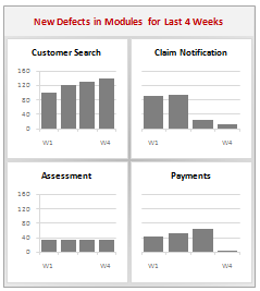
Introduction to Panel Charts using Excel – Tutorial & Template
Published on May 12, 2010 in Charts and Graphs, Featured
In this article we will learn what a Panel Chart is and how you can construct a panel chart in Excel.
What is a Panel Chart?
A panel chart is a set of similar charts neatly aligned in panels to help us understand some data which has multiple variables in it. Panel charts are also called by names “trellis displays” or “small multiples”. They are an effective way to display multi-variable data.
Here is an example panel chart showing the total defects per module over the last 4 weeks.
Continue »{ 19 Comments }
Survey Results in Dot Plot Panel Chart [followup on Incell Panel Chart]
Published on Apr 9, 2010 in Charts and Graphs
![Survey Results in Dot Plot Panel Chart [followup on Incell Panel Chart]](https://chandoo.org/img/vp/incell-dot-plot-panel.gif)
In a follow up to last week’s how to visualize survey data in excel, we will explore how you can create an incell dot plot panel chart. Please follow the links in the article to get more commentary and insights from established persona in the visualization world (including Stephen Few, Naomi, Jon etc.)
Continue »
We all know that legend can be added to a chart to provide useful information, color codes etc.
Today we will learn how to make the chart legends smarter so that they provide more meaning and context to the chart, like this:
This type of legend can be more useful than a plain legend as this provides more useful information without taking up too much space.
Continue »{ 31 Comments }
Flu Trends Chart in Excel [Yes, we can edition]
Published on Jan 22, 2010 in Charts and Graphs, Featured
![Flu Trends Chart in Excel [Yes, we can edition]](https://chandoo.org/img/p/flu-trends-chart-final-th.png)
Last week I have reviewed Google’s flu trends chart and told you that is it is very well made. Out of curiosity I made a similar chart in Excel. In this post, I am going to share the experience and results with you. Interested? Read on…
Continue »{ 7 Comments }
Visualization Lessons from Eiffel Tower [Chartbusters in Paris]
Published on Oct 9, 2009 in Charts and Graphs, Cool Infographics & Data Visualizations
![Visualization Lessons from Eiffel Tower [Chartbusters in Paris]](https://chandoo.org/img/cb/eiffel-tower-visualization-lessons.png)
Ever since I was a child, I was fascinated by Paris (and Eiffel Tower). Recently, I had opportunity to visit Paris, albeit for just a few hours (I had a 12 hour lay-over in Paris between flights). I went to see the Eiffel Tower and it looked just as beautiful and majestic as it did in my imaginations.
During my visit to Eiffel tower, I took the stairs to 2nd floor and along the way they have a handful of visualizations explaining the tower. I found them quite interesting and well made. Here, I have listed down 4 simple, yet very effective visualization lessons for all of us.
Continue »{ 31 Comments }
What would you do if a co-worker makes ugly chart? [weekend poll]
Published on Aug 7, 2009 in Charts and Graphs
![What would you do if a co-worker makes ugly chart? [weekend poll]](https://chandoo.org/wp/wp-content/uploads/2008/09/excel-charts-avoid-3d-column.png)
We talk alot about making better charts and perils of bad charts here.
I want to know what you usually do when a co-worker or boss makes an ugly chart?
- You tell them the chart sucks
- You gently point out the mistakes of their chart and tell them some nicer and cooler ways to tackle it
- You stay calm and send them an e-mail later (may be with a link to PHD chart pages or something like that)
- You don’t care (and may be continue doodling)
- Any other
Vote your option using comments.
Continue »{ 7 Comments }
Charting Lessons from Optical Illusions
Published on Jul 28, 2009 in Charts and Graphs, Featured

The other day while doing aimless roaming on the dotcom alley, I have seen some cool optical illusions. There are so many valuable lessons optical illusions can teach us – chart makers. Don’t believe me? Look at the bubble chart illusion on the left and tell me which orange circle is bigger? What is your answer? Right or left. Well, my friend, the answer is both are of same size. Read the rest of this post to find some cool optical illusions and what they can teach us – chart makers.
Continue »{ 18 Comments }
Tweetboards – Alternative to traditional management dashboards
Published on May 7, 2009 in Charts and Graphs, Featured
Here is a fun, simple and different alternative to traditional dashboards. Introducing….
{ 8 Comments }
Web Analytics Dashboard by Percent Mobile is Fun [Dashboard Reviews]
Published on May 1, 2009 in Charts and Graphs, Cool Infographics & Data Visualizations
![Web Analytics Dashboard by Percent Mobile is Fun [Dashboard Reviews]](https://i287.photobucket.com/albums/ll133/pointy-haired-dilbert/web-analytics-dashboard-th.png)
Take a look at the web analytics dashboard from percent mobile. It is well executed and provides good quality information at a glance.
Continue »{ 16 Comments }
What is Your Opinion on Pie Charts?
Published on Feb 20, 2009 in Charts and Graphs, Featured
Pie charts are one of the most used charts in the world. And for obvious reasons: they are simple to create and easy to understand. When it comes to pie chart, I have no clear opinion. Part of me says use them, the other says avoid them.
What is your opinion on Pie charts ?
Continue »
