All articles with 'conditional formatting icon sets' Tag
{ 24 Comments }
Suicides & Murders by US States – An Interactive Excel Chart
Published on Sep 9, 2011 in Charts and Graphs, Cool Infographics & Data Visualizations
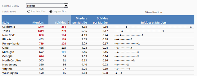
Over at PTS Blog, my dear friend & charting guru, Jon Peltier has an interesting post on using dot plots to visualize Murders & Suicides data by US States.
Not that murders & suicides fascinate me, but I wanted to play with this data myself and see how we can visualize it. So I emailed Jon and asked him to share the raw data. Being a lovely chap Jon is, he immediately sent me the data. So here we are, playing with gory data on a Friday.
Suicides & Murders by US States – An Interactive Excel Chart
You can see a demo of the chart I came up with above. Read on to learn how this chart is constructed.
Continue »{ 21 Comments }
Simple KPI Dashboard using Excel
Published on Aug 25, 2011 in Charts and Graphs, Cool Infographics & Data Visualizations
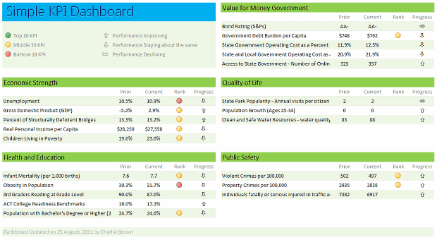
Any Tom, Dick and Sally can make things complex. It takes guts and clarity to simplify things. That is why I was pleasantly surprised to see this dashboard prepared by Michigan State. You can see it in the detailed article.
Linda, one of My Excel School students shared this dashboard link with me and asked if I can show how to construct something like this. Here is my version of the dashboard.
Read this post to learn how to construct a similar dashboard on your own. Also, you can download the excel workbook and play with it.
Continue »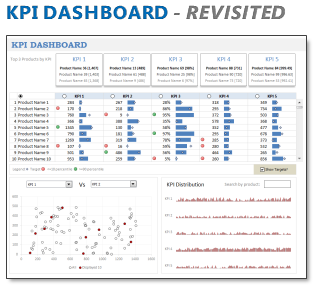
In 2008, I received an email from Robert Mundigl, which was the start of a life-long friendship. Robert asked me if he can teach us how to make KPI dashboards using Excel. I gladly said yes because I am always looking for new ways to use Excel.
The original KPI dashboards using Excel article was so popular. They still help around 12,000 people around the globe every month. Many of our regular readers and members have once started their journey on Chandoo.org from these articles.
In this article, we will revisit the dashboard and give it a fresh new spin using Excel 2007.
Continue »{ 5 Comments }
Health-care Dashboard in Excel [Dashboard Week]
Published on Mar 22, 2011 in Charts and Graphs
![Health-care Dashboard in Excel [Dashboard Week]](https://img.chandoo.org/dashboards/dw/health-care-dashboard-small.png)
As part of Dashboard Week, in this post, we will take a look at Health-care Dashboard prepared and shared by Alberto. He put together an excellent dashboard to visualize hospital performance and understand what is going on. Read this post to understand how this dashboard is made, watch a tutorial video & download example workbook.
Thank you Alberto for sharing the file & helping us learn.
Continue »{ 14 Comments }
Make Awesome Data Entry Forms by using Conditional Formatting + Data Validation
Published on Feb 7, 2011 in Learn Excel

Last week we saw a really cool holiday request form made by Theodor. This week, we will learn how to combine conditional formatting and data validation to create an awesome data entry form. First see a demo to understand what I mean: How to create such a data entry form? Very simple, just grab a […]
Continue »{ 50 Comments }
Excel Animation without Macros!
Published on Nov 30, 2010 in Charts and Graphs, Learn Excel
Today we will learn an interesting animation technique that ONLY uses, … wait for it …, Excel Formulas. That is right, we will use simple formulas to animate values in Excel.
Intrigued? Confused? Interested?
First see a short demo of excel animation achieved using this technique.
Now read the rest of this post to learn more about this technique and download sample workbook.
Continue »{ 25 Comments }
Display Alerts in Dashboards to Grab User Attention [Quick Tip]
Published on May 25, 2010 in Charts and Graphs
![Display Alerts in Dashboards to Grab User Attention [Quick Tip]](https://chandoo.org/img/dashboards/dashboard-alerts-example-th.png)
Dashboards can be overwhelming with lots of details and context. A simple way to drag user’s attention to important stuff in the dashboard is to use alerts. See this example to understand what alerts mean. How to display alerts in Excel Dashboards? The easiest way to display alerts is to use Excel 2007’s Conditional Formatting […]
Continue »{ 49 Comments }
New Features in Excel 2010 Conditional Formatting
Published on May 19, 2010 in Charts and Graphs, Learn Excel
Conditional formatting is one of favorite features in Excel. CF has helped me save the day at work more than a dozen occasions. I almost became project manager just because I knew how to make a gantt chart in excel using conditional formatting. I have written extensively about it.
So, I was naturally curious to explore what is new in Excel 2010’s Conditional Formatting. In this post, I will share some of the coolest improvements in CF.
Continue »
