All articles with 'Chart Busters' Tag
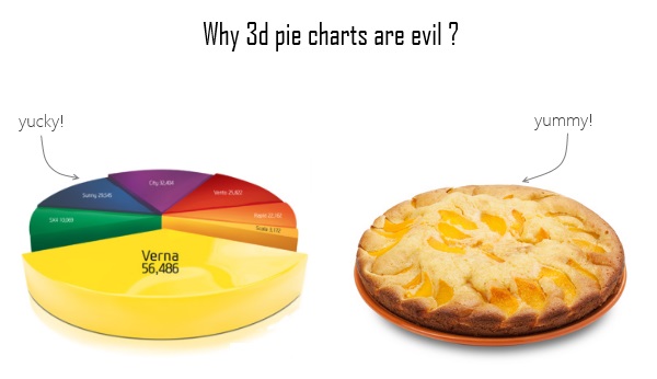
Some charts try to make you an April fool all the time (or why 3d pie charts are evil)

Recently I saw a big screaming ad that said “the chartbuster rules”. Of course, I know that chartbusters rule. Not just because I was one of them 🙂
So I got curious and read on. And I realized the ‘chartbuster’ is actually a car, not some cool, spreadsheet waving, goatee sporting dude like Jon Peltier. What a bummer!
And then to my horror of horrors, I saw the exploding 3d pie chart, with reflection effects & glossy colors. And the sole purpose of the chart is to create an impression that Verna sells better than any car in India.
Today, lets talk about this chart and alternatives for it. Read on.
Continue »5 Rules for Making Better Charts (and one fun chart)

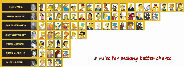
Jeff Weir, an alert reader of this blog points me this chart showcasing voice-over artist’s for various Simpson’s characters. I am a hard-core Simpon’s fan, so I naturally wasted quarter-hour looking at the chart. That is when I realize this chart is not only fun, it also teaches 5 valuable lessons on making better charts. Read the rest of this post to find out the five rules.
Continue »Evolution of Privacy Policies on Facebook – a Panel Chart in Excel

Out of curiosity I took the data from Matt McKeon’s Privacy on Facebook chart and try to re-do the chart in Excel. I made a panel chart depicting how Facebook’s privacy policies have changed since 2005. You can see a bigger version of chart as well as get the download excel from the post. Read on…
Continue »![How to Visualize Survey Results using Incell Panel Charts [case study]](https://chandoo.org/img/cb/survey-results-panel-chart-example.png)
A panel chart (often called as trellis display or small-multiples) shows data for multiple variables in an easy to digest format. It lets users compare in any way and draw conclusions with ease.
Today, I want to discuss how the principles of panel chart can be applied to visualize a complex set of survey results. For this we will use the recent survey conducted by Gartner on how various customers use BI (Business Intelligence) tools.
Continue »Remember the Sales Visualization Challenge? We got 32 extremely good dashboards submitted and finally you voted Alex Kerin’s entry as the winner. So when I informed Alex that he is the winner, I also asked him to send me a pic of him with the iPod Touch that he won. Yesterday, he sent it to […]
Continue »Ok, I need some quick feedback here. For the last few months I have been thinking and planning to launch an online excel training program. And I want to know if YOU are interested in one. Read the rest of this post if you are curious.
Continue »What is the most embarrassing charting mistake you made? [weekend poll]
![What is the most embarrassing charting mistake you made? [weekend poll]](https://chandoo.org/wp/wp-content/uploads/2008/10/making-sports-dashboards-in-excel-sml.png)
This week’s poll is very simple. What is the the most embarrassing charting mistake your made?
For me it has to be that one time when I made a sports dashboard using excel. I have adjusted the axis scale of a bar chart so that my favorite cricket player (Sachin Tendulkar, who else?)’s records are emphasized. In a matter of minutes I have received several comments from all over world pointing out the mistake. Even though, the intention was to highlight the achievements of master blaster, the axis adjustment was obviously a mistake.
Continue »We cant Cure Cancer, But we can Cure this Medicare Chart [Chart Busters]
![We cant Cure Cancer, But we can Cure this Medicare Chart [Chart Busters]](https://chandoo.org/img/cb/3/Figure_2.png)
In this installment of Chartbusters, we take a look at a poorly constructed choropleth of medicare reimbursements in US and suggest cure for it. The post is from our Guest Buster – Jeff.
Continue »![Fix this chart [excel homework #1]](https://chandoo.org/img/cb/axis-mixup-chart-fix.gif)
This column chart shows daily, weekly or monthly data depending on the user’s choice. In daily the columns are displayed properly, but in weekly & monthly mode the columns are a fraction of the width they should be – why, and how can this be avoided? Bonus points if you can describe how to use an INDIRECT formula on the x-axis labels which is another problem. Go fix it.
Continue »Are you focusing on F word or S word? [Charting Principles]
When you are making a chart next time, spend just 5 minutes (or even less) on the formatting and give more time (may be 20 minutes) to think about the story.
Continue »Bring out your bad charts, the ChartBusters are here…
Imagine having two annoying little bloggers looking over your shoulder and trying to mess up with the chart you are making…
I am still waiting, go ahead, imagine…
Now come back, that is exactly what “ChartBusters” is all about. Read more…
Continue »

