This post is from GuestBuster Jeff Weir in our Chart Busters series.
Note: The post slightly longer, but worth every word. Just get a cup of coffee and soak in to this visualization goodness. (Also, click on any image to see its full version)
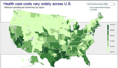
Over at the FlowingData blog, they’ve been talking about this pretty slick looking Choropleth Map that shows how Medicare returns vary across the United States:
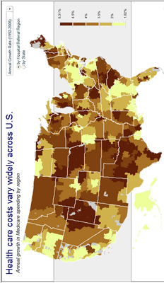
The above shows total Medicare reimbursements in 2006, either by Hospital Referring Region or by State, depending on the radio button. Using the dropdown box, you can change it to this:
…which is how the data looks if you overlay it on a Giraffe. Oops, I forgot to rotate it before saying that. Bear with me a moment…
There. See the Giraffe now? Good.
A picture is worth a thousand words, or so they say. But is a Choropleth worth the many line charts and clowns that you could squeeze into the same valuable screen real estate? Let’s find out, by evaluating what this particular chart does well, and what it does poorly, and whether other charting methods might better convey its information.
Words and music.
Right off the bat, there’s a simple way that the authors could improve this chart. While they include a description below the chart to point out what the data is, and where it came from, they miss something just as important…what they concluded from all of this. So before we consider adding – say – bullet graphs, let’s consider adding some bullet points. A few sentences can tell readers important stuff that would otherwise remain hidden in an undownloaded PDF report. Insights like:
- Care is often better in low-cost areas.
- Growth in returns are only partly explained by advancing technology, and
- Differences in growth rates across regions seem largely due to discretionary decisions by physicians that are influenced by the local availability of hospital beds, imaging centres and other resources-and a payment system that rewards growth and higher utilization.
Straight off the bat, this would make the graph a better graph…without even messing with its form.
But mess we must…
…because lurking below the chlorophyll green of this Choropleth Map are a few serious charting oversights. Ready? Let’s check ’em out.
Scale? Fail!
First, check out the legend.
Crikey…its bands are as discrete as Bruno. Its scale is about as even as my temperament. It varies about as much as =RANDBETWEEN(PaydayBankBalance, UsualOverdraft).
If you fire up Excel and look at the spread covered by each range, you see just how arbitrary the different price bands are:
Whoa…the spread of that $9k to $16k band is nearly 15 times larger than two of the other bands. That can’t be good, can it?
Nice profile
If you were to graph financial spread of each group against the aggregated number of Hospital Referral Regions that fall within each spread, you get something like a histogram. The difference between the sizes of these bands is about as different as the number of performers on stage at a Bob Dylan concert in 1964 compared with 1974. See for yourself:
Oops, wrong graphic. Try this:
Normally histograms have equal widths for each band, but here I want to highlight just how unequal the bands used are. Plus, this lets us regroup the data into evenly spread $1k bands, and overlay it on the first distribution, to see how it compares. Here’s one that I prepared earlier, with the red line as the regrouped data…
Vastly different picture isn’t it. The red is kinda like Data Pig’s heart rate before he eats chocolate covered bacon on Saturdays, and the blue is how his ECG would look when he’s in the ambulance, on the way to the hospital.
This makes it very hard to answer that important question “…compared to what?” With such different sized bands, how can we compare one to another? How can we be sure that the distributions within each band will even allow us to?
For instance, take the highest band spread of $9k to $16k: without any further information to go on, we might assume that the median (i.e. middle) value for districts in this category is midway between the $9k to $16k boundaries, like this:
But that’s like assuming that Simon and Chartjunkle (oops, Garfunkel) have equal talent. We’d be wrong. Verywrong. In actual fact, there’s only three data points to the right of our guessed median line. And as for the 55 hospital regions in Group Five that fall to the left of it…well, they all get tarred with the same brush those worst three performers. The actual median for this group is a lot further left, as shown below:
This means that over half the data in this 5th band actually falls much closer to the far left of the graph than to the far right of the same group it’s been placed in.
You can see this better if you add a one-dimensional strip plot above the graph, which gives an idea of where the 300 odd values fall within the entire range:
Whoa…looks like we’ve got a few outliers to contend with.
What a State we’re in…
This seemingly arbitrary ‘bucketing’ effect is exacerbated when aggregating the different hospital regions into State-wide totals. Except this time regions are being penalised by arbitrary geographical boundaries, as well as the arbitrary financial ones above.
Take Texas for example. Aggregating everything up to the State level, Texas appears in that highest band. Yet at the Hospital Referral Region level, one third of its 22 different hospital fall below the national average, and the median for the whole State is around $8,800. So we better be careful making assumptions from a State-wide view, because the Choropleth averages some very diverse costs over some very large chunks of real estate.
To see just how diverse, let’s rank the entire US values from smallest to largest, and highlight where the Texas readings fall within that range:
What can we tell from this? Firstly, nearly all regions nationwide fall between $5k and $10k. Secondly, there are a few outliers that really skew the picture at the high end. Thirdly, in the Texas case, the State average is boosted somewhat by 3 Texan districts that happen to be among the worst 10 culprits nationwide – one of which is clearly an outlier at $15k. Unfortunately for the lower cost Texan regions, they’re guilty by geographical association…kinda like being kidnapped and held for a zillion dollar ransom, just because you happen to live in the same State as Bill Gates.
So what do we get by aggregating to State boundaries? Probably more blurring than insight. After all, what good would a weather report be to Texans if it only reported the average weather they could expect as a State! Instead, it’s better to keep the aggregation at the Hospital Referral Region level. That way, we can look at this:
…and ask things like “Wow, why such a difference between Waco and the surrounding bits of Texas?” and “What the hell is Alaska doing there?”
Legends in the making…
What’s far worse that this though is that when looking at the State-wide map, the legend is now really, really wrong.
Here’s the legend next to the actual State-wide figures, for comparison:
Whoops…the graph title has changed to reflect we’re now looking at Medicare spending per beneficiary per State; i.e. State averages. The legend is still looking at Hospital Referral Region averages, which have a much greater spread. For instance, the Choropleth shows six States as being dark green regions, and the legend says they fall somewhere within $9k to $16k. But the actual data shows they fall in a $9.4k to $9.6k range. Oops! Slight misrepresentation, there.
How to fix it
Obviously this graph really should use a quantitative scale with equal increments; one that changes to reflect the selection that users make. What’s more, colors should have just enough variation so as to highlight any important differences, without being overwhelming or mistaken for camouflage.
But is a Choropleth Map the best way to present this data in the first place? If you want something for people to play with online, then maybe…but if you want to compare things very closely to other things, then maybe not.
For sure, a Choropleth Map looks cool, and it has what Tusha Metha calls “natural context”. But from an analytical perspective, a Choropleth only really reports how one thing changes with regards to geography. If geography is a major determinant – or if you want to show people how things look in their own back yard compared to others – then perhaps this is the piece of kit you need. But if there’s other factors that have much more sway on your data than geography, then perhaps not. For instance, we might want to see whether population density plays a significant part in Medicare returns, given the likely economies of scale from providing healthcare to densely populated regions vs. urban regions. Nows the time to break out a scatter plot:
Hmmm…looks promising. (Note: I’ve used State-wide data for the above…ran out of time to track down densities in the different Hospital Referral Regions, which is what I’d prefer to do.)
Or we might want to zoom in on the best or worst offenders, and see just how different they are to each other, and to the median value:
Conclusion
I think a better, fairer Choropleth Map at the Hospital Referral Region level would be interesting. But I don’t think it would be enough. To quote from Stephen Few’s latest book Now you see it: “Color is good at drawing your attention to something if used sparingly, but is one of the ‘pre-attentive attributes’ that is not quantitatively perceived in and of themselves”.
Whereas lines and 2D precision are very precise ways to encode quantitative values.
So when it comes to answering the ‘Compared to what’ question, I don’t think you can beat this:
Choropleth Maps in Excel
For information on the implementation of Choropleth Maps in Excel, check out Tushar Mehta’s excellent resources.
For more information on the pros and cons of Choropleth Maps, check out the Clearly and Simply blog, where Robert has built on Tushar’s excellent approach to produces some great downloadable templates. He also offers advice on potential drawbacks of Choropleth Maps, such as:
- No visualization of development over time
- No information on exact values (unless you are implementing tooltips including the data)
- Very limited direct comparability of the regions
- Possible perception problems with regards to the size of regions (e.g. Rhode Island on a US map)
- Possible misinterpretation because the size of a region may have a greater impact on the user’s visual perception than the intensity of the fill color
- Requirement of real estate on a dashboard
His recommendation: carefully consider whether or not a Choropleth Map is the best visualization for your purposes. Check out his dashboard of Lithuania at a glance to see how he mitigates some of the potential problems by incorporating other graphs into the display.
I used Robert’s template to produce this State-wide Choropleth Map of total Medicare spending per enrollee, 2006 using the same Medicare ranges as the Choropleth that’s the subject of this post:
…
…then I replotted the graph using data that had been regrouped $1k bands:
While I don’t advocate this approach, it’s interesting that even though this is aggregated to State-wide totals, you can see significant differences between the graphs.
Right, that’s it. I’m off to the Hospital to see someone about my writers cramp…
About the Author
Jeff is a Business Analyst from Wellington, New Zealand who has recently discovered a strong interest in Data Visualization. He swears by Edward Tufte and Stephen Few as much as he swears at Excel 2007. He’s so new to advanced Excel, that 2 years ago he had to ask a work friend what the dollar signs in $A$1 meant. Now that he knows that, he’s trying to find out what the dollar signs in $A$2 mean.
Note from PHD:
Thank you Jeff. Your passion and knowledge is truly outstanding. I have a whole pack of donuts waiting for you.


