
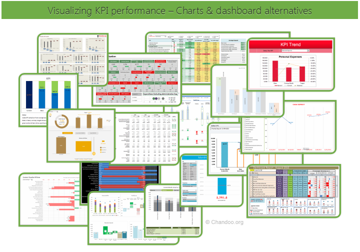
Hello all, prepare to be amazed! Here are 43 creative, fun & informative ways to visualize KPI data.
About a month ago, I asked you to visualize KPI data. We received 65 entries for this contest. After carefully reviewing the entries, our panel of judges have discarded 22 of them due to poor charting choices, errors or just plain data dumps. We are left with 43 amazing entries, each creatively analyzed the data and presented results in a powerful way.
How to read this post?
This is a fairly large post. If you are reading this in email or news-reader, it may not look properly. Click here to read it on chandoo.org.
- Each entry is shown in a box with the contestant’s name on top. Entries are shown in alphabetical order of contestant’s name.
- You can see a snapshot of the entry and more thumbnails below.
- The thumb-nails are click-able, so that you can enlarge and see the details.
- You can download the contest entry workbook, see & play with the files.
- You can read my comments at the bottom.
- At the bottom of this post, you can find a list of key charting & dashboard design techniques. Go thru them to learn how to create similar reports at work.
Thank you
Thank you very much for all the participants in this contest. I have thoroughly enjoyed exploring your work & learned a lot from them. I am sure you had fun creating these too.
So go ahead and enjoy the entries.
PS: I am sorry if your entry is not shown on this page. We had to disqualify 22 entries due to various reasons.
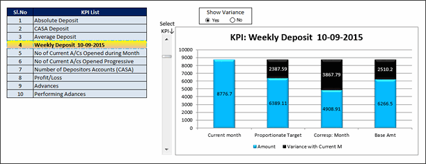
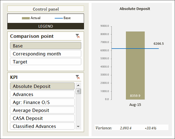
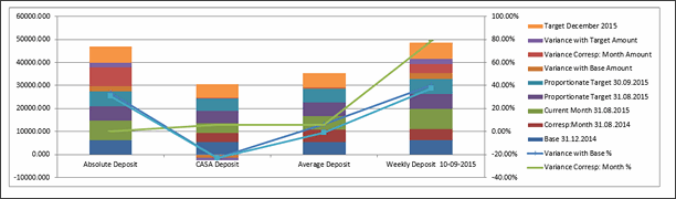
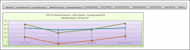
KPI Dashboard by Alberto Almoguera


- Interactive with selection mechanism
- Interesting representation
- Lower charts can be replaced with sparklines / in-cell to declutter

KPI Chart by Amit Sinha

- Comparison and variance analysis
- Could use some insights – plain text instead of second chart?


KPI Chart by Ben Spalding

- Thermo-meter chart
- Feels over formatted, could have used simple colors.
KPI Chart by Chad Markel


- Interactive
- In-cell charts
- simple colors and easy to read
- May be sorting?!?
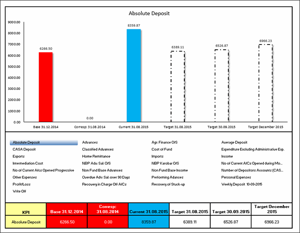
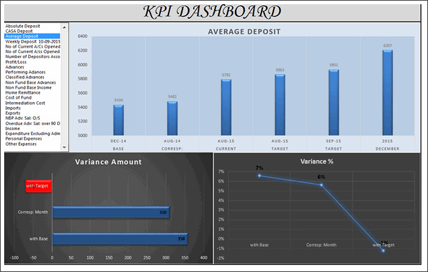
KPI Dashboard by Chetan Bhavsar


- Interactive
- Sortable
- The charts are well designed & labeled.
- Could have removed the table and kept charts (or reduced the content in table) as it is duplication.
KPI Dashboard by Francesco Petrella


- Interactive with slicers
- In-cell charts
- colorful & elegant
Become Awesome in Excel & VBA – Create dashboards like these…

- Learn how to create interactive dashboards & reports using Excel
- Develop your own macros & VBA code
- 50+ hours of video training
- Learn at your own pace
- Click here to know more
KPI Dashboard by George Gourgoulias
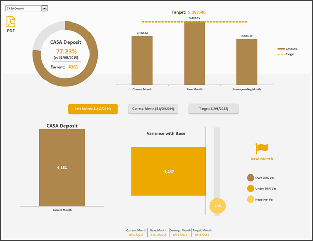

- Interactive with VBA / form controls
- Elegant and beautiful
- Ability to publish the report as PDF
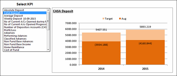
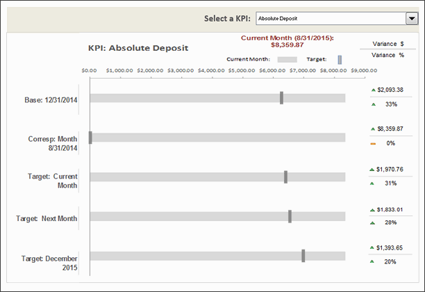
KPI Chart by Indranil Sarkar
- Interactive
- Scrollable list to select KPIs
- Could use alignment and simpler formatting
KPI Chart by Janet
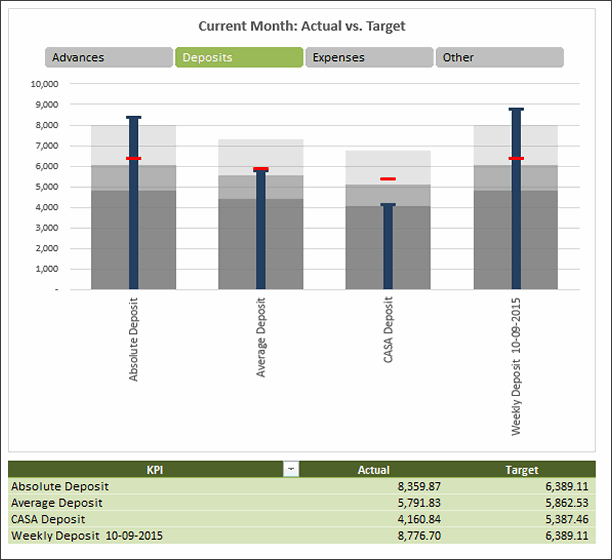
- Interactive with slicers
- Bullet charts
- Could use labels / explanation
- Also, horizontal is better
KPI Dashboard by Jiakun Zheng

- Interactive with slicers
- power pivot (XL 2010+)
- Alignment problems, poor labeling
KPI Chart by Jonathan Decker

- Interactive
- Simple colors
- The current month bar feels repetitive. Could have used a line?
KPI Dashboard by Joon Tan
- Simple charts with elegant presentation
- Ability to add commentary
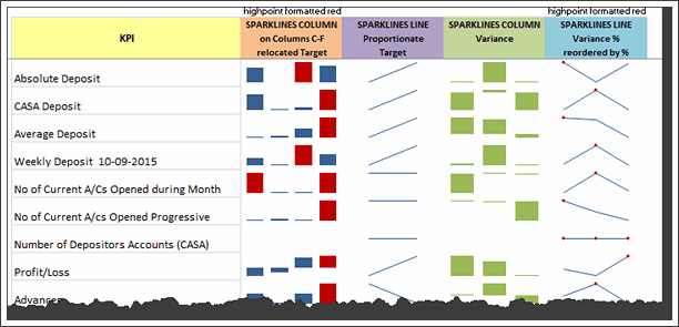
KPI Chart by Karthik Ranggarajan

- Sparklines
- Elegant table design to present the information in simple way
- Good colors and layout
KPI Chart by Kaushik Joshi
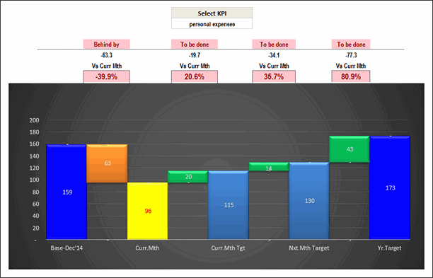
- Waterfall chart
- Interactive
- Interesting representation, reduce the colors
KPI Dashboard by Keriman Hande
- Summary of key KPIs on top and drill down at bottom
- Ability to view variance or amounts
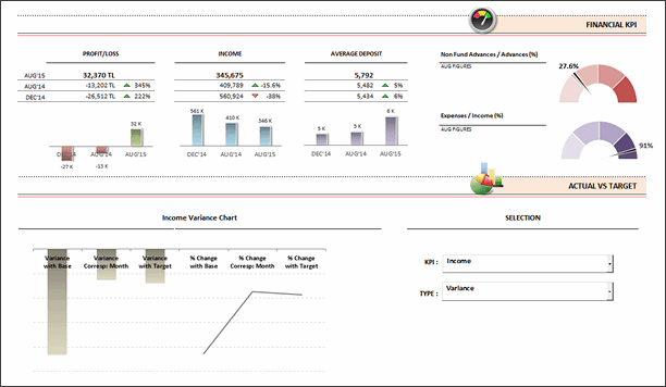
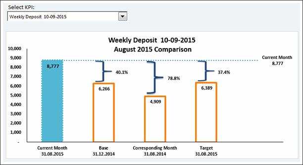
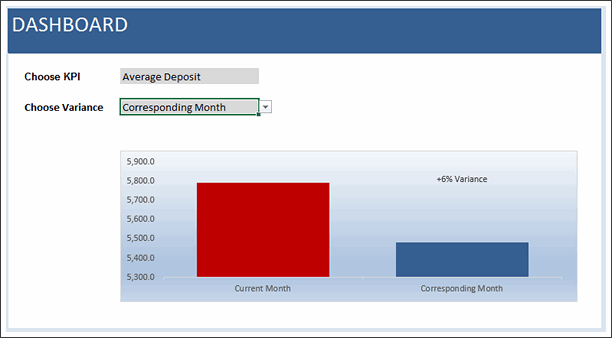
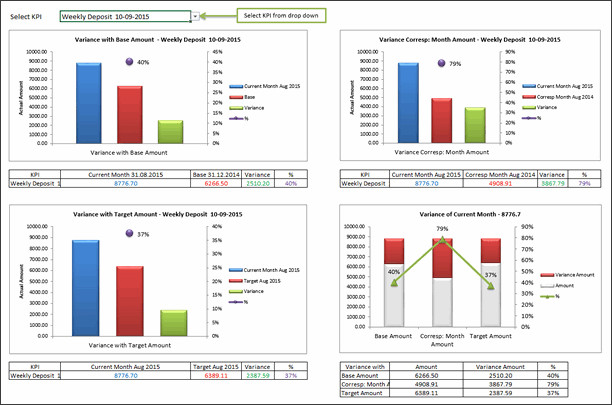
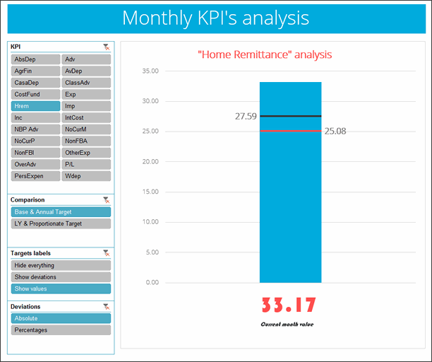
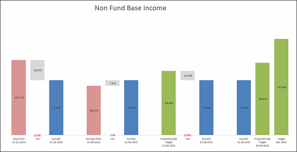
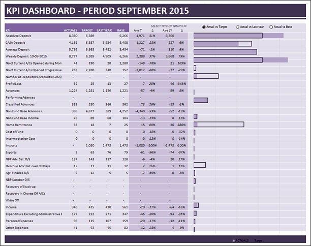
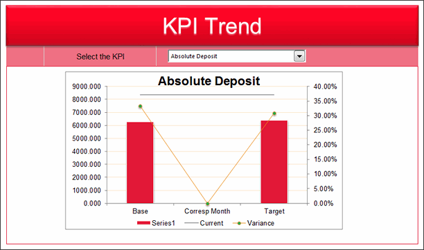
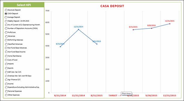
KPI Dashboard by Krishna Teja
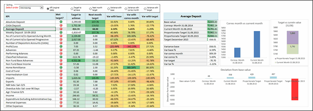

- Interactive with VBA / form controls
- Ability to sort, drill-down to selected KPI
- Feels a bit cluttered, reduce the columns
- Could use alignment and simpler colors

KPI Chart by M.Hussain Kawosh

- Interactive
- Grouped KPIs to multiple charts
- Could use explanation, not sure how to read the charts / grouping
KPI Chart by Marie-Anne Andre

- Interactive with slicers
- Interesting design and presentation
- Reduce the control panel size and give more insights.

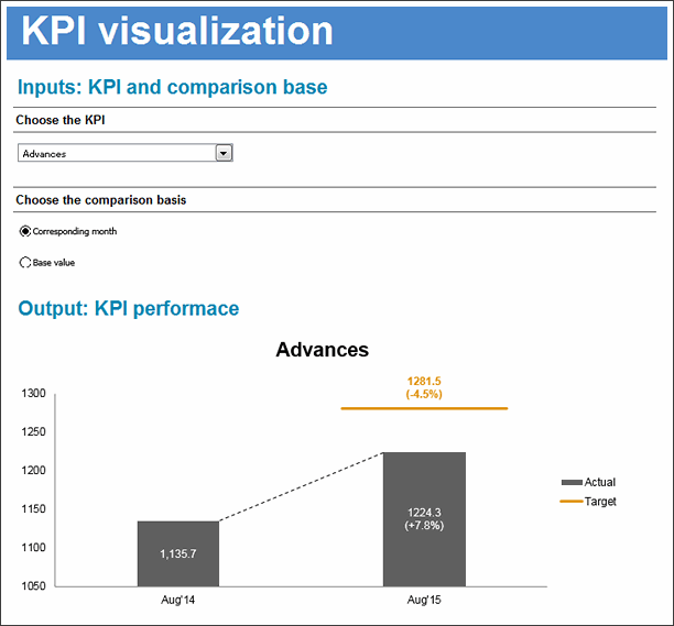
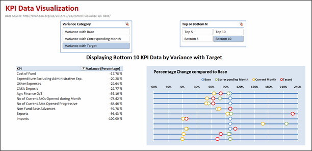
KPI Chart by Narayan Digambar
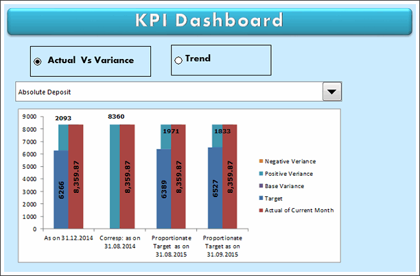


- Interactive
- Interesting take on the analysis – trend vs. variance
- Picture links
- Could use alignment and simpler colors
KPI Chart by Rabi Mahapatra
- Technically a data dump, but I give credit for the creative hexagonal KPI analysis.
KPI Chart by Ramananda V
- Interactive
- Compares handful of KPIs amongst each other
- Could use less formatting
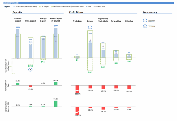
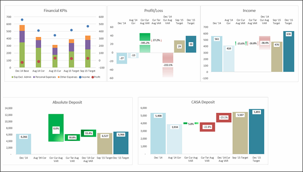
KPI Dashboard by Reynaldo Peña

- Interactive with slicers
- Clear and elegant design
- Various comparisons and insights
Become Awesome in Excel & VBA – Create dashboards like these…
- Learn how to create interactive dashboards & reports using Excel
- Develop your own macros & VBA code
- 50+ hours of video training
- Learn at your own pace
- Click here to know more
KPI Chart by Ronaldo Balas

- Interactive
- Interesting design, but feels over formatted. Reduce special effects, the caps on columns feel like stacked columns and confuse.

KPI Chart by Utkarsh Shah
- Interactive
- Error in the option button selection (25 visible KPIs vs 23 buttons)
KPI Chart by Wil Davis
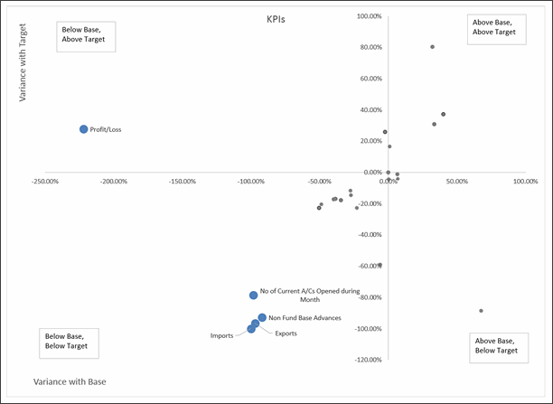

- Scatter plot with KPI performance
- Interesting representation
- Ability to drill down select KPI


Become Awesome in Excel & VBA – Create dashboards like these…
- Learn how to create interactive dashboards & reports using Excel
- Develop your own macros & VBA code
- 50+ hours of video training
- Learn at your own pace
- Click here to know more
Techniques used in these dashboards & charts
If you want to create these kind of charts & reports at work, I suggest reading up the Excel Dashboards & Excel Dynamic Charts pages. Also check out below links to know more about specific techniques.
- Form Controls
- Data validation
- Pivot tables
- Slicers
- Clickable Cells (VBA)
- VBA
- Formulas
- Sortable Tables
- Data bars (CF)
- Conditional Formatting
- Scrollable Tables
- Picture links
- Sparklines
How do you like these charts & dashboards? Which are your top 5?
Quite a few of these entries are really impressive. You can learn a lot by deciphering the techniques in these workbooks. Many thanks to everyone who participated. I will publish the winner names in next few days. Meanwhile, share your comments and tell me what you think. Share your top 5 entries too. 🙂


38 Responses to “Time to showoff your VBA skills – Help me fix ActiveSheet.Pictures.Insert snafu”
I tried your code with 2003, it works.
But, I know Addpicture does not take URLs anymore with 2007 onwards, perhaps its the same with picture.insert as well.
http://support.microsoft.com/kb/928983/en-us
The above link gives the solution as "picture fill in a shape such as a rectangle".
Tried to recreate this, but it worked fine for me. I just took the image of the error you showed in the post. Is there more info that can narrow this down a bit?
Don't know if this helps?
http://www.theserverside.com/discussions/thread.tss?thread_id=47101
Hi
Not sure if this is what you're after, but I just tried this
Sub Macro1()
ActiveSheet.Pictures.Insert("http://www.google.co.uk/intl/en_uk/images/logo.gif").Select
End Sub
Tied a button to it on the sheet and it seems to work; hope this helps a little
Ian
@All.. the issue is in Excel 2007. In 2003 ActiveSheet.Pictures.Insert seems to work fine. Unfortunately, I have design this in Excel 2007.. that is why I posted it here..
v2
Sub Macro1()
Set n = ActiveSheet.Pictures.Insert("http://www.google.co.uk/intl/en_uk/images/logo.gif")
With Range("c12")
t = .Top
l = .Left
End With
With n
.Top = t
.Left = l
End With
End Sub
Ian
That didn't come out very well. This positions at c12, so can change easily:
Sub Macro1()
Set n = ActiveSheet.Pictures.Insert("http://www.google.co.uk/intl/en_uk/images/logo.gif")
With Range("c12")
t = .Top
l = .Left
End With
With n
.Top = t
.Left = l
End With
End Sub
Works OK in 2007
Ian
The above codes work fines to my EXCEL 2007. Thanks.
Chandoo:
Try 'ActiveSheet.Pictures.Insert'
With ActiveSheet.Pictures.Insert("C:\Example.png")
.Left = ActiveSheet.Range("A1").Left
.Top = ActiveSheet.Range("A1").Top
End With
activesheet.pictures.insert "C:\Documents and Settings\Jon Peltier\Desktop\2007 stuff\insert_charts_2007.png"
Works for me in 2003 SP3 and in 2007 SP2.
Check the URL, and make sure you have internet connectivity.
What also works, and is newer (pictures.insert was supposedly deprecated in '97):
activesheet.shapes.addpicture "C:\Documents and Settings\Jon Peltier\Desktop\2007 stuff\insert_charts_2007.png", false, true, 200,200,100,100
Unfortunately you must specify dimensions (the last four arguments) and you don't necessarily know them. But the picture size is still related back to the original picture size, so you could use scaleheight and scalewidth to fix this.
Chandoo: I just re-read your post.
The code I posted works for me. However, I'm using a local picture. If you try to add a picture from the web, this won't work.
I remember solving this problem before by adding a rectangle shape first, then using the Shapes.AddPicture method to get a picture from the web.
I'll find that code and post it here.
Some more updates... The code "ActiveSheet.Pictures.Insert (path)" works fine in Excel 2007 at home. Strange it failed miserably on my work laptop. Do you think this has got something to do with SP2 of MS Office 2007 or something like that?
@Ian, Jon: Thanks for the code snippets. I guess I will use my home installation of excel to do this.
Chandoo:
Try this on your work laptop:
Sub test()
ActiveSheet.Shapes.AddShape msoShapeRectangle, 50, 50, 100, 200
ActiveSheet.Shapes(1).Fill.UserPicture _
"http://www.datapigtechnologies.com/images/dpwithPig6.png"
End Sub
FYI:
http://support.microsoft.com/kb/928983/en-us
I didn't mean to post code with a local file, because both approaches worked with an internet image as well. This is in Excel 2007 SP2.
activesheet.pictures.insert "http://peltiertech.com/images/2009-07/col_area_noblanks.png"
Jon: Looks like I have SP1 on my client machine! I wasn't paying attention.
Just checked my home computer where I have SP2, and you're right...looks like they fixed it.
I didn't even bother testing in SP1, though I could if anyone cares enough.
I'm afraid I don't have a solution, but I find it remarkable that after attaining a certain status in the Excel world, Chandoo does not need to post on an Excel discussion forum to get help for an Excel problem. Instead, he posts on his blog and all the gurus come rushing to his help.
Isn't Web 2.0 great?
Teylyn - I saw Chandoo's tweet first, and followed the link back to his blog.
@Mike.. thank you. I have seen the fill rectangle solution before posting the query here. For that matter, I have also tried the solution of embedding a browser control on a spreadsheet. both of these seemed a bit extreme. That is why I have asked it here.
But I guess I will end up using it if I had to build this in work laptop.
@Teylyn: I have thought of posting this in a forum. (Unfortunately I have not been to any excel group in the last 5 years. Last time I was active was when I built a jave based excel sheet construction solution using POI.HSSF classes of Apache... ) After searching for a few hours, I found several forum posts where others had same problem and the solution recommended (using .left and .top parameters) is not working for me. Incidentally most of these solutions are from a certain Jon Peltier 😛
I thought may be the problem is interesting for fellow blog readers. So I posted it here.
Hi,
Adapting the code in the question,
[code]
Sub InsPicture()
pPath = "http://chandoo.org/images/pointy-haired-dilbert-excel-charts-tips.png"
With ActiveSheet.Pictures.Insert(pPath)
.Left = Range("a1").Left
.Top = Range("a1").Top
End With
End Sub
[/code]
Seems to work fine
Looks like it was a problem in 2007 up to SP1, which was corrected in SP2.
@Jon.. seems like the case. I just checked the version at work laptop. it is 12.0.6331.5000 (SP1).
Thank you so much every one. I really appreciate your time and suggestions in solving this.
Glad to help. I couldn't understand why something so straightforward wasn't working.
Hi All
Is there a way of inserting a motion clip eg animated gif or swf or flv?
Thks
You can insert animated GIFs by inserting them in a browser control through VBA. For other types of movies, I can guess you can insert them as clip art.
I WANT THE INSERT PICTURE BY USING COADING
so currently i was struggling same as you, chandoo, with the insert picture method in excel 2007/10 from an url and came along your thread here.
so i re-designed the code on the addshape method as mike was suggesting it and all of the sudden it works just fine.
thanks alot to you guys, you were a great help
a big salut from switzerland
Hi guys,
I need help copying and pasting an image with the path in a cell.
I leave the code.
And thank you very much!
Sub Copiarimg()
Dim pic As Picture
With ActiveSheet
Set pic = .Pictures.Insert(Range("f2").Value)
With .Range("e9:g22")
pic.Top = .Top
pic.Left = .Left
pic.Width = .Width
pic.Height = .Height
End With
End Sub
I've played around with the approaches in these comments, and the code below is what I've come up with. The ImagePath can be a local file or a URL. As Jon mentioned above, the trick is to set an arbitrary value for the width and height, then call the ScaleWidth and ScaleHeight methods afterward to reset the picture to its original size. Once the LockAspectRatio property is set, you can change the picture width and the height will automatically scale (or vice-versa).
Sub AddPictureToRange(TopLeftCellAddress As String, ImagePath As String)
Dim pic As Shape
Dim l As Single, t As Single
Dim temp As Single
l = Me.Range(TopLeftCellAddress).Left
t = Me.Range(TopLeftCellAddress).Top
temp = 10# ' arbitrary value
Set pic = Me.Shapes.AddPicture(ImagePath, msoFalse, msoTrue, l, t, temp, temp)
pic.ScaleHeight 1#, msoTrue
pic.ScaleWidth 1#, msoTrue
pic.LockAspectRatio = msoTrue
End Sub
I need some help with inserting pictures. I have an excel file with a column of item numbers next to this row I want to insert a picture of this item. The pictures are coded with the item number so I tried to insert it with one of the codes above:
Sub InsPicture()
pPath = "http://img.bricklink.com/P/80/55236.gif"
With ActiveSheet.Pictures.Insert(pPath)
End With
End Sub
That worked but I need to do that for every row separtly.
So I tried in the code
pPath = "http://img.bricklink.com/P/80/"&Text(a1;"#")&".gif"
But that gives errors.
Anybody ideas?
Hi Nicholas, I used your solution in a related problem in Excel 2003 and it worked flawlessly..thank you!
Hi Mike Alexander,
Your solution with some changes was helpful in my problem in XL 2007, thanks.
Hi,
thanks all. In addition, I had a problem with multiple pictures inserting (every new picture replaced the prior one). I've changed it a bit, may be helpful..
Sub test()
ActiveSheet.Shapes.AddShape msoShapeRectangle, 50 , 50, 100, 200
ActiveSheet.Shapes(1).Fill.UserPicture _
"http://www.datapigtechnologies.com/images/dpwithPig6.png"
ActiveSheet.Shapes(1).Copy
ActiveSheet.Paste
End Sub
Try this instead:
Sub test()
ActiveSheet.Shapes.AddShape msoShapeRectangle, 50 , 50, 100, 200
ActiveSheet.Shapes(ActiveSheet.Shapes.Count).Fill.UserPicture _
"http://www.datapigtechnologies.com/images/dpwithPig6.png"
End Sub
Thanks to everyone, this thread has been very helpful. However, image inserting still doesn't work quite as expect for me.
While I can get a picture inserted into an Excel 2010 worksheet using either:
1) ActiveSheet.Shapes(ActiveSheet.Shapes.Count).Fill.UserPicture...
2) ActiveSheet.Pictures.Insert(pPath), and
3) Shapes.AddPicture...
unfortunately the images all insert with a display size determined not by the actual pixel dimensions of the image but by the dpi resolution.
So for example, if I insert two copies of the exact same 600x600 pixel image, one with a 300dpi resolution and the other with 72dpi, they display at vastly different sizes on screen.
While this might be intended behaviour for Excel in order to maintain a WSYWIG printing layout, I actually need a way to insert the image based on the the actual pixel dimesnsions and ignoring the dpi resolution.
Any help appreciated.
Thanks
Kez
Not doing an intentional bump, but realised I posted in rely to one of the repsonses here instead of to the main thread, so reposting.
=====
Thanks to everyone, this thread has been very helpful. However, image inserting still doesn’t work quite as expected for me.
While I can get a picture inserted into an Excel 2010 worksheet using any of the below methods:
1) ActiveSheet.Shapes(ActiveSheet.Shapes.Count).Fill.UserPicture....
2) ActiveSheet.Pictures.Insert(pPath), and
3) Shapes.AddPicture....
unfortunately the images all insert with a display size determined not by the actual pixel dimensions of the image but by the dpi resolution.
So for example, if I insert two copies of the exact same 600×600 pixel image, one with a 300dpi resolution and the other with 72dpi, they display at vastly different sizes in Excel on screen.
While this might be intended behaviour for Excel in order to maintain a WYSIWYG printing layout, I actually need a way to insert the images based on the the actual pixel dimesnsions and ignoring the dpi resolution.
Any help appreciated.
Thanks
Kez
Well, answered my own question 🙂
For those who might be interested, you can use this function:
Public Function GetPicDims(strFilePath As String, strFileName As String) As String
GetPicDims = CreateObject("Shell.Application").Namespace((strFilePath)). _
ParseName(strFileName).ExtendedProperty("Dimensions")
End Function
to get the dimensions of the image you want to insert. Then you can parse the return string and use the width and height values to add a rectangle shape of the appropraite size, like:
ActiveSheet.Shapes.AddShape msoShapeRectangle 50, 50, iWidth, iHeight
which you then fill with the picture:
ActiveSheet.Shapes(ActiveSheet.Shapes.Count).Fill.UserPicture "c:\temp\test.jpg"
This way the picture gets inserted using the pixel dimensions and the (print) resolution gets ignored.
If desired, the GetPicDims function can be made more generic to get other ExtendedProperties.
Regards
Kez