
Recently, I ran a contest asking you to analyze a bunch of sales data and present your results in charts. We received a total of 78 charts from 45 people. The contest entries had a mind-boggling variety of excel charts, techniques and ideas. It took me a while to go thru all the files and compile the results. Thanks for your patience. In this post, you can find all the charts along with my comments & links to download files.
How to read this article?
This is a very big page. So let me help you out.
- Each of the 45 contestant’s entries are shown in one box. The box shows one of the charts the contestant has made.
- If the contestant has made more than 1 chart, then thumbnails of remaining charts are shown beneath. You can click on thumbnails to enlarge the images.
- For some charts, I have added my comments.
- You can download the file(s) for each contestant’s charts by clicking download links below the image
- If you want to learn how a particular chart is constructed, refer to Related Articles section
- I really liked some of the entries. You can see “Chandoo’s pick” icon on top of such charts.
- This article is big. So get a cup of coffee and enjoy it sip by sip.
Winner of this contest will be announced tomorrow.
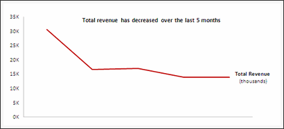
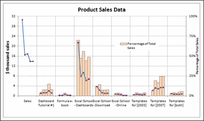
[01] Line chart by Aditya


| My comments | Downloads | Related Articles | » Smart chart labels » Good color choices, well contrasted |
• Download file | ♥ Smart chart labels |
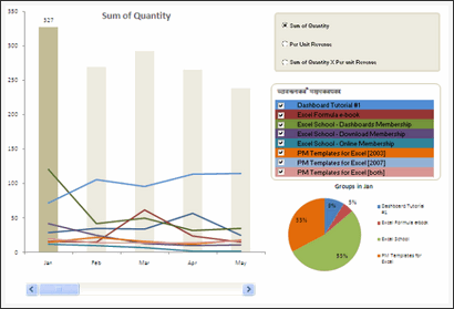
[02] Column chart by Al


| My comments | Downloads | Related Articles | » Interesting presentation » Use of shapes to highlight the message |
• Download file | ♥ Smart chart labels ♥ How to make charts when you have too much data |

[04] Column chart by Ameya


| My comments | Downloads | Related Articles | » Interactive charts » Revenue Trend lines |
• Download file • Download file 2 • Download file 3 |
♥ Using form controls ♥ Dynamic Charts with Check Boxes |

[06] Column chart by Anachalee

| My comments | Downloads | Related Articles | » Interactive charts » Revenue Trend lines |
• Download file | ♥ Using form controls |
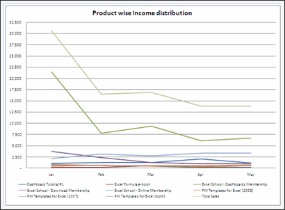
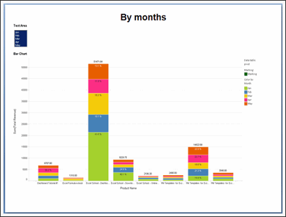
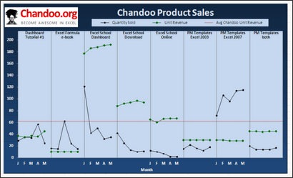
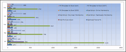
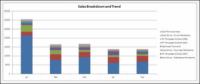
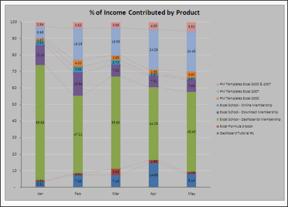
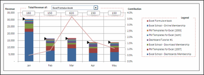
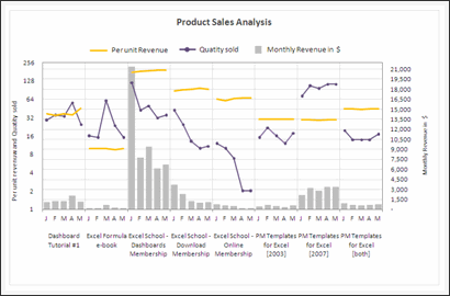
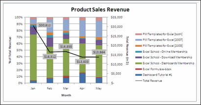
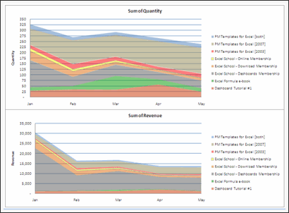
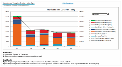
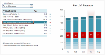
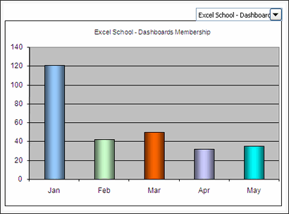
Excel School Online Training Program by Chandoo

| My comments | Downloads | Related Articles | » Learn Excel Step by Step » Analyze data like a pro » Become Awesome! |
• Download Excel School Brochure | ♥ Excel School Demos ♥ Excel School FAQS ♥ Excel School Pricing & Signup |
[08] Column chart by Arpita


| My comments | Downloads | Related Articles | » Interesting presentation » Not made in Excel |
• Download file | ♥ Using form controls |
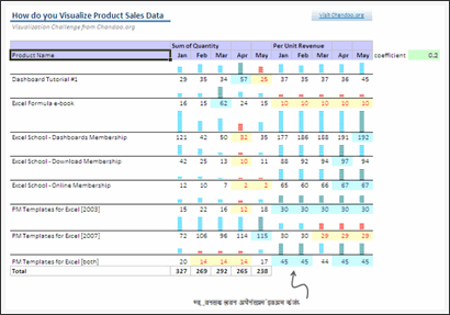
[09] Panel chart by Ben
| My comments | Downloads | Related Articles | » Panel chart » Average line |
• Download file | ♥ Panel charts |
[11] Panel chart by E
| My comments | Downloads | Related Articles | » Panel chart » Very well constructed » Good color choice, well contrasted |
• Download file | ♥ Panel charts |
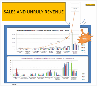
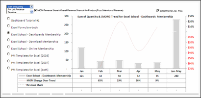
[12] Dashboard by Ezequiel
| My comments | Downloads | Related Articles | » Interactive charts » Multiple types of analysis possible |
• Download file | ♥ Using form controls ♥ Display on-demand details in excel charts ♥ Panel charts |
[13] Line charts by Fredrick


| My comments | Downloads | Related Articles | » Good observations » Trend line |
• Download file |
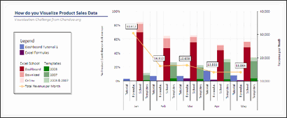
[15] Dashboard by Harshad


| My comments | Downloads | Related Articles | » Good structuring of charts » Interactive charts » Interesting observations |
• Download file | ♥ Using form controls ♥ Comparison charts ♥ Donut bar chart |
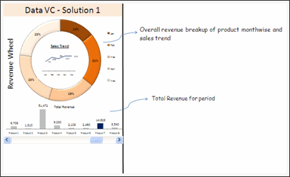
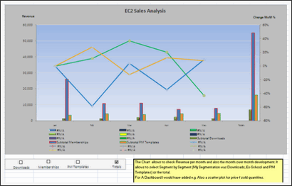
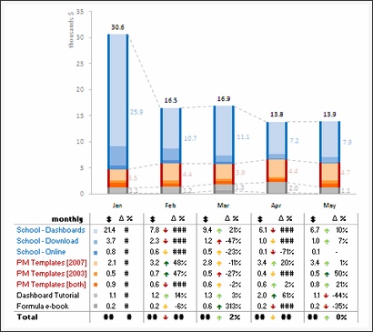
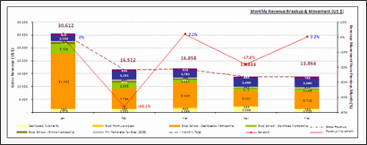
[16] Panel chart by Jay
| My comments | Downloads | Related Articles | » Panel chart » Totals vs. monthly product-wise breakup |
• Download file | ♥ Panel charts |
Excel School Online Training Program by Chandoo
| My comments | Downloads | Related Articles | » Learn Excel Step by Step » Analyze data like a pro » Become Awesome! |
• Download Excel School Brochure | ♥ Excel School Demos ♥ Excel School FAQS ♥ Excel School Pricing & Signup |
[17] Panel chart by Jeff


| My comments | Downloads | Related Articles | » Good color choices » Panel chart |
• Download file | ♥ Panel charts |
[18] Column chart by Jennifer
| My comments | Downloads | Related Articles | » Interesting legend | • Download file | ♥ Smart chart labels |
[19] Column chart by Jochen
| My comments | Downloads | Related Articles | » Interactive chart » Lots of analysis possible |
• Download file | ♥ Using form controls ♥ Dynamic Charts with Check Boxes |
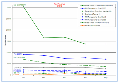
[22] Panel chart by Laksiri
| My comments | Downloads | Related Articles | » Panel chart » Monthly panels along with overall panel » Good colors |
• Download file | ♥ Panel charts |
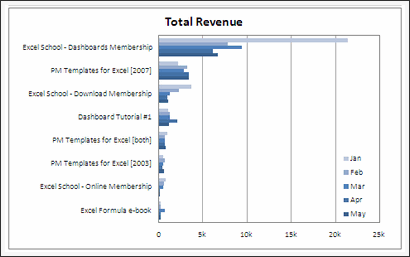
[23] Column chart by Lu
| My comments | Downloads | Related Articles | » Incell chart | • Download file | ♥ Incell Charts |
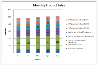
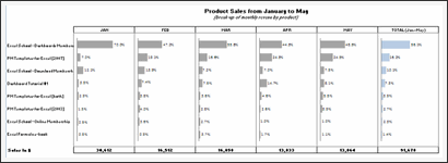
[24] Column chart by Lukas

| My comments | Downloads | Related Articles | » Very good colors » Interesting chart construction » Table to support additional analysis |
• Download file |
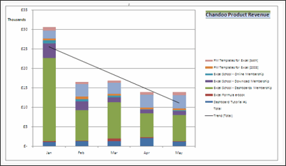
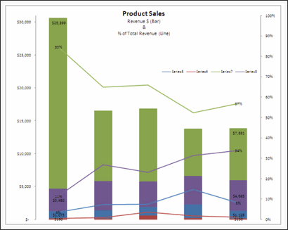
[25] Area chart by Mat
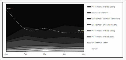
| My comments | Downloads | Related Articles | » totals in second series as a line » Well contrasted labels » Grouping |
• Download file |
[26] Panel chart by Matt

| My comments | Downloads | Related Articles | • Download file • Download file 2 |
♥ Panel charts |
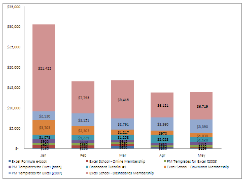
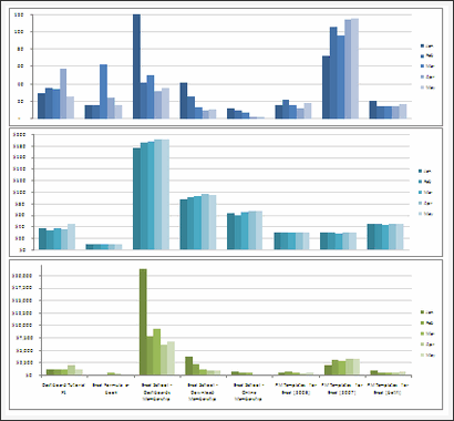
[28] Column chart by Michael


| My comments | Downloads | Related Articles | » Multiple charts for different types of analysis | • Download file |
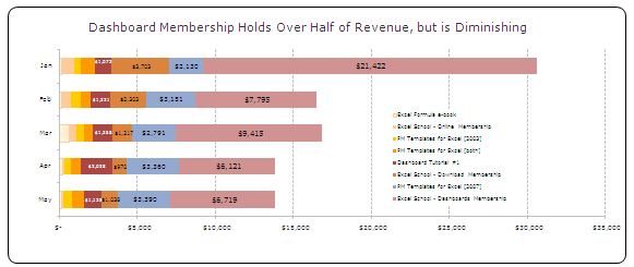
[29] Column chart by Michael
| My comments | Downloads | Related Articles | » Interactive charts » Interesting presentation, lots of analysis possible » Indicator arrows for selected series (clever) |
• Download file | ♥ Using form controls ♥ Display on-demand details in excel charts ♥ Smart chart labels |
[30] Panel chart by Mohammed
| My comments | Downloads | Related Articles | » Interesting panel chart construction » Good color choices, well contrasted |
• Download file | ♥ Panel charts |
[31] Column chart by Nadeem

| My comments | Downloads | Related Articles | » Interactive charts » Very well constructed, lots of analysis possible » Good colors |
• Download file | ♥ Using form controls ♥ Comparison charts |
[32] Column chart by Noah

| My comments | Downloads | Related Articles | » Grouping of data » Good color choices, well contrasted |
• Download file |
[33] Column chart by Nuruddin
| My comments | Downloads | Related Articles | » Interactive chart » Lots of analysis possible |
• Download file | ♥ Using form controls ♥ Display on-demand details in excel charts ♥ Dynamic Charts with Check Boxes |


[40] Column chart by Shellie
| My comments | Downloads | Related Articles | » Interactive charts » Lots of analysis possible » Well contrasted colors |
• Download file | ♥ Using form controls ♥ Dynamic Charts with Check Boxes |
[41] Column chart by Simon
| My comments | Downloads | Related Articles | » Very well constructed interactive chart (requires macros) » On demand details, lots of analysis possible » Good colors |
• Download file | ♥ Using form controls ♥ Display on-demand details in excel charts ♥ Comparison charts |
[43] Panel chart by Tom


| My comments | Downloads | Related Articles | » Good color choices » Panel chart » Lots of chart options |
• Download file | ♥ Panel charts |
[44] Column chart by Utami
| My comments | Downloads | Related Articles | » Interactive chart | • Download file | ♥ Using form controls |
[45] Column chart by M
| My comments | Downloads | Related Articles | » Simple and effective colors » Well contrasted labels |
• Download file |
Excel School Online Training Program by Chandoo
| My comments | Downloads | Related Articles | » Learn Excel Step by Step » Analyze data like a pro » Become Awesome! |
• Download Excel School Brochure | ♥ Excel School Demos ♥ Excel School FAQS ♥ Excel School Pricing & Signup |
Thanks to Everyone
Many thanks to all the participants of this contest. I have really enjoyed going thru your files and understand the charting techniques you have employed. I learned a lot of interesting techniques too, which I will share on this blog during next few weeks.
Special thanks to Ravindra, my assistant, who helped me in compiling all the results and taking screenshots of the charts.
Also, thanks to Hui, for giving his feedback and suggesting few more picks.
Which charts did you like?
As you can see, there are several excellent charts. I liked the about 14 different entries and marked them all with Chandoo’s pick
What about you? Which charts did you like? Please tell us using comments.
Who is the winner?
I will be announcing the winner of this contest by tomorrow (1st of July).
Related Articles
If you want to learn how many of these charts are constructed, then you must go thru these articles.
- Using form controls
- Display on-demand details in excel charts
- Panel charts
- Comparison charts
- Donut bar chart
- Smart chart labels
- How to make charts when you have too much data
- Dynamic Charts with Check Boxes
- Incell Charts
- Sales Dashboards using Excel
- Excel Dashboards – Information, templates & tutorials
- Dynamic & Interactive Charts in Excel
- Excel Charting Examples & Templates


38 Responses to “Time to showoff your VBA skills – Help me fix ActiveSheet.Pictures.Insert snafu”
I tried your code with 2003, it works.
But, I know Addpicture does not take URLs anymore with 2007 onwards, perhaps its the same with picture.insert as well.
http://support.microsoft.com/kb/928983/en-us
The above link gives the solution as "picture fill in a shape such as a rectangle".
Tried to recreate this, but it worked fine for me. I just took the image of the error you showed in the post. Is there more info that can narrow this down a bit?
Don't know if this helps?
http://www.theserverside.com/discussions/thread.tss?thread_id=47101
Hi
Not sure if this is what you're after, but I just tried this
Sub Macro1()
ActiveSheet.Pictures.Insert("http://www.google.co.uk/intl/en_uk/images/logo.gif").Select
End Sub
Tied a button to it on the sheet and it seems to work; hope this helps a little
Ian
@All.. the issue is in Excel 2007. In 2003 ActiveSheet.Pictures.Insert seems to work fine. Unfortunately, I have design this in Excel 2007.. that is why I posted it here..
v2
Sub Macro1()
Set n = ActiveSheet.Pictures.Insert("http://www.google.co.uk/intl/en_uk/images/logo.gif")
With Range("c12")
t = .Top
l = .Left
End With
With n
.Top = t
.Left = l
End With
End Sub
Ian
That didn't come out very well. This positions at c12, so can change easily:
Sub Macro1()
Set n = ActiveSheet.Pictures.Insert("http://www.google.co.uk/intl/en_uk/images/logo.gif")
With Range("c12")
t = .Top
l = .Left
End With
With n
.Top = t
.Left = l
End With
End Sub
Works OK in 2007
Ian
The above codes work fines to my EXCEL 2007. Thanks.
Chandoo:
Try 'ActiveSheet.Pictures.Insert'
With ActiveSheet.Pictures.Insert("C:\Example.png")
.Left = ActiveSheet.Range("A1").Left
.Top = ActiveSheet.Range("A1").Top
End With
activesheet.pictures.insert "C:\Documents and Settings\Jon Peltier\Desktop\2007 stuff\insert_charts_2007.png"
Works for me in 2003 SP3 and in 2007 SP2.
Check the URL, and make sure you have internet connectivity.
What also works, and is newer (pictures.insert was supposedly deprecated in '97):
activesheet.shapes.addpicture "C:\Documents and Settings\Jon Peltier\Desktop\2007 stuff\insert_charts_2007.png", false, true, 200,200,100,100
Unfortunately you must specify dimensions (the last four arguments) and you don't necessarily know them. But the picture size is still related back to the original picture size, so you could use scaleheight and scalewidth to fix this.
Chandoo: I just re-read your post.
The code I posted works for me. However, I'm using a local picture. If you try to add a picture from the web, this won't work.
I remember solving this problem before by adding a rectangle shape first, then using the Shapes.AddPicture method to get a picture from the web.
I'll find that code and post it here.
Some more updates... The code "ActiveSheet.Pictures.Insert (path)" works fine in Excel 2007 at home. Strange it failed miserably on my work laptop. Do you think this has got something to do with SP2 of MS Office 2007 or something like that?
@Ian, Jon: Thanks for the code snippets. I guess I will use my home installation of excel to do this.
Chandoo:
Try this on your work laptop:
Sub test()
ActiveSheet.Shapes.AddShape msoShapeRectangle, 50, 50, 100, 200
ActiveSheet.Shapes(1).Fill.UserPicture _
"http://www.datapigtechnologies.com/images/dpwithPig6.png"
End Sub
FYI:
http://support.microsoft.com/kb/928983/en-us
I didn't mean to post code with a local file, because both approaches worked with an internet image as well. This is in Excel 2007 SP2.
activesheet.pictures.insert "http://peltiertech.com/images/2009-07/col_area_noblanks.png"
Jon: Looks like I have SP1 on my client machine! I wasn't paying attention.
Just checked my home computer where I have SP2, and you're right...looks like they fixed it.
I didn't even bother testing in SP1, though I could if anyone cares enough.
I'm afraid I don't have a solution, but I find it remarkable that after attaining a certain status in the Excel world, Chandoo does not need to post on an Excel discussion forum to get help for an Excel problem. Instead, he posts on his blog and all the gurus come rushing to his help.
Isn't Web 2.0 great?
Teylyn - I saw Chandoo's tweet first, and followed the link back to his blog.
@Mike.. thank you. I have seen the fill rectangle solution before posting the query here. For that matter, I have also tried the solution of embedding a browser control on a spreadsheet. both of these seemed a bit extreme. That is why I have asked it here.
But I guess I will end up using it if I had to build this in work laptop.
@Teylyn: I have thought of posting this in a forum. (Unfortunately I have not been to any excel group in the last 5 years. Last time I was active was when I built a jave based excel sheet construction solution using POI.HSSF classes of Apache... ) After searching for a few hours, I found several forum posts where others had same problem and the solution recommended (using .left and .top parameters) is not working for me. Incidentally most of these solutions are from a certain Jon Peltier 😛
I thought may be the problem is interesting for fellow blog readers. So I posted it here.
Hi,
Adapting the code in the question,
[code]
Sub InsPicture()
pPath = "http://chandoo.org/images/pointy-haired-dilbert-excel-charts-tips.png"
With ActiveSheet.Pictures.Insert(pPath)
.Left = Range("a1").Left
.Top = Range("a1").Top
End With
End Sub
[/code]
Seems to work fine
Looks like it was a problem in 2007 up to SP1, which was corrected in SP2.
@Jon.. seems like the case. I just checked the version at work laptop. it is 12.0.6331.5000 (SP1).
Thank you so much every one. I really appreciate your time and suggestions in solving this.
Glad to help. I couldn't understand why something so straightforward wasn't working.
Hi All
Is there a way of inserting a motion clip eg animated gif or swf or flv?
Thks
You can insert animated GIFs by inserting them in a browser control through VBA. For other types of movies, I can guess you can insert them as clip art.
I WANT THE INSERT PICTURE BY USING COADING
so currently i was struggling same as you, chandoo, with the insert picture method in excel 2007/10 from an url and came along your thread here.
so i re-designed the code on the addshape method as mike was suggesting it and all of the sudden it works just fine.
thanks alot to you guys, you were a great help
a big salut from switzerland
Hi guys,
I need help copying and pasting an image with the path in a cell.
I leave the code.
And thank you very much!
Sub Copiarimg()
Dim pic As Picture
With ActiveSheet
Set pic = .Pictures.Insert(Range("f2").Value)
With .Range("e9:g22")
pic.Top = .Top
pic.Left = .Left
pic.Width = .Width
pic.Height = .Height
End With
End Sub
I've played around with the approaches in these comments, and the code below is what I've come up with. The ImagePath can be a local file or a URL. As Jon mentioned above, the trick is to set an arbitrary value for the width and height, then call the ScaleWidth and ScaleHeight methods afterward to reset the picture to its original size. Once the LockAspectRatio property is set, you can change the picture width and the height will automatically scale (or vice-versa).
Sub AddPictureToRange(TopLeftCellAddress As String, ImagePath As String)
Dim pic As Shape
Dim l As Single, t As Single
Dim temp As Single
l = Me.Range(TopLeftCellAddress).Left
t = Me.Range(TopLeftCellAddress).Top
temp = 10# ' arbitrary value
Set pic = Me.Shapes.AddPicture(ImagePath, msoFalse, msoTrue, l, t, temp, temp)
pic.ScaleHeight 1#, msoTrue
pic.ScaleWidth 1#, msoTrue
pic.LockAspectRatio = msoTrue
End Sub
I need some help with inserting pictures. I have an excel file with a column of item numbers next to this row I want to insert a picture of this item. The pictures are coded with the item number so I tried to insert it with one of the codes above:
Sub InsPicture()
pPath = "http://img.bricklink.com/P/80/55236.gif"
With ActiveSheet.Pictures.Insert(pPath)
End With
End Sub
That worked but I need to do that for every row separtly.
So I tried in the code
pPath = "http://img.bricklink.com/P/80/"&Text(a1;"#")&".gif"
But that gives errors.
Anybody ideas?
Hi Nicholas, I used your solution in a related problem in Excel 2003 and it worked flawlessly..thank you!
Hi Mike Alexander,
Your solution with some changes was helpful in my problem in XL 2007, thanks.
Hi,
thanks all. In addition, I had a problem with multiple pictures inserting (every new picture replaced the prior one). I've changed it a bit, may be helpful..
Sub test()
ActiveSheet.Shapes.AddShape msoShapeRectangle, 50 , 50, 100, 200
ActiveSheet.Shapes(1).Fill.UserPicture _
"http://www.datapigtechnologies.com/images/dpwithPig6.png"
ActiveSheet.Shapes(1).Copy
ActiveSheet.Paste
End Sub
Try this instead:
Sub test()
ActiveSheet.Shapes.AddShape msoShapeRectangle, 50 , 50, 100, 200
ActiveSheet.Shapes(ActiveSheet.Shapes.Count).Fill.UserPicture _
"http://www.datapigtechnologies.com/images/dpwithPig6.png"
End Sub
Thanks to everyone, this thread has been very helpful. However, image inserting still doesn't work quite as expect for me.
While I can get a picture inserted into an Excel 2010 worksheet using either:
1) ActiveSheet.Shapes(ActiveSheet.Shapes.Count).Fill.UserPicture...
2) ActiveSheet.Pictures.Insert(pPath), and
3) Shapes.AddPicture...
unfortunately the images all insert with a display size determined not by the actual pixel dimensions of the image but by the dpi resolution.
So for example, if I insert two copies of the exact same 600x600 pixel image, one with a 300dpi resolution and the other with 72dpi, they display at vastly different sizes on screen.
While this might be intended behaviour for Excel in order to maintain a WSYWIG printing layout, I actually need a way to insert the image based on the the actual pixel dimesnsions and ignoring the dpi resolution.
Any help appreciated.
Thanks
Kez
Not doing an intentional bump, but realised I posted in rely to one of the repsonses here instead of to the main thread, so reposting.
=====
Thanks to everyone, this thread has been very helpful. However, image inserting still doesn’t work quite as expected for me.
While I can get a picture inserted into an Excel 2010 worksheet using any of the below methods:
1) ActiveSheet.Shapes(ActiveSheet.Shapes.Count).Fill.UserPicture....
2) ActiveSheet.Pictures.Insert(pPath), and
3) Shapes.AddPicture....
unfortunately the images all insert with a display size determined not by the actual pixel dimensions of the image but by the dpi resolution.
So for example, if I insert two copies of the exact same 600×600 pixel image, one with a 300dpi resolution and the other with 72dpi, they display at vastly different sizes in Excel on screen.
While this might be intended behaviour for Excel in order to maintain a WYSIWYG printing layout, I actually need a way to insert the images based on the the actual pixel dimesnsions and ignoring the dpi resolution.
Any help appreciated.
Thanks
Kez
Well, answered my own question 🙂
For those who might be interested, you can use this function:
Public Function GetPicDims(strFilePath As String, strFileName As String) As String
GetPicDims = CreateObject("Shell.Application").Namespace((strFilePath)). _
ParseName(strFileName).ExtendedProperty("Dimensions")
End Function
to get the dimensions of the image you want to insert. Then you can parse the return string and use the width and height values to add a rectangle shape of the appropraite size, like:
ActiveSheet.Shapes.AddShape msoShapeRectangle 50, 50, iWidth, iHeight
which you then fill with the picture:
ActiveSheet.Shapes(ActiveSheet.Shapes.Count).Fill.UserPicture "c:\temp\test.jpg"
This way the picture gets inserted using the pixel dimensions and the (print) resolution gets ignored.
If desired, the GetPicDims function can be made more generic to get other ExtendedProperties.
Regards
Kez