fbpx
Search
Close this search box.

All articles with 'panel charts' Tag

60 sports in six charts

Published on May 14, 2018 in Charts and Graphs
60 sports in six charts

On twitter I follow many charting and visualization related accounts. One of them is @Andy Kriebel, who runs Makeover Monday. The idea is simple. Every Monday they publish a data-set and ask the community to visualize. Last Monday (7th May, 2018), they have published about toughest sport by skill data. This categorizes 60 sports by 10 skill categories to find out which sport is the toughest. Over the weekend, Andy posted a summary of all toughest sport viz entries. Many of the entries are made in Tableau. I thought it would be a fun challenge to re-create some of these charts in Excel. The result is this post. 60 sports in 6 charts. Check out the charts and download workbook to learn more.

First four charts are re-creations of Tableau designs. Last two are mine.

Continue »

Employee Performance Panel Charts in Power BI with R

Published on Aug 11, 2017 in Power BI, Power Query
Employee Performance Panel Charts in Power BI with R

Yesterday we saw a beautiful example of panel charts with R. Today let me show you how to create the same (or even better) with Power BI & R. What you need: Power BI Desktop and R Raw data set – rem-data.csv Creating Panel Charts in Power BI with R Load CSV data in to […]

Continue »

Employee Performance Panel Charts – Excel vs. R [video]

Published on Aug 10, 2017 in Charts and Graphs, R programming
Employee Performance Panel Charts – Excel vs. R [video]

Recently, I had to make a bunch of panel charts. After wrangling with Excel (and a tiny bit of VBA) to create them, I wondered if we are suffering needlessly by being too loyal to Excel. I switched to R and could create these panel charts in almost no time (well, first I had to learn how to pivot the data using dplyr). Today, let me share the experience.

Continue »

How to visualize multiple variables over several years? [Contest]

Published on Jun 24, 2016 in Charts and Graphs, Excel Challenges
How to visualize multiple variables over several years? [Contest]

Our newest contest is inspired from a question asked by Kaushik, one of our forum members, interesting problem.

Need to quickly visualize 3 variables ( Company, years, Financials) in a single […] chart.

Create a chart to understand multiple variable data and you could win $100 Amazon gift card. Do send your charts before 4th of July to qualify for the prizes.

Continue »

Excel Links – from USA edition

Published on May 8, 2013 in excel links

Hello there,

My travel to US was fantastic and fun. Many thanks to Jocelyn & Rob Collie, who found a nice apartment for us and made sure we are settled down in almost no time. Weather has been excellent so far too with lots of sunshine and blue skies. We went to a nearby park the other day and kids really loved walking on trials and exploring.

Gentle reminder

Today is last day to sign-up for my USA Masterclass

Today is last day to join my USA Advanced Excel & Dashboards masterclass with early bird discount. If you live near Chicago, Washington DC or Columbus and love Chandoo.org style of teaching, then you will benefit alot from my masterclass. We have very few spots left in Chicago & Columbus. So go ahead and book yours today and save $200.

Click here to know more and join us.

Continue »

How the tax burden has changed over the years – Excellent chart by NYTimes & Redoing it in Excel

Published on Dec 6, 2012 in Charts and Graphs

If I need some charting inspiration, I always visit New York Times. Their interactive visualizations are some of the best you can find anywhere. Clear, beautifully crafted and powerful. Long time readers of Chandoo.org knew that I like to learn from visualizations in NY Times & redo them using Excel.

Today let me present you one such chart. This is based on an interactive visualization prepared by NY Times explaining how the tax burden has changed over years for various income groups.

Take a look at tax burden chart – Excel implementation
Tax burden over years chart - recreated in Excel

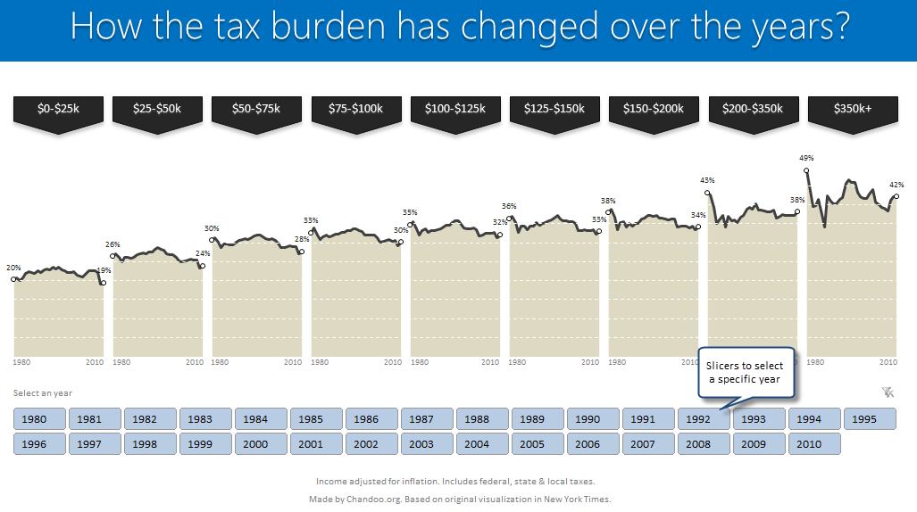
Read on to learn how to create this chart using Excel.

Continue »

Excel Links – Going to Togo Edition

Published on Sep 4, 2012 in excel links

After a long time, I am writing one more Excel links post. First let me share a quick personal update.

I am invited to Lome, Togo to spend a day at Ecobank – CFO conference in 3rd week of September. I will be conducting a one day masterclass on Advanced Excel & Dashboard Reporting. I am excited about this trip as I have never been to any African country. I will post some pics and tell you how it went once I am done with the conference.

Moving on to Excel Links for today,

Continue »

Making Small Multiples in Excel [Charting Technique]

Published on Nov 16, 2011 in Charts and Graphs
Making Small Multiples in Excel [Charting Technique]

Today, lets learn how to create small-multiples (or panel charts) to visualize trend of 2 product lines over years in various regions. The inspiration for this chart and article came from my friend, Paresh‘s recent article on his blog.

See how you can create a combination of area & line chart to create the small-multiple chart and clone it. You can also download the workbook and play with it to understand this technique better.

Continue »

Sales Analysis Charts in Excel – 78 Alternatives

Published on Jun 30, 2011 in Charts and Graphs, Excel Challenges, Learn Excel
Sales Analysis Charts in Excel – 78 Alternatives

Recently, I ran a contest asking you to analyze a bunch of sales data and present your results in charts. We received a total of 78 charts from 45 people. The contest entries had a mind-boggling variety of excel charts, techniques and ideas. It took me a while to go thru all the files and compile the results. Thanks for your patience. In this post, you can find all the charts along with my comments & links to download files.

Continue »

Evolution of Privacy Policies on Facebook – a Panel Chart in Excel

Evolution of Privacy Policies on Facebook – a Panel Chart in Excel

Out of curiosity I took the data from Matt McKeon’s Privacy on Facebook chart and try to re-do the chart in Excel. I made a panel chart depicting how Facebook’s privacy policies have changed since 2005. You can see a bigger version of chart as well as get the download excel from the post. Read on…

Continue »

Introduction to Panel Charts using Excel – Tutorial & Template

Published on May 12, 2010 in Charts and Graphs, Featured
Introduction to Panel Charts using Excel – Tutorial & Template

In this article we will learn what a Panel Chart is and how you can construct a panel chart in Excel.
What is a Panel Chart?

A panel chart is a set of similar charts neatly aligned in panels to help us understand some data which has multiple variables in it. Panel charts are also called by names “trellis displays” or “small multiples”. They are an effective way to display multi-variable data.

Here is an example panel chart showing the total defects per module over the last 4 weeks.

Continue »

Survey Results in Dot Plot Panel Chart [followup on Incell Panel Chart]

Published on Apr 9, 2010 in Charts and Graphs
Survey Results in Dot Plot Panel Chart [followup on Incell Panel Chart]

In a follow up to last week’s how to visualize survey data in excel, we will explore how you can create an incell dot plot panel chart. Please follow the links in the article to get more commentary and insights from established persona in the visualization world (including Stephen Few, Naomi, Jon etc.)

Continue »

How to Visualize Survey Results using Incell Panel Charts [case study]

Published on Apr 1, 2010 in Charts and Graphs, Featured, Learn Excel
How to Visualize Survey Results using Incell Panel Charts [case study]

A panel chart (often called as trellis display or small-multiples) shows data for multiple variables in an easy to digest format. It lets users compare in any way and draw conclusions with ease.

Today, I want to discuss how the principles of panel chart can be applied to visualize a complex set of survey results. For this we will use the recent survey conducted by Gartner on how various customers use BI (Business Intelligence) tools.

Continue »

Excel Links of the Week – PHD’s new tag line [Nov 24]

Published on Nov 24, 2008 in blogging, excel links

This is probably the 100th time I have changed this site’s tag line. So, it may not be a great news to you. But again, I need to say out this loud so that you, my dear reader, will know what this blog is going to stand for: Excel Tips, Charting Ideas and Visualization Oomph. […]

Continue »