
We all know that legend can be added to a chart to provide useful information, color codes etc.
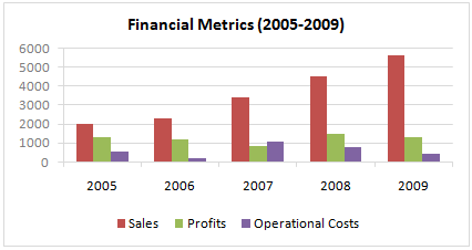
Today we will learn how to make the chart legends smarter so that they provide more meaning and context to the chart, like this:

To make your chart legends legendary, just follow these simple steps:
Step 1: Make a regular chart
Step 2: Create legend messages in separate cells
Now, for the above chart, there are 3 series. So, we need 3 legend messages. Let us say we want to show how much the % change has been since 2005 in each of the three series. The message pattern can be like this:
[arrow symbol] [label] by [% change]
We can find up and down arrow symbols from Insert > Symbol menu.
![]()
Let us write a simple formula like this to create the message.
(assuming data is in table B1:D5)
=IF(B5>B1,"up arrow symbol","down arrow symbol")&" Sales by "&TEXT(B5/B1-1,"0%")
Now repeat similar formulas for other 2 series as well.
Step 3: Add three text boxes to the chart area.
This is simple. Select the chart. Now go to Insert > Textbox (ALT+NX in Excel 2007+). Type anything in it.
Now, color the text boxes in such a way that the background colors match chart series fill colors.
Step 4: Assign legend message cells to text boxes
Select first text box. Go to formula bar, press = and then select the first legend message cell. See this screencast to understand.
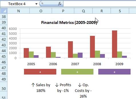
Repeat the same step for other 2 text boxes
Step 5: Show off your chart
That is all. Now your chart legends are legendary. Go ahead and show off.
Download the example chart and play with it
Click here to download the excel file containing this example. Play with it to understand this trick.
Related Charting Tricks & Ideas:
> Show colors in Chart Labels, Axis Labels
> Show symbols in Chart Labels, Axis
> 5 Chart Formatting Tricks
> More charting tutorials and tips


33 Responses
I like this alot however my boss would want more “graphic” text.
Although someone might argue that if you’re trying to show differences over time rather than between variables in a given period, a line chart might be more suitable, I like the trick.
There is no need to have those simple formulas placed into text boxes, the same formulas can be written into the cells where legend / series names are retrieved 😉
This is neat.
I’ve wanted to ask you how you prepare your animated instructions that you include in your emails?
What tool or application.
I sometimes need to train non technical folks and your approach could be a real bonus…
Hi Chandoo, neat trick, I like it. The Insert Symbol menu was new to me – using 2003 it seems to work IF you select a font that has that symbol. I mainly use Verdana, and it doesn’t seem to have the up and down arrows. So you need to specify some other font – such as Arial (yuk ! 🙂 )
@Gerald.. use Calibri.. it seems to have all the good things of Verdana (plus a touch of class). You should already have it in your comp…
Mirko – you’re right, but Chandoo’s suggestion gives you a bigger coloured text box than the standard legend function. I like it.
This is a great idea in that it begins to peal back the issues with in-cell formatting of words… which works for certain text attributes for static text but does not work if you want to format formula driven text statements (at least as far as I have discovered). Using different fonts in the same formula is also problematic (until this suggestion). The issue of not being able to have multiple fonts in the same formula is probably why no one has created and passed around a font designed to provide more alternatives to in-cell graphing (horizontal and vertical bars and lines) for those little graphics that seem to be so popular… this very clever use of text and graphics in a formula in a graph text field could not have been done using the =char() formula because all of the arrows do not exist in the same font. Nice!
Hey – love the website – very very useful.
I’m currently using Excel 2003, and have tried inserting the text box with formula, however it doesn’t seem to work. Is this due to my prehistoric computer? Or some other user related problem?
@AnnaLou… Thank you 🙂
Can you tell me where it is failing. Or you unable to insert text box in to charts or unable to assign formula to the box?
Hi,
Wanted to know is it possible that when a user clicks / double clicks on the data label in a chart, it should display the details of the data label. For example in chart if a user clicks on a data label which contains some number it should display the details of the numbers.
It is same as “SHOW DETAILS” in Pivot Tabel
From the moment i have landed in yourpage, i have become an avid fan.. I have always loved excel and thanks to you.. am now able to create better charts and dashboards.. Thanks a lot Chandoo.
I want to know how to edit series name CA0 to a text that has A0 as subscript?
I recommend the program Graphs Made Easy – free, easy to use, and results look great. Of course, I would say that – I work for them!
John S
Just installed the program. Seems useful, though not a fan off all the bloatware/malware it attempts to fool you into installing.
Why do up and down arrow symbols in my excel become two letters? How to fix it?
@Da Dao
Change the Font to Wing Dings or Web Dings 1 or 2 or 3
Hi I tried this doesn’t as the whole formula changes to shapes!
do you have any other alternatives?
Thank you very much Chandoo for your work and much more for the fact that it’s free of charge. My excel skills have improved from the moment i’ve landed on your page. I used to visit a lot of excel tips site but now, i’ve found my favorite for creating dashboards and AWESOME charts.
Thks a lot and be blessed you and your family!!!
Stephane
Hi there,
Just wondering what tools you used to capture the screenshot and also what tool to convert to gif file… cool!
Thanks
@Ratio
Have a read of: http://chandoo.org/wp/about/what-we-use/
Hi Chandoo,
I have tried this data labels, when I put the formula it doesn’t show the arrows symbol instead I get text as ‘up arrow symbol’ ‘down arrow symbol’
could you help me with this please?
Thanks
Vivek
Dear Chandoo or all,
How to change the legend from bar (see step 1) to below legend :
1, sales will be triangle
2. profit will be circle
3. op. cost will be box
I really appreciate your reply, thanks.
Pantun
Using your same example, how do you write the formula if you want the box to say “Sales “up arrow” by 180%? I cant get it to work no matter what i try. 🙁
Hi Chandoo et al.,
Thanks so much for this great resource!
I would like to change the font color of some parts of my chart legend, while keeping other text black.
For instance, in the chart legend:
AAR
BBR
CCR
I would like A,B & C to be black and R to be red.
Any suggestions?
Thanks,
William