
First some good news,
On 21st November, 2010, our little blog received its 10,000th comment!
Thank you so much for making this happen.
Those of you reading chandoo.org for a while know my penchant for comments. I have learned a lot of excel tips & ideas just by reading the comments you posted on this blog. I think comments are one of the best parts of this blog. So, naturally, I wanted to celebrate this milestone, with something big & awesome.
My intention was to download all the 10,000+ comments and play with the data to come up with something outstanding, like a dashboard. It took me 2 days to conceptualize and create this beauty.
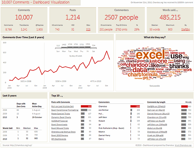
10,007 comments visualized in an Excel Dashboard:
[click here for a larger version]
Summary of Findings from the Dashboard:
- Out of 10,007 comments, 8766 are comments left by people and 1241 are ping-backs (a comment made automatically by other blogs when they link to chandoo.org).
- Roughly 20% of comments are @ replies.
- 31 posts had more than 50 comments each. The maximum comments were 313 on the last visible cell poll.
- These 10,007 comments came from 2507 unique people. Top 20 commenters made 28% of comments.
- Median words per comment are 33. You said a total of 485,000 words so far. Impressive.
- There were only 5 days with zero comments in 2010 (as against 66 in 2008 and 15 in 2009).
- Fridays are most popular days for commenting with 20% comments coming in.
Learn How Dashboard is Constructed in a Crash Course:
I made this dashboard with lots of love & coffee. Of course, coffee wont magically turn data into in-cell charts. We need to arm twist our data and get the insights out ourselves.
That is why I made an hour long tutorial explaining how I constructed this dashboard. In the video I explain how I came up with the design, what formulas I used to cleanse & process the data, how various charts were constructed, what techniques I have used to put this together.
As this video is kind of advanced training on dashboards, I have decided to sell it. You can get a copy of the video & unlocked excel files for $37.
What you get with the purchase:
- A HD video explaining the dashboard construction process
- Same video in iPod compatible format for watching on the go.
- 2 Excel files, the original version & instructor version (unlocked)
Please note: You will not enjoy the video if you are an Excel beginner. Instead go thru Excel Dashboards page to equip yourself with necessary dashboard & charting skills before getting a training like this.
How is this Dashboard Made?
If you are curious to know which nuts & bolts are used in the dashboard, read up:
- The chart showing monthly trend of comments and day of week distribution are 2 different charts, one arranged on top of other.
- The word cloud showing relative frequencies of words used in comments is made using wordle. This is the only non-native Excel part of the dashboard.
- The Top 10 tables at the bottom are incell charts with some fancy colors.
- I have used pivot tables, SUMPRODUCT, SUMIFS, INDEX+MATCH, VLOOKUP formulas to process the data.
- Word counts are generated by processing the comment text using this technique.
Download the Dashboard File:
Click here to download a locked copy of the dashboard [mirror here]. You can examine the dashboard, but you can not alter it as it is password protected.
If you want an unlocked copy, you can get it by purchasing the video tutorial. Click here (or here).
A Big Thank You
A big, warm, cuddly thanks to you for making 10,000 comments. Everyday, your comments teach me new tricks on Excel & make me better at what I do. I am sure you feel the same about others comments.
Special thanks to top commenters – Jon Peltier (228), Hui (186), Jeff Weir (148), Robert (138), Jimmy (62), Rick Rothstein (60), Martin (58), Daniel Ferry (54), Dan l (53). Also, kudos to Stef@n for leaving a 900 word comment, the longest ever.
How do you like the dashboard?
Do you like the dashboard? Do you find it insightful? What modifications you would have made to it? Go ahead and share your ideas and tips with us. Please leave a comment.
PS: And get a copy of the training video if you work with dashboards a lot. I am sure you can pick up few tricks to become even more awesome.


31 Responses to “An Excel Dashboard to Visualize 10,007 Comments [Dashboard Tutorial]”
Congrats on reaching that mark! Comments definitely mean a larger audience participation and that's what we love about this site.
You're welcome, keep up the great work.
(that was #63)
Chandoo, you are the top commenter with 1,399 comments so far.
That makes 1.28 comments by day during 3 years without forget all your awesome posts.
Well done!
AWWWWWWWW YEAH THATS DAN L ON THE TOP COMMENTER LIST.
Must....keep...commenting....to overtake....Dan Ferry....
Great dashboard though. Things I like:
-The hot series in two of the top ten charts
-The MTWTF columns placed on top of a really good line chart
-The conditional formatting of the labels on the top 10 charts. I have no idea how that works, but I think I want to find out now.
I'm curious though chandoo:
Are you going to try to plug this thing directly into your web server so you can update it?
Nice one Chandoo. Congrats on the 10K mark and the dashboard, very clean and well designed. Is it Excel? Who could ever imagine! 😉
Congrats!! Who has the 10000th comment? 🙂
Love your blog and I have learnt so much. There are still a lot to learn but I'm really enjoying this! Keep up the good work!
Chandoo ,
DashBoard is not dynamic , a static dashboard is very simple thing to do , it wont take 2 days
next time try to do something creative rather than just do the same thing again and again.
Poor execution and the price is too much for such an ordinary DB
Nice features in your dashboard. Kudos! And the best part is: you can use it next year. 🙂
i was very impressed by the “Wordle” word picture. while it is fairly easy to get Excel to do a word cloud with word sizes varying by some metric, it seems to me that it would be much more difficult to program the words at different angles and sizes while, at the same time, not overlapping the words. you could possibly do this with an xy-plot. but, getting the words to fit together without overlapping would be a neat programming trick. this subject would be very worthy of a “how to” blog. -bill
Hahahah,
gfy, 'bokay?
Great Going Chandoo 🙂
Cheers !!!
@All.. thank you 🙂
@Dan l: Good idea about making this dashboard live. Let me give it a thought. WordPress database is quite flexible. With some javascript api magic this should be possible.
@Jorge: Thank you. Excel 2007 gives a lot of freedom when you are designing charts and putting together dashboards.
@Fred: Rahul has the 10,000th comment - here: http://chandoo.org/wp/2010/11/10/vlookup-second-value/#comment-142747
@HAHAHA: I see no reason why this dashboard has to be dynamic. Also, I am not as skilled as you are, so I take 2 days to imagine and create something like this. And the price is not for the dashboard, it is for the lesson explaining how to make one like this.
If you feel adventurous, go ahead and download the free version. The data is in there, make a dashboard and share it with us.
@Bill: I have written about excel word clouds a while ago - http://chandoo.org/wp/2008/04/22/create-cool-tag-clouds-in-excel-using-vba/
Wordle uses some really advanced algorithms to layout the tag clouds without overlapping content. While it would be challenging to try the problem ourselves, I am sure it will take me ages to write something as elegant as wordle. So I just used theirs.. 🙂
Chandoo ,
The $37 price tag is too much for the lessons.
@Hahaha: My assumptions are very simple. This lesson will help dashboard makers quite a bit. I am guessing they can easily save 4-6 hours on research and learning work by watching this video to pick up important tricks. Assuming an hourly salary of $35 (that would be low-end for someone in BI/ Dashboard roles), this training immediately pays off.
If you find the lesson to be pricey, I can totally understand this. Why dont you drop me an email and I will give you some discount?
@Chandoo
There is a very good Semi Automatic Excel Tag Cloud by MrExcel (Bill Jelen) pod cast here: http://www.howtodothings.com/video/how-to-make-a-pivot-tag-cloud-on-excel
Chandoo,
First off, congrats on the 10,000th post. Second, I really like your dashboard. Very professional looking, smartly organized, and the content is relevant. And, as you stated earlier, it didn't need to be dynamic. Also, I'm impressed with you executing this in two days. Speaking from experience, it's not as easy as it looks (the conceptualization process makes the execution seem easy!). Thanks again for everything.
Tom
@Hui.. very interesting technique. I really loved it.
@Tom: Thank you so much. I am very happy you like it. Many people think the difficult part of making dashboards / models is in writing formulas or making charts. In my humble opinion, the hard work is in coming up with a good layout and cleaning data. Once you do that, making charts and writing formulas is a breeze.
Wow !!! I’ve made it !!! I’m on a top 10 list !!! and the best part of it… it’s on an Excel blog, and one of the best, I must say !!!!
Congratulations, my friend !!
…and the hits will keep oooon comin’ !!!!! 🙂
[...] Structurally, this dashboard is similar to my 10,000 comment dashboard. [...]
Dear Chandoo,
"The Top 10 tables at the bottom are incell charts with some fancy colors. "
The colors in the in-cell chart is it conditionally done (automatically) or u just color it manually?.. i found out that the number label can be conditionally formatted but how about the characters in the incell chart?
@xsaed: I use the technique discussed here: http://chandoo.org/wp/2008/03/13/want-to-be-an-excel-conditional-formatting-rock-star-read-this/
I am very glad that, I visit this site...i have learnt lots of thing from this site...thanks chandoo...u r fabulous 🙂
[...] Excel Dashboard with 10007 comments data [...]
Chandoo,
Very impressive and elegant dashboard. I'm specifically looking at your use of the wordle tag cloud. Do you happen to know if there are any copyright issues with embedding a wordle into a dashboard I'm trying to create for a company? I also was curious if there is any chance there is a student priced edition of your workbook. I'd love to learn more of the details but unsure if my research will pay for this. Thanks again and congratulations on an awesome site you truly are a master of VBA. -Mike
[...] An Excel Dashboard to Visualize 10,007 Comments [Dashboard Tutorial] | Chandoo.org – Lear... – [...]
[...] You can do damn near anything in Excel. Calendar chart visualizations. Music videos. Beautiful art. More music videos. Respiration wavelengths. Chess games. Word clouds. [...]
Great! 🙂
I wanted to thsnk you for this very good read!! I absolutely
enjoyed every bit of it. I've got you savbed as a favorite
to check ouut new stuff you post…
when I went to buy this, it was priced at 47, not 37. is that a price increase? or am I messing up somehow.
thanks
Jeff
Have you ever considered creating an e-book or guest authoring on other sites?
I have a blog based on the same ideas you discuss and would love
to have you share some stories/information.
I know my subscribers would enjoy your work.
If you're even remotely interested, feel free
to send me an email.
Thanks for your blog. Very impressive and elegant dashboard. I'm specifically looking at your use of the wordle tag cloud. Do you happen to know if there are any copyright issues with embedding a wordle into a dashboard I'm trying to create for a company? I also was curious if there is any chance there is a student priced edition of your workbook.