Designing a dashboard to track Employee vacations [case study]

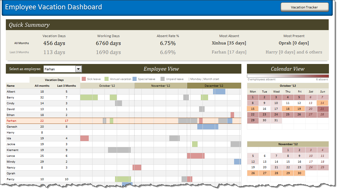
HR managers & department heads always ask, “So what is the vacation pattern of our employees? What is our average absent rate?”
Today lets tackle that question and learn how to create a dashboard to monitor employee vacations.
What do HR Managers need? (end user needs)
There are 2 aspects tracking vacations.
1. Data entry for vacations taken by employees
2. Status dashboard to summarize vacation data
Data and Calculations for our Customer Service Dashboard [Part 2 of 4]
Welcome back. In part 2 of Making a Customer Service Dashboard using Excel let us learn how the data & calculations for the dashboard are setup.
Designing Customer Service Dashboard
Data and Calculations for the Dashboard
Creating the dashboard in Excel
Adding Macros & Final touches
In this installment, we will examine all the variables, named ranges & various formulas that drive our dashboard. Also, you can download the full dashboard workbook and play with it to examine these formulas and learn better.
Designing a Customer Service Dashboard in Excel [Part 1 of 4]
Sawadee Krup folks. Today, we begin a new series on Chandoo.org – Making a Customer Service Dashboard using Excel. This 4 part tutorial teaches you,
Designing Customer Service Dashboard
Data and Calculations for the Dashboard
Creating the dashboard in Excel
Adding Macros & Final touches
Customer service is one area where a lot of data is collected regularly. Understanding all this and making business decisions is quite complex task. This is where dashboards shine.
Read on to learn how to design customer service dashboards.
MLB Pitching Stats Dashboard in Excel+VBA by our VBA Class Student
Nothing gives a teacher more satisfaction than seeing a student apply the knowledge to do something awesome. So naturally, I jumped with joy when I got this email from Dan, one of my VBA Class students,
Hi Chandoo,
After going thru your VBA Classes, I realized that we can lots of awesome stuff with pivot tables + simple macros. I recently created an Excel Dashboard to depict MLB (Major League Baseball) Pitching Stats. I could not have done this had I not learned VBA. Thank you so much for teaching the class.
I got curious and requested Dan, if I could share the file with you all. Being a lovely person, Dan agreed immediately.
Video Tutorial on Interactive Dashboard using Hyperlinks
Few days ago, we published an article on how to create interactive dashboards using hyperlinks. Many of you loved this tutorial. But quite a few of you also said, this tutorial is a bit complex to follow.
So, I made a short video explaining how the UDF and interactive hyperlinks work and how our dashboard is weaved together.
Interactive Dashboard in Excel using Hyperlinks
Last week we learned how to create dynamic hyperlinks in Excel. Today, I want to show you something even cooler. An interactive dashboard based on hyperlinks, like shown above.
Isn’t it impressive?
Well, to create something like this, you don’t need a degree in advanced cryogenics. You just need a bunch of data, a chart, a one line macro code and some pixie dust (go easy on pixie dust).
Show Top 10 Values in Dashboards using Pivot Tables
A good dashboard must show important information at a glance and provide option to drill down for details.
Showing Top 10 (or bottom 10) lists in a dashboard is a good way to achieve this (see aside). Today we will learn an interesting technique to do this in Excel.