
A while ago, we published a new year resolution template. This was a hit with our readers with thousands of you downloading it. During last week, Peppe, one of our readers from Italy, took this template and made it even more awesome.
The original template had tasks and completion check marks. As you finish each task, you can see overall progress too.
Peppe added priorities to this. With his new version, progress is measured based on how much priority we assigned that particular task. Pretty neat eh?!?
Personal Todo list with Priorities – Demo
First take a look at Peppe’s todo list.

How is this made?
Using lots of Excel goodness of course. The basic components of this todo list are,
- Check boxes – to mark each activity as done (or not done)
- Data validation – to assign priority (1 to 5) to each activity
- Conditional Formatting – to highlight a row when the activity is marked as done
- Thermo-meter chart – to show the progress as you mark each activity done
- Formulas – to calculate % done based on how many activities are done & their priorities.
Since first 4 items are already explained on Chandoo.org, let me focus on the formula part.
Calculating % completion based on priorities:
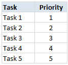
To understand this problem, lets imagine, we have 5 tasks & priorities like below:
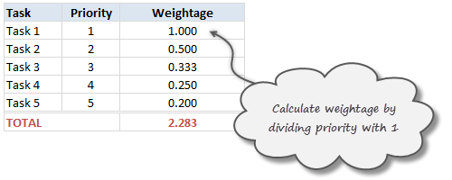
Step 1: Calculating weights
First step is to calculate how much weight each task should get. This is a simple job of inverting priority values (1/priority value). We will get this.
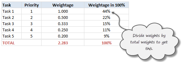
Step 2: Calculate weights to 100%
Next, we adjust the weights so that their total is 100%. To do this, we just divide a task’s weight by total of all task weights.
Step 3: Calculate % done only if a task is marked as done
Now, we just use TRUE / FALSE values generated by the check boxes to calculate % done. For this, we just need to multiply 100% weights with TRUE or FALSE values.
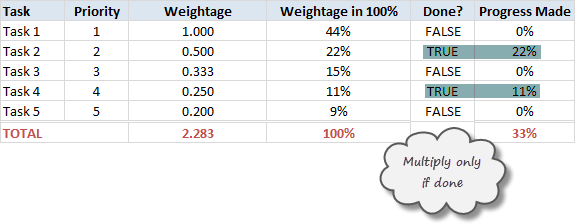
The total of this column gives us how much % of all tasks are done.
Note on weights for priorities
In this approach, we are assuming that doing one priority 1 task gives same output (%done) as doing two priority 2 tasks, three priority 3 tasks etc.
That means the weight enjoyed by priority 1 task is twice that of priority 2 task.
Some other possibilities are,
- Priority 1 is 1, 2 is 0.8, 3 is 0.6…
- A mapping table telling us how much each priority weighs
Read weighted averages in Excel to understand more.
Download this todo list template
Click here to download this template and chase that todo list in style. Examine the formulas in hidden column to understand this better.
Thank you Peppe
I find this template quite simple, yet powerful. It shows how much we can do with Excel by using a little creativity, simple features (conditional formatting, form controls etc.) and a some motivation.
Peppe, Thank you so much for sharing this with us.
If you enjoyed this todo list template, go ahead and say thanks to Peppe.
Also, use comments to share how you handle to dos & pending tasks using Excel. Share your tips & ideas with all of us.
Update
Over in the Chandoo.org Forums, Asshu has updated this witha VB Interface
Have a look and use if from: http://chandoo.org/forum/threads/to-do-list-vb-interface.28973/
More todo lists: Simple todo list in Excel, To do lists & Project Management


113 Responses to “Advanced Data Validation Techniques in Excel [spreadcheats]”
Let me add that usually you should have those lists in a "control" or "support" sheet, creating a named range for each list. Then you could enter: If($B$7="Full List", range1, range2). Just a bit cleaner.
@Jorge: You are right... using a control sheet is always advisable.
=OFFSET(C9,MATCH($B$6,$B$10:$B$22,0),0,COUNTIF(B10:B22,$B$6),1)
OFFSET(reference, rows, cols, [height], [width])
Hello everybody,
I am trying to use the OFFSET proposed formula =OFFSET(C9,MATCH($B$6,$B$10:$B$22,0),0,COUNTIF(B10:B22,$B$6),1) but doing "reference" from a another sheet in the same woorkbook.
Can you confirm that the OFFSET accept a "reference" from another sheet in the same workbook, e.g. sheet2!C9...
Thank you in advance for your feedback.
@AFP
Yes, That can be done and your format is correct
=OFFSET(Sheet2!C9,MATCH($B$6,$B$10:$B$22,0),0,COUNTIF(B10:B22,$B$6),1)
Just remember that if there are multiple values of the cell B6 in the range B10:B22 that you will get a #Value! error
That occurs as you are trying to return a Range which will be the No of occurrences of B6 in the Range B10:B22 long
If you want just the cell at the offset, use:
=OFFSET(Sheet2!C9,MATCH($B$6,$B$10:$B$22,0),0,1,1)
If you want to sum up that many cells use
=Sum(OFFSET(Sheet2!C9,MATCH($B$6,$B$10:$B$22,0),0,COUNTIF(B10:B22,$B$6),1))
any suggestion on-
(1)how to make this data range dynamic
(2)Data Validation will be on a separate sheet
(3)Whatever data updated on the data range, the same will be automatically update in Data Validation list in separate sheet.
yes is does
@ Jorge & Chandoo == Thanx for nice idea. Without naming the range, control/list from other sheet does not work.
@ Jorge & Chandoo == Ref. Problem#2
If you make databse in following order of Area, it won't work :
Marketing
Ops
Marketing
Sales
Sales
Marketing
i.e. all the similar areas are to have one after other OR need to sort on area.
Your comment pls !
Yes I notice that if col A is not sorted and select project dropdown list values will be incorrect for any unsorted selection from Col A. Is there any way to sort this using formula first. I am trying to stay away from using vba
@Ketan
That's why it says in the solution that "the list is sorted on column B".
@Lincoln: thanks...
@Ketan: you are right The list needs to be sorted as I have noted in the article.
There are some solutions involving array formulas (shudder) etc. to overcome this, but I always try to keep these things simple so that anyone can understand and use. As such I am no good at array formulas myself and don't venture in to them unless they are the only option.
Since we are on the topic of named ranges (well sort of) can someone tell me an easy way to rename a named range? I have a report where it would be really helpful to use a named range in my vlookup but the range varies month to month..
And since it's Thanksgiving, I wanted to say thanks to you Chandoo because people think I spend hours & hours researching how to do things when really most of my information comes from right here!! 🙂
I have a question....may b m asking for too much....can it work like we have on web pages...i wud illustrate it wid an example as to what actualy am lukin for....
suppose when we select deptt "Ops" then it should remove the value currently present in project value instantly.......(if it's not of "Ops" deptt)
@Cheryl... thank you. did you try using indirect or offset functions in the named range definition. That way even though the names stays same, you can change the range it refers to by simply changing value in a control cell. Let me know if you have trouble in doing this. I can elaborate on this.
@Azmat: hmm.. resetting value on previous selection... I guess you can use VBA to get this effect. But you wouldnt probably want to use vba. I dont know other ways around this. Does any one know how to reset a data validation enabled field when some other cell changes?
I have not, but I know you did have a posting about those recently. I will check that out! Thank you.
Have a simpler version of this solutions.
1. Define a name range with name as "Department" and list containing “Marketing, Ops, Sales, IT”
For Ex: In D1 put the title as Department, D2 as Marketing, D3 as Ops and so on
2. For each of the projects define a named range with the department names.
E1 will have the title Manufacturing, E2 has project 1,project2 ...
3. In Cell A1 use data >> Validation >> source = Department
4. In Cell B2 just use data >> Validation >> source =INDIRECT(A1)
This works as well. Thanks.
Hey in all the above examples the 'list' is in the same Excel file. What will I do if my 'list' is another Excel file?
Hey there Asif,
Name your list first and then in validation box type the name of your list. Let's assume you name your list as LIST. So in validation box type as =LIST and it will work. Please reply with your reslut.
Thanks...Taha
[...] Check out Chandoo’s blog - Pointy Haired Dilbert - article ‘Advanced Data Validation’ [...]
Why is it that if you extend the Range ($B$10:$B$22) to for example ($B$10:$B$33) it gives you wrong output?
@Darwin .. Are you sure you have edited the range in all places?
I used your sample Excel file to test the data and extend the rows up to B33, then in Data Validation>Source I try to change the formula to this: =OFFSET(C9,MATCH($B$6,$B$10:$B$33,0),0,COUNTIF(B10:B33,$B$6),1)
If I select Marketing, the resulting list includes Projects under Ops Area.
I sent you an email with your sample data and additional rows in your gmail.
@Darwin... Did you sort the list by department name? It seems to work fine for me.
Got it! I should have paid attention to the comments here. Thanks!
Can anybody tell me about calender of date option in data validation, when I wish to put any date then calender should appear on screen.
Your reply will be highly appreciated.
thanks and and regards,
Adnan
@Adnan... I think you have to use a bit of VBA to show calendar control to let user enter valid dates.
[...] 30: Advanced Data Validation Tricks in Excel – Part 1 [...]
I've got a few columns of data where the next column need to refer to the previous as data vaildation eg. District, Area, Area Manager, Project No. etc. if i choose a district (North) it brings up only the Areas for North but how can I go beyond that so that in a next cell I can select the Area Manager for that Area & the Project numbers for that Area
Dear Chandoo,
Am a Silent reader of your posts and this blog..Its quite interesting and very useful for me..
In the above post, using Indirect(Cell reference) also works very well...The referenced cell may contain any one of the Name..
Venkat
@Adnan
There are several examples and free pop up calendars
a quick search of Google will find references to both
http://www.google.com.au/search?hl=en&safe=off&q=popup+calendar+in+excel&btnG=Search&meta=&aq=f&oq=
@Amien
Have a read of these few posts on http://www.contextures.com
http://www.contextures.com/xlDataVal02.html
http://www.contextures.com/xlDataVal13.html
http://www.contextures.com/xlDataVal15.html
I Think they are what your after
Amein, the same can be done with the use of Name Manager and INDIRECT function...
This is excellent - really helped me out. However, still a little stuck I'm afraid. I have 7 lists in total, each needs to feed off the preceeding list. Can you give me some guidance on what I need to have in the data validation cells from list 3 - 7 so it includes all of the previous entries?
Additionally, there is some overlap in each list (i.e. I have one list titled Region, where Global is seen in more than one of the preceeding categories). Right now, when I click the drop down list I get multiple Global's rather than just one.
Any thoughts? I've been working on this for ages now so any help you can give would be great!
Chandoo,
What if I have problem 1 in problem 2 above?
To explain, If my list under marketing is too big and I only want to see only the items that are frequently used instead of all available items, how should I amend my formula?
Help please!!!
The data has to be in the same worksheet i believe? usually a separate worksheet is used for reference. could you clarify how do you go about it? It doesnt work if you reference the data from a different sheet. the control page or something mentioned is not clear to me.
Hi Chandoo,
I am not too sure if i can use data validation with the problem that i have.
I have a data enry of around 5000 rows in 1 sheet and i want to be able to select a person randomly after applying auto filters.
i am not sure if this is possible.
say for example, i want to select a name randomly which is in coumn D after filtering using other columns which shows me who is attended a specific course, meeting etc.
your help would be much appreciated.
Thanks
Ahmet
Hi,
Please help in creating Data Validation which accepts only text.
Please Note: It should not accept text and number combination.
Thanks
Swamy
I have created a file with data validation. In a column there are over 75 entries in a drop down data. One has to scroll through the list to select an entry.
Is there a way by which just by entering the 1st letter or the 1st two letter, the drop down list shownall the data with these starting letters so that the selection becomes easier.
My thanks in advance for this guidance.
@Ananthanarayanan
Excel doesn't have an Auto Complete facility in Data Validation.
But with a bit of careful planning you can achieve the same result.
Read how here:
http://www.ozgrid.com/Excel/autocomplete-validation.htm
Question:
If the lists are as follows what is the expected list in first dropdown?
B C
a aa
a ab
a ac
a ad
b ba
b bb
c ca
c cb
c cc
c cd
c ce
d da
d db
d dc
What I get in first dropdown is {a, a, a, a, b, b, c, c, c, c, c, d, d, d}. How to reduce it down to only {a, b, c, d}
regards,
Jagmohan
@Jagmohan
Have a look at some techniques here
http://chandoo.org/wp/2010/02/02/data-validation-using-an-unsorted-column-with-duplicate-entries-as-a-source-list/
.
http://chandoo.org/wp/tag/unique-items/
.
or use an Advanced Filter
.
All of these techniques can be automated if required.
Hi Hui,
Thanks. I tried to use the Pivot table technique and it worked. Further question on the same.
Now I add few items in column H and column I (sorted again) - as follows
Excel Information
The lists are in Column H and I starting from row 4. F9 contains the first drop down. G9 contains the second dropdown. Pivot is located in Column M starting from row 13.
H I
a aa
a ab
a ac
a ad
b ba
b bb
c ca
c cb
c cc
c cd
c ce
d da <- New item
d db <- New item
d dc <- New item
Now is it that I need to delete the pivot table, create a new one and then use it? Or is there any technique by which I can dynamically grow the pivot table?
Ofcourse I changed the formula in G9 to following
offset(I4, match($F$9, offset($H:$H,0,0,counta($H:$H)-1,1),0), 0, countif(offset($H:$H,0,0,counta($H:$H)-1,1),$F$9), 1)
@Jagmohan
If the pivot table is based on a Dynamic Range, then refreshing the pivot table will add the extra items.
Now how do I check that?
@Jagmohan
Dynamic Ranges expand/defalte as the data in the range increases or is deleted
They are added using Named Formula
refer: http://chandoo.org/wp/2009/10/15/dynamic-chart-data-series/
Once you setup a Named Formula for your range, change the pivot table to be based on that range
As you add or remove data and update the pivot table it will adjust for the new data scenario
how do i do the same if there are more than 2 columns for eg , country, state, city.
I want to be able to use data validation where the restricted input would be either a number greater than 0 or the text "na". I tried using an OR statement, but it didn't work. Not sure if I just had bad syntax or if I can't do it that way. Any help would be appreciated.
how to generate a list of non-repeating combinations, with some values sums off, and some values on, beside show how many evens and odds numbers.
Thanks Chandoo, it's really very helfull formula. But the formula doesn't work if we copy and paste in the other rows and we can correct by taking out $ from $B$6. So the correct formula should be
=OFFSET(C9,MATCH($B6,$B$10:$B$22,0),0,COUNTIF(B10:B22,$B6),1)
Here is my scenario I'm trying to find a solution to - any input would be greatly appreciated!
Lets say apples oranges and pears have cost codes associated with them:
Apples - 123456
Oranges - 789123
Pears - 567890
Is there a way to see the text "Apples" in the dropdown, then once you select it the cost code "123456" would populate and not the Apples text?
In the 'Data Validation - Change Lists' - What if I have multiple 'Select Area' and 'Select Project'? How to apply the formula in each and every cell in the column with same data list? Your speadsheet shown only one cell of 'Select Area' and one cell of 'Select Project'.
Thank you very much.
Denz
[...] Cascading Drop downs – load values in 2nd list depending first list [...]
Hi,
I've tried this formula but my list is in another tab in my workbook and because of this i keep getting the message that I can't reference validation lists to other tables or worksheets. Ive tried naming my range but this isn't working either. Please help 🙂
I have too many columns and i want to prevent duplication. for example
col 1 col2 col3 col4 ...................
xyz 123 aaa bbb ccc
xyz 132 ccc aaa bbb
abc 234 aaa ccc ddd
abc 324 ccc aaa bbb
now i want to prevent this entry
xyz 123 .............
or
abc 234 .............
plz help
I just used pivot tables to extract the data. it will remove the duplicates. Then reference the pivot table for your drop down?
Hi,
I wanted to create dependent lists. For example:
Col A Col B Col C
------ ------ ------
TaskA BAU Z101
TaskA PRJ Z002
TaskA PRJ Z003
TaskB BAU Y403
TaskB BAU Y407
TaskB BAU Y412
I need to find out what formula should I put in my data validation in Col B so that when TaskA is selected, I will only see "BAU" and "PRJ" in the dropdown list and "PRJ" should come only once. When TaskB is selected, I will only see "BAU" once. Presently with your solution I can only get to the stage where BAU will appear 3 times, if TaskB is selected.
Thank you so much in advance for your help.
Hi,
I would like to ask if is possible to swith off Scrolling bar in pop up tab :
I got values for example
1
2
3
4
5
6
7
8
9
10
and only 8 are visible in pop up window. I would like to disable this and have biger tab offering me all 10 (I am aware if bigger list i might have difficulties to pick one I need.
Many thanks
Pavel
Hi,
Problem 1 didn't work as explained.
The data validation list only shows the false statement part and didn't even the have Full List word showing on the List down menu. Any advise???
Thanks.
Mike.
I am looking for a formula so that an error message is returned when incorrect data is entered into the cell.
If the adjacent cell on the left contains the data CY+3 (or any other number)or the data IND+0 then this particular cell CAN NOT contain the data EVT (or EVT+ any number) and an error message should be returned. I then wish to copy this down the column.
Please help! I am pretty sure this is possible. I used to be a wizz with excel formulas but I haven't used them for almost 10 years now!
Thanks.
Hi C
sometimes the forum looks like a wishing list 😉
why not to add more to it...
Change list values based on what is selected in another list?
could you elaborate more in the case of a 3rd or a 4th list how the offset should look like, e.g..:
List 1
Men
Women
List2
Blue
Pink
List3
XL Men
L Men
L Women
M Women
so, ig I pick Men from one data list I will get from list 2 Blue and for list3 XL Men & L Men,
what will be the best way to do it?
=manythanks
P
Chandoo.. This is an amazing trick.. thanks a ton 🙂
Hi
I am using the second formula using offset and match and it works fine when the list is sorted. My list is sorted but there may be instances when it is not. This formula doesn't then return the correct values. Do you have any ideas how to get around this?
In the second problem, how do one allow for the user to enter data freely in the project list?
E.g. in my sheet the user can first choose between the areas "marketing", "sales", "ops" or "others". If the user selects one of the first three he will get a new list to choose from in the "select project cell", but if the user selects "other" he should be able to type in whatever he wants in that cell.
HI,
When dealing with PROBLEM 1 i have another Problem using Data Validation. The Solution works perfekt, but activating "Circle Invalid Data" leads to the following problem:
In SITUATION1, when selecting a value of the "Partial-list-range" the data is not recognized as invalid data. But selecting "FullList" (SITUATION2) and then a value of the "Full-list-range" the cell is circled and marked with a Data Validation Error. Saying "Restriction: Value must match one of the listed items".
I have googled my a** of to find anything about this problem or a workaround or sth., but without succes. I was not able to teach excel that a value of either the one or the other list is valid.
Can anybody help me with this issue?
Hello everyone,
Is it possible to limit the data range depending upon value selected in drop down list.
Suppose i have a drop down list (say in cell M1)which has 5 options, namely Refrigerator, TV, Mixer, Micro oven, Speaker.
Now i want to limit the data entered in cell X20 depending upon the option selected.
For example:
For TV maximum value allowed to be entered in cell X20 = 1000$, For refrigerator 800 $ and so on....
Is it possible to do in excel 2010? If it is possible, tell me how to do it.
Thanks & Regards
@Abhinandan
Setup a lookup table where you have a list of the appliances and the maximum values
Then setup a Data Validation as a Number
Set Minimum to 0 and Maximum to the a formula like =INDEX(AA20:AA24,MATCH(M1,Z20:Z24,0))
which will retrieve the maximum from the lookup table
Refer: https://www.dropbox.com/s/khqink3sft7b2tw/Data%20Validation%20-%20Max%20Value.xlsx
Thanks a ton sir.
It's really working.
But there is a problem. I can still Copy paste the data above the maximum limit. Let say for TV maximum limit is 800. In some other cell (which is not Protected) i wrote 1000. Now i copied that 1000 and paste it into the validated cell. And it is showing 1000 as input.
Can you tell me how to protect it from copy paste option?
Thanks & Regards
Abhi
So,
I have used this validation:
=OFFSET($T$9,MATCH($C$11,$S$10:$S$34,0),0,COUNTIF($S$10:$S$34,$C$11),1)
I want to copy this into about 300 more cells, but I need the values for C11 to change to each subsequent cell. (C12, C13, etc)
I have tried making Fields instead of point to a specific cell, but this brings me errors. Is there a fast way to copy the "equation" while changing cells to fit reference cells per row? Right now, I am manually changing all of them. Way too much time for what I am doing.
Thanks.
@Derek
Remove the $ from the C11
=OFFSET($T$9,MATCH($C11,$S$10:$S$34,0),0,COUNTIF($S$10:$S$34,$C11),1)
The $ locks that component of the cell reference and hence it doesn't change as you copy the formula
It worked! You guys are great! I look forward to learning more from you in the future!!
Thank you sir. I will give it a try. Will let you know. I LOVE this site! You guys have a ton of great info.
Thanks so much! It worked. You guys at Chandoo.org are the very best! I look forward to learning more!
Thanks so much! It worked. You guys are the very best! I look forward to learning more!
How do i get cell D6 in Sheet"Data Validation - Change Lists" to revert back to blank if the selection in cell B6 has changed?
I would like to validate if cell d7 contains "C" or "F". In case "C", cell G7 can get a value, but in case of "F", cell G7 should be locked, or a error message shoudl pop up. can this be done with data validation?
[…] Advanced Data Validation Techniques in Excel […]
Hi,
I would like to create a ONE to MANY drop down list.
E.g. I have a sheet with the first drop down as COUNTRY, after selecting country I would like multiple other lists to be dependant on this first selection, so BLOCK or CONTRACT lists should refer to the selection in COUNTRY and then the options reflect the chosen COUNTRY, is this possible?
I can create 1 dependant list using the INDIRECT formula without problem but I cannot get any additional lists created that are dependent on the first selection due to not being able to define the names in the same way, i.e. select UK as country then the next list is defined by UK but I cannot create a third due to not being able to name another list as 'UK'.
Please can you help me out with this. (Hopefully what I have written makes sense and is clear enough...)
Many thanks,
Dave
Hi Dave.. please see this: Dynamic (Cascading) Dropdowns that reset on change
Great, thanks for pointing me in the right direction.
Nice site too by the way, lots of helpful stuff on here.
Cheers,
Dave
Hi,
I’m used your formula for a data validation.
I’ve just adjusted the range’s of data to reflect my lists, however it seems out of sync by 1. Instead of the dropdown returning E6:E10, it returns E7:E11.
Thanks in advance for your help… any suggestions at all?
=OFFSET(‘Branch List’!$E$1,MATCH($B$3,’Branch List’!H:H,0),0,COUNTIF(‘Branch List’!$H:$H,$B$3),1)
Super Chandoo!!
Hi Shabbeer
Dear Chandoo,
I have list which i want to use in data validation. However the same is quite long, about 200 lines - each line is different value. Now while using data validation, i want to display only those name which match the criteria i put in the cell
for e.g.
My list is as follows :
PUNE
Chembur
Maninagar
KONDWA KHURD , (PUNE)
MAJURA NONDH(SURAT)
BIBWEWADI (PUNE)
if i type PUN, the list should show only following
PUNE
KONDWA KHURD , (PUNE)
BIBWEWADI (PUNE)
Please let know any method
At work recently I changed some information in 2 cells that I had filtered and it changed all the cells in between too. How can I avoid this happening again ?
please help me how to make it automatically appear in the other sheet. ahmmm ill change " this determines what is loaded here " to "This determines what is going to appear here". thanks!
Hi
I am trying to prepare a macro for an excel sheet. I need to know how can i change the data in various cells on changing the selection from a drop down list.
Hi...
I am trying your worksheet example, applying Table Nomenclature.
I copied your validation cels (B6...C7) to B30:C31; the data table from B9:C22 to B34:C47 =(Table1, fields: [Area] and
[Project]).
The offset function is =OFFSET($C$34;MATCH($B$31;Table1[[Area]:[Area]];0);0;COUNTIF(Table1[Area];$B$31);1)
The formula works out fine when reviewed (in Edit Mode, a "F9" over the entire formula). But when the same is pasted to the data validation, excel compains there is a mistake in the writing of the formula and does not allow it.
May I suggest that in your example worksheets, you also provide examples using "Table Nomenclature.."
Can you help..!!
Many thanks... and kind regards
I know that Excel does not allow auto completion in a data validation cell. There are several workarounds, but I cannot seem to get them to work. Does anyone have any simple suggestions.
Thanks.
Hi Phillip..
The closest to what you may be are looking for would be at:
http://www.contextures.com/datavalidationmultiselectpremium.html
Hope this helps...
Cheers.
Hi,
I am using offset+match+countif in my validation list and I am able to get the correct range of list.
However, even tough I have checked the error alert box in the data validation, there is no error message prompt out if I manually input wrong description. I wish there is error message prompt out if I input invalid data, does anyone have any suggestion?
Thx.
Hi
I have a spreadsheet that is updated very frequently. At any point in time I will need to print out data that has been collected today (=Today() ). Once printed, only fresh data with Today's date will be printed and not any previous data.
Any help would be appreciated.
Kevin
@Kevin
Can you ask the question at the Chandoo.org Forums
http://chandoo.org/forum/
Please attach a sample file to make answering easier
Thx , this is what i looking for.
I was trying to do Problem 2 - "You would like to change a list’s values based on what is selected in another list"
My problem is I can't create the drop down in the second column (the projects, in column D). The formula only works if I enter it in the cell, but then I get the full list, not a drop down.
Here is what I mean - go to Test tab
https://docs.google.com/spreadsheets/d/1UJB3aTCUTdI3Ckewa0rfK43wSsNkogzZBctX-VS6Q7o/edit?usp=sharing
Thank you for your help,
Irina
My Macro is not working
Ans = 0
Function da(basic)
If MTH >= 1 Then
da = basic * 0.05
ElseIf MTH >= 5 Then
da = basic * 0.1
Else
da = 0
End If
da = Application.Round(da, 2)
End Function
@Durga
You haven't defined Mth anywhere and so it will be 0
I have a spreadsheet that works on a value entered in one box then generates a unit number in another so e.g. No of units = 10 it gives you 10 cells underneath labels U1-U10 under these are drop downs that give you option of small - large per unit of which then the selection returns a value of pages 30-90 to allow us to cost the units, The problem I have is that if you select 10 units max select the small - large drop downs it works fine but if you then change the 10 to 5 units the units headers disappear but the drop down list below remains and stays stuck on the previous selection so still brings in a page number and therefore a calculation of costs. Is there a way to refresh and remove the drop down when the header above is not there. The drop down is dependent on the unit header been above.
Thanks
I am using a list box (form controls) which is for listing the months. Is there any way I can make the list dynamic ie., for July, the list will show Apr. to Jul. Next month, it will Apr. to Aug. so on.
Alternately, pl. suggest the way forward in Data validation.
Regards
Dear sir,
I have two queries.
1. I have applied data validation rule to a range of cells to accept only decimals between 0 to 30. It works well, but it accepts other values when copied and pasted to that range. So, how do I restrict copy-paste on those cells?
2. i stored marks of students out of 50. Data validation check is applied to restrict user from entering wrong values too. but now it does not allow me to place "ABSENT" to some cells. So, How to add multiple checks to data validation?
Please reply at your earliest...
Thanks in advance.
Dipak
hi there,
i would like to limit the entry for drop down list. Example.
I have 4 names in the list drop down. the moment i choose more than 2 times the same name it should show me an error and not allow me to choose the same name.
Can i know how to go about it.
thanks
Dear Chandoo, thank you as always. This article inspired me to combine the switch and change lists. Here it is if you want to take a look:
http://www.filedropper.com/showdownload.php/advanceddatavalidationtechniques
P.S.: The file attached is perfectly safe. 🙂
I have 2 validation drop down list. Second validaion drop down list is based on first one.
Validation is working fine for me. My question is if I change select any value from first drop down, in second i get the correct list, but I get selected value from previously selected option.
Example: If I have firstname and lastnames in first drop down list, if i select my name "Gagan" from first list then i get "Chawla" from second list which is correct, but if I change first one to any other name, I see "Chawla" already in cell how to change this? So that i someone forgets to change dependent list, it should be blank?
Thanks
Gagan
[…] Read More […]
Hi
In Data Validation Cells how to protect from Copy Paste means Same Like Combo Box not allow copy paste same like in data validation cells please tell me how to do this
Hello gurus, I have struggled to avoid using OFFSET function in the drop down list. I have made this formula to determine the range to use, but the formula is not being accepted in data validation. Please help. Thanks: =INDEX($C$10:$C$22,MATCH(B6,B10:B22,0)):INDEX(C10:C22,MATCH(2,1/(B10:B22=B6)))
First of all I love your emails and all of your tips. When using a formula as the source for a list in Data Validation and it is longer that the text box, is there any easy to edit any portions that are beyond the edge of the text box. I can place the cursor at the far right and then press the right arrow key but it always adds a cell reference that I then have to take out. I can they make my changes. Is there a better way?
Hello,
I have the 1st file that list the employee names, their designations and their departments. In the same file under Name Manager they are saved as per departments (Name Tele refers to =test!$B$13:$B$25) (Sales refers to =test!$B$27:$B$43) and so on for the other departments.
In the 2nd file (attendance) I need to add;
1. Drop down list that will have all the Departments (sales, tele, backoffice) from the 1st file
2. This drop down list should pick names only from the 1st drop down list (ie employees from their respective departments from the 1st file)
Pls advice.
Thanks & best regards
@Akram
I would ask the question in the Chandoo.org Forums
https://chandoo.org/forum/
Attach a sample file to ensure a quicker response
I have put validation in my spreadsheet. I want to get an update on my mail, when ever that validation value will change. How to do it.
I really loved your directions. And it would be really helpful if I get directions to get over this consequential issue. Please guide!
In Solution 1:
The formula does the job of auto selecting from the drop down list based on its "if" conditions. But once we manually select an item from drop down list, then onwards the formula stops running.
Can we retain the formula even after we've manually selected from the drop down liwt? If so, please help.
Thanks a tonne!
Name your list first and then in validation box type the name of your list. Let's assume you name your list as LIST. So in validation box type as =LIST and it will work. Please reply with your reslut.
Thanks...