All articles with 'Charts and Graphs' Tag

In Petal Charts – an Alternative to Radar Charts I have suggested using a radar chart tweak to replace the radar charts. Both PTSBlog and Information Ocean have posted their critical reviews of these petal charts. So as a penance for proposing petals, I am going to provide a tutorial on creating a comparison table […]
Continue »Info-graphics of the week [Oct 3]
Every week Pointy Haired Dilbert celebrates the art of visualization by featuring 5 of the coolest and most awesome visualizations floated around the web. Click here to browse the full archives of featured cool infographics. US Electoral College Vote Prediction Tracker – Cool Interactive Visualization With each media house providing its own predictions on the […]
Continue »
Seattle Public Library’s Central branch not only boasts unique architecture but also world class visualizations of library data. On the level 5 of the building they have six large LCD display screens dedicated to provide visualizations of data like what people are reading, which books are checked out in the last hour etc. See them […]
Continue »![Excel Links of the Week [Sep 29]](https://chandoo.org/wp/wp-content/uploads/2008/09/excel-links-sep-29-simple-todo-list.png)
Time for sharing another round of excel related articles around the web. List of all data visualization and analysis excel add-ins, The list includes some of the really useful add-ins. Handy bookmark if you work with data visualization alot and need to know where to find good stuff to add to your excel capabilities. Designing […]
Continue »
There are few charts in excel that are as revolting as a radar chart. The purpose of a radar chart is to compare m options across n parameters so that audience can be convinced that option A is better than say option B. But, I am yet to come across a radar chart that tells […]
Continue »Visualization Challenge – How to show market share changes?

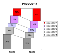
One of our readers Jennifer mailed me with this excel charting problem she is having. I thought why not ask other readers for their advice on this. So here it goes: The Charting Challenge – Visualizing Changes in Market Share Here is an excerpt from her email: The gist of my problem is how to […]
Continue »Infographics of the week [Sep 12]
![Infographics of the week [Sep 12]](https://chandoo.org/wp/wp-content/uploads/2008/09/best-pie-charts-car-logos.jpg)
Donations made to Presidential Candidates – US Elections 2008 What would you get when you take 1.4 million rows of presidential election donations made to Obama’s and McCain’s campaigns? One possibility is the above visualization. The folks at Pitch Interactive created the above visualization. The half pies in the middle represent the overall donations made […]
Continue »
Gauges are a familiar metaphor, everyone can understand them, you can see them everywhere – near your stove, ac, car, gaming console, pc – you name it. So, when you are preparing a chart to tell a point, gauge chart like the one above can be effective. (I know charting pros like Jon Peltier wouldn’t […]
Continue »![Cool Info-graphics of the Week [Sep 5]](https://chandoo.org/wp/wp-content/uploads/2008/09/anatomy-of-a-great-speech-obama-acceptance-dnc.jpg)
Once every week Pointy Haired Dilbert celebrates the art of chart making by sharing 4-5 of the best info-graphics featured in various web sites. Click here to see the visualizations featured earlier. Anatomy of a Great Speech – Obama’s acceptance speech at DNC Presentation Zen captures Obama’s symphony like acceptance speech in a graph shown […]
Continue »
Often it is easy to get carried away with a tools features. Excel is no exception. But here is a list of grotesque charts that you should never make, not even on your last day at work. 1. Leave the radar charts for Spidermen why? You can hardly conclude anything by looking at them They […]
Continue »Cool Visualizations of the Week [Aug 29]
![Cool Visualizations of the Week [Aug 29]](https://chandoo.org/wp/wp-content/uploads/2008/08/infographics-aug29-thumb.jpg)
Once every week Pointy Haired Dilbert celebrates the art of chart making by sharing 4-5 of the best info-graphics featured in various web sites. Click here to see the charts featured earlier. How to does Love, Anger, Joy and other emotions look like? Have you ever wondered how your emotions look like? That is exactly […]
Continue »![5 wonderful visualizations you must see [Aug 22]](https://chandoo.org/wp/wp-content/uploads/2008/08/5-awesome-charts-thumb-aug22.jpg)
Every week Pointy Haired Dilbert celebrates the art of chart making by sharing 5 of the most beautiful, innovative and effective infographic ideas from various sites. Click here to see the visualizations featured earlier. Pop, Soda or Coke? – Countywise terms used for sweetened carbonated water The pop-vs-soda map tells how marketers have been effective […]
Continue »My polar clock using donut charts in excel started a conversation and readers have been awesome enough to download the excel and create their own clocks to show time. Even though the idea of this blog is share the little that I know with you, it is amazing how much I have learned from you […]
Continue »![Polar clock using donut chart [Excel Visualization fun]](https://chandoo.org/wp/wp-content/uploads/2008/08/donut-clock-in-excel-thumb.png)
Smashing Magazine is one of daily hangouts for new design ideas, inspiration and ogle fun. When they featured Pixel Breaker’s Polar clock last Friday on Top 10 creative ways to display time, I knew this could be an interesting visualization to do in excel. So I have created a donut chart in excel that can […]
Continue »Charts of the Week [Aug 15]
Every week, this blog features 5 of the best visualizations from the last week around the web. Average gas prices in US regions from 1993 plotted in dynamic bar Flowing data takes a look at the historical gasoline price data and provides us this eye candy. My friend Jon takes a look at this and […]
Continue »

