All articles with 'Charts and Graphs' Tag
{ 26 Comments }
Visualize Excel Salary Data & You could win XBOX 360 + Kinect Bundle [Contest]
Published on Jun 25, 2012 in Excel Challenges
![Visualize Excel Salary Data & You could win XBOX 360 + Kinect Bundle [Contest]](https://img.chandoo.org/contests/excel-salary-survey-prizes.jpg)
Its contest time again! Put on your creative hats & bring your Excel skills to the game.
Analyze more than 1900 survey responses & present your results in a stunning fashion, and you could walk away with an XBOX 360 + Kinect Sports Bundle (valued at $299).
Sounds interesting? Read on.
Continue »{ 7 Comments }
Give more details by showing average and distribution [Charting Tips]
Published on Apr 6, 2011 in Charts and Graphs
![Give more details by showing average and distribution [Charting Tips]](https://chandoo.org/img/c/show-distribution-along-with-average-to-give-more-details-charting-tips.jpg)
When we have lots of data, we try to summarize it by calculating the average. As they say, averages are mean, they do not give away much.
I want to share with you an interesting example from Amazon.com on how they give more details by combining average with distribution.
As you might know, Amazon shows the rating of each of the products they sell. Customers & users rate the products from 1 to 5 stars. When you visit the product page you will see the average rating. But there is a small down-arrow next to it. When you click on it, Amazon shows you the break-up of that rating so you have a better idea of how the ratings are split.
Continue »{ 11 Comments }
Show Top 10 Values in Dashboards using Pivot Tables
Published on Dec 1, 2010 in Charts and Graphs, Pivot Tables & Charts
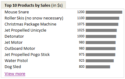
A good dashboard must show important information at a glance and provide option to drill down for details.
Showing Top 10 (or bottom 10) lists in a dashboard is a good way to achieve this (see aside). Today we will learn an interesting technique to do this in Excel.
Continue »{ 14 Comments }
90% of you can see up to cell M26 & other findings [visualization]
Published on Nov 12, 2010 in Charts and Graphs, Learn Excel
![90% of you can see up to cell M26 & other findings [visualization]](https://chandoo.org/img/vp/last-visible-cell-in-excel-visualization-thumb.png)
Two weeks back I ran a poll asking you to tell me what is the last visible cell in your excel window. It was a casual poll. So I didn’t expect a lot of responses. But, boy I was wrong! 295 of you have responded at last count. This is so much more than what I expected.
As I said, the purpose of this poll is to make a visualization out of the poll responses. In this post you can see the chart(s) I made from this data & learn more.
Continue »{ 24 Comments }
How to hide “0” in chart axis [quick tip]
Published on Dec 14, 2009 in Charts and Graphs, Excel Howtos
![How to hide “0” in chart axis [quick tip]](https://chandoo.org/wp/wp-content/uploads/2009/12/hide-zero-chart-axis.png)
Have you ever wondered how you can hide that 0 (zero) at axis bottom? Like shown beside. You can use custom cell formatting codes (or custom number formatting codes) to do just that. Just go to axis formatting and from the number tab set the axis number format to something like #,##0;-#,##0;; Read the rest of the post to learn more.
{ 7 Comments }
What is the most embarrassing charting mistake you made? [weekend poll]
Published on Nov 13, 2009 in Charts and Graphs
![What is the most embarrassing charting mistake you made? [weekend poll]](https://chandoo.org/wp/wp-content/uploads/2008/10/making-sports-dashboards-in-excel-sml.png)
This week’s poll is very simple. What is the the most embarrassing charting mistake your made?
For me it has to be that one time when I made a sports dashboard using excel. I have adjusted the axis scale of a bar chart so that my favorite cricket player (Sachin Tendulkar, who else?)’s records are emphasized. In a matter of minutes I have received several comments from all over world pointing out the mistake. Even though, the intention was to highlight the achievements of master blaster, the axis adjustment was obviously a mistake.
Continue »{ 0 Comments }
Zoho sponsors our Visualization Challenge #2
Published on Nov 12, 2009 in blogging, Charts and Graphs
Aravind (@arvindnatarajan on twitter) who works at Zoho emailed me earlier today and asked if Zoho Reports – Online Reporting and Business Intelligence Service, can sponsor our visualization challenge #2.
Continue »{ 24 Comments }
Top X chart – Show Top X values of a chart Interactively
Published on Nov 12, 2009 in Charts and Graphs, Learn Excel
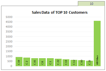
Two charting principles we hear all the time are,
- Sort your data in a meaningful order before plotting it.
- Show only relevant information, not everything – because un-necessary information clutters the chart.
Today we will learn a dynamic charting technique that will mix these two ideas in a useful way. I call this a Top X chart.
Continue »{ 19 Comments }
Switch Rows and Columns in Charts [Quick Charting Tip]
Published on Nov 2, 2009 in Charts and Graphs, Excel Howtos
![Switch Rows and Columns in Charts [Quick Charting Tip]](https://chandoo.org/img/c/switch-rows-columns-in-charts.png)
Let us say you have built a nice chart showing your sales and profits for the top 5 products (learn how to highlight top 5 products in a list), with products on X axis. Suddenly your boss wants to switch the rows to columns (or transpose the chart) so that she can see metric level grouping instead of product level grouping. No need to freak out and rush to Espresso machine, You can do it very easily with Excel Charting features.
In today’s quick tip you will learn how to swap chart rows and columns in excel.
Continue »{ 10 Comments }
Using Combo Charts to Group Related Time Events [Charting Goodness]
Published on Aug 26, 2009 in Charts and Graphs
![Using Combo Charts to Group Related Time Events [Charting Goodness]](https://chandoo.org/wp/wp-content/uploads/2009/08/excel-combo-chart-th.png)
In his latest book, Now You See It, on pages 165 and 166 of the book, Stephen Few discusses how grouping related time intervals can facilitate analysis of data. As an illustration he explains that when viewing data of daily website visits, it helps in separating weekdays and weekends to differentiate expected traffic during these periods. The use of this technique would make it easier for the analyst to identify any anomalous movement in ether the weekend or the week day.
Fortunately excel combo charts can help you do that. In this guest post, Paresh explains to us how to do this.
Continue »{ 2 Comments }
2 Great Pieces of Advice for Chart Makers, Dashboard Designers and Story Tellers Everywhere
Published on Jul 17, 2009 in Charts and Graphs
The worldwide web is a wonderful place. I am constantly amazed by the simple yet very effective stuff we can learn by just reading. Today I want to share with you two very great pieces of advice: Seth Godin’s 4 Simple Principles for making effective graphs: Seth Godin is probably one of the most remarkable, […]
Continue »{ 8 Comments }
Create a Combination Chart, Add Secondary Axis in Excel [15 Second Tutorial]
Published on Jul 2, 2009 in Charts and Graphs, Excel Howtos
Two most commonly asked or searched queries when it comes to charting are,
- How to combine two chart types in one chart, like a line chart combined with bar chart?
- How to add a secondary axis to the chart so that one or more data series are plotted on the secondary axis?
Watch this video tutorial to learn how to do both in less than 15 seconds.
Watch it on youtube: Creating combination charts and adding secondary axis – video tutorial
Continue »{ 0 Comments }
Are you focusing on F word or S word? [Charting Principles]
Published on Jun 17, 2009 in Charts and Graphs
When you are making a chart next time, spend just 5 minutes (or even less) on the formatting and give more time (may be 20 minutes) to think about the story.
Continue »{ 2 Comments }
Interview With Presentation Zen’s Garr Reynolds on Charting & Telling Stories
Published on Jun 15, 2009 in Charts and Graphs
As mentioned earlier, I have met Garr Reynolds of presentation zen fame in Malmo, Sweden last Friday. What was to be a quick 15 minute interview became a 2 hour lengthy discussion on presentations, charting, excel, data, Japanese culture and of course our pointy haired dilbert blog. Read the entire interview in the post.
Continue »A very warm, cuddly and hugsy welcome to Pointy Haired Dilbert. I am happy to know that you are reading this. This is a blog about YOU becoming successful. It is all about understanding your data, making your charts better and improving the way you work using excel. Read this post to know more about this site.
Continue »
