All articles with 'screencasts' Tag
Quick and easy Gantt chart using Excel [templates]
![Quick and easy Gantt chart using Excel [templates]](https://img.chandoo.org/pm/quick-gantt-chart-template-excel.png)
Gantt charts are a very popular way to visually depict project plans. Today, let us learn how to use Excel to make quick & easy Project Plan Gantt Chart.
This is what we will be creating.
Continue »Quickly combine text in multiple cells using this trick! [Formulas]
![Quickly combine text in multiple cells using this trick! [Formulas]](https://img.chandoo.org/q/combine-text-values-to-one-value-excel-trick.png)
Ever wondered how to go from a bunch of cells with text to one big combined text? Like shown above.
Well, there is a simple trick. One of our readers, Grant shared this with us. Read on to learn this.
Continue »42% of the world goes to polls around a pie chart – Like it or hate it?

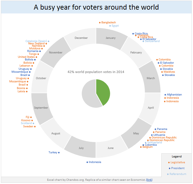
Today lets have a poll. Lets debate if this pie chart about world elections in 2014 is good or bad.
First lets take a look at the chart
This chart, published by The Economist talks about how 42% of the world population is going to vote this year. Take a look and read on to learn how you can re-create this in Excel.
Continue »How to find what is in the hidden cells? [quick tip]
![How to find what is in the hidden cells? [quick tip]](https://img.chandoo.org/q/howto-find-hidden-cell-contents-excel.png)
You have been there. You are looking at a complex workbook with some hidden rows /columns. You want to know what is in that hidden cells. Alas, the worksheet is protected.
It is like the special coffee machine on top floor reserved for senior executives. You know it is there, but you cannot get to it. Now what?!?
Simple. Follow this process.
(I am talking about hidden cells, not the coffee machine.)
Continue »Making a slick on/off switch using Excel & little bit of VBA [case study]
![Making a slick on/off switch using Excel & little bit of VBA [case study]](https://img.chandoo.org/c/on-off-switch-interactive-chart-demo.gif)
I have a confession to make.
I am not sure how to describe this new thing I made in Excel / VBA. So first take a look at it.
Read on to learn how you can create something like this using Excel & a little bit of VBA.
Continue »Show pop-up calendar upon right click [Excel VBA]
There are times when we are entering dates into several columns and would like to select a date from a popup calendar instead of manually typing.
Today, lets understand how we can set up a pop-up calendar in Excel so that your users can easily input dates by right clicking on a cell and inserting a date.

Closing gaps in this Gender Equality Gap chart…

Today lets close some gaps.
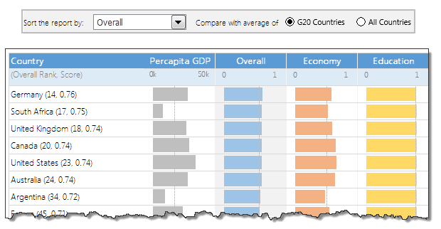
Recently I saw this interesting chart on Economist Daily Charts page. This chart is based on World Economic Forum’s survey on how women compare to men in terms of various development parameters. First take a look at the chart prepared by Economist team.
So what are the gaps in this chart?
This chart fails to communicate because,
- All country charts look same, thus making it difficult to spot any deviations.
- We cannot quickly compare one country with another on any particular indicator.
- It does not provide a better context (for eg. how did these countries perform last year?)
But criticizing someone’s work is not awesome. Fixing it and making an even better chart, that has awesome written all over it. So that is what we are going to do. You can see the improved chart above. Click on it to learn how you can create it.
Continue »How to create a Then vs. Now interactive chart in Excel?

You have been there before.
Trying to compare last year numbers with this year, or last quarter with this quarter.
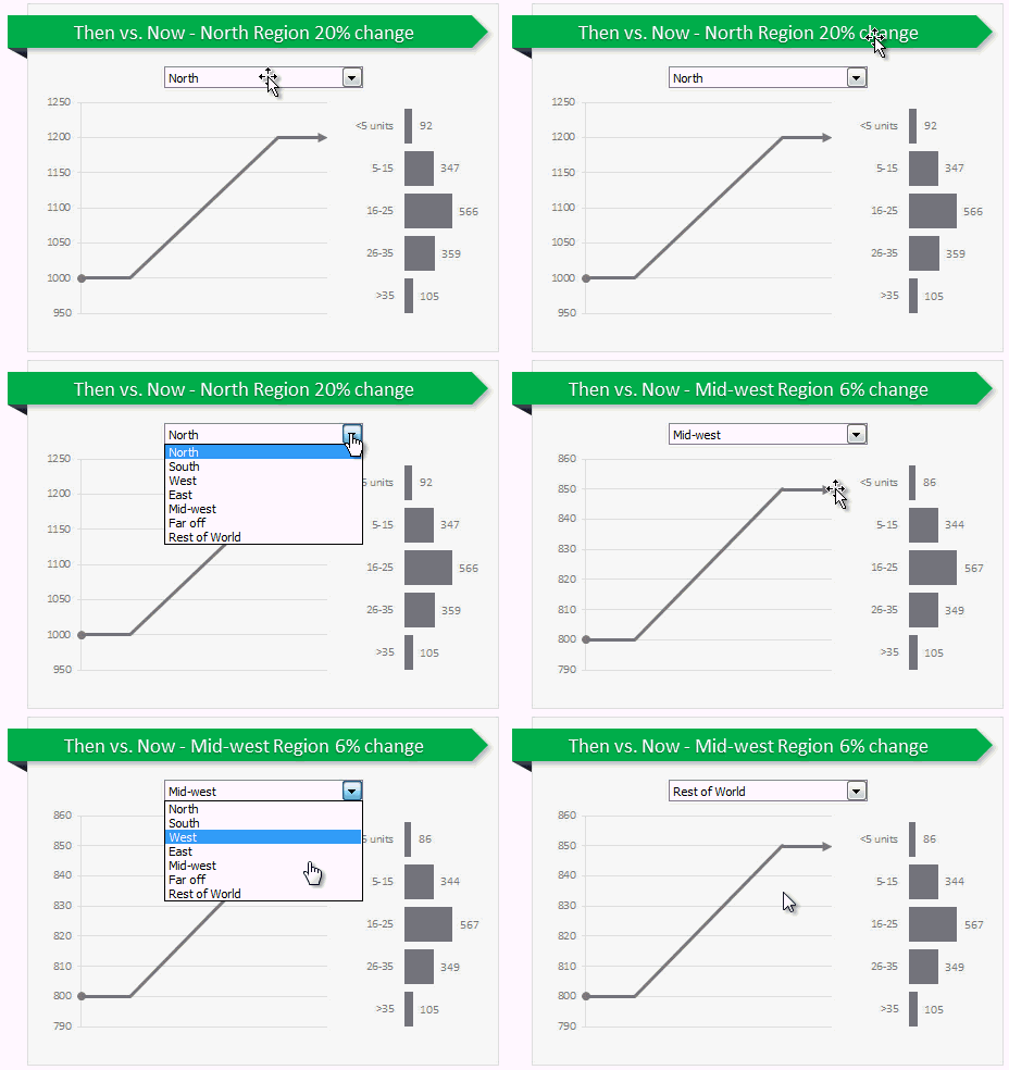
Today, let us learn how to create an interactive to chart to understand then vs. now.
Demo of Then vs. Now interactive chart
First, take a look the completed chart below. This is what you will be creating.
Continue »Are you ready for 2,000 miles, 15 days & 10 Excel tips road trip?

Finally my Excel classes in USA are over. It was a lot of fun traveling to new cities, teaching Excel & dashboards to enthusiastic crowds and making new friends. As if that is not fun enough, we (Jo, kids & I) are going on a 2,000 mile, 2 week road trip starting today.
Although I am enjoying all this, I also feel bad for not taking enough time to share new tricks, ideas & techniques with you here. So, I have a wacky, wild & awesome plan for you. Join us on our road trip.
That is right. You can join me on our road trip and see what I see, learn some pretty cool Excel tricks, all while sipping coffee and stretching legs in the comfort of your office cubicle.
Continue »How to create an Interactive Chart in Excel? [Tutorial]
![How to create an Interactive Chart in Excel? [Tutorial]](https://cache2.chandoo.org/images/c/interactive-chart-in-excel-demo.gif)
Imagine you have a worksheet with lots of charts. And you want to make it look awesome & clean.
Solution?
Simple, create an interactive chart so that your users can pick one of many charts and see them.
Today let us understand how to create an interactive chart using Excel.
Continue »![How to create interactive calendar to highlight events & appointments [Tutorial]](https://img.chandoo.org/vba/interactive-event-calendar-in-excel.png)
One of the popular uses of Excel is to maintain a list of events, appointments or other calendar related stuff. While Excel shines easily when you want to log this data, it has no quick way to visualize this information. But we can use little creativity, conditional formatting, few formulas & 3 lines of VBA code to create a slick, interactive calendar in Excel. Today, lets understand how to do this.
Continue »How to remove all cells containing John (or anything else) [Quick tip]
![How to remove all cells containing John (or anything else) [Quick tip]](https://img.chandoo.org/q/delete-all-cells-with-a-specific-value.png)
Here is an interesting question someone asked me recently,
If I have to delete all rows with “John” in it. Do you know how to do it?
Well, it looks like they really hate John. But it is none of my business.
So lets go ahead and understand a dead-simple way to get rid of all cells with John or whoever else you fancy.
Continue »Use Advances vs. Declines chart to understand change in values

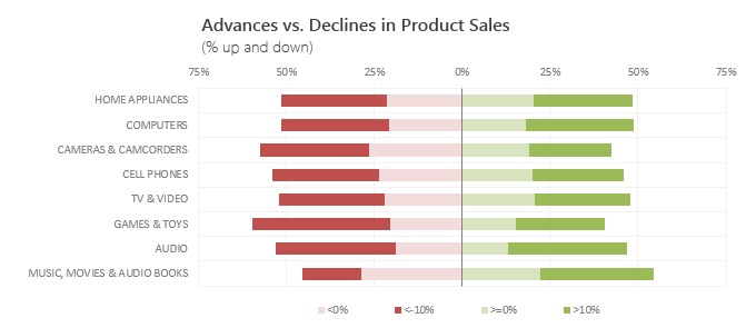
Lets say you are responsible for sales of 100s of products (which belong to handful of categories). You are looking at sales of each product in last month & this month. And you want to understand whether sales are improving or declining by category. How would you do it?
Turns out, this is not a difficult problem. In fact, this question is asked every day & answered using Advances vs. Declines chart.
You may have seen this chart in financial newspapers or websites. Shown above, Advances vs. Declines chart tells us how many items have advanced & how many have declined.
Read on to learn how to create this chart using Excel.
Continue »Transpose a table quickly using Copy – Paste [Quick tips]
![Transpose a table quickly using Copy – Paste [Quick tips]](https://img.chandoo.org/q/transpose-a-table-quickly-using-copy-paste.png)
On Friday, we learned how to transpose a table of data using Excel formulas. Today lets learn a quicker & easier way to do this by just using copy, paste, find & replace.
Continue »Transpose a table of data using Excel Formulas

Today lets tackle a familiar data clean-up problem using Excel – Transposing data.
That is, we want to take all rows in our data & make them columns. Something like this:
Learn these 4 techniques to transpose data:
1. Using Paste Special > Transpose
2. Using INDEX formula & Helper cells
3. Using INDEX, ROWS & COLUMNS formulas
4. Using TRANSPOSE Formula


