All articles with 'pivot tables' Tag
{ 5 Comments }
Matching transactions using pivot tables [video]
Published on Jun 10, 2014 in Pivot Tables & Charts
Last week, we learned how to use formulas to reconcile (match) transactions in Excel. Today, lets take a look at even faster and simpler way to do this:
Using Pivot Tables
Here is a short video explaining the technique and why it works. See it below
Continue »{ 18 Comments }
How to select a random sample from all your data [trick]
Published on Jan 31, 2014 in Excel Howtos
![How to select a random sample from all your data [trick]](https://img.chandoo.org/pivot/how-to-select-random-samples-from-data.png)
The other day, I got a text message (SMS) from one of our readers. It read,
So today, let us learn a very easy trick to select random sample from your data.
Continue »{ 2 Comments }
Details about upcoming Power Pivot course (and a bonus tip on dashboards)
Published on Jul 24, 2013 in Power Pivot

Hello friends..,
I have 2 things for you:
- Details about our upcoming Power Pivot courses
- A short video about designing better dashboards.
{ 41 Comments }
How to use Excel Data Model & Relationships
Published on Jul 1, 2013 in Excel Howtos, Pivot Tables & Charts

Have you ever been in a VLOOKUP hell?
Its what happens when you have to write a lot of vlookup formulas before you can start analyzing your data. Every day, millions of analysts and managers enter VLOOKUP hell and suffer. They connect table 1 with table 2 so that all the data needed for making that pivot report is on one place. If you are one of those, then you are going to love Excel 2013’s data model & relationships feature.
Continue »{ 28 Comments }
How to find sum of top 3 values based on filtered criteria [video]
Published on May 17, 2013 in Excel Howtos
![How to find sum of top 3 values based on filtered criteria [video]](https://img.chandoo.org/f/sum-of-top-3-values-meeting-filtered-criteria-excel.png)
Lets say you are looking at some data as shown above and wondering what is the sum of budgets for top 3 projects in East region with Low priority. How would you do that with formulas?
Continue »
Last week, we had a lovely poll on what are your favorite features of Excel? More than 120 people responded to it with various answers. So I did what any data analyst worth his salt would do,
I analyzed the data and here are the top 10 features in Excel according to you.
Read on to learn more.
Continue »{ 15 Comments }
Finding Conversion ratio using Pivot Table Calculated Items
Published on Mar 6, 2013 in Pivot Tables & Charts, Power Pivot
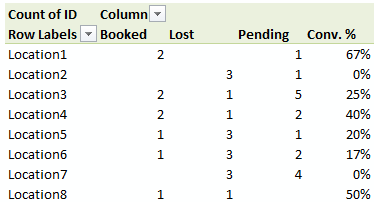
Today, lets understand how to use Calculated items feature in Pivot tables. We will use a practical problem many of us face to learn this feature – ie calculating conversion ratio from a list of sales calls.
Continue »{ 4 Comments }
Distinct Count & Blanks – Power Pivot Real Life Example
Published on Feb 11, 2013 in Power Pivot
When it comes to analyzing business data, managers are always asking, “so how many distinct x each y is doing?”
And that sends us, data analysts & reporting professionals running from pillar to post figuring out the best way to do it.
- We can use variations of SUMPRODUCT, COUNTIFS etc, but the methods are not flexible..
- We can use VBA, but it would become slow as you add more data.
- We can use Pivot tables, but it only gives half of what we want ie each y part, but not distinct count of x.
- We might as well shave our head with a shovel before manually counting values.
And that brings us to 2 distinctly simple solutions:
- Using Power Pivot & Excel 2010
- Using regular pivot tables in Excel 2013
Today, lets talk about these 2 approaches & see why they are so better than anything else for distinct count situations.
Continue »{ 4 Comments }
Details about our Power Pivot Course [and a video for those of you not interested]
Published on Jan 30, 2013 in Excel Howtos, Power Pivot
![Details about our Power Pivot Course [and a video for those of you not interested]](https://img.chandoo.org/power-pivot/power-pivot-course-details.png)
Hello folks,
If this article was a person, they would be schizophrenic. You see, it has 2 purposes:
- Give you all the details about my upcoming Power Pivot course
- Give you a solution to last week’s vacation days problem
Details about Power Pivot Course
Power Pivot, an Excel add-in makes it easy to connect, analyze & visualize massive amounts of data. This course aims to teach you how to use Power Pivot to analyze data, create advanced reports & prepare dashboards all from familiar interface of Excel. This is ideal for data analysts, reporting & MIS professionals, business analysts, managers & dashboard makers.
{ 23 Comments }
Introduction to DAX Formulas & Measures for Power Pivot
Published on Jan 28, 2013 in Power Pivot
A measure is a formula for the values area of Power Pivot table.
A measure can be implicit or explicit.
Implicit measures are created automatically when you drag and drop a field in to Power Pivot values area. For example, in last week’s introduction, we created an implicit measure for SUM of Sales by dragging and dropping the sales amount field in to values area of our power pivot table.
Explicit measures are created by you using New measure button in Power Pivot tab (or Calculated Field button in Excel 2013 Power Pivot tab). You can also create a measure in the Power Pivot window.
Learn what measures are, how to create them using DAX (Data Analysis Expression) formulas in this video tutorial.
Continue »{ 61 Comments }
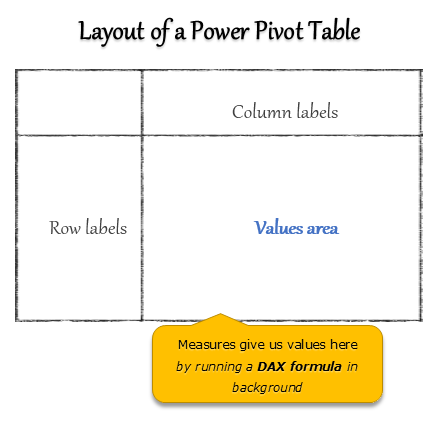
What is Power Pivot – an Introduction [video]
Published on Jan 21, 2013 in Learn Excel, Power Pivot
![What is Power Pivot – an Introduction [video]](https://img.chandoo.org/power-pivot/introduction-to-power-pivot-excel.png)
Today, lets talk about Power Pivot & understand it.
What is Power Pivot?
Power Pivot is an Excel add-in to connect, analyze & visualize massive amounts of data..
Lets take a closer look at the definition.
Connect: You can use multiple tables of data & set up relationships between them using Power Pivot. For example, you can connect customer details to sales transactions so that you can summarize sales by customer location or gender easily.
Analyze: You can create simple pivot table style reports or create something exceedingly complex by defining your own calculated fields for values area of the pivot. There is a whole set of formulas defined for exactly this purpose, called as DAX formulas.
Visualize: Instantly filter your reports using slicers, time lines (Excel 2013 or above only), conditional formats, pivot charts etc. You can even define KPIs and see the performance in bands.
Massive Amounts of Data: Although your typical Excel worksheet contains a million rows, if you tried to load even half of those with any data, Excel would quickly become slow & lazy. Power Pivot can take a million rows for breakfast and would be hungry for more. It can processes millions of rows of data very quickly and easily, all from the comfort of a standard desktop or laptop.
Continue »{ 38 Comments }
How the tax burden has changed over the years – Excellent chart by NYTimes & Redoing it in Excel
Published on Dec 6, 2012 in Charts and Graphs
If I need some charting inspiration, I always visit New York Times. Their interactive visualizations are some of the best you can find anywhere. Clear, beautifully crafted and powerful. Long time readers of Chandoo.org knew that I like to learn from visualizations in NY Times & redo them using Excel.
Today let me present you one such chart. This is based on an interactive visualization prepared by NY Times explaining how the tax burden has changed over years for various income groups.
Take a look at tax burden chart – Excel implementation
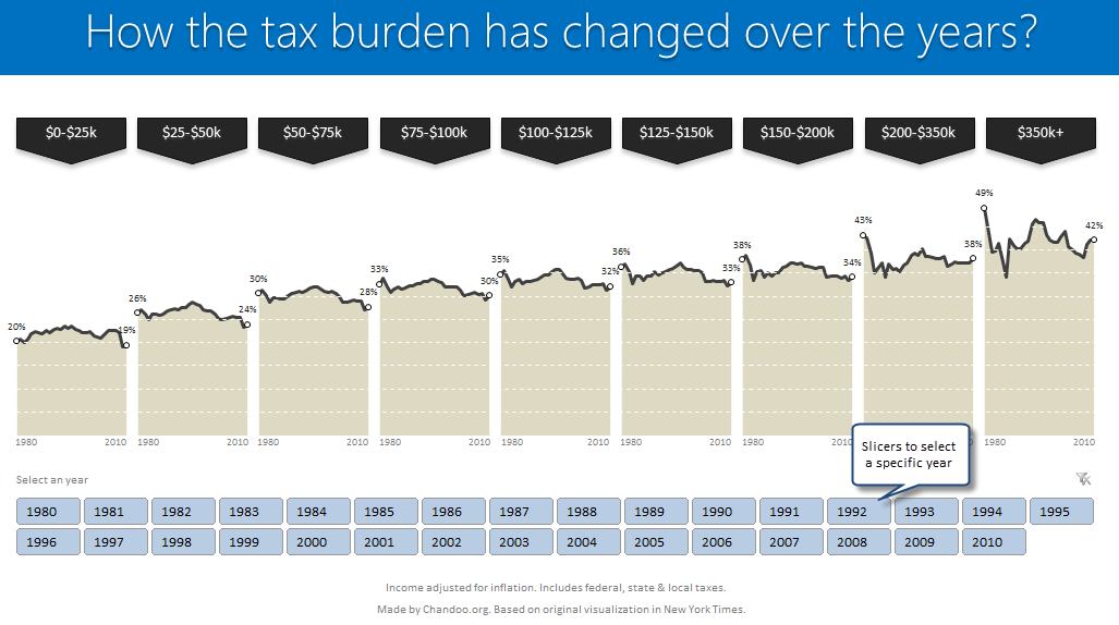
Read on to learn how to create this chart using Excel.
Continue »{ 54 Comments }
Show monthly values & % changes in one pivot table
Published on Nov 6, 2012 in Excel Howtos, Pivot Tables & Charts
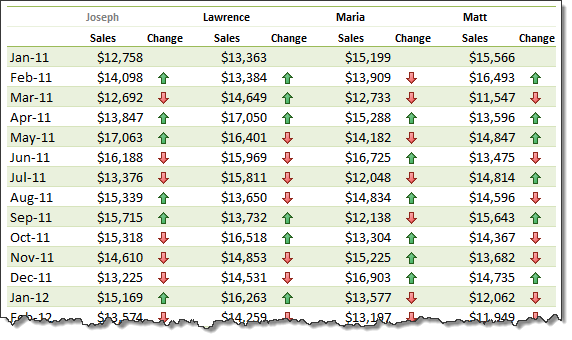
Pivot tables are great help when analyzing lots of data. One of the common questions managers & analysts ask (when looking at monthly sales data for example) is,
How is the monthly performance of our teams (or regions, products etc.)?
A pivot report can answer this question in a snap. Today lets learn how to do that.
Continue »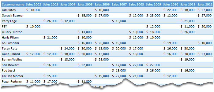
Moosa, one of our readers emailed this interesting question:
I have huge list of customers (around 1500).
Table includes following information
Customer # , Customer Name, Sales 2002, sales 2003, … sales 2012My requirements are
1. list of customer who did not have sales during all these years
2. List of customer who have not business from 2003
3. List of customer who have not business from 2004
Today, lets learn how to identify all the non-performing customers.
Continue »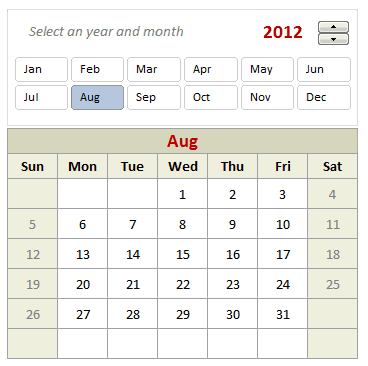
Can we make a calendar using Pivot Tables?!? Of course we can. Today let us learn a simple technique to create calendar style reports using Pivot tables. Thanks to Rob for inspiration Before making any progress, let me thank Rob from PowerPivotPro for the inspiration. Recently he wrote an article explaining how to use PowerPivot […]
Continue »
