All articles with 'ideas' Tag
Starting this week I will post cool infographics from around the web, 4-5 of them a week to inspire , to give more ideas on presenting information and to provide some eye candy for awesome readers @ Pointy Haired Dilbert. Go ahead, click through these awesome graphics: California Walkability Score Heat Map Lee Byron took […]
Continue »Google Maps adds directions by Public Transport – Wow
Wow, this is awesome. Google maps has added directions by public transport. Sometime back when they integrated public transport timings along with bus-stop / train station icons, it was pretty cool, but adding directions based on bus / train routes is totally awesome. Try it for yourself, click here to see a sample direction.
Continue »We have been debating whether or not to buy iPhone. For one, we are not on any cellular contract and free to go. But the sheer cost of $400 one time (one for my wife and one of me) and a monthly bill of ~ $150 is holding us back. Our current mobile bill is […]
Continue »Excel Bullet Graphs

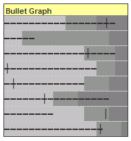
Bullet graphs provide an effective way to dashboard target vs. actual performance data, the bread and butter of corporate analytics. Howmuchever effective they are, the sad truth is there is no one easy way to do them in excel. I have prepared a short tutorial that can make you a dashboard ninja without writing extensive […]
Continue »
In response to Making Incell charts better article, reader Tony mailed me an excel sheet in which he has modified the charts to display colors and negative values. This is pretty cool. Take a look at the chart below: The trick lies in displaying the charts in 2 rows, one for positive values and another […]
Continue »Bingo / Housie Ticket Generator in Excel

I am fascinated by board games. They provide immense fun, anyone can enjoy them, they are unpredictable and best of all they are great value for money. That is why whenever I get sometime I experiment with simulating games to know them better. So, out of curiosity I have created an excel sheet that can generate bingo / housie (housey) tickets – 24 of them at a time. To get new set of tickets you would hit F9 (recalculate).
Continue »Each of us have our mechanisms to track how we spend money. We use Excel, various online sites and software like Quicken or Microsoft Money to track how we spend our bucks. The bottom line is to track where each penny / paisa / cent is going. So, how great would be it be, if […]
Continue »How geeky are you? Show off your geekness to others with this kickass room decor ideas, Just click the images to follow up. live geek, love geek 😀 1. Lets start with the door. You can experiment with the door locks to create your own puzzle: 2. Now that you are in how geeky would […]
Continue »Jon @ Peltiertech has taken a critical look at the partition charts suggested yesterday. You can read his review of the partition charts here. One of the commenters on his site said, Jon, the partition chart is not that bad. It just needs to be defragmented… 🙂 So I de-fragmented my partition chart, this time […]
Continue »![Partition Charts in Excel – alternative to pie charts [visualization hack]](https://chandoo.org/wp/wp-content/uploads/2008/07/partition-charts-in-excel.gif)
Next time you had to create a pie chart, consider building a partition chart as these charts can reveal trend information along with how much each pie is contributing. What more? They are as easy to create as eating a chocolate chip cookie dough ice cream 🙂 I made a sample partition chart based on […]
Continue »I was doing some weird analysis on corporate mission statements and I had to count the number of words in each cell. That is when I realized there is no formula to calculate the number of words in a cell, I was too lazy to write an UDF for that, so I figured out a […]
Continue »Just click those ads and tell me what you understood. Humor me, go ahead, I am waiting. … Ok, stop scratching, you might loose more hair than the common sense brand managers at vodafone lost. Apparently these adds convey that Vodafone has solved the unsolvable conundrum of “talk-time” or “validity” by introducing a lifetime valid […]
Continue »I haven’t noticed this before, but google maps provides 3d building outlines. I think this is pretty cool. You can see them in action here. Earlier on google : Google Park bench in Russia
Continue »Just a take a moment away from your job, graduation term project, cooking or cat petting – whatever it is that you are doing. Now think and tell me if you have any other interesting, exciting, simpler, cooler of way of doing the same? Just remove all your assumptions, forget anything you have learned about […]
Continue »
Let us learn a simple charting hack to create a thermo-meter chart in excel. This type of charts can be effective in communicating one data point, they can make excellent presentation slide or dashboard widget. What more, they are as simple to do as adding whipped cream to your latte. So lets begin: 1. First […]
Continue »

