All articles with 'Learn Excel' Tag
{ 28 Comments }
Check if a Word or Phrase is Palindrome using Excel Formulas [Weekend Fun]
Published on Aug 12, 2011 in Excel Howtos, Learn Excel
![Check if a Word or Phrase is Palindrome using Excel Formulas [Weekend Fun]](https://img.chandoo.org/f/check-for-palindrome-excel-formulas.png)
The other day, while I was putting my kids to sleep, this idea came to me. How do I check if a cell contains a palindrome, using Excel formulas?
Next morning, I wrestled with excel for about 20 minutes and boom, the formula is ready.
But what is a palindrome?
A palindrome is a word, phrase, verse, or sentence that reads the same backward or forward. For example: A man, a plan, a canal, Panama!
So, to check if a cell contains palindrome, we need to reverse the cell contents and see if both original and reverse are the same.
{ 11 Comments }
MLB Pitching Stats Dashboard in Excel+VBA by our VBA Class Student
Published on Aug 10, 2011 in VBA Macros
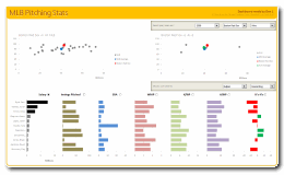
Nothing gives a teacher more satisfaction than seeing a student apply the knowledge to do something awesome. So naturally, I jumped with joy when I got this email from Dan, one of my VBA Class students,
Hi Chandoo,
After going thru your VBA Classes, I realized that we can lots of awesome stuff with pivot tables + simple macros. I recently created an Excel Dashboard to depict MLB (Major League Baseball) Pitching Stats. I could not have done this had I not learned VBA. Thank you so much for teaching the class.
I got curious and requested Dan, if I could share the file with you all. Being a lovely person, Dan agreed immediately.
Continue »
On a cup of green tea with a friend I grabbed the golden rule of accounting. It is simple (You can easily miss if it came your way!) and can be applied to almost all the accounts (Depreciation, Gross Block, Cash, Equity, Debt) – You name it, and you have to use it! So concentrate […]
Continue »{ 122 Comments }
10 Excel Keyboard Shortcuts I can’t live without!
Published on Aug 8, 2011 in Learn Excel

Everyone and their colleague knows the importance of Excel keyboard shortcuts. While it may be a good idea to know a 97 different shortcuts for everything in Excel, the fact is, you don’t use them all the time. So, it all boils down to memorizing the few shortcuts that you use all the time.
In this post, I am sharing 10 such shortcuts that I can’t live without, especially, when I am analyzing data, making charts and formatting my workbooks.
Continue »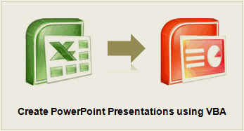
You’ve been there before. It’s almost 5:00, and you are going crazy trying to finish the presentation due for a monthly performance meeting the next morning. The model is refreshed, and now it just takes a LOT of copying, pasting, and positioning to get the PowerPoint ready. Finally, the slides are finished…, until you read a new message from your boss requesting a minor change. But of course her change means you have to start all over with the copy and pastes…
There is always a better way! In the Oil and Gas industry, I constantly have monthly reports to assess the performance of our operating assets. Excel VBA makes it a cinch to automate the entire process. So when a simple change is requested, the presentation is automatically generated with the click of a button. No more wasting time!
Continue »{ 26 Comments }
Get busy this weekend, with OR XOR AND [Excel Homework]
Published on Jul 29, 2011 in Excel Challenges, Excel Howtos
![Get busy this weekend, with OR XOR AND [Excel Homework]](https://img.chandoo.org/hw/bitwise-operations-in-excel-howto.png)
Some of you have heard my neighbor’s dog bark in a video or two that I recorded. While I was busy explaining how to do something awesome in Excel, this dog would decide to bark, adding her own two cents to the lesson. Quite a few of my VBA class students have grown used to it. So much that they complain when a lesson doesn’t have a couple of woofs. But I digress.
So coming back, one of the dogs (probably stray) has decided that she should bring her infant puppies and hide them under our terrace stair case. So, now we have 2 cute little puppies barking day long (and very late in to the night) just outside my office window. We have tried hard to get rid of them, but they somehow sneak back in and start barking or crying. So, I will be busy this weekend trying to move them out.
But that doesn’t mean, you have to live Excel-less for a few days. So I have a homework.
OR XOR AND, Get busy this weekend!
Don’t worry. I am not speaking elvish or something. OR, XOR & AND stand for bit-wise operations. This week, your task is to write formulas in Excel that would get the bit-wise results for AND, OR & XOR.
Continue »{ 10 Comments }
Scenario Analysis for the Project Valuation [Financial Modeling]
Published on Jul 26, 2011 in Financial Modeling
![Scenario Analysis for the Project Valuation [Financial Modeling]](https://chandoo.org/wp/wp-content/uploads/2011/07/clip_image004_thumb.jpg)
Few months ago, we learned how to create a project valuation model in Excel as part of our series on Financial Modeling in Excel.
My Project Evaluation Model had a limitation!! In one of the personal comments that I received, the reader pointed out an important problem!
Continue »{ 13 Comments }
Video Tutorial on Interactive Dashboard using Hyperlinks
Published on Jul 25, 2011 in VBA Macros
Few days ago, we published an article on how to create interactive dashboards using hyperlinks. Many of you loved this tutorial. But quite a few of you also said, this tutorial is a bit complex to follow.
So, I made a short video explaining how the UDF and interactive hyperlinks work and how our dashboard is weaved together.
Continue »
Two weeks ago we asked you what you wanted to see at Chandoo.org and you responded.
We have had 71 responses giving us 101 ideas to date.
Here are the results…
Continue »
Last week we learned how to create dynamic hyperlinks in Excel. Today, I want to show you something even cooler. An interactive dashboard based on hyperlinks, like shown above.
Isn’t it impressive?
Well, to create something like this, you don’t need a degree in advanced cryogenics. You just need a bunch of data, a chart, a one line macro code and some pixie dust (go easy on pixie dust).
Continue »{ 5 Comments }
Details about our Financial Modeling Class
Published on Jul 18, 2011 in Financial Modeling
Hi there,
Do you know that Chandoo.org run an online training program on Financial Modeling & Project Finance Modeling?
So far, we have trained more than 200 students thru this program and now, I am excited to announce that from July 27th, you can join this course again.
Read this short post to understand how our program can benefit you.
Continue »{ 43 Comments }
Create Dynamic Hyperlinks in Excel [Video]
Published on Jul 14, 2011 in Excel Howtos, Learn Excel
![Create Dynamic Hyperlinks in Excel [Video]](https://img.chandoo.org/q/dynamic-hyperlink-in-excel.png)
During one my recent training programs, a participant asked an interesting question.
I have a list of values. I would like to place a hyperlink in my workbook that would always take me to the last value in the list.
Something like shown aside.
Click on the image to learn how this is done.
Continue »{ 7 Comments }
NPV() function to calculate Present Value
Published on Jul 5, 2011 in Financial Modeling, Learn Excel

Today, let us learn how to use NPV() function in Excel & create a simple financial model.
If you are dealing with cash and valuations, you are bound to have come across the NPV function. If you don’t know the assumptions behind the same, I bet it could cost you your job!
Let’s take a simple project – You buy a MSFT stock for USD 100. You receive a dividend of USD 10 in the first year, USD 20 in the second year, USD 40 in the third year and then you sell it out for USD 140. If you could have alternatively put this money in bank at 10% interest rate, have you gained anything?
How do you model this in excel? In this tutorial we understand how you can use NPV to do this analysis and what kind of pitfalls you can land into!!
Continue »{ 40 Comments }
Winners of the Sales Analysis Chart Contest + One more Giveaway
Published on Jul 1, 2011 in blogging, Charts and Graphs
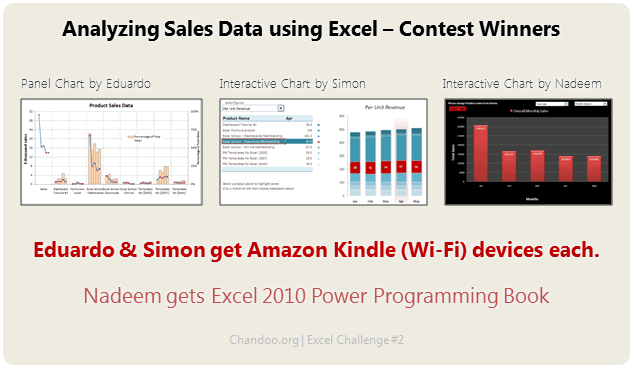
Our Sales Analysis Chart Contest is over and the winner is….,
Oh, wait!
I have decided to award the prize to 2 contestants. Each of them will get an Amazon Kindle Reading Device.
The winners are,
Continue »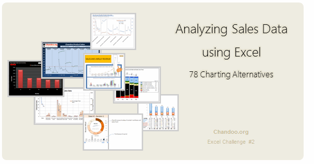
Recently, I ran a contest asking you to analyze a bunch of sales data and present your results in charts. We received a total of 78 charts from 45 people. The contest entries had a mind-boggling variety of excel charts, techniques and ideas. It took me a while to go thru all the files and compile the results. Thanks for your patience. In this post, you can find all the charts along with my comments & links to download files.
Continue »
