All articles with 'dashboards' Tag
2 Great Pieces of Advice for Chart Makers, Dashboard Designers and Story Tellers Everywhere
The worldwide web is a wonderful place. I am constantly amazed by the simple yet very effective stuff we can learn by just reading. Today I want to share with you two very great pieces of advice: Seth Godin’s 4 Simple Principles for making effective graphs: Seth Godin is probably one of the most remarkable, […]
Continue »Excel Links – Bacon bits are good edition
In this edition of Excel Links, we feature a new excel blog on the blog, named bacon bits. We also share links about interesting articles like generating tinyurls using vba, making maps using xy charts, designing filters for your dashboards and more.
Continue »Tweetboard Implementations – Download and make your twitter style dashboard today

Check out two fabulous implementations of tweetboards in excel. Download the workbooks and play with them yourself. Thanks Fernando and Lee for sharing these workbooks with us.
Continue »Tweetboards – Alternative to traditional management dashboards
Here is a fun, simple and different alternative to traditional dashboards. Introducing….
Web Analytics Dashboard by Percent Mobile is Fun [Dashboard Reviews]
![Web Analytics Dashboard by Percent Mobile is Fun [Dashboard Reviews]](https://i287.photobucket.com/albums/ll133/pointy-haired-dilbert/web-analytics-dashboard-th.png)
Take a look at the web analytics dashboard from percent mobile. It is well executed and provides good quality information at a glance.
Continue »What is Your Opinion on Pie Charts?

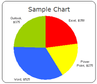
Pie charts are one of the most used charts in the world. And for obvious reasons: they are simple to create and easy to understand. When it comes to pie chart, I have no clear opinion. Part of me says use them, the other says avoid them.
What is your opinion on Pie charts ?
Continue »Visualizing Search Terms on Travel Sites – Excel Dashboard

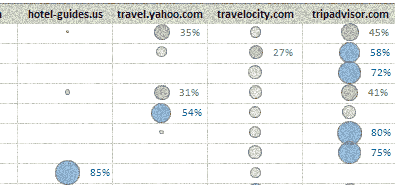
Microsoft excel bubble chart based Visualization to understand how various travel sites compete search terms
Continue »Excel Links of the week – the Christmas edition
It is the holiday week, that means less posts and more fun. We went to a friend’s wedding yesterday and had wonderful time. We are planning to celebrate Christmas at home with friends this year. How are you celebrating the holidays this year?
Continue »Prevent users from scrolling away on your dashboards [dirty little trick]
Dashboards let users get all the information they want in a quick glance. Not if users start using scroll bars and scroll down to cell A64000. So here is a quick and dirty trick. Assuming your dashboard ends in row 40, select row 41 and go to menu > window > freeze panes. That way […]
Continue »
Yesterday I have learned this cool excel charting trick and I cant wait to share it with you all. The problem: I have too many charts & want to show one based on selection You have made 3 charts to show your company performance in the last 8 years. But you don’t want to clutter […]
Continue »![Adding Box Plots to Show Data Distribution in Dashboards [Part 6 of 6]](https://chandoo.org/wp/wp-content/uploads/2008/10/box-plot-excel-dashboard-visualization-thumb.png)
This is a Guest Post by Robert on Visualization Techniques for Excel KPI Dashboards. This 6 Part Tutorial on Management Dashboards Teaches YOU: Creating a Scrollable List View in Dashboard Add Ability to Sort on Any KPI to the Dashboard Highlight KPIs Based on Percentile Add Microcharts to KPI Dashboards Compare 2 KPIs in the […]
Continue »Sports Statistics Dashboard in Excel – Few More Alternatives

First of all, thanks everyone for making the should you always start barcharts at zero? discussion lively. Almost everyone felt that we should start bar charts at zero. After spending sometime with my initial test cricket statistics dashboard, I have created few alternatives. You can see them below. But somehow I feel that I haven’t […]
Continue »
It all began with my Excel Dashboard Tutorial – Making a dashboard with player statistics. I have used bar charts with axis whose minimum is not zero, to create a dramatic effect in the charts. See below: Jon Peltier commented saying that, Rule #1: Bar and column chart value axes should start at zero. Since […]
Continue »![KPI Dashboards – Compare 2 Decision Parameters [Part 5 of 6]](https://chandoo.org/wp/wp-content/uploads/2008/10/excel-dashboard-visualization-tips-thumb.png)
This is a Guest Post by Robert on Visualization Techniques for KPI Dashboards using Excel. This 6 Part Tutorial on Management Dashboards Teaches YOU: Creating a Scrollable List View in Dashboard Add Ability to Sort on Any KPI to the Dashboard Highlight KPIs Based on Percentile Add Microcharts to KPI Dashboards Compare 2 KPIs in […]
Continue »![Excel KPI Dashboards – Adding Micro Charts [Part 4 of 6]](https://chandoo.org/wp/wp-content/uploads/2008/09/kpi-dashboard-excel-thumb.jpg)
This is 4th part of Creating Management Dashboards in Microsoft Excel 6 post series by Robert. This 6 Part Tutorial on Management Dashboards Teaches YOU: Creating a Scrollable List View in Dashboard Add Ability to Sort on Any KPI to the Dashboard Highlight KPIs Based on Percentile Add Microcharts to KPI Dashboards Compare 2 KPIs […]
Continue »

