All articles with 'Charts and Graphs' Tag
Making a chart with dynamic range of values

We all know that to make a chart we must specify a range of values as input.
But what if our range is dynamic and keeps on growing or shrinking. You cant edit the chart input data ranges every time you add a row. Wouldn’t it be cool if the ranges were dynamic and charts get updated automatically when you add (or remove) rows?
Well, you can do it very easily using excel formulas and named ranges. It costs just $1 per each change. 😉
Ofcourse not, there are 2 ways to do this. One is to use Excel Tables and another is to use OFFSET formula.
Continue »
A Pareto chart or pareto graph displays the importance of various factors in decreasing order in columns along with cumulative importance in a line. Pareto charts are often used in quality control to display most common reasons for failure, customer complaints or product defects. The pareto chart is a great way to do the pareto analysis. Today, we will learn how to use excel to make a pareto chart.
Continue »Dynamically Grouping Related Events [Excel Combo Charts with Pizzazz]
![Dynamically Grouping Related Events [Excel Combo Charts with Pizzazz]](https://chandoo.org/img/n/dynamic-event-grouping-charts-th.gif)
Yesterday we have posted how to use excel combo charts to group related time events. Today we will learn how to change the event grouping dynamically using form controls.
This effect can be easily achieved with a cup of coffee, one combo box form control and the good old IF formula. Read more to learn how to do this.
Continue »50 Best Cities for Finding a Job [Incell Dashboard using Excel]
![50 Best Cities for Finding a Job [Incell Dashboard using Excel]](https://chandoo.org/wp/wp-content/uploads/2009/08/incell-comparison-charts.png)
We all know that incell charts are a very cool way to explore and visualize data. Personally I like them so much that I have written several tutorials on it here. Today we will see how a Job dashboard on “50 best cities for finding a job” originally prepared by Indeed job search engine can be recreated in Excel using In-cell charts. The final outcome is something like this.
Continue »Waterfall Charts using Excel

Learn how to create waterfall charts in Excel in this tutorial. Our guest author, Aaron, explains how to create cool looking waterfall charts with connectors. Waterfall charts are great, especially for visually showing the contribution of parts to a whole.
Continue »What would you do if a co-worker makes ugly chart? [weekend poll]
![What would you do if a co-worker makes ugly chart? [weekend poll]](https://chandoo.org/wp/wp-content/uploads/2008/09/excel-charts-avoid-3d-column.png)
We talk alot about making better charts and perils of bad charts here.
I want to know what you usually do when a co-worker or boss makes an ugly chart?
- You tell them the chart sucks
- You gently point out the mistakes of their chart and tell them some nicer and cooler ways to tackle it
- You stay calm and send them an e-mail later (may be with a link to PHD chart pages or something like that)
- You don’t care (and may be continue doodling)
- Any other
Vote your option using comments.
Continue »Charting Lessons from Optical Illusions

The other day while doing aimless roaming on the dotcom alley, I have seen some cool optical illusions. There are so many valuable lessons optical illusions can teach us – chart makers. Don’t believe me? Look at the bubble chart illusion on the left and tell me which orange circle is bigger? What is your answer? Right or left. Well, my friend, the answer is both are of same size. Read the rest of this post to find some cool optical illusions and what they can teach us – chart makers.
Continue »We cant Cure Cancer, But we can Cure this Medicare Chart [Chart Busters]
![We cant Cure Cancer, But we can Cure this Medicare Chart [Chart Busters]](https://chandoo.org/img/cb/3/Figure_2.png)
In this installment of Chartbusters, we take a look at a poorly constructed choropleth of medicare reimbursements in US and suggest cure for it. The post is from our Guest Buster – Jeff.
Continue »![Project Management: Show Milestones in a Timeline [Part 3 of 6]](https://chandoo.org/img/pm/project-timeline-chart-excel-th.png)
Learn how to create a timeline chart in excel to display the progress of your project. Timelines are a good way to communicate about the project status to new team members and stake holders. Also, download the excel timeline chart template and make your own timeline charts.
Continue »![Fix this chart [excel homework #1]](https://chandoo.org/img/cb/axis-mixup-chart-fix.gif)
This column chart shows daily, weekly or monthly data depending on the user’s choice. In daily the columns are displayed properly, but in weekly & monthly mode the columns are a fraction of the width they should be – why, and how can this be avoided? Bonus points if you can describe how to use an INDIRECT formula on the x-axis labels which is another problem. Go fix it.
Continue »Asset Allocation Chart Turns Zombie [ChartBusters #1]
![Asset Allocation Chart Turns Zombie [ChartBusters #1]](https://chandoo.org/img/cb/bad-asset-allocation-chart-donut.png)
In this installment we take a look at Asset Allocation Chart that looks like it is hexed. Our reader DMurphy submitted this.
Continue »Incell Dot Plots in Microsoft Excel

Dot plots are a very popular and effective charts. According to wikipedia “Dot plots are one of the simplest plots available, and are suitable for small to moderate sized data sets. They are useful for highlighting clusters and gaps, as well as outliers.”
Today we will learn about creating in-cell dot plots using excel. We will see how we can create a dot plot using 3 data series of some fictitious data.
Continue »Hurray, PHD blog crossed 2000 RSS Subscriber base. This is a very significant milestone for me.
To celebrate this occasion we have a mega post: 100 Excel & Charting Tips, Tricks and Resources for you.
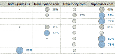
Continue »Visualizing Search Terms on Travel Sites – Excel Dashboard

Microsoft excel bubble chart based Visualization to understand how various travel sites compete search terms
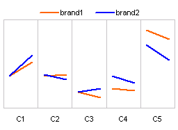
Continue »How to present changes in Market Share using Charts?

Most of us are comfortable with numbers, but we are confused when it comes to convert the numbers to charts. We struggle finding the right size, color and type of charts for our numbers. The challenge is two fold, we want to make the charts look good (we mean, really… really good) but at the […]
Continue »

