All articles with 'Charts and Graphs' Tag

I have a new community project for all the members of PHD. It is a simple yet intuitive challenge. Make your own country’s flag using Excel Charts. To start the project, I have made the Indian flag using a bar and pie chart. Go ahead and see the rest of this post to findout how this chart is made and then participate in the “flag project” by making your own country’s flag. All the best.
Continue »Annual Goals Tracker Sheet [awesome ways to use excel]
Marko, who is a long time PHD reader and an excel ninja sent this via email, I work at an insurance company in Slovenia. At the beginning of each year we have a conversation with our superiors to review our work in the past year and to set new goals (main activities) that we’re gonna […]
Continue »Use Paste Special to Speed up Chart Formatting [Quick Tip]
![Use Paste Special to Speed up Chart Formatting [Quick Tip]](https://chandoo.org/img/q/use-paste-special-in-charts.png)
Excel Paste Special is one of my favorite features. So I was naturally thrilled when I discovered that you can use paste special to paste formatting from one chart to another. When we have multiple charts, ensuring consistent color schemes, fonts etc. is very important. Often we individually format the charts because they have different […]
Continue »What is the most useless feature in Excel? [poll]
![What is the most useless feature in Excel? [poll]](https://chandoo.org/img/l/surface-charts-excel-whats-the-point.png)
What do you think is the most useless feature in MS Excel? I know there are a ton of cool, extremely useful features in excel. But it also comes with a few really un-necessary features. For me, the most useless feature seems to be a 3D surface chart. I have tried to figure why this […]
Continue »Flu Trends in a City chart from Google is Awesome!

There is nothing awesome about flu. In fact, it is anti-awesome if you have flu. I have been fortunate enough not to get it ever (it is another story that I have cold almost 364 days of an year).
Don’t worry if you are afraid of it, Folks at Google are not letting you down. They are using google search terms to predict flu trends and present the information in a beautiful chart.
Today I want to tell you why this particular chart on flu trends made by Google is awesome…
Continue »Product Recommendation – Excel Dashboard Training Kit

If you want to make better charts and create lasting impressions, chances are you have heard about Jorge Camoes. He writes at excelcharts.com (previously charts.jorgecamoes.com). I have been reading Jorge’s blog for over 2 years now and have linked to his excellent articles on PHD several times. Jorge also has an Excel Dashboard Training Kit, which teaches us how to make a dynamic and comprehensive excel dashboard. The dashboard training kit is a culmination most of his lessons implemented in a practical way using Excel.
In this article, I review the product and tell you why you should get a copy of it.
Continue »A Brief History of Microsoft Excel – Timeline Visualization
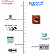
Timeline charts are great for providing quick snapshots of historical events. And hardly a day goes by without some one making a cool visualization of a time line of this or that. Time lines are easy to read, present information in a logical manner and mostly fun.
So yesterday, I set out to mimic the iconic gadgets of all time in excel, just for fun. Then it strike me, why not make a visual time line of Microsoft Excel ? So I did that instead.
Continue »Sales Dashboards – Visualizing Sales Data – 32 Dashboard Examples & Implementations

Sales reports and dashboards are very common in any company. There are several ways in which you can visualize sales data to understand the trends and sales performance. So in November, I have asked you to visualize sales data using sample data. The visualization challenge #2, sponsored by Zoho Reports generated a huge buzz around the community and fetched 32 incredible entries. The response was so overwhelming that it took me almost 24 hours to write this post. Thanks everyone for participating and making this a huge learning experience for everyone. Personally I have learned several useful dashboard and charting tricks. I will be sharing some of these lessons with all of you in the coming weeks.
Continue »Best Charts to Compare Actual Values with Targets – What is your take?
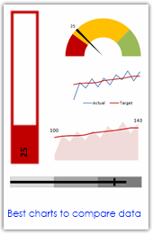
Comparing values is one of the main reasons we make charts. Yesterday we have a post on using thermometer charts to quickly compare actual values with targets. Today we follow up the post with 10 charting ideas you can use to compare actual values with targets. Check out how bullet charts, thermometer charts, traffic lights, gauges, column charts, area charts can help you compare targets with actual performances. A review of best charting options when you need to compare.
Read the rest of the post to see the options and participate in poll.
Continue »Make a Quick Thermometer Chart to Compare Targets and Actuals
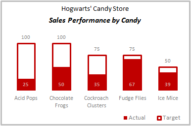
Comparing values is one of the reasons why we make charts. So today I am going to teach you a handy little trick to make a thermometer like chart to compare targets with actuals. This type of chart is very useful when you have a bunch of sales targets and you want to measure how the performance has been.
Continue »Use Shapes and Images to make Prettier Charts [Dashboard Tricks]
![Use Shapes and Images to make Prettier Charts [Dashboard Tricks]](https://chandoo.org/img/c/use-shapes-to-make-better-dashboard-charts.png)
One of the annoyances of charts is that they all look like boxes (except for pie charts, they just look wrong). Boxes might be ok when you are making 1 or 2 charts. But a whole dashboard of boxes can look little rigid. So how can we make the charts peppy without loosing any effect? Like these charts below:
Very simple, we use drawing shapes in MS Excel to draw whatever we want and overlay the chart on top.
Continue »What is the most embarrassing charting mistake you made? [weekend poll]
![What is the most embarrassing charting mistake you made? [weekend poll]](https://chandoo.org/wp/wp-content/uploads/2008/10/making-sports-dashboards-in-excel-sml.png)
This week’s poll is very simple. What is the the most embarrassing charting mistake your made?
For me it has to be that one time when I made a sports dashboard using excel. I have adjusted the axis scale of a bar chart so that my favorite cricket player (Sachin Tendulkar, who else?)’s records are emphasized. In a matter of minutes I have received several comments from all over world pointing out the mistake. Even though, the intention was to highlight the achievements of master blaster, the axis adjustment was obviously a mistake.
Continue »Lets Pimp a Gauge Chart [Chart Porn Friday]
![Lets Pimp a Gauge Chart [Chart Porn Friday]](https://chandoo.org/wp/wp-content/uploads/2009/11/fancy-excel-gauge-chart-th.png)
Egil, one of our alert readers from Norway sent this to me in e-mail, which I swear, I am not making up – A Fancy Gauge Chart. See the e-mail and chart yourself. I’m having a lot of fun with your gauge template 🙂 To make it more industrial-like, I’ve added: 1. Brushed metal background […]
Continue »Dashboard Best Practice – Google Analytics Intelligence Report
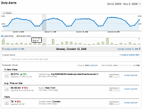
Yesterday while checking my website analytics reports on Google analytics site, I have noticed a new beta feature called “Intelligence”. Out of curiosity I clicked on it. It took me to a an intelligence alert dashboard. Ok, lets just back up for a minute and understand what “intelligence dashboard” is before moving on. In the […]
Continue »Project Dashboard + Tweetboard = pure awesomeness!!!
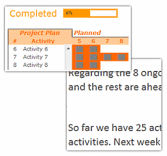
Check out an implementation of project dashboard along with tweetboard by our reader Fernando. He says, it “turned out to be a great success”. I am so happy for him.
Btw, the post includes a link to download the workbook so that you can see the dashboard and tweetboard in action.
Continue »

